Accesible Signup Form for Optimal Workshop

Introduction
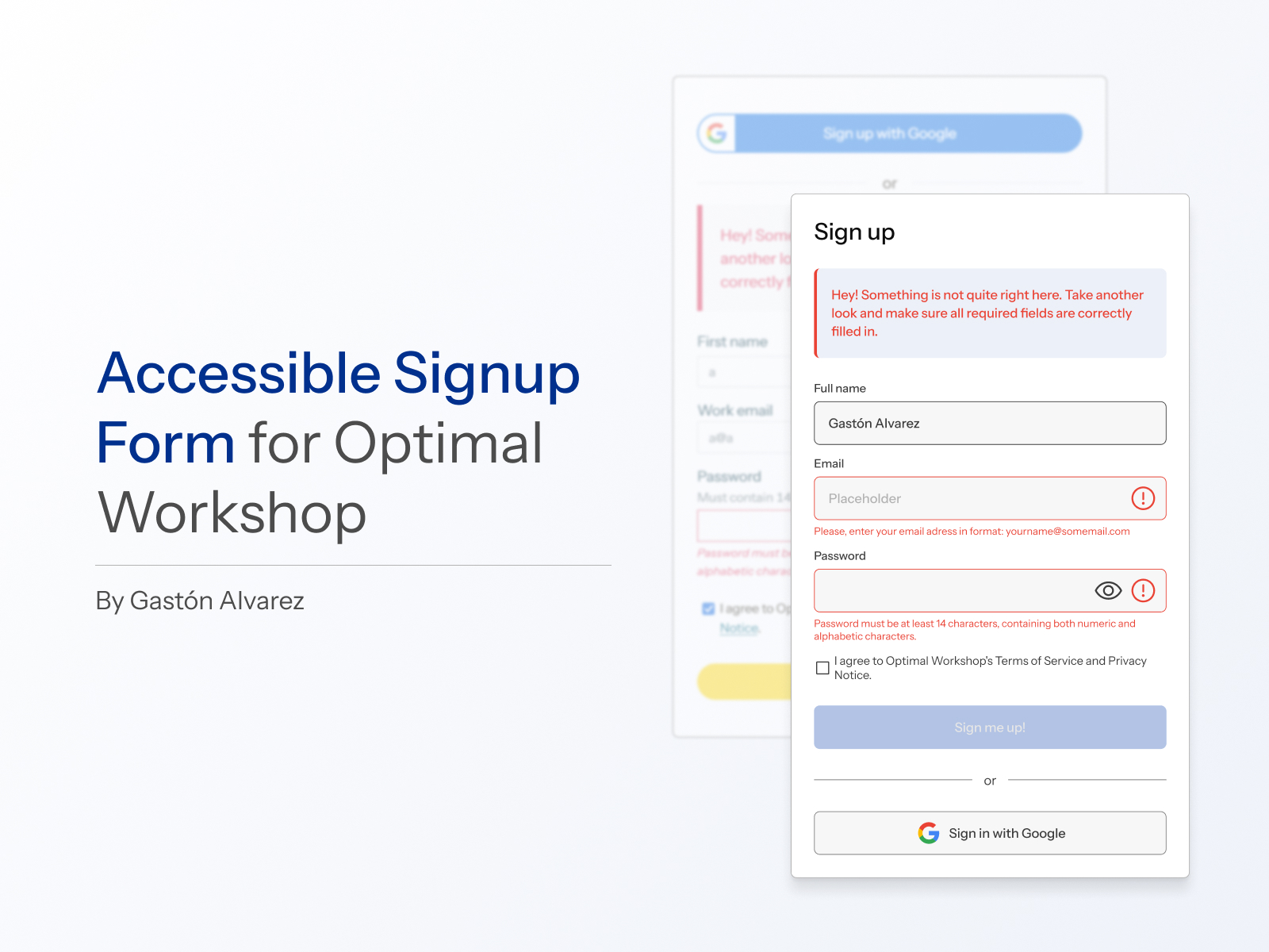
This project focuses on improving the user experience of the login and signup screens for Optimal Workshop, with a strong emphasis on accessibility and best design practices.
Motivation
Inspired by Uxcel’s proposal to design an accessible login/signup flow for a SaaS platform, I explored various well-known websites. Upon analyzing Optimal Workshop's login page, I quickly identified several shortcomings. What began as a casual observation turned into a more in-depth analysis, uncovering multiple opportunities for improvement. This ultimately led me to select this platform for my redesign.
Opportunities for Improvement and Proposed Solutions
Visual inconsistencies
- The login and signup screens were not aligned with the site's recent redesign. To enhance visual consistency, I used the current site aesthetics as a reference.
- Since the official typography requires a license (https://displaay.net/typeface/saans-collection/), I used Instrument Sans (https://fonts.google.com/specimen/Instrument+Sans) as an alternative and adjusted it to closely match the current design.
Lack of informative placeholders
- Input fields lacked clear guidance for users. I added descriptive placeholders to guide users in completing each field.
Primary CTA button enabled without validation
- The call-to-action button was active even when required fields were incomplete. I adjusted its functionality to activate only when all required fields were properly filled out.
Unclear help text
- The instructions for creating a password were confusing. I rephrased the text to make it clearer and more user-friendly.
Error messages insufficiently highlighted
- Errors were only indicated by the color red. I added icons associated with the relevant fields to visually reinforce the error messages.
Focus state visibility issues
- The focus state for navigating with the keyboard was difficult to identify. I improved its design to make it more prominent and accessible.
Name fields in two columns
- The fields for full name were unnecessarily split into two columns. I merged them into a single field with a simplified label: “Full name.”
Inconsistent form positioning
- The position of the form changed between the login and signup pages. I redesigned both screens to keep the form consistently located on the left side of the screen.
Inconsistent styling of titles and text
- Titles and text blocks accompanying the forms had differing styles. I standardized these elements to ensure visual coherence.
Inconsistent error message styling
- Error messages were presented differently on the login and signup screens. I applied a uniform design for both.
Login button disappearing from navigation bar
- The login button in the navigation bar disappeared when accessing the signup page. I ensured this element remained visible across screens for consistency.
Lack of clear screen indication
- There was no explicit indication of whether the user was on the login or signup screen. I added clear titles to distinguish each page.
Tools used
From brief

Topics
Share
Reviews
2 reviews

The product design is really good, and the warnings are presented very clearly and logically. This helps users easily recognize and respond promptly to the necessary information. However, there are a few minor points that I think could be improved further. First, in terms of aesthetics, choosing a different font would enhance readability, as the current font is a bit thin and tightly spaced, which may cause difficulties for some users. Second, the phrase "7-day" should be written as one word instead of being split across lines, as this creates an inconsistent and illogical impression for the viewer. These small adjustments would not only improve the user experience but also enhance the aesthetics of the interface. I look forward to seeing updates in the future!

I like how you managed to place the value proposition, and the bold headings make the page easy to scan. WCAG compliance is met, the error feedback uses polite, supportive microcopy, which works well. The Google sign-in option is also accessible and a nice touch for users.
A few things could be improved. The placeholders in the email and password fields should be replaced with clearer prompts like “Enter your email address.” The “Already have an account? Log in” link would feel more natural inside the form. The eye icon in the password field looks a bit large and could be resized.
For an extra challenge, you could add inline feedback to validate email and password fields in real time.
Good work, keep it up!
You might also like

Pulse — Music Streaming App with Accessible Light & Dark Mode


Islamic E-Learning Platfrom Dashboard

SiteScope - Progress Tracking App


Mobile Button System


FlexPay


CJM for Co-Working Space - WeWork

Visual Design Courses

UX Design Foundations


Introduction to Figma

Design Terminology
