Best Practices for Designing Notifications
Create notifications that inform users at the right moment without disrupting their flow
Notifications exist to help users, but poorly designed ones do the opposite. They interrupt focus, create confusion, or get ignored entirely. The difference between notifications that work and ones that annoy comes down to details: where they appear, how often they appear, and what they say. Placement decisions affect both usability and aesthetics. A notification in the wrong spot can obscure important content or clash with other interface elements. Timing and frequency shape user perception just as much. Notifications that arrive at the wrong moment or repeat unnecessarily train users to tune them out.
Then there's the content itself. Users glance at notifications for a fraction of a second before deciding whether to engage or dismiss. That brief window demands clarity. Every word needs to earn its place. Designing notifications well means thinking beyond the message itself to consider the full context: what users are doing when the notification arrives, what they need to know, and how to communicate it without adding friction to their experience.
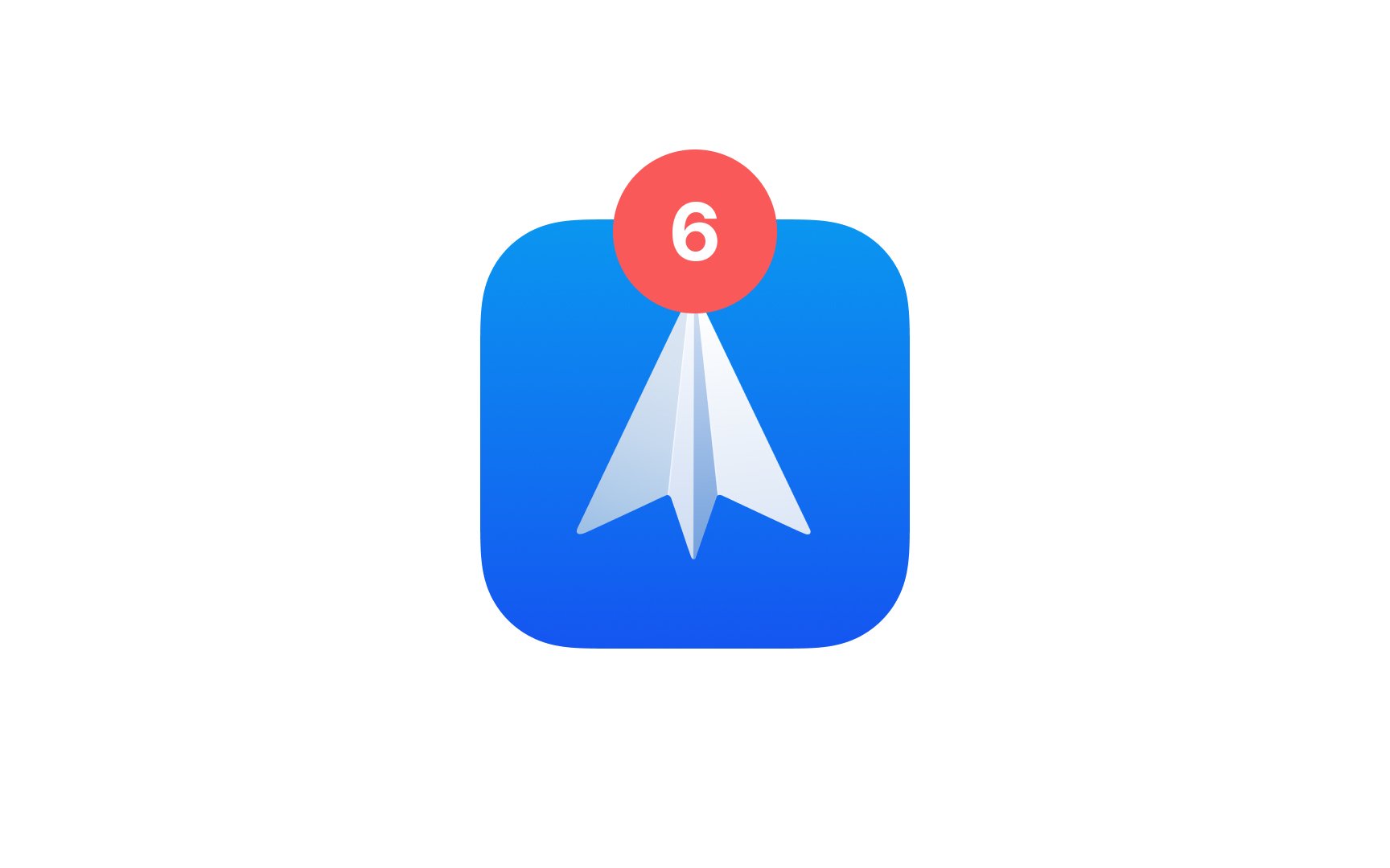
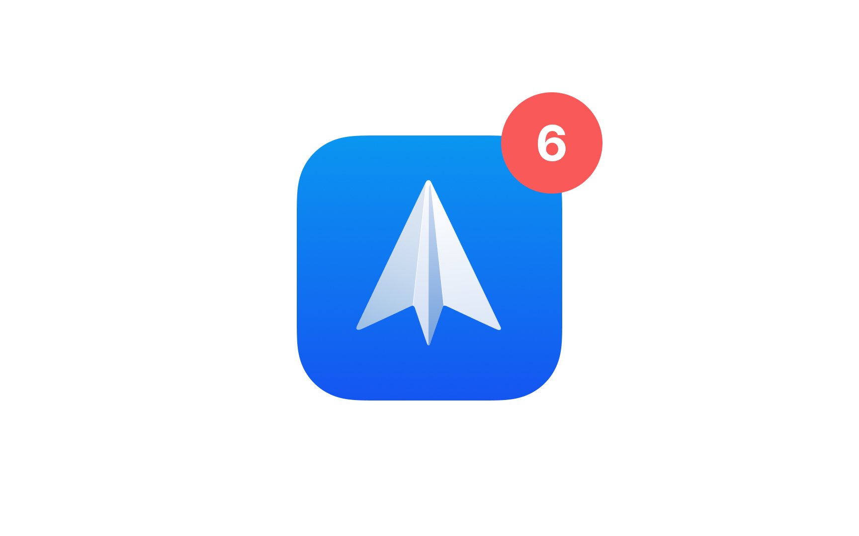
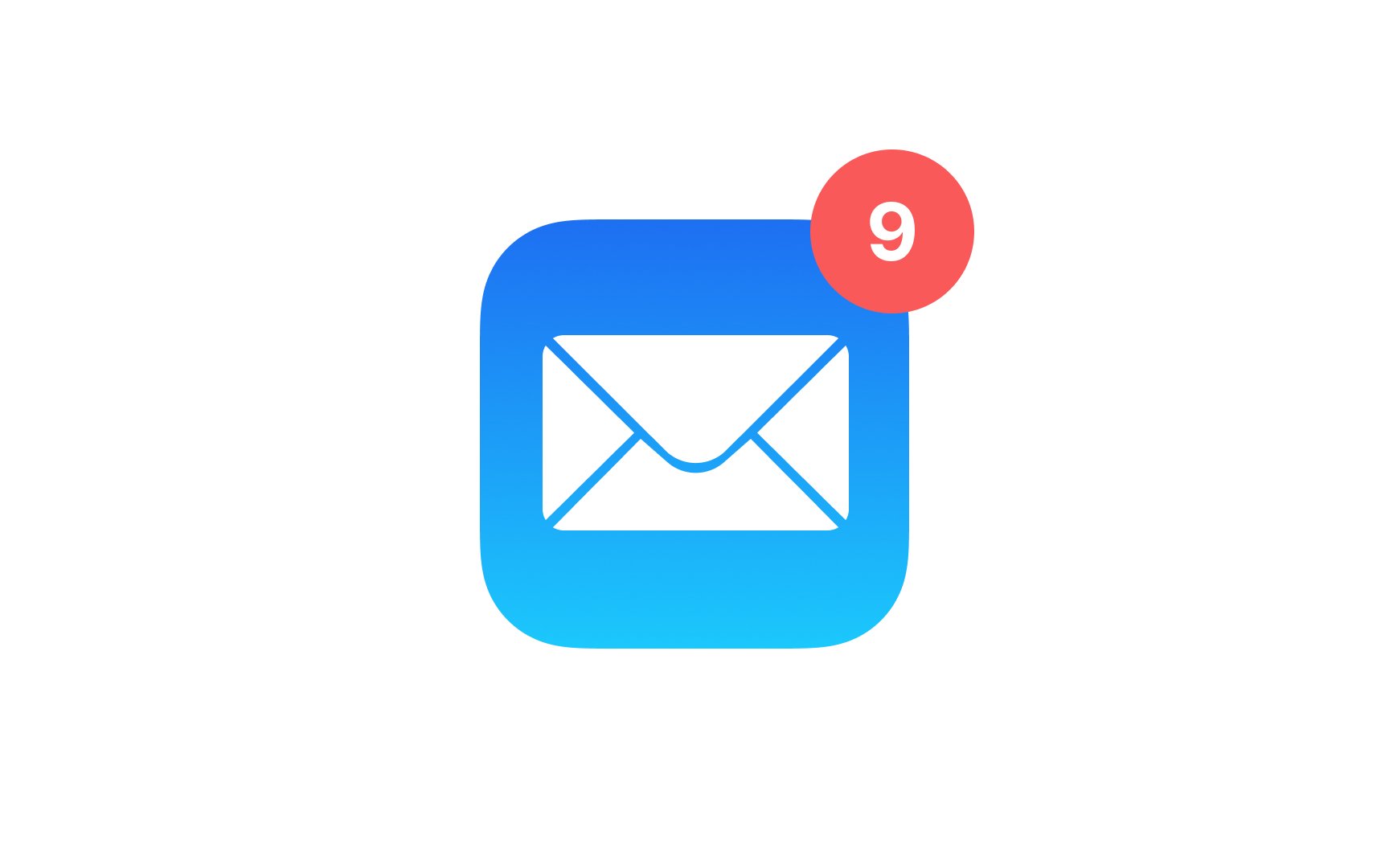
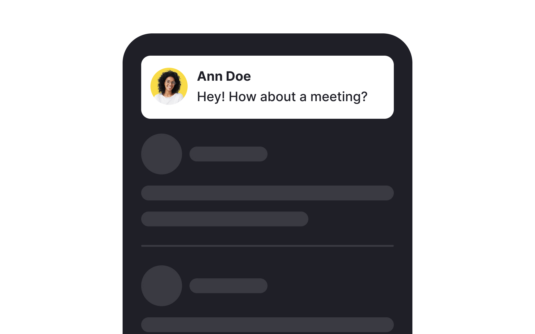
Badges in an app serve as signals that there's something awaiting users' attention, like a new message or a reaction. Typically, these badges should be placed at the top right of icons. This consistent placement is crucial because users have grown accustomed to finding them there. It makes the app experience more intuitive.
Also, use badges thoughtfully. While they can boost user engagement by highlighting important information, excessive or annoying use may lead users to ignore them.


Users are accustomed to associating the dot badge shape with unseen updates or messages in most digital interfaces today. The shape is subtle, doesn't overwhelm the visual space, and efficiently communicates the presence of
A notification
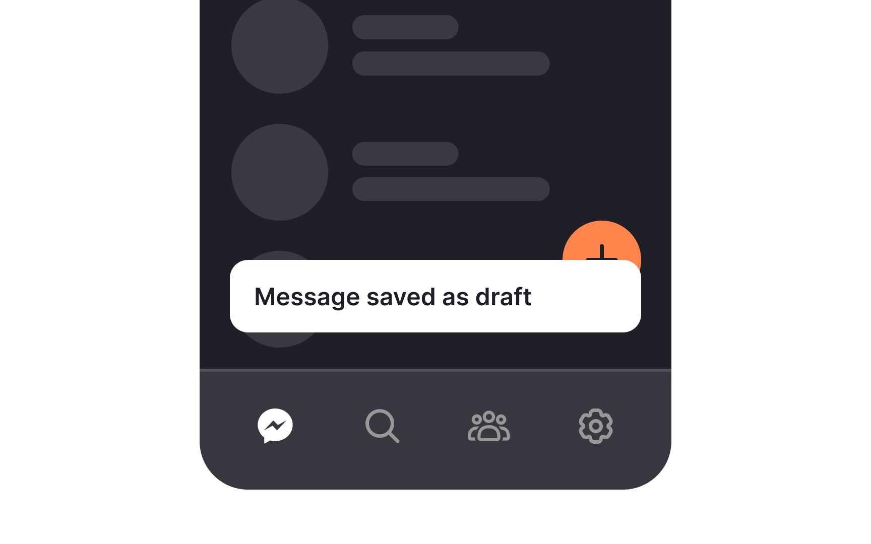
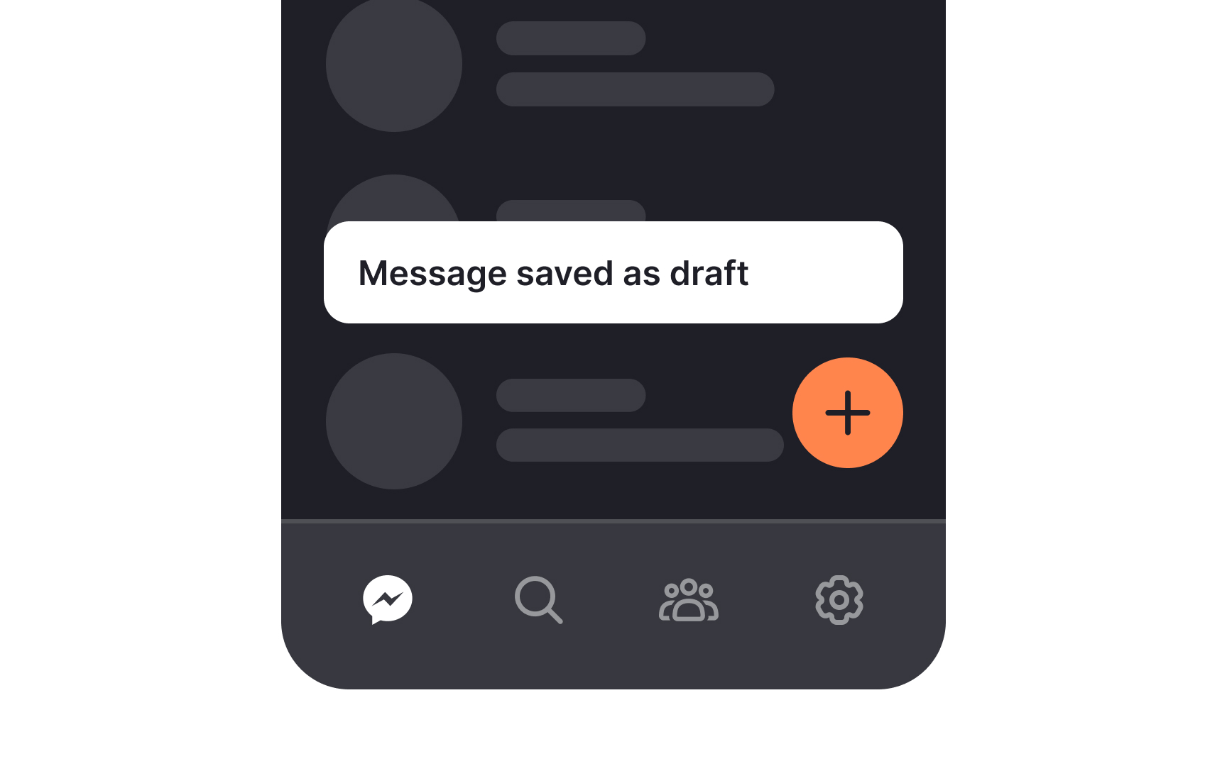
Snackbars should never cover or hide important elements like floating action buttons (FABs). When a snackbar appears, it needs to stay above the FAB. It should not overlap with it and should never be placed behind it. If a snackbar covers the FAB, users might miss an important action. If it goes behind the FAB, part of the message may not be visible. Keeping the snackbar above all
Refrain from bombarding users with repeated
Utilize techniques such as notification grouping, where related notifications are bundled together, or employ reminder notifications after a reasonable period. For instance, in the messaging app scenario, consider sending a reminder notification if users haven't opened the message after a set time. Additionally, provide users with customizable notification settings, allowing them to choose the frequency and type of notifications they prefer.
When your app is in the foreground, it's crucial to handle
Every notification should be highly contextual, delivering value to users and assisting them in accomplishing goals. Personalizing each message to align with the user's journey enhances relevance. For instance, during onboarding, in-app
Effective personalization involves segmenting users and tailoring messages for each group. For loyal customers, in-app notifications could offer exclusive discounts, enhancing their experience. Similarly, when users near their free usage limit, a personalized prompt for upsell opportunities can be triggered. This approach ensures that notifications are not only timely but also tailored to individual user needs, contributing to a more engaging and user-centric experience.[1]
Whether you’re creating push or in-app
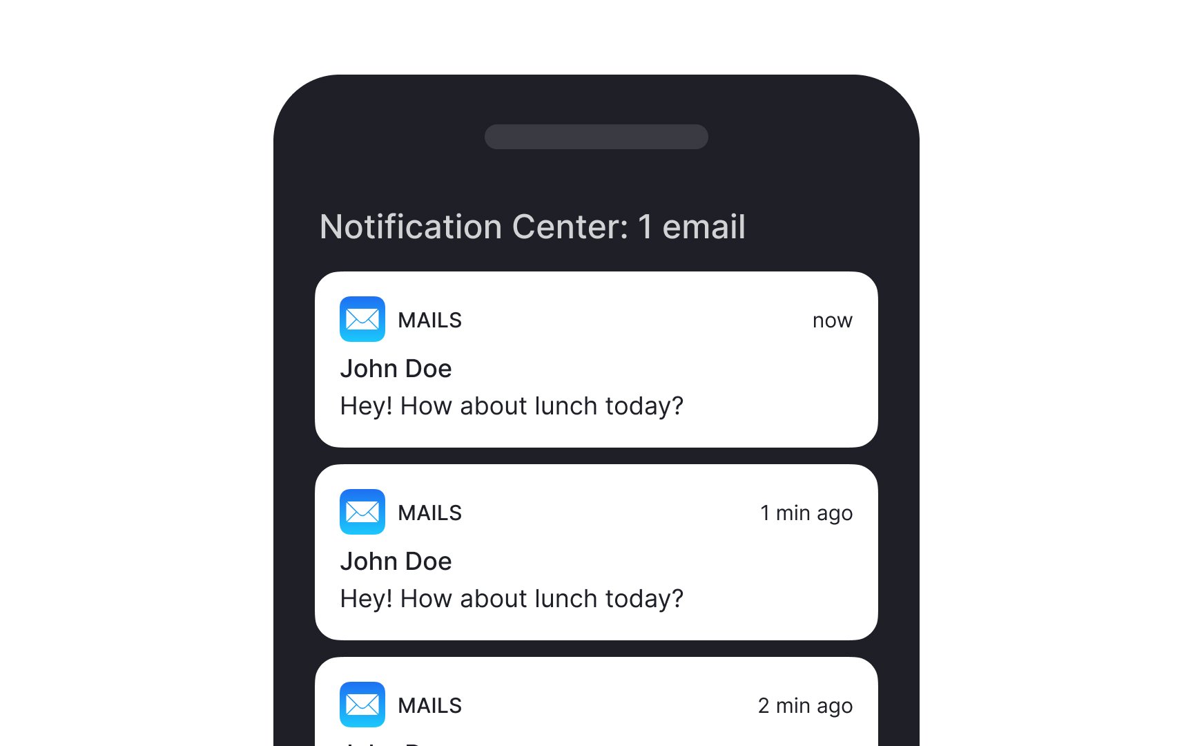
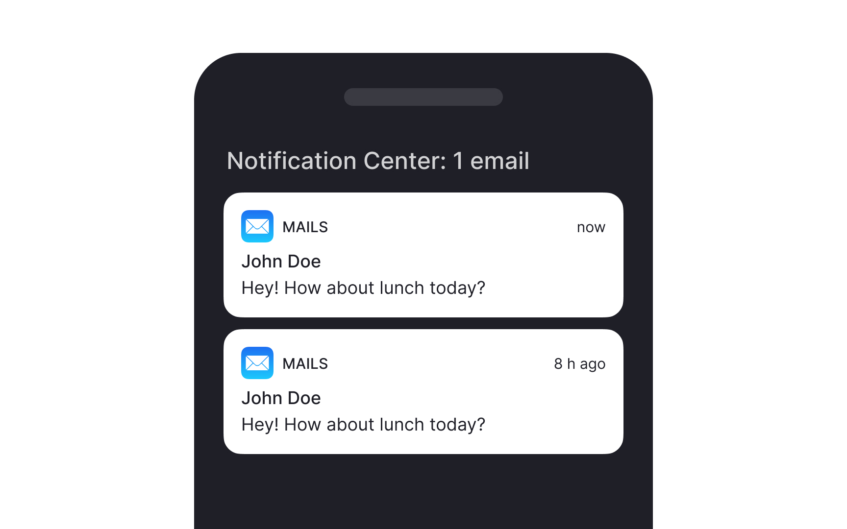
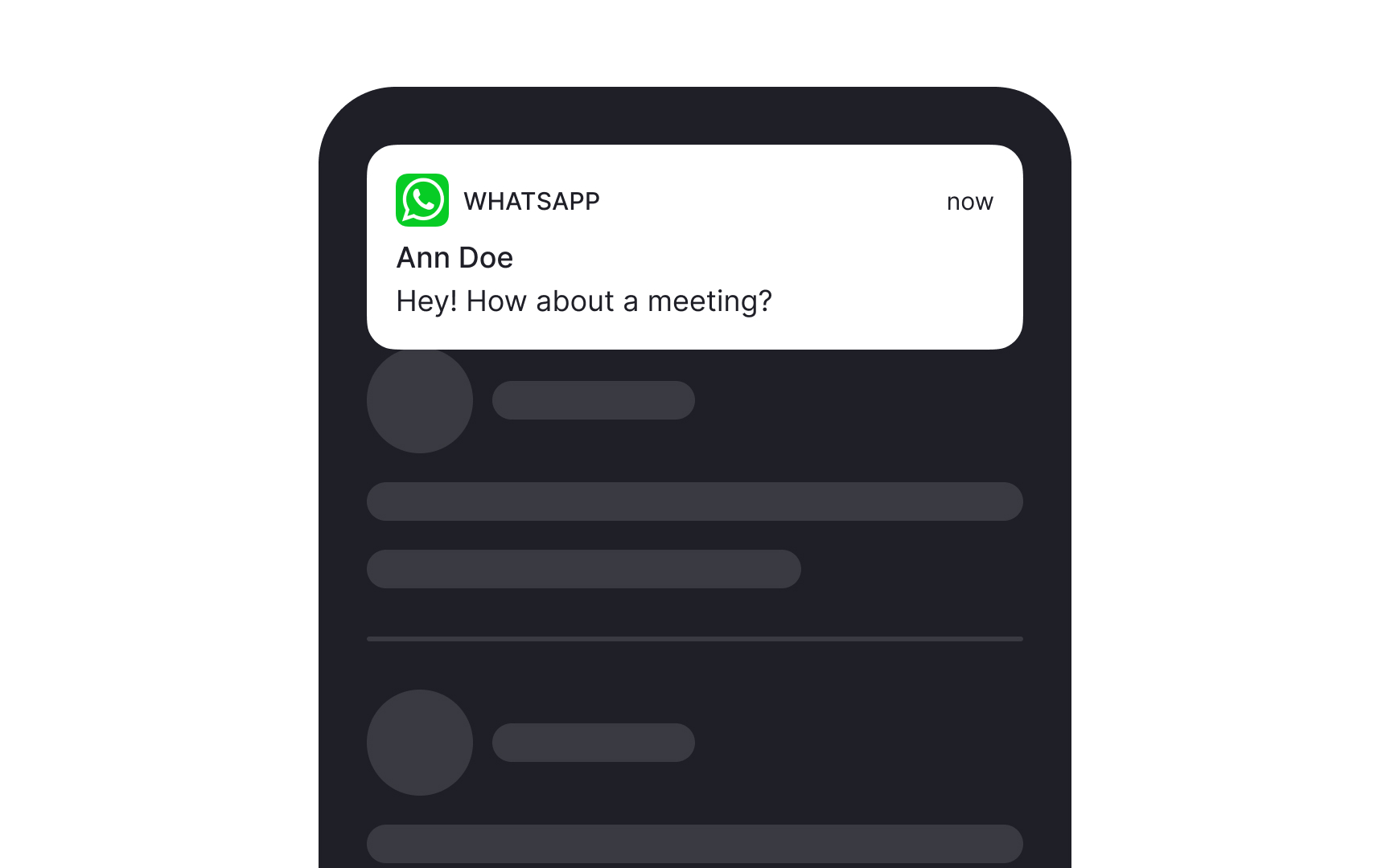
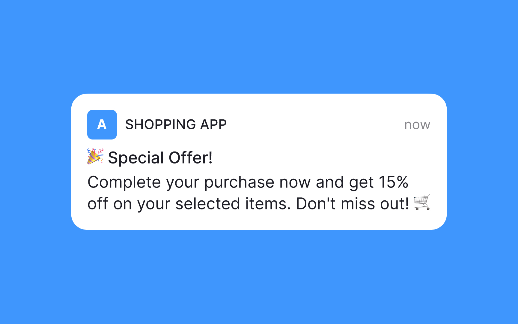
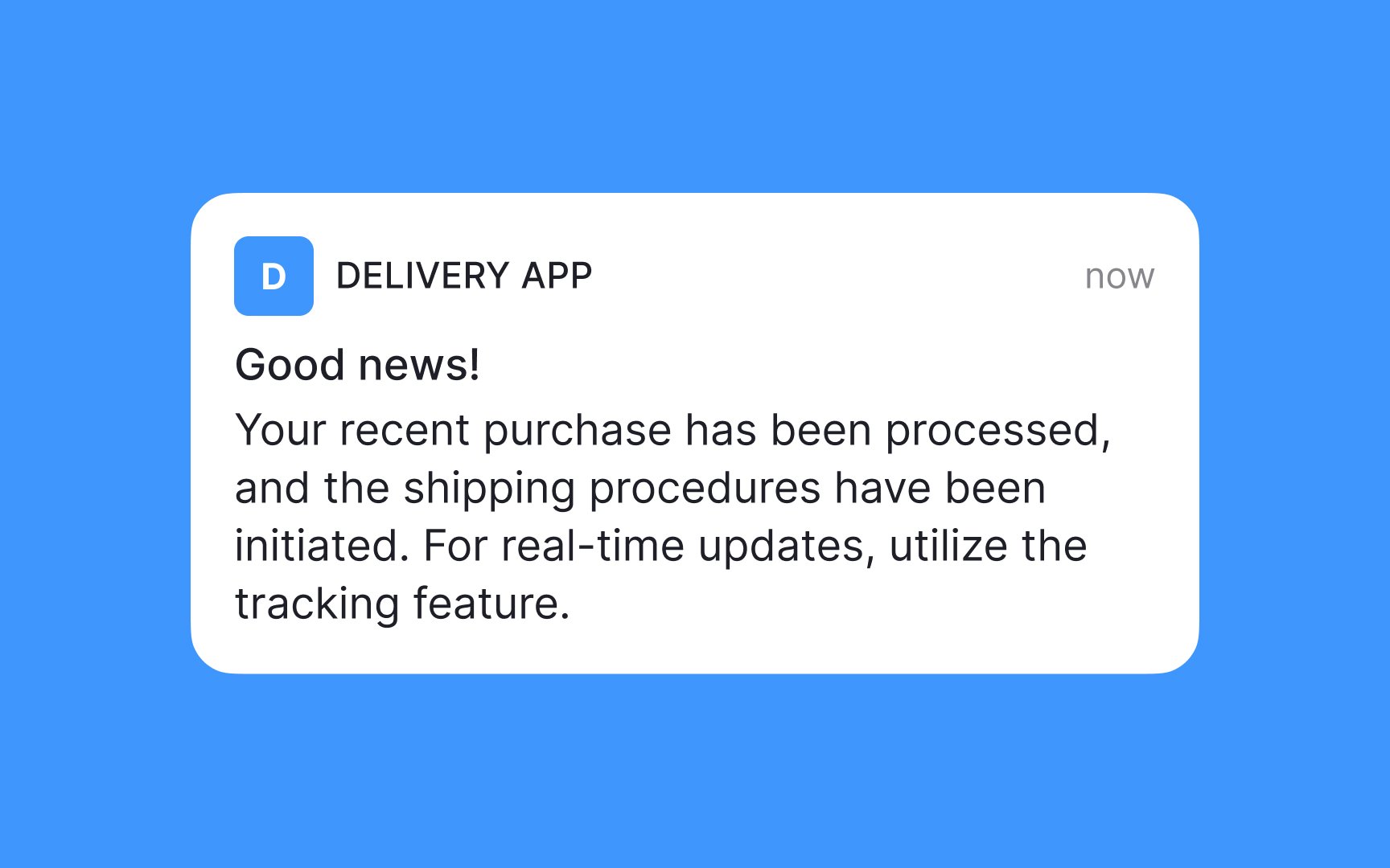
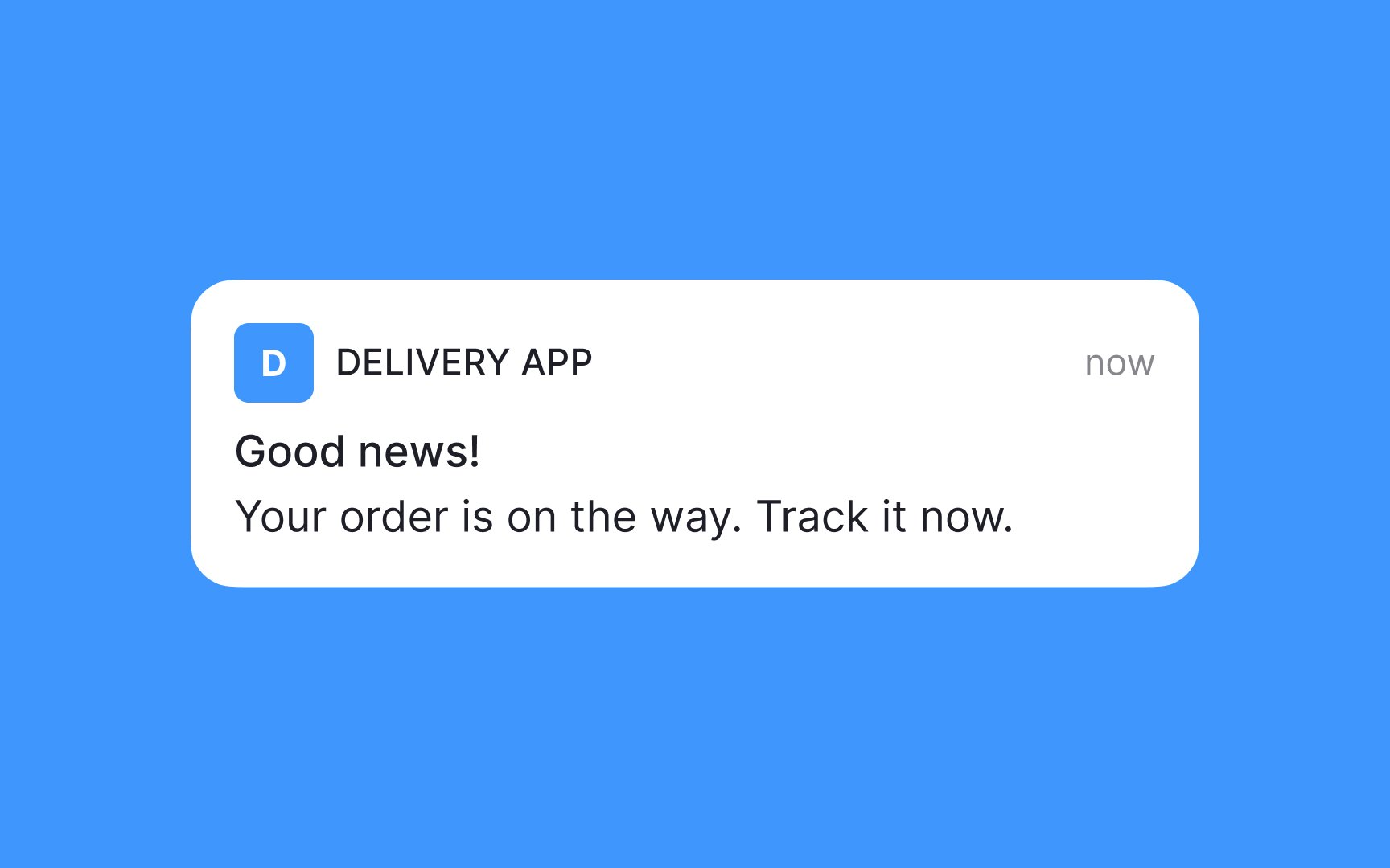
While the allowed character count varies, most platforms can handle up to 39 characters for the title and 150 for the message. While you technically have some flexibility within these limits, always aim to keep it as short as possible. If you can convey your message in a single line, why drag it out? The goal is to make sure users can quickly absorb the information with just a glance.
Pro Tip: Make sure your choice of words is in line with your brand voice.


Similar lessons

Best Practices for Designing Login & Signup Flows

Best Practices for User Onboarding Flow Design
