Image Types and Formats
Learn the different image types and formats and each of their use cases
Conventional wisdom says that an image is worth a thousand words. A study proves this idea by noting that the human brain processes visuals 60,000 times faster than text. Moreover, visual information is easier to remember and recall than auditory one. However, other factors like motivation can influence our abilities.[1]
So you know that images are certainly important. But what do the acronyms like JPG, PNG, GIF mean? More importantly, how do they differ from each other? By understanding these names and other image terminology, you'll know what words to use for communicating with designers, developers, and clients and which formats to use in which cases.
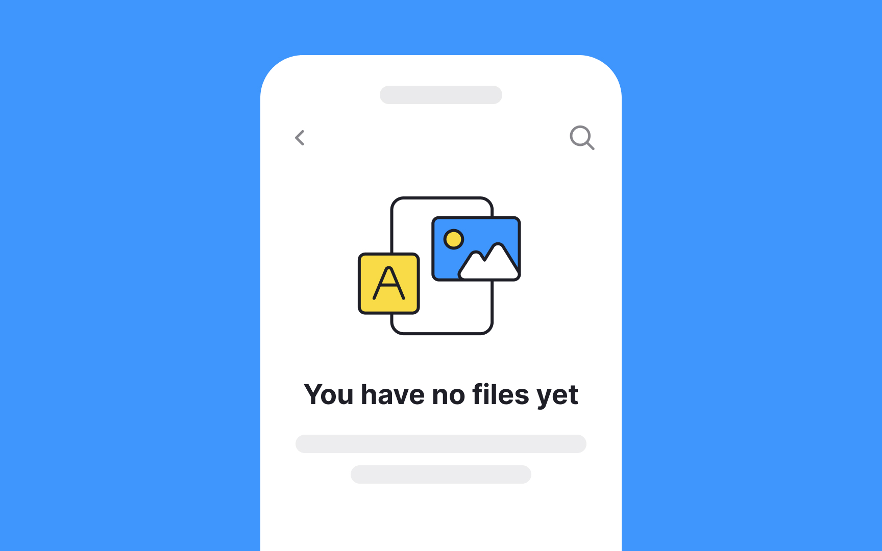
In web and mobile UI design, icons are pictograms that visually represent ideas, objects, or actions. They tell users how they can use various elements throughout the design.
When used correctly, icons can speed up user interactions as they are immediately recognizable. They can also add style and visual interest to user interface designs.
Pro Tip: The best icons are those that can be understood without putting in a lot of guesswork.
An illustration is a visualization made by an artist to explain an idea, concept, or process. It refers to any artwork such as a drawing, photograph, pencil sketch, or painting.
Illustrations come in different forms. Common forms include:
- Editorial illustrations in magazines, newspapers, and books
- Concept art in games and movies
- Fashion illustrations
- Infographics
- Packaging illustrations
The most popular digital tools for creating illustrations are Adobe Illustrator, Adobe Photoshop, and Procreate.
In
There are two main types of patterns:
- Regular patterns have a consistent, predictable repetition of elements. Think of a checkerboard or stripes.
- Irregular patterns shake things up a bit; the elements or their arrangement may vary, offering a less predictable layout.
Whether you opt for regular or irregular, the key is to use patterns in a way that enhances the user experience, without overwhelming or confusing users.[2]
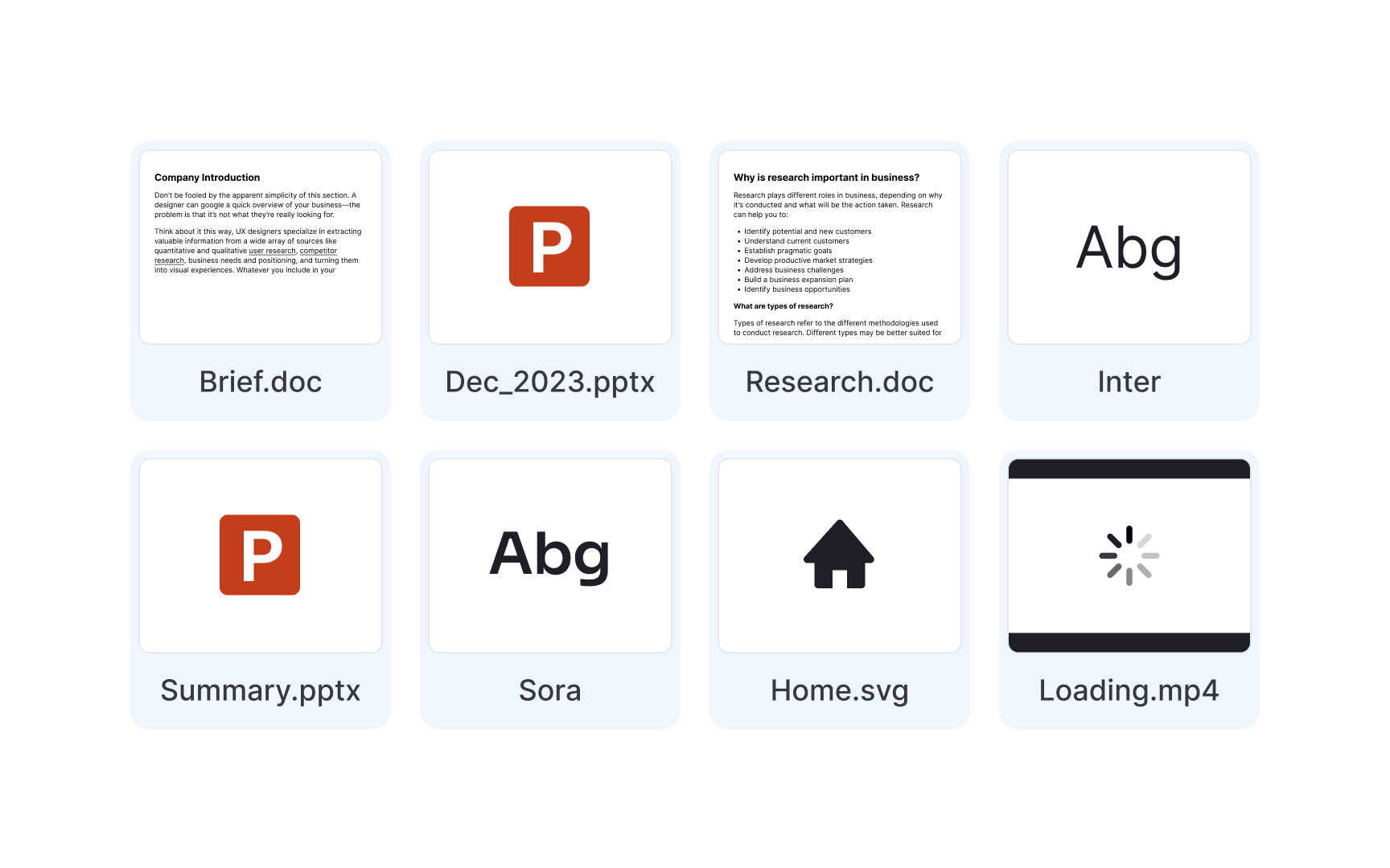
In design, assets refer to the digital resources utilized throughout the design process. These encompass UI components, typefaces,
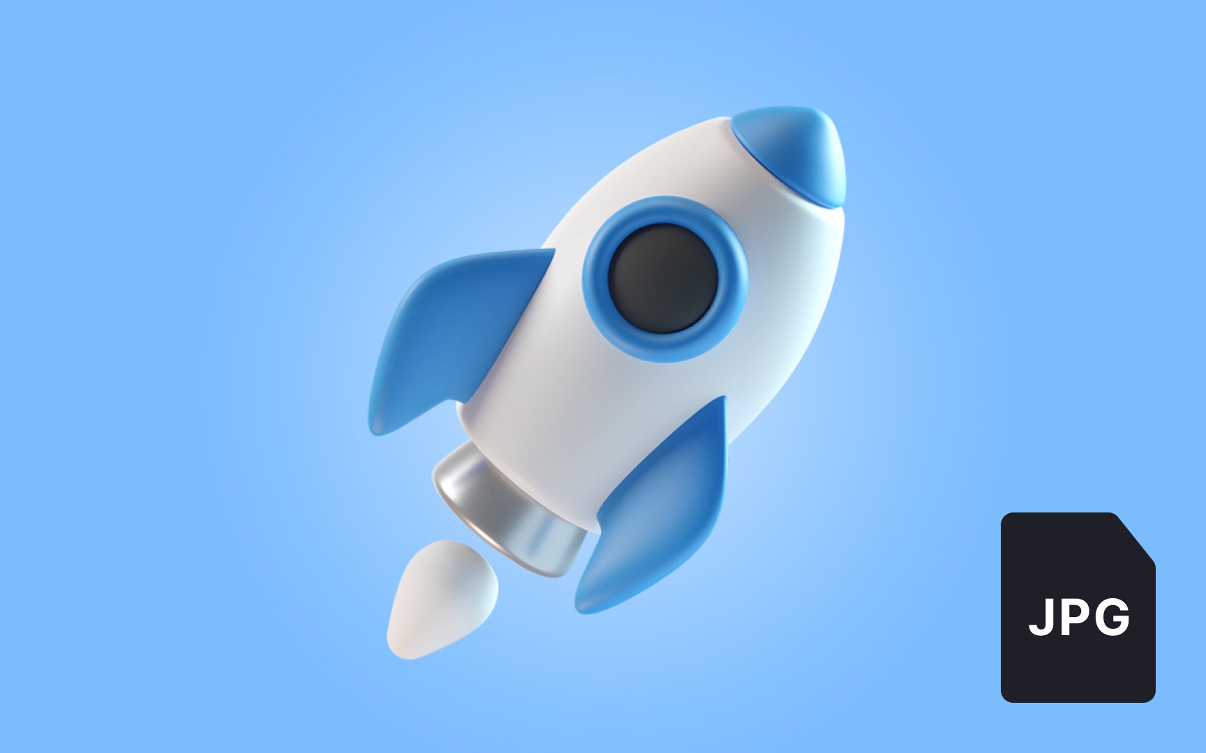
JPG (also referred to as JPEG) is a standard image format for compressed
JPG shrinks the file's storage size, discarding unnecessary image details and decreasing quality. That's why JPG files can't display files with the "richest"
In comparison to PNG, JPG doesn't support pixel transparency. If you create a transparent background and save the image in JPG, the background becomes white.
JPG format is the best option for small-sized images, such as images used on websites or emails. Quality is less important than site speed in this situation.
Pro Tip: Avoid saving text-heavy images and illustrations with fine lines in JPEG. Those details will get blurry after compression.
GIF is an image file format that supports
You've definitely encountered GIFs as small animated
According to the creator, American computer scientist Steve Wilhite, the term should be pronounced as "JIF," contrary to the widespread pronunciation of "GIF."
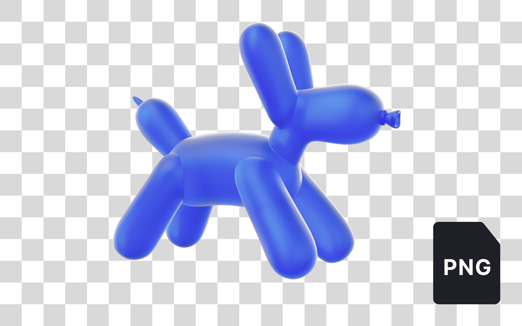
PNG is an image file format used for high-quality
In contrast to JPG, PNG compresses images without losing a bit of information. This means no blurring or other undesirable effects. While GIF supports only 256
One of PNG's standout features is its ability to support transparent backgrounds. This is especially useful in
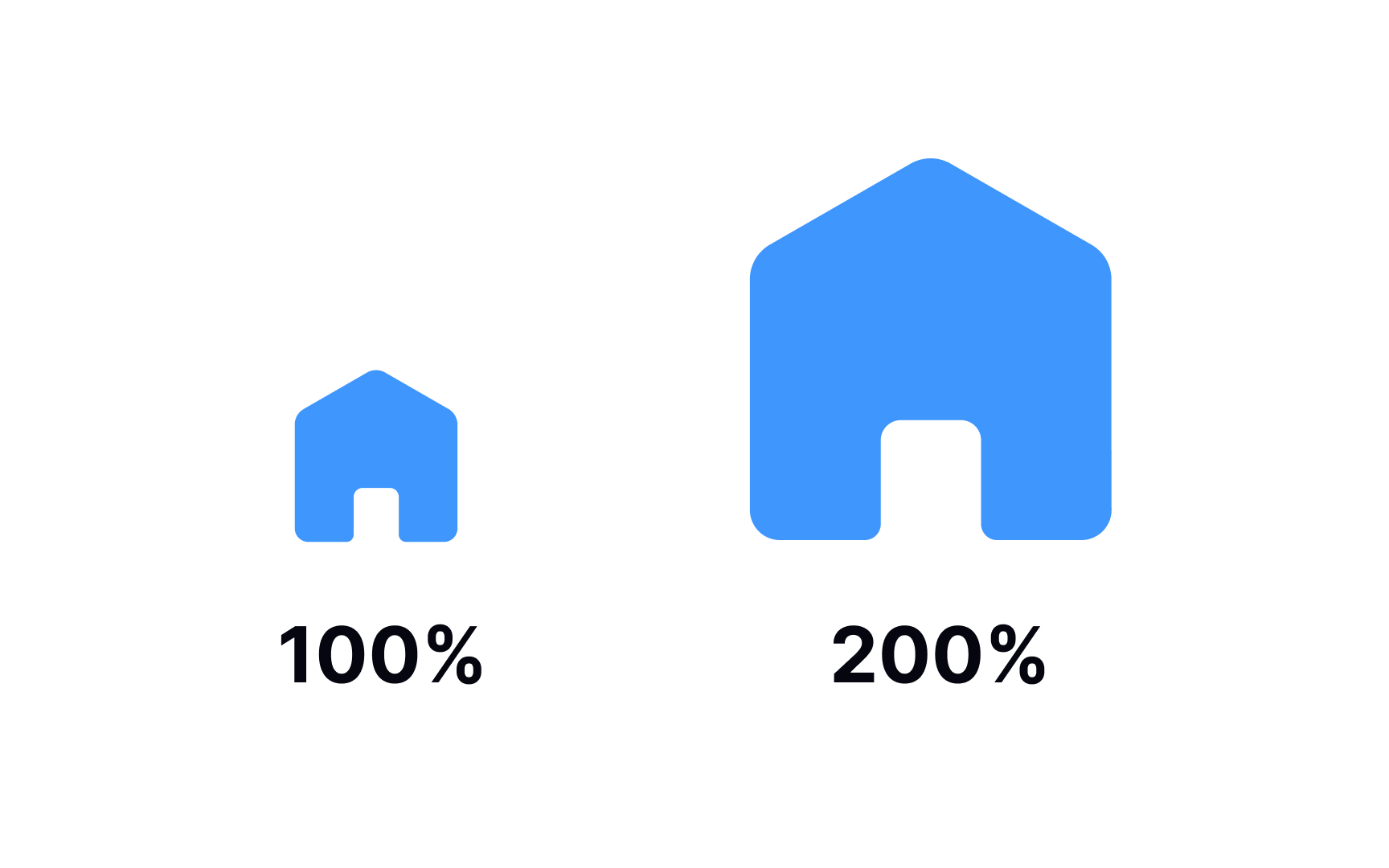
SVG is a vector image format. The abbreviation stands for Scalable Vector Graphics. SVG
One of the many advantages of the format is that it can be created and edited with any text editor. SVG images can also be compressed, animated, and printed in high quality at any resolution.
Most designers use software tools such as Adobe Illustrator, Sketch, or Inkscape to create SVG images.
Pro Tip: SVG images are perfect for responsive design, as they stay sharp and don't lose their quality at any scale or zooming degree.
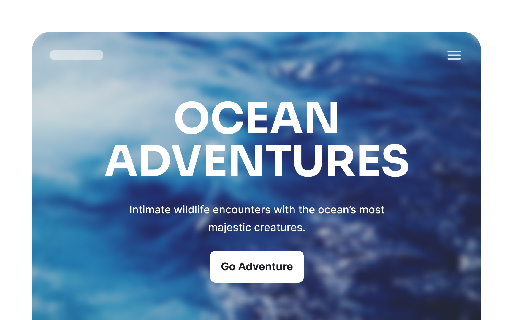
Blur is a visual effect used to soften the details of an
Most graphic design software, including Adobe Photoshop, Figma, and Sketch, offer various blur options. Whether you're looking to highlight key information or create a visually pleasing backdrop, blur can be a strategic design choice.
Lottie is a recently new JSON-based
You can scale Lottie files, and the quality of animations remains crisp and vibrant due to being coded. GIFs have a hard time performing and compressing complicated graphics, and files get blurry and pixelated when zooming.
Designers can edit Lottie files at any stage and change the background
References
Top contributors


Topics
From Course

Share


Similar lessons

Common UI Components Part I

Image Terminology
