<?xml version="1.0" encoding="utf-8"?>

Users relate to designs that mimic their real-world experiences, and shadows are ubiquitous in the physical world. When done properly, applying shadows to your interface elements can give a softer, more organic feel to your designs.

Shadows can also be an important visual cue in a UX design, indicating to users both visual hierarchy and things that may be interactive. A well-placed shadow can make an element stand out from its background. This quality can be particularly helpful in instances like placing text on top of a photo.

But as with most design elements, there is such a thing as overdoing it. Consider each shadow you use carefully and make sure that it serves a purpose for your users.

Exercise #1

Shadow

Shadow

Shadows play a crucial role in design by adding depth and natural beauty, helping elements to pop from their backgrounds. They also help in:

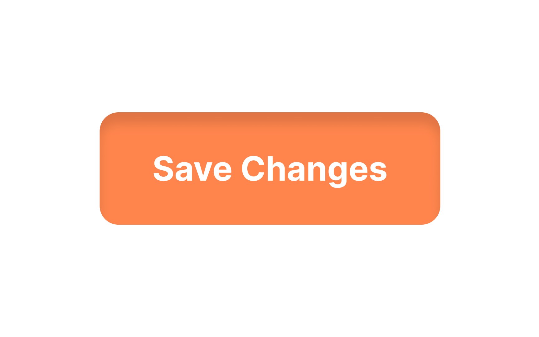
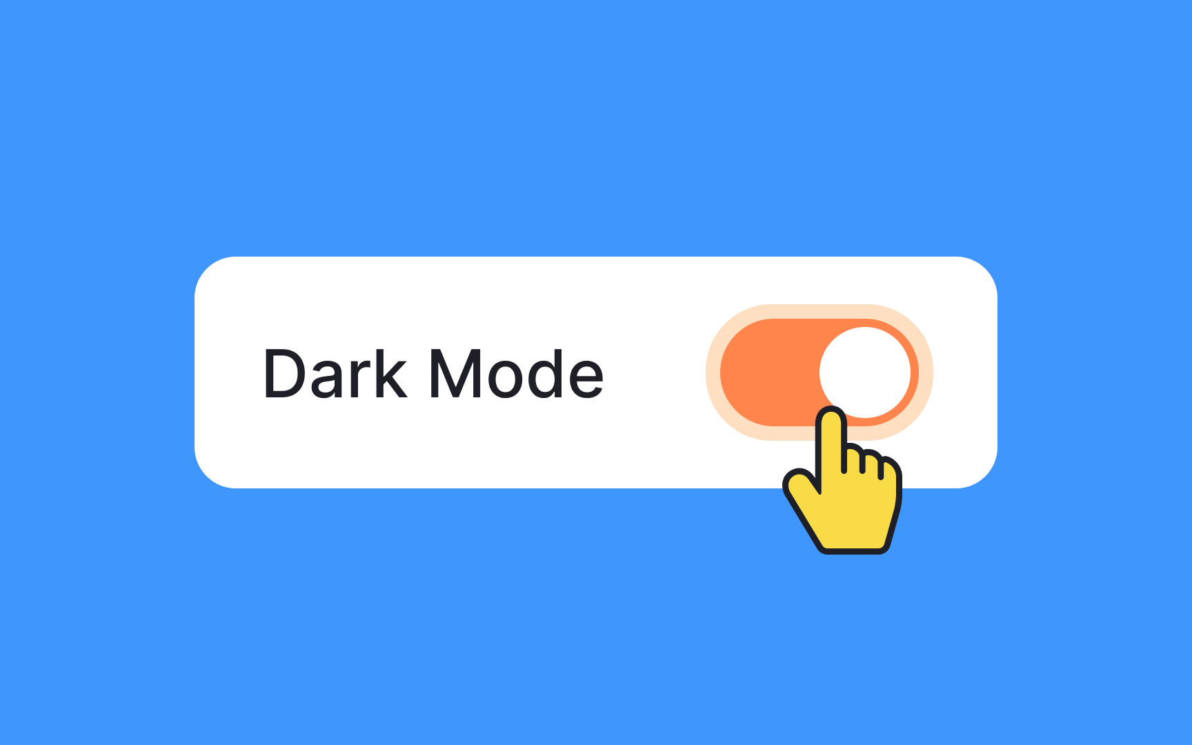
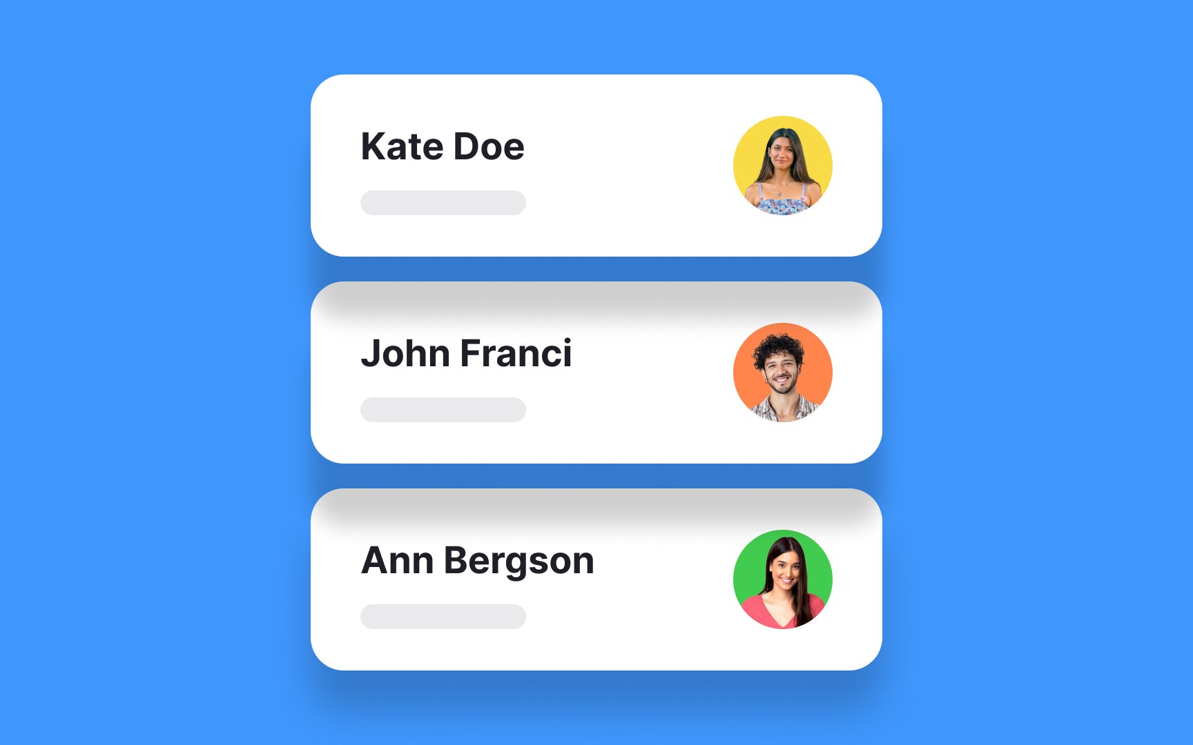
  • Creating design affordances: Shadows act as signals for interactive elements. Raised elements like buttons suggest they can be pressed, while sunken elements imply they can be filled, such as input fields.
  • Enhancing scannability: Shadows guide users' attention, making certain elements stand out and aiding in quickly spotting them.
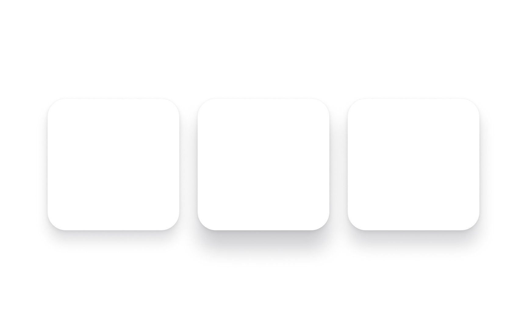
  • Emphasizing visual order: Shadows highlight the visual hierarchy of elements. The closer an element is to the viewer, the more important it appears.

However, excessive or improper use of shadows can lead to visual confusion and harm a design's usability. It's important to grasp the principles behind effective shadow usage and apply them appropriately in different design scenarios.[1]

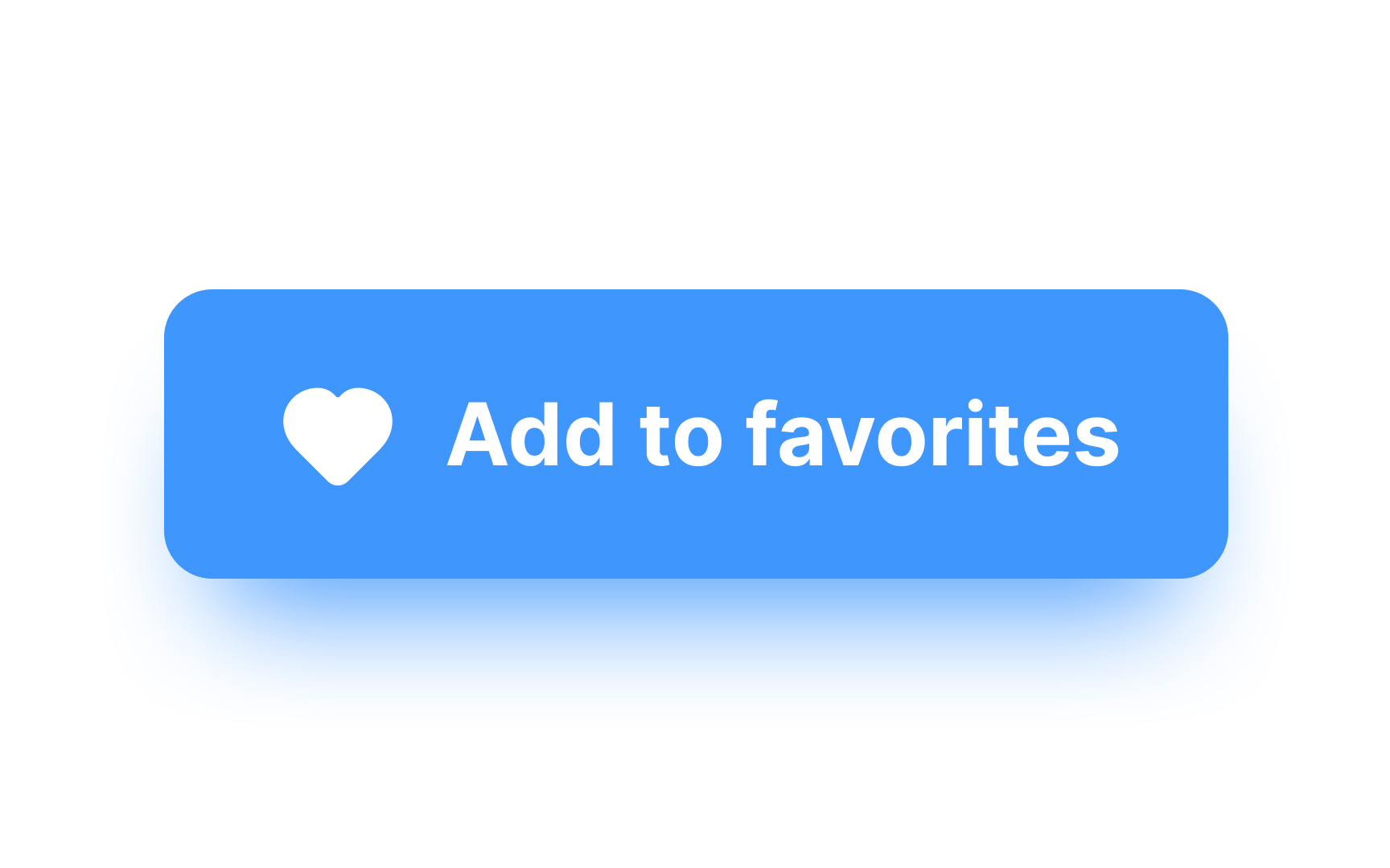
Pro Tip: Use shadows to make interactive elements like buttons appear more clickable.

Exercise #2

Hard shadow

Hard shadow

Hard shadows simulate light shining directly on an object. They usually have sharp edges and are darker in appearance. Think of the kinds of shadows cast by shadow puppets when you shine a flashlight directly behind your hand, creating a sharp-edged silhouette.

Exercise #3

Soft shadow

Soft shadow

Soft shadows are more diffused. They imitate ambient light and are less prominent than hard shadows. Besides, soft shadows usually fade outward at the edges, with a barely discernible edge. Also, soft shadows appear more realistic than hard shadows.

Exercise #4

Inner shadow

Inner shadow

Inner shadows give a sense of depth to an element, creating a sunken effect. Some kinds of elements can appear more realistic and three-dimensional with an inner shadow, but they can be trickier to design. Such shadows are particularly useful in designing elements in particular states, such as pressed or disabled states.

Pro Tip: The larger the blur and spread of an inner shadow, the more sunken the element appears.

Exercise #5

Shadow blur

Shadow blur

Shadow blur disperses the shadow’s borders and blends them with a background element. A hard shadow will have little to no blur, while a soft shadow will significantly blur. Blur makes shadows appear more realistic and helps maintain visual hierarchy among layout elements.

Exercise #6

Shadow spread

Shadow spread

Spread can also have an impact on the appearance of elevation. Spread is defined as the overall radius of the shadow extending in both the x- and y-axes. The larger the spread, the larger the shadow. A negative value decreases the size of the shadow.[2]

Exercise #7

Shadow elevation

Shadow elevation Bad Practice
Shadow elevation Best Practice

There is a direct relationship between shadow elevation and blur amount. Elevation is defined as the space between the element and the one beneath it along the z-axis. In general, the bigger and blurrier the shadow, the more significant distance is implied between the top and bottom elements. Elevation can provide immediate visual feedback that an element is clickable or tappable.

You can create several shadow styles to support visual hierarchy. Subtle, low-elevated shadows should be used for content with low priority, while blurrier, high-elevated shadows should indicate content with high priority.

Exercise #8

Shadow grouping

Shadow grouping Bad Practice
Shadow grouping Best Practice

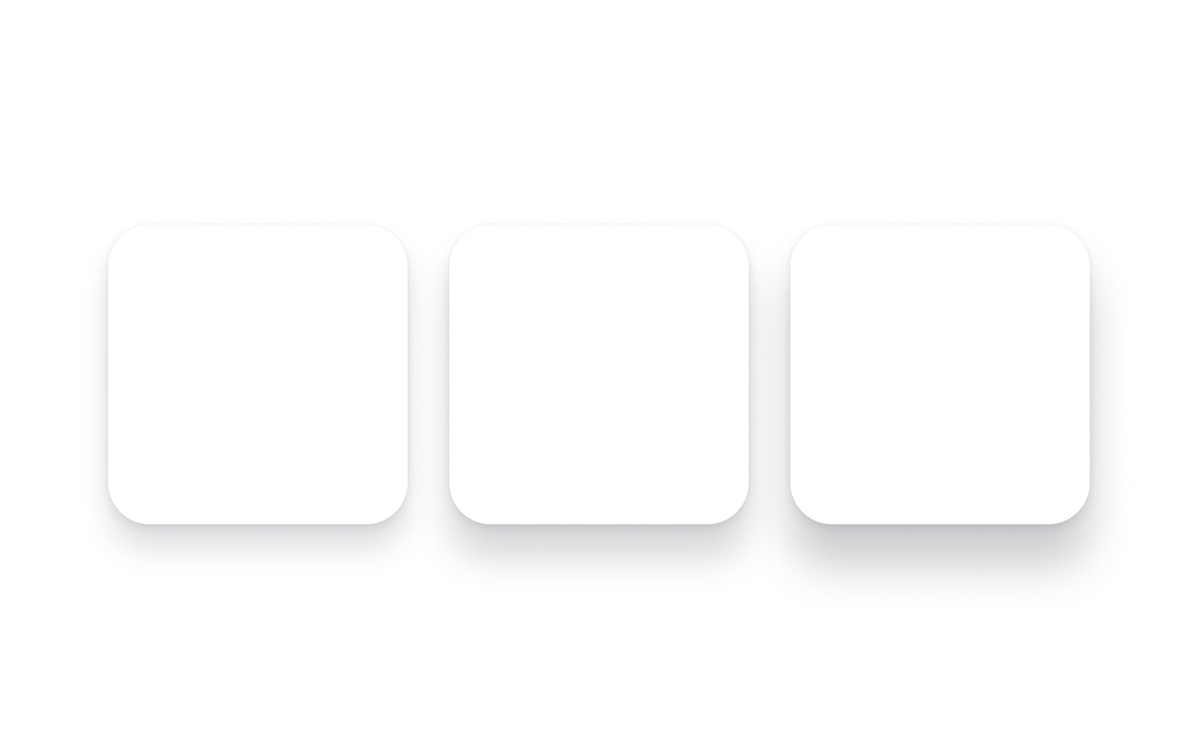
Elements in a design often exist in a group. Many instances will require you to apply shadows to more than one element in your interface. When you’re applying shadows to several related elements, you’ll want to treat them like a shadow group rather than separate entities.

Adding shadows to each individual element results in a messy, unnatural design unless you’re intentionally creating a window blind effect.

Exercise #9

Shadow opacity

Shadow opacity

The opacity of a shadow has a substantial influence on the appearance of a UI element, imparting depth, dimension, and subtlety to its visual presentation. A lower shadow opacity results in a more delicate and understated effect, offering a gentle lift to the element without overwhelming its surrounding context. This approach can be suitable for achieving a softer and more minimalist aesthetic.

On the other hand, a higher shadow opacity creates a more pronounced and bold shadow effect, contributing to a stronger sense of elevation and separation from the background. This can be particularly effective when striving to make an element stand out prominently or when aiming for a more dramatic and layered visual style.

Exercise #10

Shadow stacking

Shadow stacking Bad Practice
Shadow stacking Best Practice

In the physical world, objects have three dimensions. Stacking books on top of each other, for example, shows both shadows and reflected light. When stacking elements, applying multiple shadow styles can help delineate the hierarchy of elements and create a natural stacking effect. Just be sure that you keep the direction of each shadow the same to prevent visual confusion.

Complete this lesson and move one step closer to your course certificate