Align control elements to the right

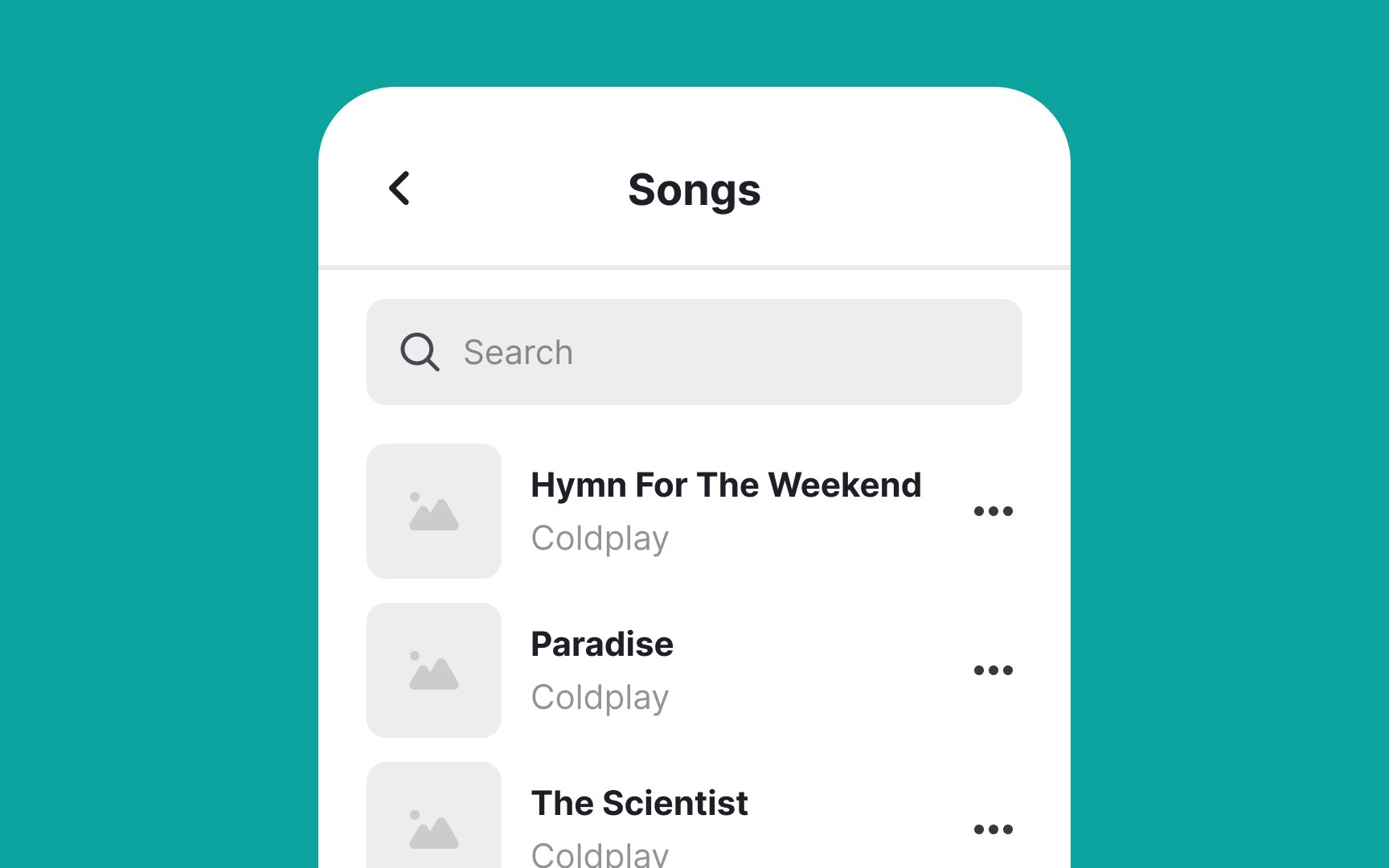
Align control elements like buttons, checkboxes, menus, or other interactive elements on the right side of list items. This approach is intuitive because it aligns with users' expectations based on standard design conventions. When controls are consistently positioned on the right, users don't have to search for them, making navigation more efficient.
This works especially well for right-handed people using their phones, as they can easily reach these controls with their thumb. We know this isn't ideal for left-handed folks (about 10% of users), who've had to adapt to a right-handed world in apps just like they do with scissors and door handles.
To make it work better for everyone, make sure buttons are big enough to tap (at least 44x44 pixels) and keep them far enough apart to prevent mis-taps.
Top contributors