Primary call to action buttons
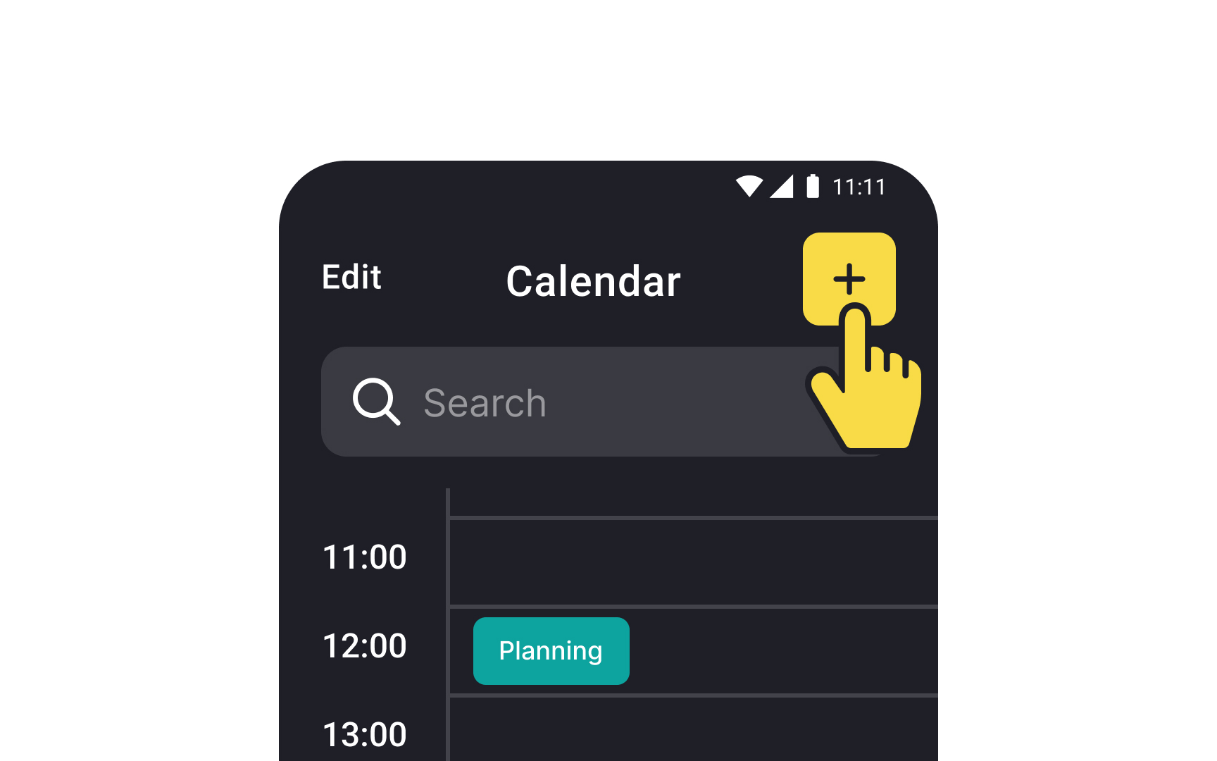
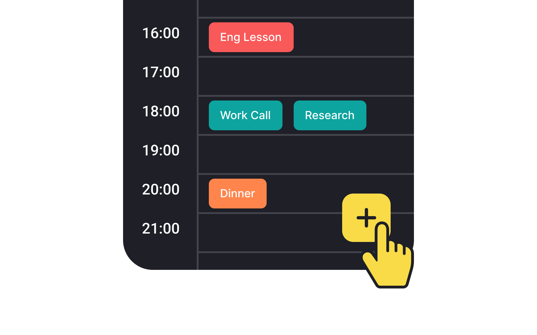
The floating action button (FAB) highlights the most important primary action on an Android screen through its distinctive shape and prominent placement. According to the latest Material guidelines, FABs must feature a rounded square container that maintains strong contrast with the background, ensuring optimal visibility and interaction clarity.
There are 3 FAB sizes to accommodate various use cases and screen layouts. The standard FAB suits most scenarios, while the small FAB works in space-constrained interfaces. The large FAB provides an enhanced touch target and increased visibility for critical actions, particularly useful in tablet or desktop interfaces.
The button can be aligned left, center, or right, and positioned either above the navigation bar or nested within it. This adaptability ensures the FAB remains accessible while maintaining visual hierarchy across different screen sizes and orientations.[1]
