Applying WCAG to mobile interfaces
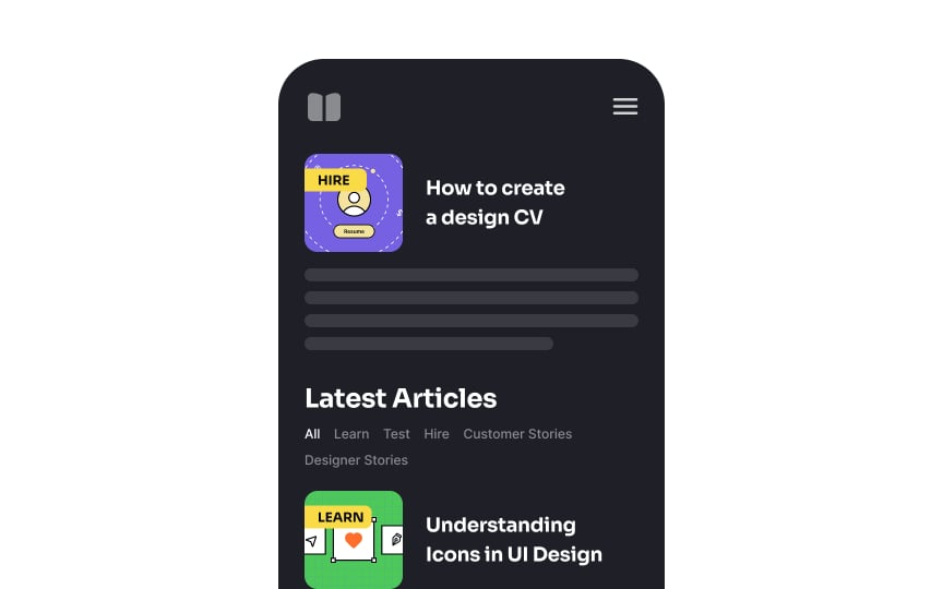
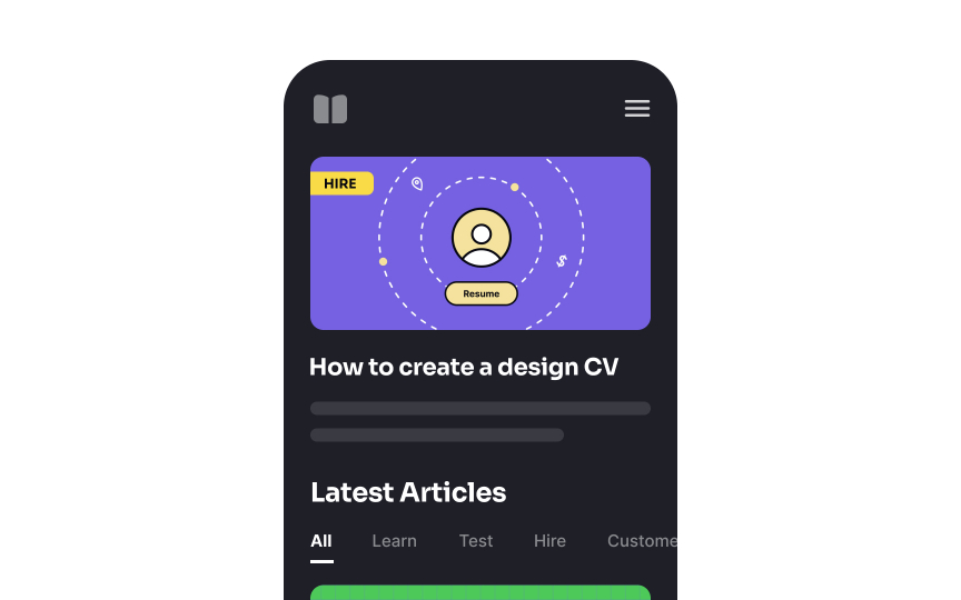
Screen size is a primary mobile design challenge. Whether choosing responsive, adaptive, or native app design, you must optimize content for mobile viewing while maintaining clarity.
Best practices for small-screen accessibility:
- Prioritize content hierarchy: Rather than simply reducing content, adapt it for mobile use cases. Focus on key features and place popular functions where users see them first
- Use UI components wisely: While space-saving elements (tabs, modals, dropdowns) help organize content, they can challenge impaired users. Ensure adequate font sizes and touch targets
- Stack elements vertically: Horizontal layouts are harder to scan and waste limited screen width. Arrange form fields and controls in columns


