The Anatomy of Good (And Bad) Metrics
Turn abstract goals into measurements that actually matter for your product's success
Metrics should be your product's compass, pointing toward real success and not just numbers that look good in presentations. Good metrics connect directly to business value and tell you when to act, while bad ones create distractions and can even push teams in harmful directions. Think about it: a metric is only useful if it helps you make better decisions. The best metrics are actionable (showing clear next steps), relevant (tied to what actually matters), and timely (available when you need them).
Watch out for those vanity metrics: they might make everyone feel good temporarily, but they won't drive real progress. The real skill lies in taking fuzzy product goals like "improve user experience" and turning them into concrete indicators that everyone understands without accidentally creating incentives that work against your actual goals. For example, if you care about customer satisfaction, look at repeat purchases or retention. If you want to know how easy a page is to use, check click rate or conversion rate. If you’re trying to see how motivating your flow is, look at completion or conversion rates. And if trust matters, track how much information people fill in or check off. When done right, the perfect metrics transform big-picture strategies into day-to-day progress you can actually see.
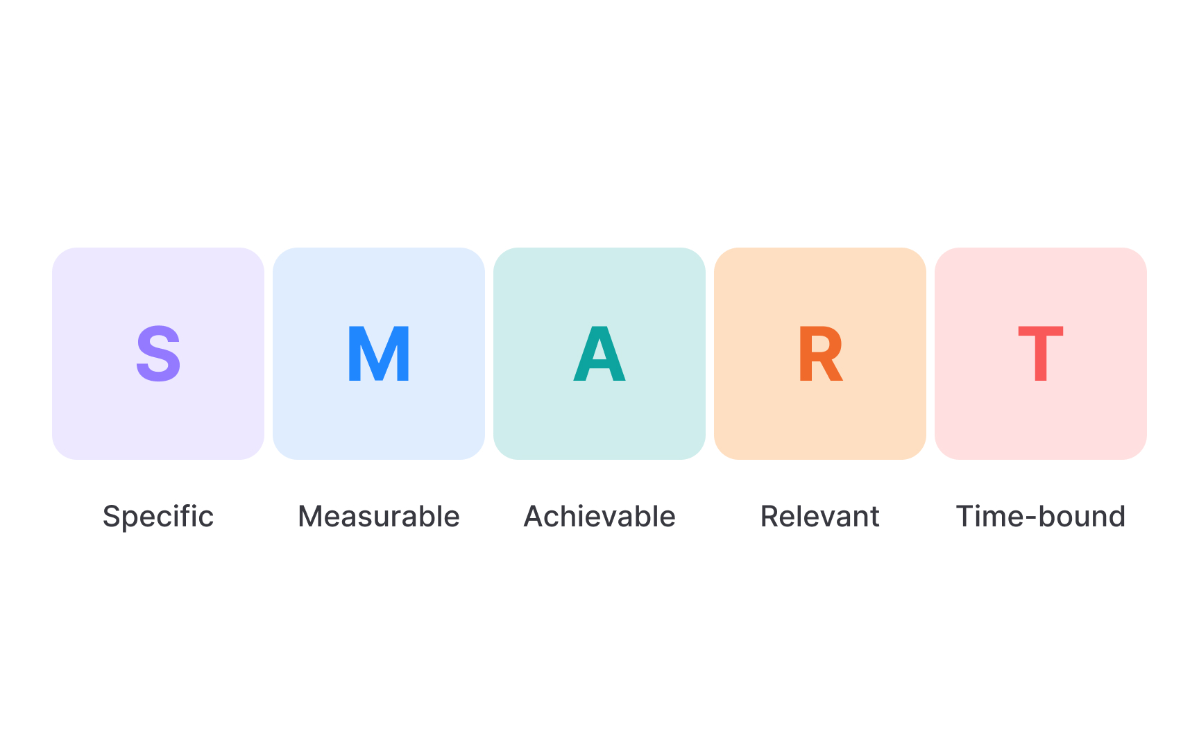
The SMART framework transforms vague tracking ideas into powerful, actionable metrics. This structured approach ensures every metric drives meaningful action and provides clear direction.
A SMART metric includes these essential components:
- Specific: Clearly defines what's being measured
- Measurable: Can be consistently quantified
- Achievable: Sets realistic targets that stretch but don't break team morale
- Relevant: Directly connects to business objectives and user needs
- Time-bound: Includes clear timeframes[1]
For example, "percentage of users who complete at least 3 tasks per week" is a SMART metric. It's specific (defines exactly what activity counts), measurable (can be tracked as a percentage), achievable (can be influenced through design), relevant (indicates meaningful engagement), and time-bound (measured weekly). But sometimes, you won’t have the right metric yet, and that’s fine. In such cases, your goal can be: “Be able to confidently track this metric within X weeks.” Making it a priority to define and track the right thing is a valid goal on its own.
Pro Tip: When evaluating potential metrics, have your team score each one against the SMART criteria on a 1-5 scale to quickly identify weaknesses that need addressing.
Common examples of vanity metrics include:
- Total
page views or website visits - Total impressions
- Active users
- Social media followers or likes
- Raw download counts
- Registered user totals (without activity qualification)
- Cumulative customer count (ignoring churn)
These metrics fail the crucial test: "Does this information help us make better decisions?" For instance, knowing you have 10,000 app downloads looks impressive, but if only 500 users become active and just 50 convert to paying customers, the download number alone misleads more than it informs. Instead, focus on metrics that reveal user value and business impact, such as active user
Actionable metrics inform specific decisions and drive meaningful change. Unlike
The most valuable actionable metrics share these key characteristics:
- They answer specific questions about user behavior
- They connect directly to business goals and
revenue - They suggest clear next steps when values change
- They reveal opportunities for product improvement
Creating actionable metrics starts with identifying the critical user behaviors that drive business success. Then design metrics that measure those behaviors in ways that suggest clear action paths. Finally, establish regular review processes where teams discuss metric changes and decide on specific responses. For example, tracking "percentage of new users who complete key actions within their first session" reveals onboarding effectiveness. If this metric drops, the team knows exactly where to focus: improving the initial
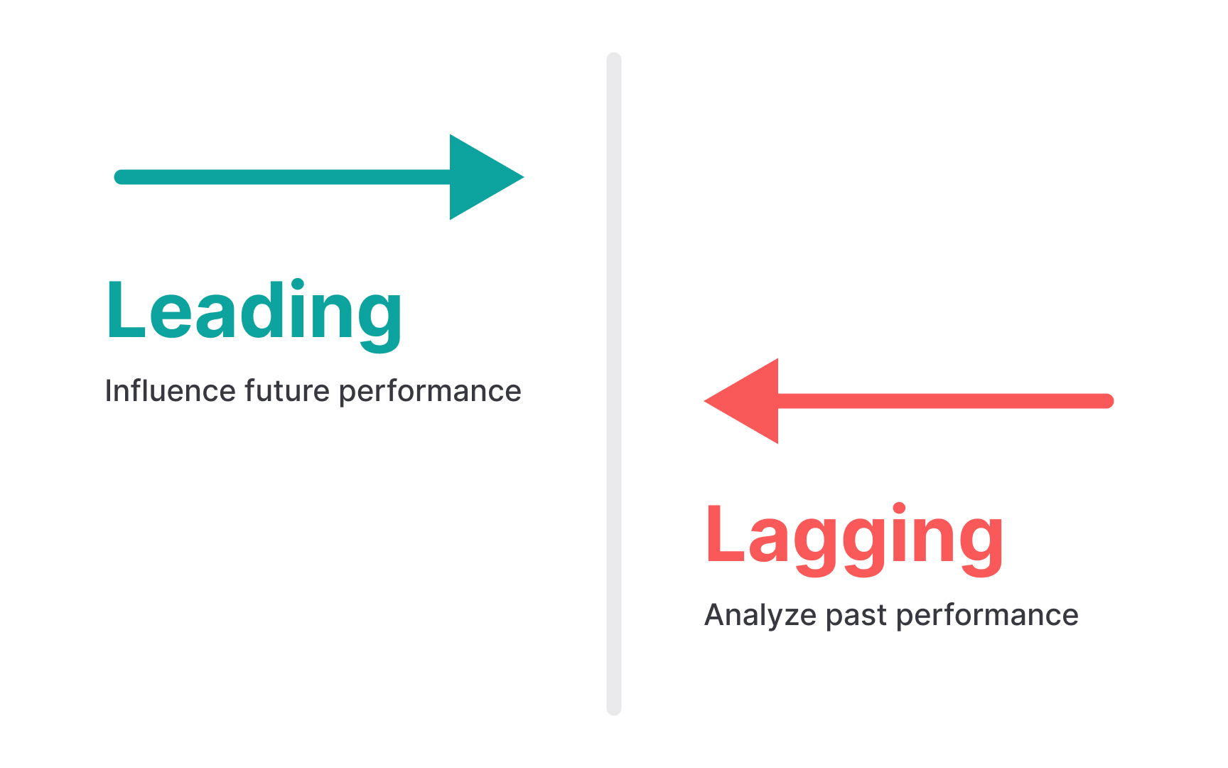
Leading indicators are predictive metrics that signal future outcomes before they happen. For example, feature adoption rates, user engagement frequency, customer satisfaction scores, free trial conversion momentum, and
Lagging indicators, on the other hand, reflect past performance after the results are in. For example, monthly recurring revenue, customer lifetime value, churn rate, market share, and profit margins. While they confirm what has already happened, they don’t provide much time to react.
A strong analytics approach includes both. Leading indicators help teams stay ahead, while lagging indicators validate the impact of past decisions. Together, they give a clearer view of product health. Leading indicators are also useful when you need to move fast. For example, if your goal is to improve month 2
Effective product measurement requires both numbers and narratives. Quantitative metrics offer precision and scale through concrete numbers and trends. These include
Qualitative metrics provide context and emotional understanding that numbers alone cannot capture. User satisfaction ratings, Net Promoter Scores, sentiment analysis from feedback, usability test observations, and customer support themes all help explain the human experience behind the data. These insights reveal motivations, frustrations, and desires that drive the behaviors quantitative metrics measure.
The most powerful insights emerge when these approaches complement each other. For example, if session duration drops, quantitative data shows the extent, but only user interviews or feedback analysis can reveal whether it's because the product became more efficient (positive) or more frustrating (negative). In practice, you might run a few A/B tests or other quantitative tests, and then switch to usability studies when you’re not sure what to try next. Or you might start with a qualitative study to spot problems or opportunities, then use quantitative testing to measure the impact of changes.
Metrics only matter when they connect directly to business outcomes. This connection manifests through cause-and-effect relationships that teams can test and verify. For instance, higher user
Creating relevance means starting with business goals and working backward. Begin with outcomes like revenue growth, customer acquisition cost, or profitability. Then figure out which user behaviors are most likely to influence those outcomes. Design metrics around those behaviors and not just activity for the sake of tracking. One way to do this is by cohorting users. You can group them by demographics or behavior, then compare business metrics across those groups. For example, look at average revenue for users who activated versus those who didn’t, or lifetime value for users who used a key feature versus those who didn’t. This helps you spot which behaviors actually drive value.
Most companies benefit from establishing a hierarchy of metrics with clear relationships between them. Leading metrics like engagement feed into business metrics like retention, which ultimately support financial metrics like revenue and profitability. This hierarchy ensures everyone understands how their work connects to business success and prevents teams from optimizing for disconnected metrics.
Metrics inevitably shape behavior, sometimes in unexpected ways. When teams face pressure to improve specific numbers, they may optimize for the metric rather than the underlying business goal. This is a phenomenon known as Goodhart's Law: "When a measure becomes a target, it ceases to be a good measure."[3]
Metric manipulation takes various forms, from harmless optimization to harmful distortion. For example, a team might focus on increasing session duration might add unnecessary friction to tasks, making the product less efficient but "improving" the metric. Similarly, focusing exclusively on short-term
Detecting metric gaming requires establishing balancing metrics that catch unintended consequences. If optimizing for speed, also measure accuracy. If tracking conversion, monitor
Product development often involves inherent tensions between different success indicators. Speed conflicts with quality, conversion conflicts with
The first step in balancing competing metrics is recognizing the natural trade-offs in your product. Short-term
Creating balanced scorecards helps manage these tensions by ensuring no single metric dominates decision-making. Rather than maximizing any one dimension, aim for healthy performance across multiple indicators. For example, instead of purely optimizing for
However, this requires regular stakeholder alignment on acceptable performance thresholds for each metric. Establish minimum performance levels for secondary metrics, even while prioritizing improvements in primary ones. This prevents overoptimization and maintains product health across all dimensions.
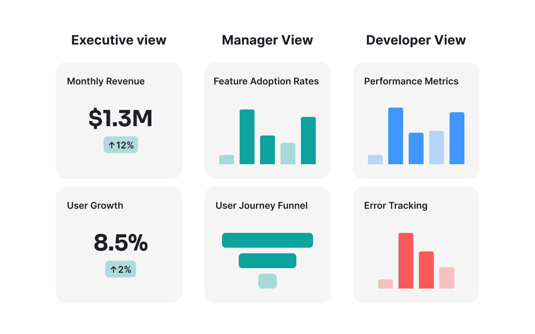
Metrics create value only when they inform decisions across the organization. Even the most sophisticated measurement framework fails if stakeholders cannot understand, access, or act upon the insights it provides. Your main dashboard should focus on the essentials: your North Star, objectives, and key results.
Other metrics can be placed on dashboards tailored to different stakeholders:
- Executive leadership needs high-level business metrics tied directly to strategy and financials.
- Product managers need detailed behavioral metrics that suggest feature improvements.
- Engineering teams need performance and technical metrics that highlight optimization opportunities.
- Each group requires different levels of detail, context, and visualization.
Accessibility also means creating consistent, trustworthy data sources. When different teams use different definitions or calculation methods for the same metrics, confusion and conflict inevitably follow. Document metric definitions clearly, including exactly how each is calculated, what data sources feed it, and what limitations or caveats apply. This transparency builds confidence and encourages wider adoption.
Visual presentation also dramatically affects comprehension. Dashboards should highlight trends and patterns rather than overwhelming viewers with raw numbers. Use consistent color coding for related metrics, provide clear titles and labels, and include brief interpretations that explain what the numbers mean. The best dashboards answer the question "so what?" by making the implications of metric changes immediately apparent to viewers.
References
- The Art of Setting Clear and Measurable Product Goals - Beyond the Backlog | Beyond the Backlog
- Vanity Metrics | ProductPlan
- How to Mind Goodhart’s Law | Built In | Built In
Topics
From Course

Share


Similar lessons

Introduction to Churn Metrics and Analysis

Common Causes of Customer Churn
