Building Confidence With Data
Convert data anxiety into analytical confidence through practical techniques
We all know we should be "data-driven," but what does that actually mean in practice? Many professionals feel overwhelmed when faced with dashboards, spreadsheets, and competing metrics. This data anxiety is completely normal and surmountable. Building confidence with data isn't about becoming a statistics expert; it's about knowing which numbers matter for your specific goals and how to interpret them meaningfully. Sometimes, the most valuable insights come from combining hard metrics with the rich context of user interviews and qualitative feedback.
Learning when to use data proactively (to explore opportunities) versus reactively (to diagnose problems) creates a more balanced approach. Even "soft" metrics like satisfaction scores provide crucial perspectives that purely objective measurements miss. By recognizing both the power and limitations of data, you'll move from feeling intimidated by metrics to using them as powerful tools that inform better product decisions and more meaningful OKRs and KPIs. The goal isn't to chase numbers for their own sake, but to develop a comfortable, confident relationship with data that genuinely improves your work.
Analysis paralysis occurs when teams become overwhelmed by data, preventing timely and effective decision-making. This happens when an abundance of metrics,
The most common triggers include metric overload (tracking too many
Recognizing these symptoms is the first step toward building data confidence. When you notice yourself postponing decisions until you have "more data" or feeling overwhelmed by dashboards, take a step back and identify the specific questions you need answered.
Does being "data-driven" mean ignoring human intuition? Absolutely not. The misinterpretation of "data-driven" as "data-only" leads many teams astray. Data excels at answering "what" questions: What are users doing? What features get most engagement? However, data frequently falls short on "why" questions that require human interpretation and domain expertise. This is where intuition becomes essential.
The ideal approach creates a cycle between these complementary forces. Use data to identify opportunities and challenge assumptions, while applying intuition to generate hypotheses and interpret unexpected results. Consider how this might work: imagine a music streaming app notices an unusual pattern where users repeatedly play short segments of songs. Data alone might suggest optimizing for this behavior, but human intuition could hypothesize that users are trying to learn lyrics. This intuitive leap could lead to developing a lyrics feature, something the data revealed as an opportunity but required human interpretation to understand the underlying user need.
Pro Tip: After reviewing key metrics, always ask: "What does the data not show us?" This question creates space for intuitive insights that might be missing from your quantitative analysis.
Proactive data analysis anticipates opportunities and challenges before they become apparent, while reactive analysis responds to issues that have already occurred.[2]The difference significantly impacts how teams use metrics and the value they extract from data.
Organizations typically default to reactive analysis because it addresses immediate, visible issues. However, this approach means constantly operating in response mode rather than strategically directing product development. Proactive analysis requires deliberate effort to explore data without predetermined questions, allowing unexpected insights to emerge.
Implementing both approaches creates a balanced data strategy. Allocate specific time for exploratory data analysis (proactive) while maintaining systems to quickly investigate performance drops (reactive). This ensures you both solve current problems and discover future opportunities that competitors might miss.
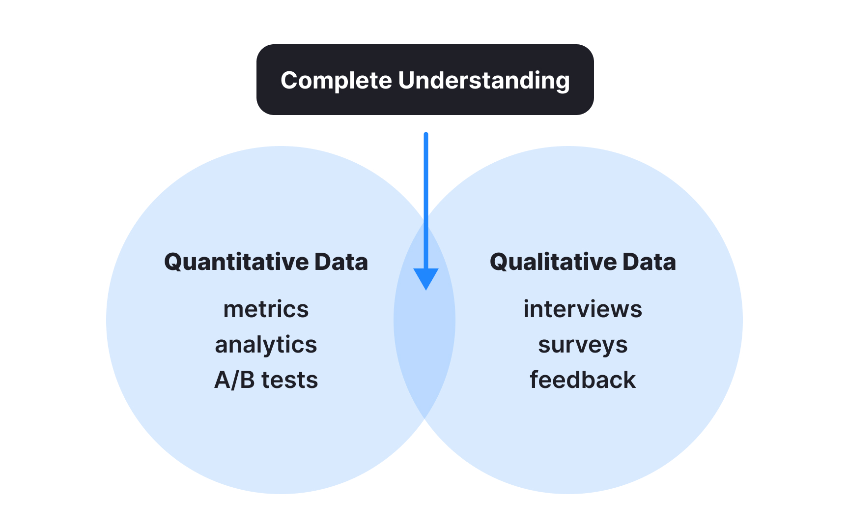
Qualitative and quantitative data each tell only half the story of product performance. Quantitative metrics reveal what users do through numbers, patterns, and trends: clicks, conversions, time spent, and other measurable behaviors. Qualitative insights explain why users behave as they do through interviews, surveys, and feedback revealing their motivations, frustrations, and emotional responses.
Integrating these data types creates a complete understanding that neither can provide alone. When analytics show users abandoning a workflow,
Effective integration follows a cyclical process: use quantitative data to identify patterns requiring explanation, gather qualitative insights to understand those patterns, then validate interpretations with further quantitative testing. This prevents both missing the human context behind metrics and relying too heavily on small sample feedback.
Pro Tip: For every key metric in your dashboard, pair it with a qualitative data source that helps explain changes in that number, creating linked "what + why" measurement pairs.
The quality of insights derived from data depends directly on the questions you ask. Generic questions like "How are users engaging with our product?" generate vague, unhelpful answers. Specific, focused questions such as "Which feature do users engage with in their first week that correlates with 30-day
Effective data questions start with business objectives rather than available metrics. Begin by identifying decisions you need to make, then determine what information would clarify those choices. This prevents the common trap of collecting data first and trying to extract meaning later.
Frame questions to reveal underlying patterns rather than just current states. Instead of asking "What is our conversion rate?", ask "What factors predict changes in our conversion rate?" The first tells you where you are, while the second helps you understand how to improve.
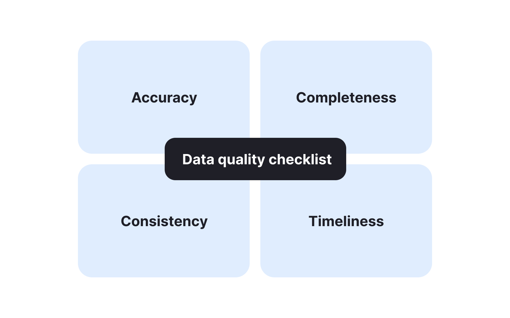
Not all data deserves equal trust. Data quality issues often manifest through inconsistencies, unexpected outliers, or metrics that contradict established patterns. Identifying these problems early prevents flawed analysis and misguided decisions.
Key evaluation criteria include:
- Accuracy: Your data should reflect reality. For example, website visit counts should match actual user behavior rather than including bot traffic or test accounts in your production metrics.
- Completeness: You need all necessary data points without gaps. This means ensuring your analysis includes all relevant time periods, user segments, and interactions rather than partial information that might skew conclusions. A common mistake is including data from before a feature went live, so avoid that.
- Consistency: Related metrics should align logically with each other. If signups increased but new user logins didn't, or if purchase counts don't match revenue figures, something's likely wrong with your tracking.
- Timeliness: Data must be current enough to be relevant for your decision. Last quarter's customer preferences may not represent current behavior, especially in fast-changing markets. Always check when your data was collected.[3]
Remember that even sophisticated analysis based on flawed data will lead to poor decisions. Building confidence with data starts with ensuring the data itself deserves your confidence.
Statistical significance helps determine whether observed data patterns represent real trends or just random variations. Understanding this concept is crucial for avoiding false conclusions when analyzing product metrics. You don't need to be a statistician, but grasping the fundamentals will strengthen your data confidence.
Key concepts to understand include:
- Statistical significance: Indicates that an observed effect is unlikely to have occurred by random chance. Typically, results are considered significant when there's less than a 5% probability (p < 0.05) they occurred randomly. Some teams may use a 10% probability when working with smaller sample sizes and faster timelines.
- Confidence level: The probability that your findings accurately reflect the true pattern in the overall population. Common confidence levels are 90% or 95%, meaning you can be 90% or 95% confident your results represent reality rather than coincidence.
- Sample size: While larger samples do give more reliable results, they also take longer to collect. That’s a tradeoff: the bigger your sample, the slower your test. In many cases, running several smaller, faster tests can give you quicker insights than waiting for one large test to finish.
Pro Tip: To understand how reliable your experiment is, ask about the confidence level being used, whether the sample size reached the required minimum, and if the overall setup was designed and executed correctly.
Data is useless if you can’t communicate it to people. Effective data translation converts complex statistics into clear narratives that highlight business implications. Your goal is to answer "So what?" for every chart and number you present.
Here are some tips for presenting data to non-technical audiences:
- Start with the goal and the result: Begin presentations with your key finding or recommendation with respect to the goal you are trying to achieve, then support it with data and not the reverse. For example, we are trying to achieve [goal]. We know that our customers [insight]. Therefore we tested [experiment]. We found that [conclusion].
- Use business language: Replace technical terms with business outcomes. Instead of "session duration increased," say "customers spent more time engaging with our content."
- Contextualize with benchmarks: Raw numbers mean little without context. Show how metrics compare to previous periods, industry averages, or targets.
- Visualize selectively: Choose visualizations that emphasize your main point rather than showing everything possible. One clear chart often communicates better than ten complex ones.
Remember that different audiences need different translations. Executives typically care about
Data confidence isn't just an organizational capability. It's a personal skill you can develop through consistent practice, even without a technical background. Building your own data confidence means creating habits that make data more approachable and useful in your daily work. With regular practice, you'll move from data anxiety to data fluency.
Try incorporating these habits into your routine:
- Daily metric check: Spend 5-10 minutes each day looking at 2-3 key metrics relevant to your work. Regular exposure builds familiarity and reduces anxiety when analyzing data deeply.
- Question practice: When presented with data, develop the habit of asking "What might be missing here?" and "What alternative explanations could exist for this pattern?"
- Documentation: Keep a simple log of data-informed decisions you make, noting your confidence level and revisiting them later to see if outcomes matched expectations.
- Tools familiarity: Invest time in learning the basics of your organization's analytics tools.
Remember that data confidence builds gradually through experience. Start with small, low-stakes decisions before applying data analysis to critical choices. The more you practice using data in everyday situations, the more natural it becomes to apply in complex scenarios.
References
- Analysis Paralysis: Definition, Example, and Tips - Work Life by Atlassian | Work Life by Atlassian
Top contributors


Topics
From Course

Share


