The Principles of Information Architecture
Explore the fundamental principles of IA and discover how they can transform your designs into user-friendly and scalable environments
Information architecture principles are guidelines that help designers create organized, user-friendly digital spaces. In 2010, Dan Brown, a UX consultant and information architect, introduced eight principles to guide IA thinking. These principles are designed to improve how users interact with information on websites and apps. For example, the principle of choices emphasizes offering users meaningful options. Another key principle is the principle of disclosure, which involves revealing information progressively to avoid overwhelming users. These principles help designers create intuitive, scalable, and user-centered information structures, enhancing the overall user experience.
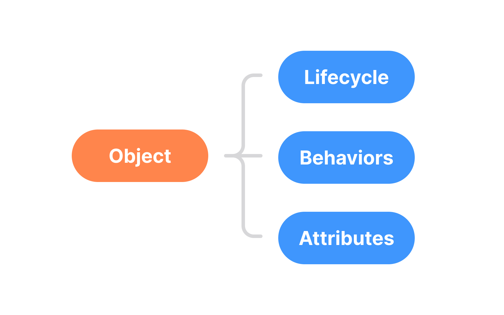
The principle of objects refers to organizing information into meaningful chunks or units that people can easily understand and interact with. Think of objects as containers that group related information together, much like how folders on your computer group similar files. For example, let’s say you’re designing a website for a library. You could think of different categories like "Books," "Authors," and "Genres" as objects. Each object contains specific information related to it — like a "Book" object might include the title, author, and publication year, while the "Author" object might have the author’s bio and a list of their books.
By organizing information this way, you help users find what they need more easily. When people visit the library’s website, they don’t have to dig through a pile of random information — instead, they can quickly navigate through well-organized objects that make sense and are easy to explore.
This approach helps make websites, apps, or any information systems more user-friendly, logical, and efficient to navigate.[1]


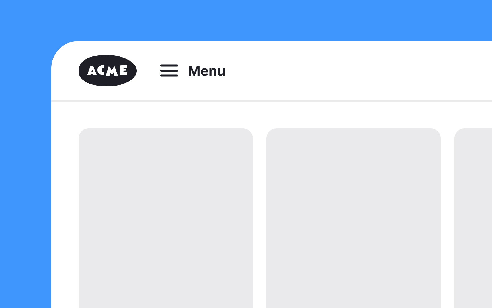
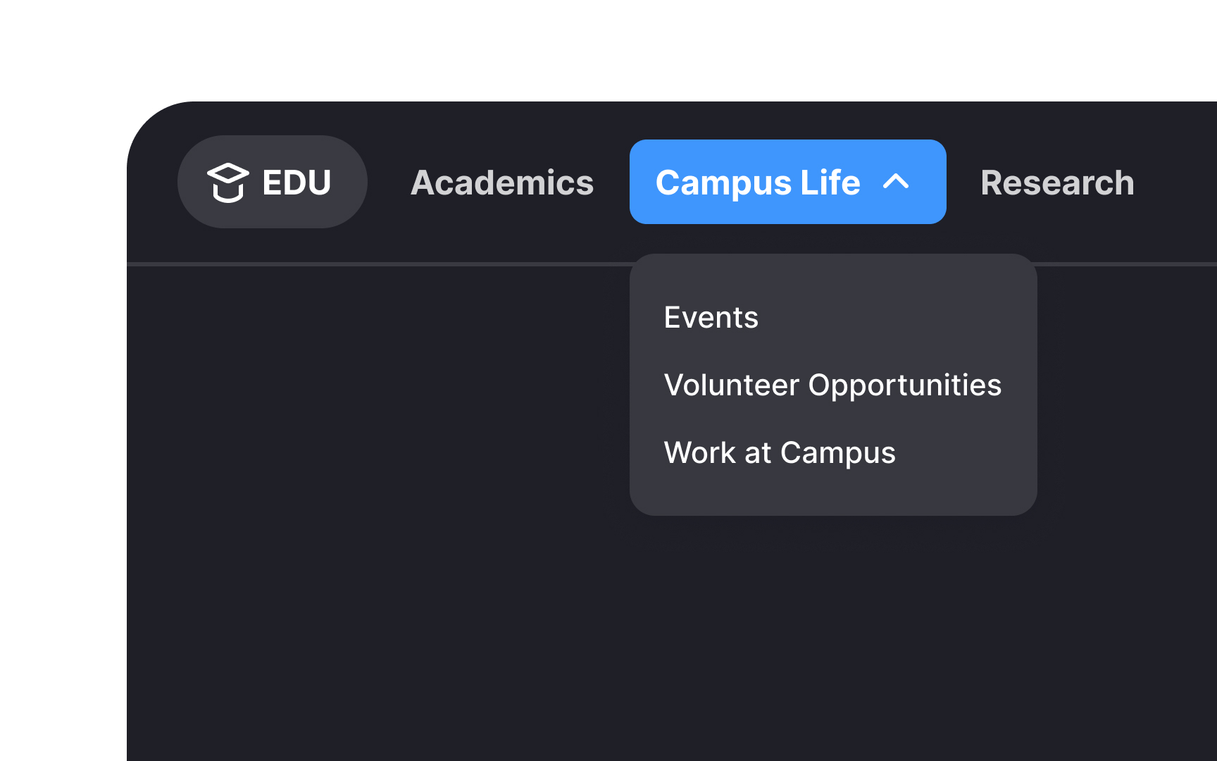
The principle of choices emphasizes the importance of simplicity in user interfaces. Users should never feel overwhelmed by too many options. Instead, presenting a limited number of choices at any given time helps users stay focused and makes navigation easier. For example, an online banking app might limit the main navigation to key actions like checking account balance, transferring funds, and paying bills.
By reducing the number of visible choices, users can accomplish their tasks efficiently without unnecessary distractions. This approach not only improves the
The principle of disclosure emphasizes revealing only relevant information as needed. By showing users just what they need to complete their task, you prevent them from feeling overwhelmed and help them make informed decisions on how to proceed. For example, an online shopping site might first show a product's key features and price. If users are interested, they can click to see more details like specifications, customer reviews, and related products. This approach keeps the initial interface clean and simple, helping users focus on what matters most at each stage of their journey.


The principle of exemplars highlights the use of specific examples to illustrate how elements work together, rather than relying solely on descriptions. This approach helps users quickly understand and navigate an interface through a more intuitive, visual language. For instance, a project management tool could use icons to represent different task statuses — like a green checkmark for completed tasks, a yellow clock for tasks in progress, and a red exclamation mark for urgent tasks. These icons help users quickly grasp the status of their projects at a glance, without needing to read through detailed descriptions.
The principle of front doors emphasizes that not all users will start their journey on your homepage. Regardless of which page they land on, users should be able to find what they need quickly and easily. This means every page should serve as a helpful entry point, guiding users to the main areas of your site. For example, consider an e-commerce website. A user might land directly on a product page from a search engine. This page should provide clear


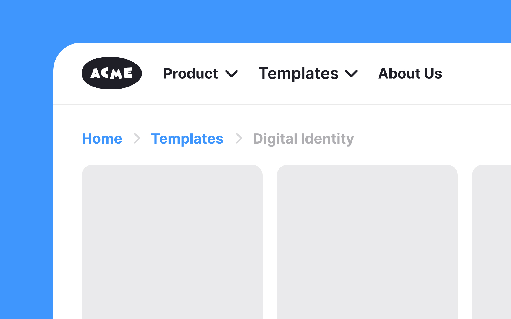
The principle of multiple classification acknowledges that people navigate interfaces differently. It's the responsibility of the information architect to provide multiple classification systems tailored to diverse needs, ensuring everyone can find what they’re looking for efficiently. For example, consider an online clothing store. Some users might prefer browsing by category, such as "Men," "Women," and "Kids," while others might


The principle of

The principle of growth emphasizes designing systems that can evolve over time. As more information is added, the interface should maintain its usability and clarity, ensuring it doesn't become cluttered or confusing. Imagine, for example, a corporate intranet designed to store company documents and resources. At launch, it might only include basic HR policies and forms. Over time, additional documents like training materials, project archives, and departmental guidelines will be added.
A well-thought-out


Similar lessons

Intro to Information Architecture

How to Design Good Search Experiences in UIs
