Setting paragraph and letter spacing
Paragraph and letter spacing improve legibility by giving text enough separation to read comfortably. Letter spacing adjustments benefit smaller sizes that often appear in captions or metadata. Slightly looser spacing helps distinguish each character. Larger display sizes sometimes benefit from slightly tighter spacing because the increased scale already gives characters more breathing room. WCAG guidance recommends a minimum letter spacing of 0.12 times the font size to support readability for a broader range of users .
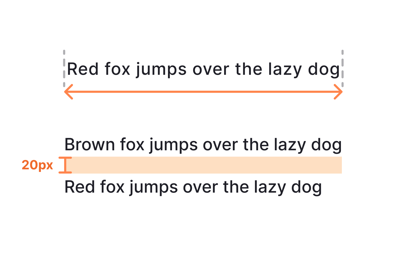
Paragraph spacing helps users identify where one thought ends and the next begins. Clear separation prevents large text blocks from blending together. WCAG suggests using spacing after paragraphs that is at least twice the font size, which improves comfort when scanning longer content.
Some design systems avoid defining a dedicated paragraph spacing property because native platforms and the web do not always support it directly. Instead, they use spacing tokens or layout components to create consistent gaps. When paragraph and letter spacing follow predictable rules, designers can mix headings, body text, and labels without creating visual clutter.
Pro Tip: Test spacing within full text blocks. Adjustments that look small in isolation often have a large impact in real layouts.
