Selecting font weights with intent
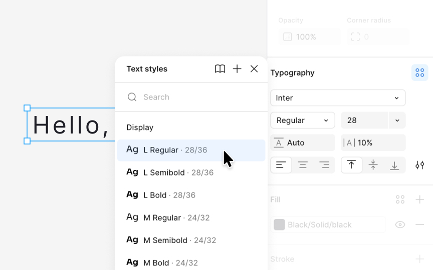
Font weight shapes how users perceive hierarchy and emphasis. A readable system does not rely on size alone. Weight helps distinguish headings, body text, and supporting details. Regular, medium, and bold weights usually form a complete set for interfaces because they cover the common needs without overwhelming the system with options:
- Regular works well for long paragraphs because it preserves comfortable reading.
- Medium aligns visually with icons, especially line icons that often appear near text.
- Bold gives emphasis when needed but should be used sparingly to avoid losing contrast between levels.
Weight also affects how text appears next to elements with different densities. A light weight can feel lost on busy pages, while an overly heavy weight can create unnecessary stress in dense layouts.
Pro Tip: Check weights next to icons and UI controls to confirm they feel visually balanced.

