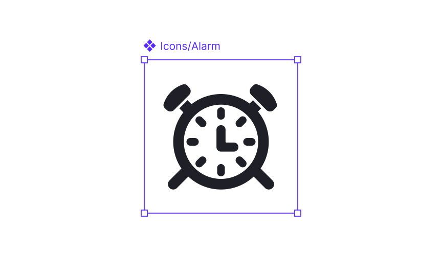
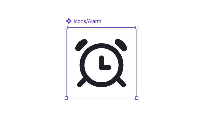
Balancing simplicity and detail for legibility
Simplicity is essential for icons to remain clear at small sizes. Since icons often appear beside text or inside dense layouts, users must recognize them within a fraction of a second. Simple shapes help achieve this because they reduce visual noise and highlight the core metaphor instead of decorative details.
Excessive detail tends to blur or disappear when an icon is viewed at small scales. Fine lines, inner patterns, or unnecessary angles can become hard to read and may create uneven visual weight within the set. Minimizing detail keeps shapes crisp and helps icons stay legible across different screen densities.
Keeping forms simple also reinforces consistency. When all icons follow the same level of refinement, they appear more cohesive as a system. This makes it easier for users to scan interfaces and easier for teams to expand the icon set without constant stylistic adjustments.
Pro Tip: If removing a detail does not change the meaning of the icon, leave it out.

