Seeing the layers of consistency
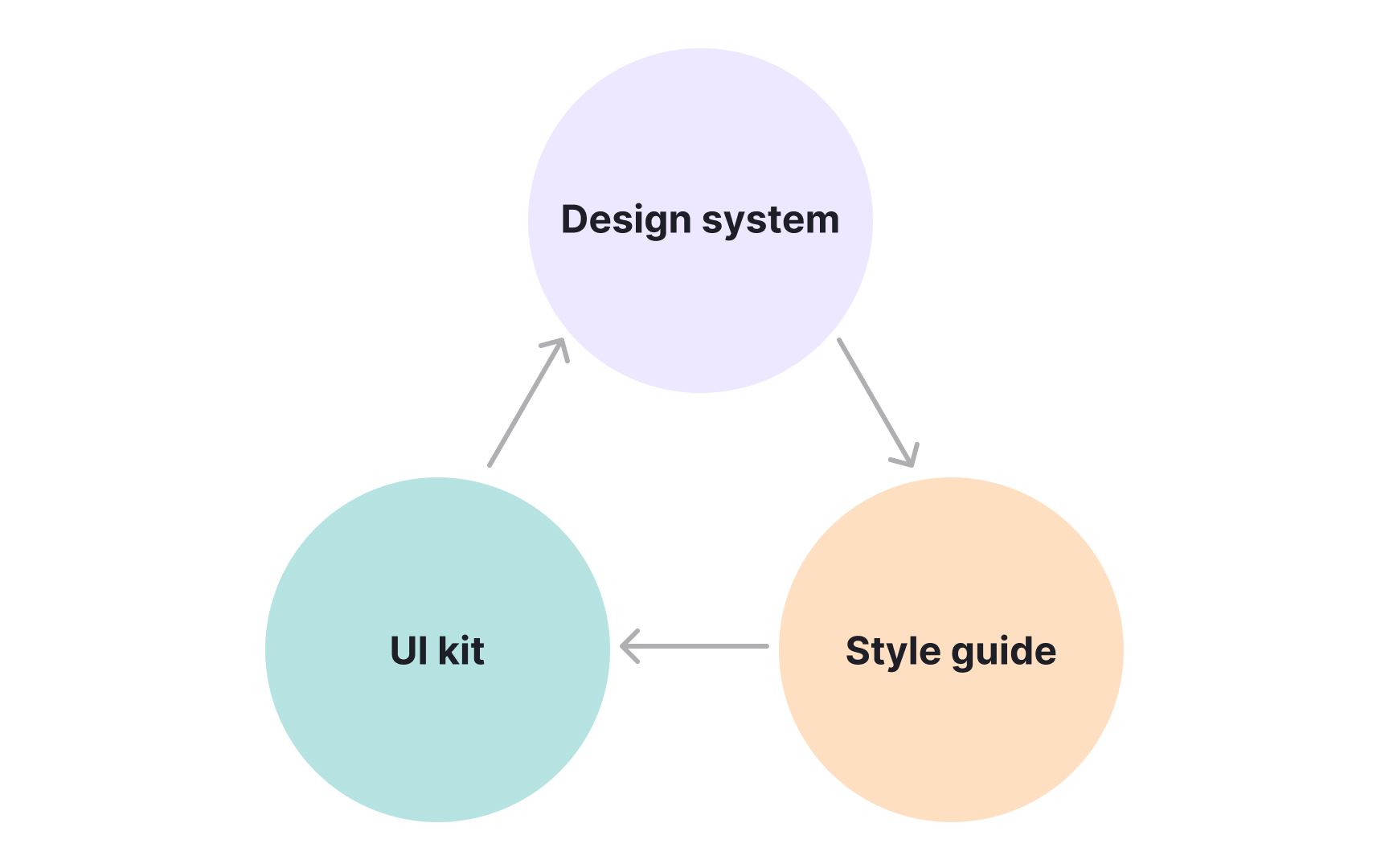
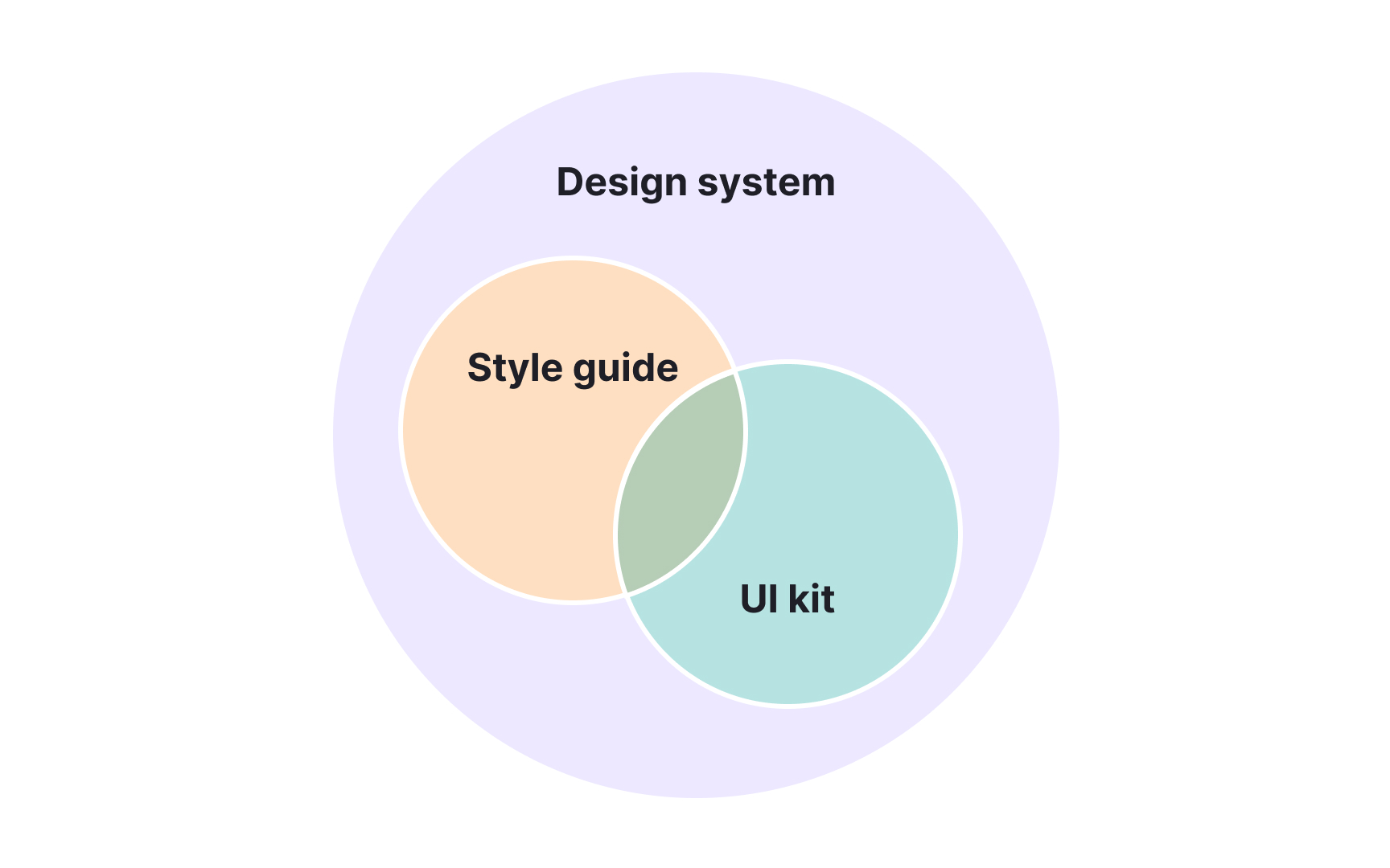
Consistency in digital design depends on several layers working together. Style guides, UI kits, and design systems each strengthen this consistency but on different levels.
A style guide defines the visual and verbal identity of a product. It sets rules for typography, color, tone of voice, and branding so that every element aligns with the same standards. These guides create visual unity but focus on documentation rather than implementation.
A UI kit adds a practical layer. It contains ready-made design elements such as buttons, icons, and forms that designers can reuse when building interfaces. This speeds up work and ensures visual harmony, though it does not include detailed guidance or code.
A design system connects these layers into a single structure that unites design and development. It includes style rules, coded components, and reusable patterns that teams can apply directly in real products. Together, these tools form a hierarchy: style guides define the rules, UI kits make them usable, and design systems integrate everything into a scalable framework.[1]
Pro Tip: Start small: define visual rules, create reusable UI pieces, then connect them into a system that supports growth.
