Understanding accent color roles
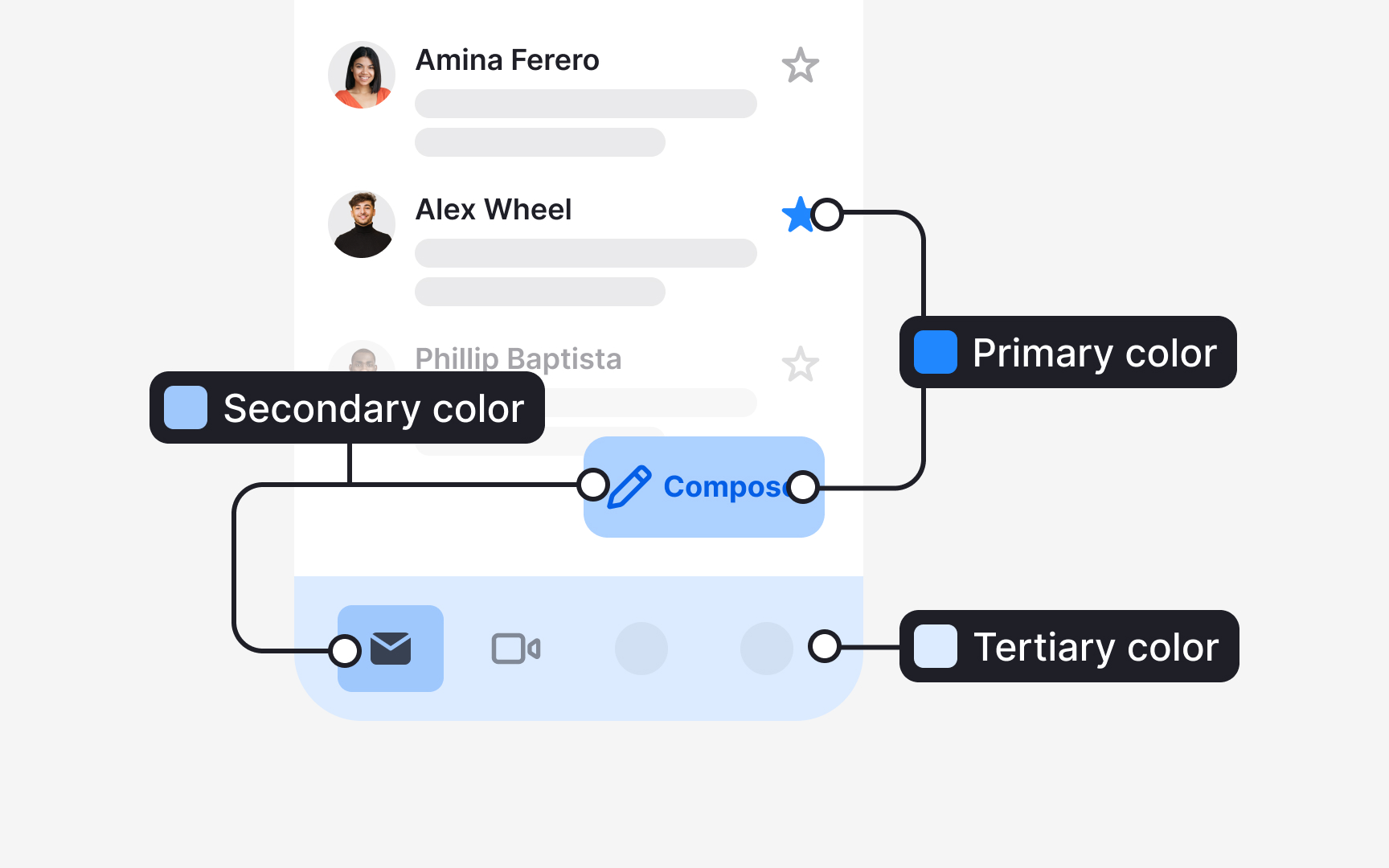
Accent colors in a system gain meaning through the roles they carry. Material Design 3 divides these roles into primary, secondary, and tertiary, each supporting a different level of emphasis in the interface:
- Primary accent roles support the most important actions. They include 4 values: the primary color, the on-primary color for text and icons placed on it, the primary container, and the on-primary container. These roles help highlight key elements such as a prominent action button or an active state.
- Secondary accent roles support elements that still need visibility but not strong emphasis. They also consist of 4 values that describe how fills and text pair within this quieter role. These roles are used for components like filter chips or tonal buttons.
- Tertiary accent roles introduce complementary accents. They bring additional contrast when a design needs a distinct visual cue without relying on the primary or secondary colors. Their four values help apply these accents consistently across fills, text, icons, and containers.[1]
