Accessibility in Design Systems
Build accessible experiences by starting with clear, inclusive, and easy-to-use design choices at the foundation.
Accessibility becomes much easier to achieve when it starts at the foundation of a design system. Small choices in color, spacing, typography, or component behavior can remove barriers for many people. When these choices are not considered early, they often turn into issues that are much harder to fix later in development. Many real accessibility problems actually begin in design, not code.
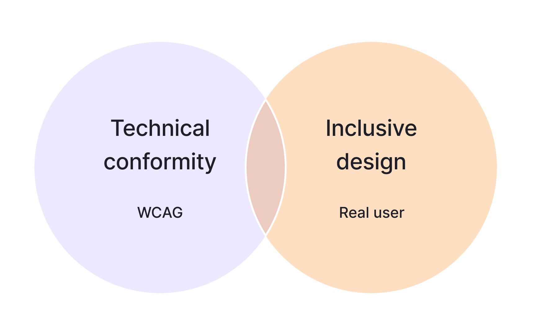
A design system that treats accessibility as a core principle helps teams make better decisions without relying on guesswork. Clear tokens, reusable patterns, and helpful documentation give designers and engineers practical tools that support different abilities and different ways of interacting with products. This includes following WCAG rules while also thinking about real situations, such as how users navigate, read, or understand content in everyday life.
Keeping a system accessible is an ongoing process. Checklists, annotations, audits, and regular testing help teams notice issues early and stay aligned as products evolve. These habits build a shared mindset where accessibility is something that grows with the system and becomes part of everyday work. This steady approach creates experiences that feel more inclusive, supportive, and easier to use for everyone.
Pro Tip: Keep a shared checklist in your design file so important accessibility steps are never forgotten.
Standards alone are not enough to create experiences that feel usable. Even if each component meets individual criteria, the experience can still break when users move through an interface. A common example is focus order. A button might be fully compliant on its own, but if it appears in a confusing sequence, keyboard
Design system
Pro Tip: Check how components work together in real flows, not only how they pass individual rules.
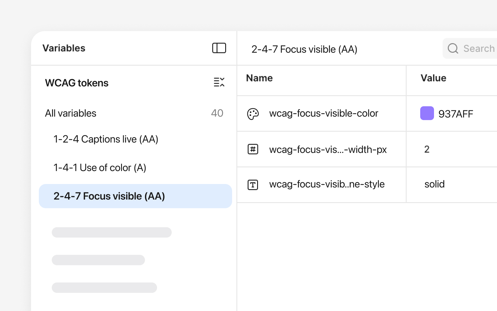
Design tokens, named in Figma as styles, shape how accessible a product feels long before components are built.
Spacing and
Language plays a key role in
Clear and respectful wording often follows simple patterns, for example:
- Using everyday words instead of technical terms when possible. For example, “Start” instead of “Initiate process.”
- Avoiding jargon, unclear shortcuts, or phrasing that may exclude or stereotype certain groups.
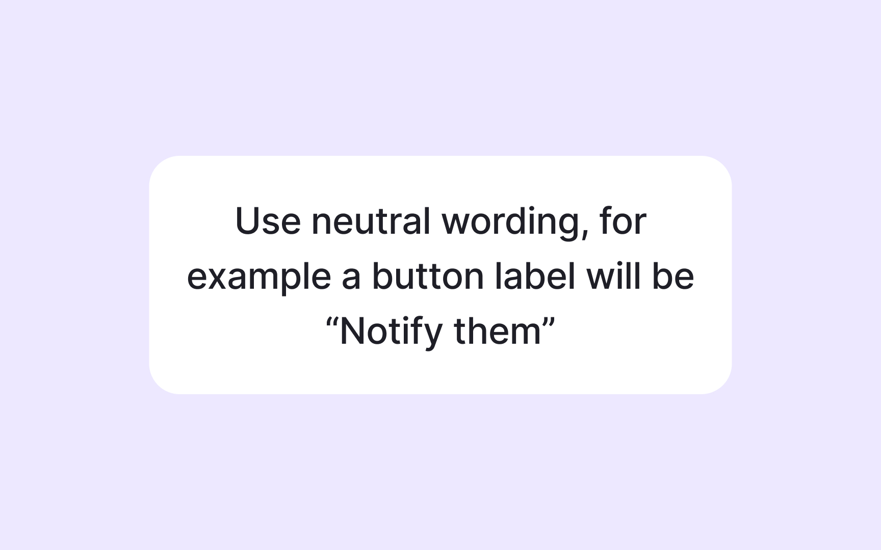
- Choosing neutral expressions that do not assume gender, culture, or ability. Instead of “he” or “she” when gender is unknown, use “they.”
- Avoiding tone that sounds overly formal or harsh.
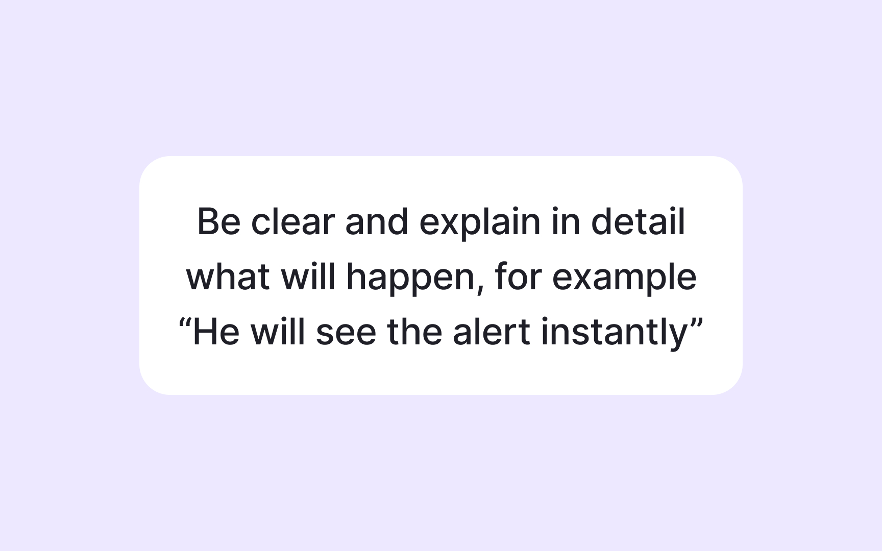
- Writing
labels that tell users exactly what will happen, such as “Save changes” instead of vague actions.
Localization adds another layer to accessible
Localization-friendly design often includes choices like:
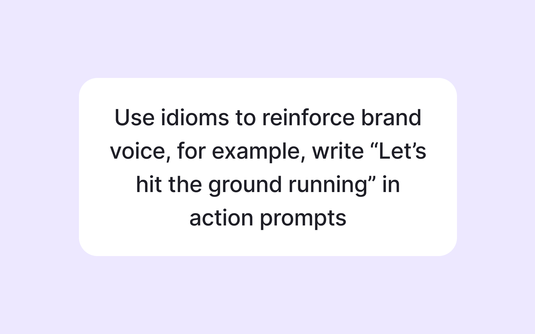
- Avoiding idioms that do not translate well. For example, “Hit the ground running” does not make sense in many languages, so a clearer phrase like “Start quickly” works better.
- Planning for languages that expand when translated. German or Finnish text often becomes much longer, so components need flexible space to support this growth.
- Supporting right to left languages when needed. Arabic or Hebrew interfaces require mirrored
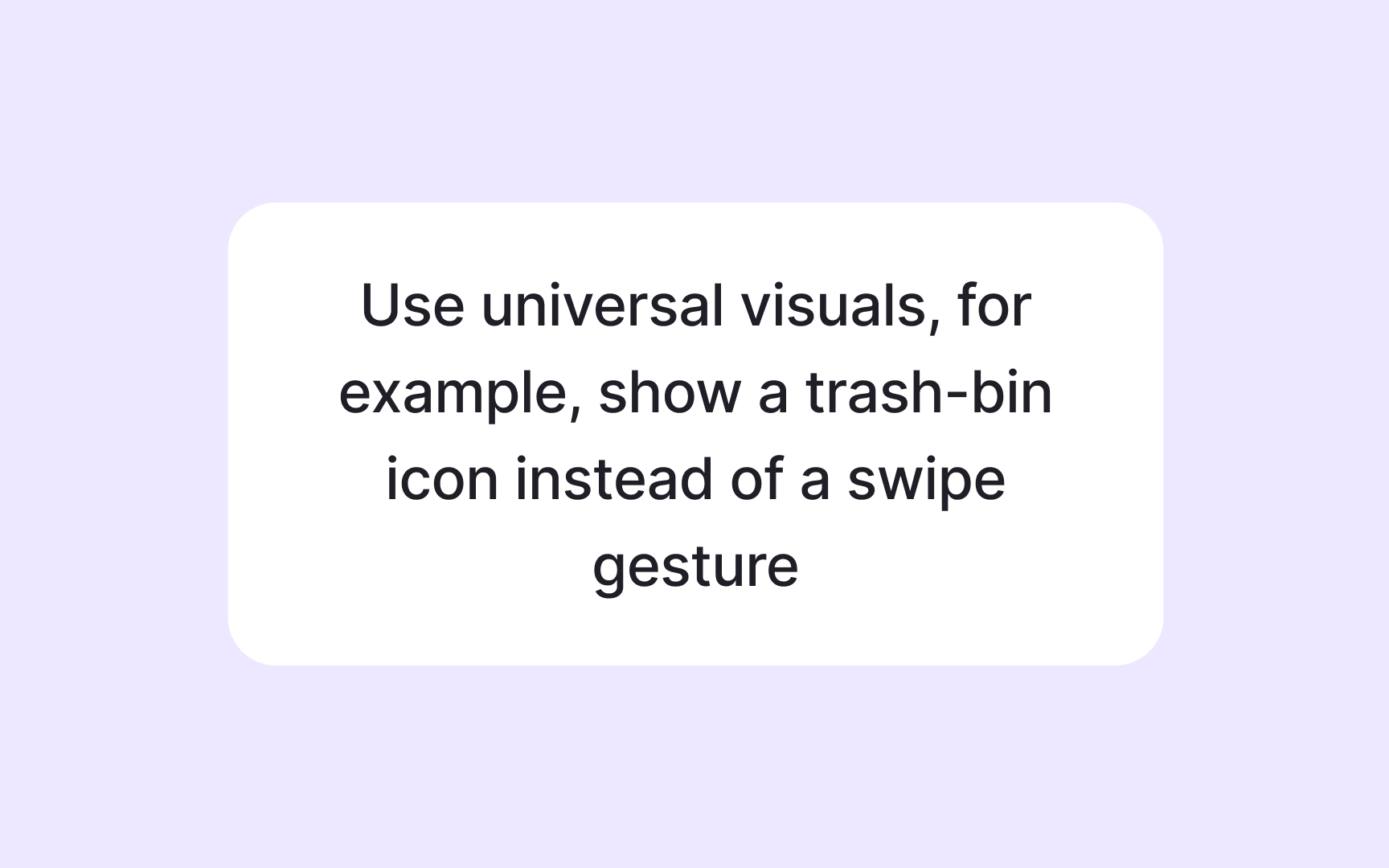
layouts that affect alignment,navigation , and icons. - Using neutral visuals that do not rely on local cultural symbols. For example, you may consider replacing hand gestures with simple icons that feel universal.
Planning for these differences helps the interface stay readable, natural, and respectful across cultures. It also reduces redesign later because the system already supports global use.
Every component in a
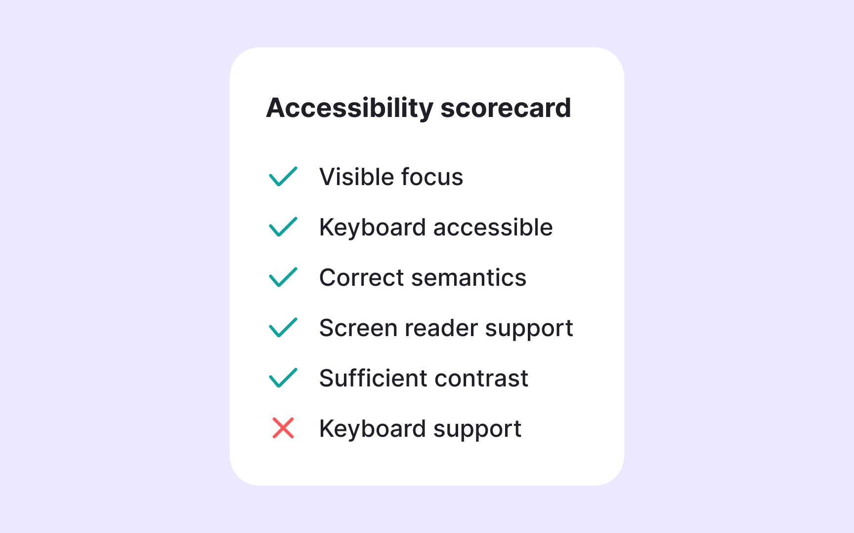
Some design systems use accessibility scorecards to keep these checks consistent. A scorecard is a simple visual panel attached to a component’s
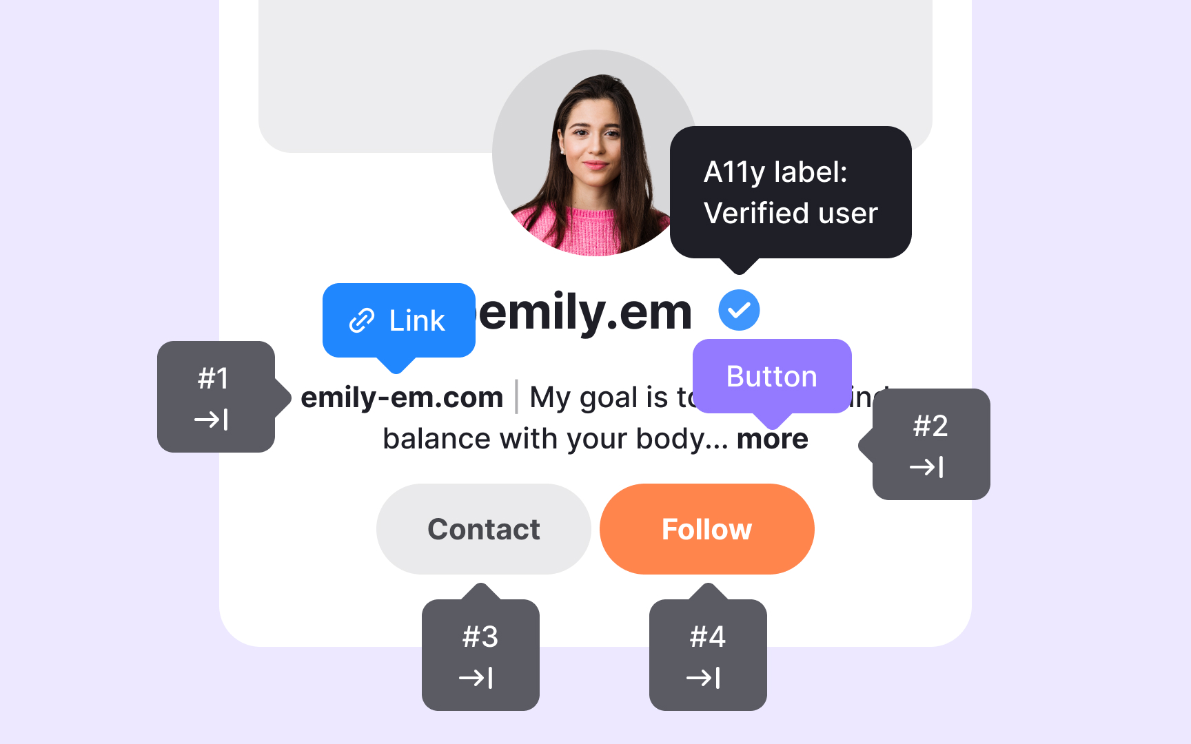
Annotations allow designers to bring
To make this process smoother, teams often store annotation assets in shared Figma libraries. This lets designers drag and drop ready-made notes into their files using a consistent format. A shared library also helps new team members quickly understand how accessibility expectations are communicated. Many
Pro Tip: Add annotations during design, not at the end, so accessibility decisions stay clear and consistent.
Automated
Automation alone cannot capture how an experience feels when someone interacts with it. Many issues appear only through manual testing. Keyboard
Audits also show how components behave when combined into real
A
A supportive culture also encourages teams to ask questions, share feedback, and collaborate early. When accessibility is discussed at the beginning of a project, it shapes tokens, components, and patterns instead of becoming a fix applied at the end. Regular conversations between teams help catch issues sooner and reduce the risk of inaccessible design choices slipping into production. Over time, this steady collaboration makes accessibility a natural part of the workflow and not something handled only by specialists.
Pro Tip: Accessibility grows stronger when teams encourage curiosity, shared ownership, and continuous improvement.
References
- How To Build an Accessible Design System [& Why It Matters] | UX Design Institute
Topics
From Course

Share


Similar lessons

Intro to Accessibility

Inclusive Design Basics
