Repetition in Design Composition
Uncover how to strategically repeat design elements such as colors, shapes, patterns, and typography to establish a sense of unity, balance, and rhythm within your designs
One of the most effective ways to establish a habit in real life is through repetition. In UI design, repetition brings consistency to designs and, depending on how it’s used, can add energy to a composition.
Learning the various ways in which repetition can be used, including both simple and complex repetition, gives you more options as a designer. Repetition is a powerful composition technique that can add life to your designs — or make them boring and monotonous if done poorly.
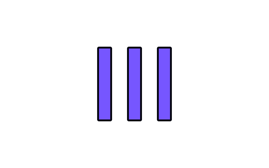
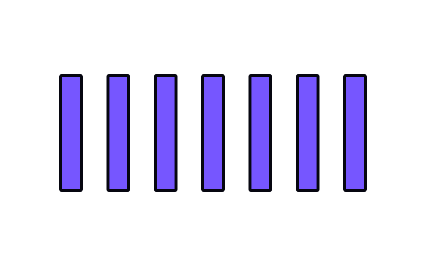
Repetition refers to duplicating a single element many times. Railroad tracks, stairs, and bookshelves all represent the repetition of objects in real life. Repetition is best used in small doses within a
Pro Tip: Repetition is the best friend of consistency in design, making users feel relaxed and comfortable.
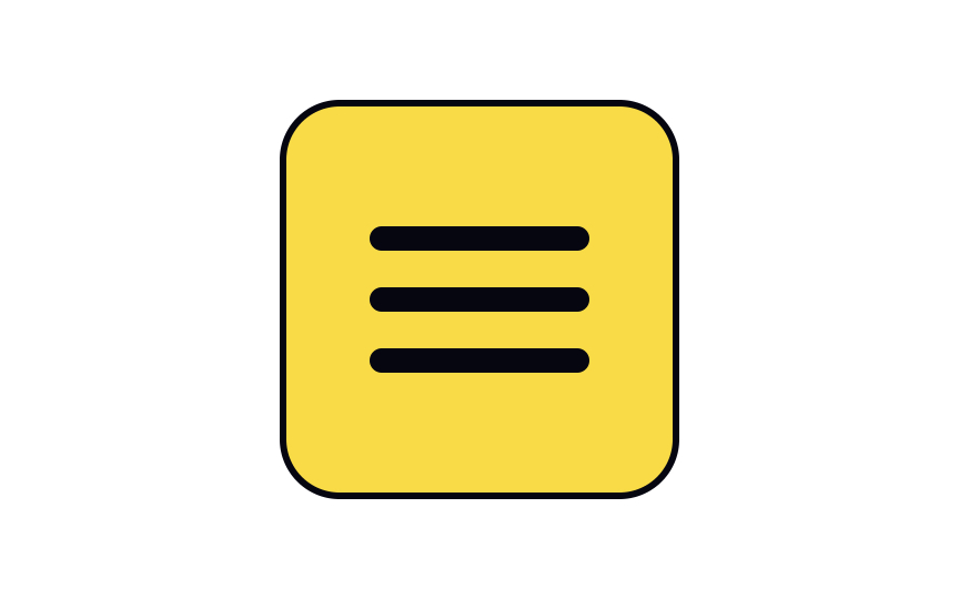
Simple repetition is best kept to small doses (such as three repeating lines in a hamburger menu icon). When used too much, it can become boring and monotonous. It’s useful in reinforcing an idea or concept, however, it is vital to understand how to use it effectively.
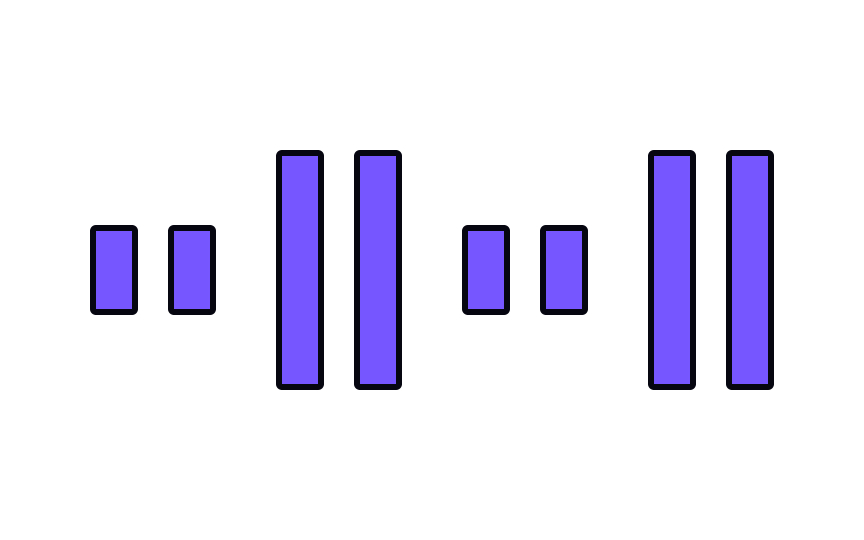
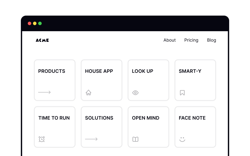
To understand the idea of complex repetition, think of carpets or wallpapers. They create rhythms and patterns — repetition of more than one design element working together as a group.[2] Complex repetition can be quite dynamic and refreshing, adding more visual interest than simple repetition.
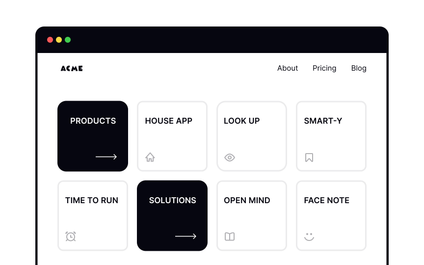
Designers can use complex repetition to make particular elements stand out within a group. They can also use complex repetition more subtly for things like patterns and textures within a
Repetition — particularly simple repetition — is common for balanced, symmetrical, and static
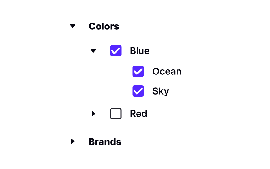
Simple repetition doesn’t mean every element has to be exactly the same. For example,
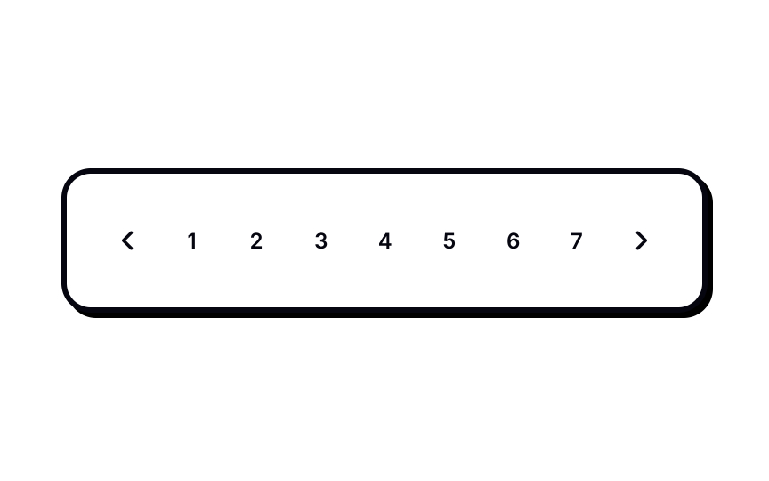
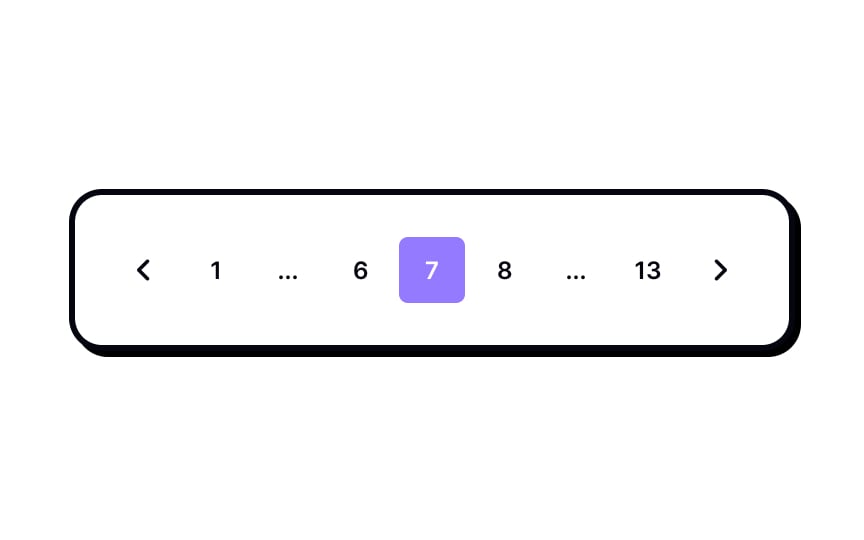
Pagination is usually an example of simple repetition, where each page number appears in the same pattern. When there are many pages, showing every number at once creates clutter. In these cases, complex repetition is used. The pagination keeps the same visual pattern and structure, but only shows a small range of page numbers at a time, along with the first, last, and current pages. Skipped pages are implied rather than displayed. This creates continuity and helps users understand where they are, while keeping the interface clean and easy to scan.
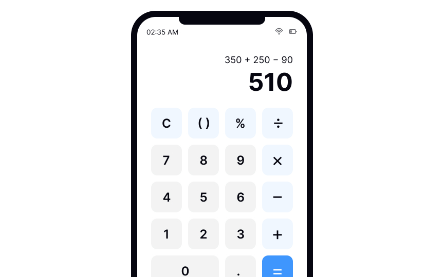
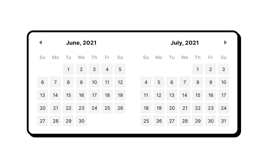
Some interfaces just naturally lend themselves to repetition — calculators, calendars, tables, and the like. Repetition in these cases orients users and makes the interface intuitive to use. Colored boxes repeated at equal intervals give a sense of order and balance.
Simple repetition focuses on equal relationships between elements. Each element, such as days in a calendar, shares the same shape,
Complex repetition involves variations of shape,
References
- Repetition, Pattern, and Rhythm | The Interaction Design Foundation
- Learn Web Design: How Repetition Leads to Rhythm | Creative Market Blog
Top contributors
Topics
From Course
Share
Similar lessons

Intro to Design Layouts

Intro to Design Grids

