Composition Grids in Design
Explore the various types of grids and learn how to use them effectively to create balanced, harmonious, and visually pleasing compositions
Grids help designers organize content and create consistent user experiences. Users feel more relaxed when finding features in places where they expect them to be, regardless of the device type and screen size.
With grids, designs become easier to modify and reuse. Grids also enable collaboration, allowing multiple designers to work on different parts of the layout and stay confident the product designs will remain consistent, and their work will be seamlessly integrated.
Grids are the underlying structures that provide support and flexibility for designs, just like the skeletal structure in the human body. It's a combination of lines — vertical or intersecting — that divide a page into sections and help organize
Besides, grids are a natural part of life, and if you take a look around, you'll notice that we use them to structure just about everything — apartment buildings, bookshelves, streets, and botanical gardens.
Initially, grids appeared in print
So what makes grids so beneficial and crucial for design?
- Grids strive for consistency. In the responsive design era — phones, tablets, laptops, and monitors — grids help create consistent designs that fit any screen. Plus, users can always be sure they would find things where they expect them to be.
- Grids maintain hierarchy and arrange elements in the most logical and intuitive way.
- Grids keep things clear so that nothing distracts users from the
content .
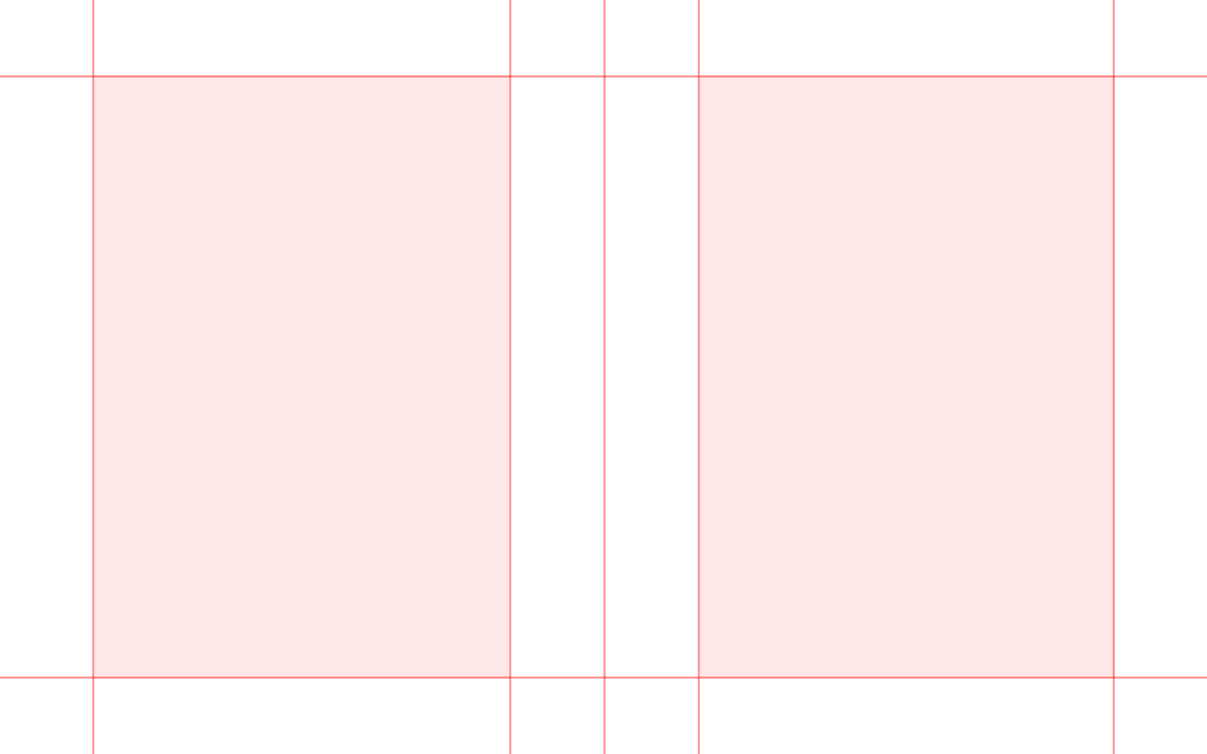
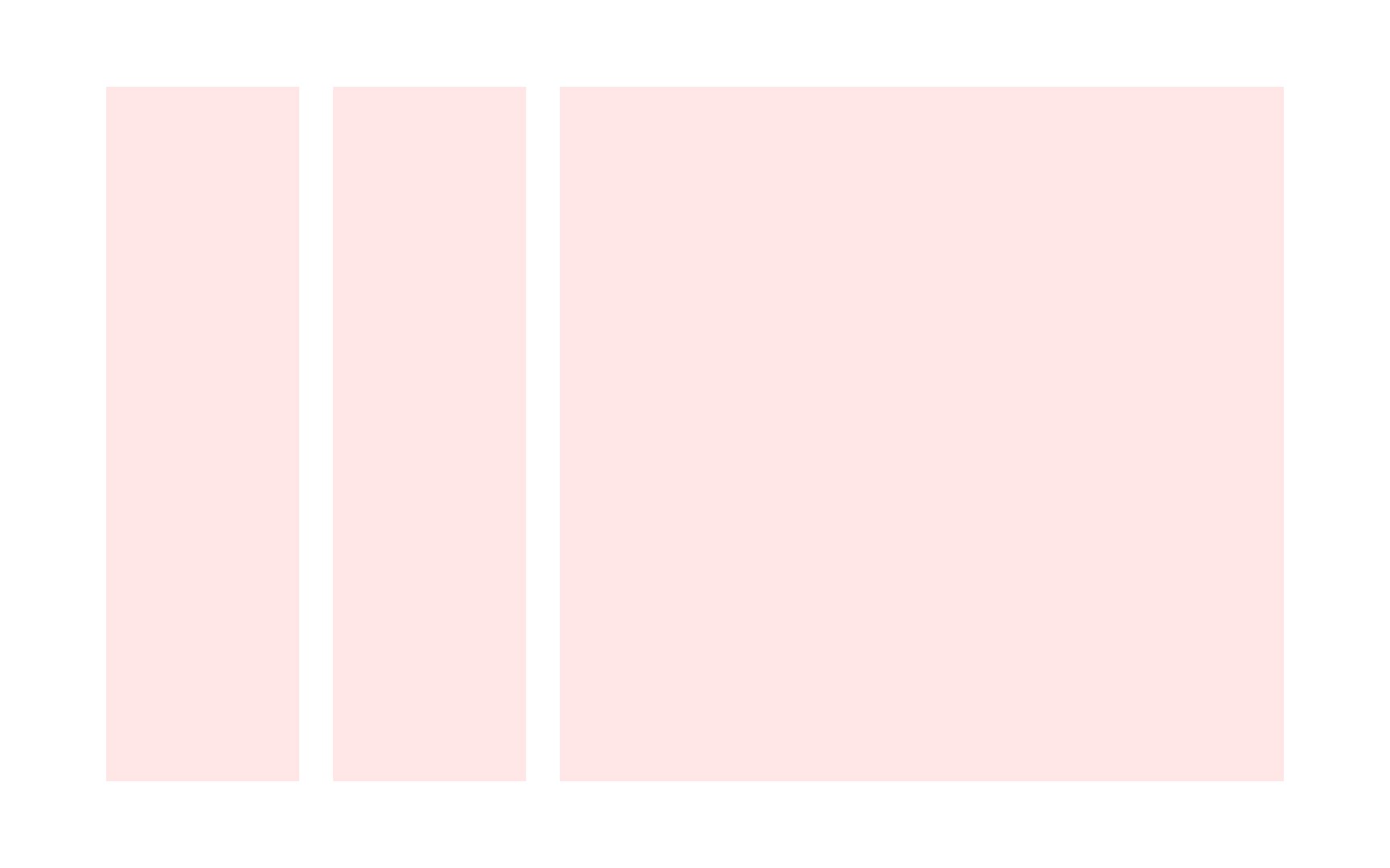
As the name suggests, the column grid consists of columns and gutters — pretty easy, right? Selecting the number of columns is entirely up to you, but traditionally you'll see 12 on desktop, 8 on
All columns and all gutters are of equal sizes, and as a result, such grids allow for the creation of well-balanced, harmonious
Pro Tip: The more columns you add, the more flexible your grid becomes. But don't go overboard.

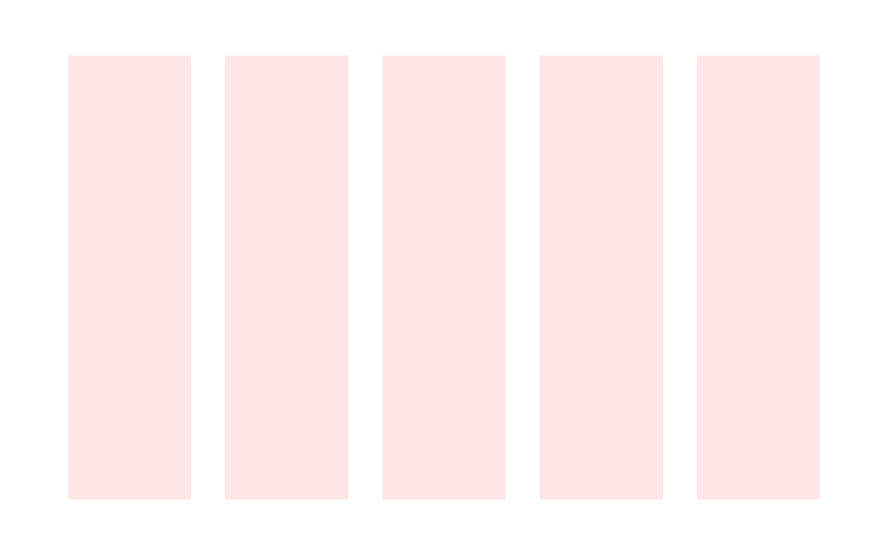
While the column
Pro Tip: Use a single module for one unit of content or combine several modules to create content blocks.
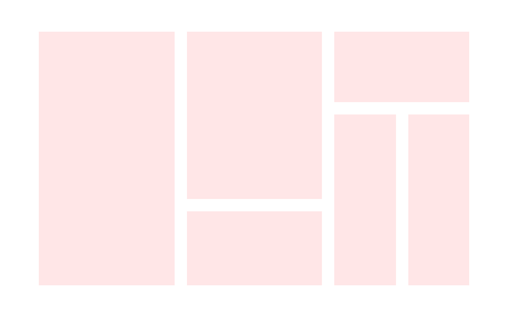
From an outside perspective, hierarchical grids appear chaotic and don't obey the rules of standard grids. However, those grids rely on agreements inside a design team that dictate the alignment of various elements. For example, designers can agree that the format is divided into sections based on the proportioning of the golden section. They may also decide that the position of a
A bit of this helter-skelter approach can help create something genuinely phenomenal and non-traditional.
Sometimes, two grids are better than one. In other words, an integrated
Some websites require a more personal approach, and that's when you can break the rules of the grid and create something more adventurous.
For example, you may use a golden rectangle as a proportion for elements. Larger elements will be for
You may use a custom
Usually, designers experiment with grids on promo or landing pages, breaking a sweat to present a portfolio or specific product in a favorable light.
Despite the range of

Symmetrical grids use an equal amount of same-sized
Simple symmetrical grid structures create a classic and elegant solution. Pages with this type of grid can also appear boring and lack movement.

Asymmetrical grids feel more dynamic and modern. They use differently sized
In contrast to fiction books that used classic symmetrical grids, asymmetrical grids were more suitable for books with more complex
References
- Layout Essentials | O’Reilly Online Learning
- Using Grids in Interface Designs | Nielsen Norman Group
Top contributors


Topics
From Course

Share


Similar lessons

Intro to Design Layouts

Intro to Design Grids
