Heatmap analysis and user behavior patterns
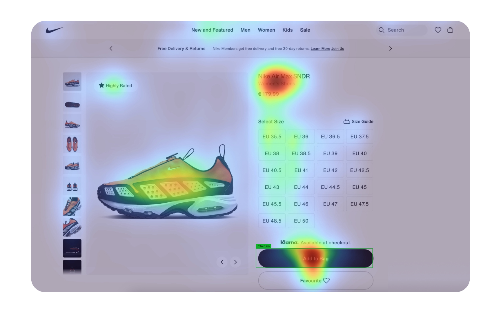
Heatmaps transform complex user interactions into visual data that reveals how users actually engage with your designs. These color-coded visualizations show where users click, move their cursors, and how far they scroll down pages. By analyzing these patterns, you can identify which design elements attract attention and which get ignored.
- Click heatmaps: Show exactly where users click, highlighting if they're missing important buttons or clicking non-interactive elements
- Move heatmaps: Reveal where users hover their cursors, indicating interest or confusion
- Scroll heatmaps: Display how far down the page users typically read, showing if important content is being missed
- Attention zones: Identify which parts of your interface receive the most and least attention
- Device comparison: Analyze how behavior differs between desktop, tablet, and mobile users
Look for unexpected patterns in heatmap data, such as repeated clicks on non-interactive elements or cursor "dead zones" where users rarely venture. These insights often reveal usability issues that wouldn't be apparent through analytics alone. Heatmaps work best when analyzed alongside other research methods to verify and explain the patterns you discover.[1]
Pro Tip: Create heatmaps for different user segments to see how behavior patterns vary between new and returning users, or between different demographic groups.
