Color Scheme Personalities
Explore popular color schemes that can be used to build a color palette
Color schemes, or color harmonies, are essential tools for creating visually pleasing palettes. Using a color wheel, you can explore different harmonies that evoke distinct emotions and reactions. Understanding these combinations helps you craft the right effect for your audience.
To build a successful color palette, start by defining the message you want to convey. Is it warmth and comfort, or energy and excitement? Knowing the purpose of your design helps you select colors that align with your goals, enhancing the overall impact of your work.

A monochromatic
Monochromatic combinations create a harmonious and visually appealing look. The hue unifies the design, which works well if you want your brand to be identified with a particular color. Monochromatic palettes are also the easiest to create. The downside of monochromatic palettes is that they can end up being boring and lacking visual interest. To avoid that, make sure there's enough contrast between light and dark hues. Another strategy to liven up a monochromatic scheme is to add a solid neutral like white or black.
Use monochromatic harmonies to:
Pro Tip: When creating monochromatic, text-based designs, use dark shades for text and lighter shades for background. Save the brightest variation for graphic accents.

Analogous
The simplest way to create an analogous palette is to choose a primary color as a base, then choose 2-3 neighboring hues as accent
It's easier to balance analogous colors if you use only warm or only cool colors. Also, be wary of choosing colors that are too closely related, as they may blend together and wash out your design.
Use analogous harmonies to:
- Add visual interest to an otherwise monochrome color scheme
- Create a calm and unified look that won’t distract users from your primary message

Complementary
Complementary palettes are one of the most difficult to pull off successfully — especially for new designers. When done wrong, they can feel overwhelming, especially if you're using highly saturated colors. A way to balance complementary colors is to pick one
Use complementary color schemes to:
- Draw attention to your focal point
- Express boldness and inspire action
- Create youthful, lively designs

Split complementary
Split complementary color schemes add more variety than complementary color schemes as they include 3 hues. This results in dynamic palettes but doesn't create tension because of the analogous colors of the
Using split complementary color schemes, you'll get both warm and cool hues. This will give you more room to balance the colors than a high-contrast complementary scheme.
Use split complementary schemes to:
- Experiment with complementary harmonies — especially if you're a new designer
- Make an impact without being too flashy

A triadic
Triadic schemes are vibrant and have a lot of energy, especially compared to monochromatic and analogous schemes. But because the colors are evenly spaced around the color wheel, they also feel balanced. This is especially true when you let one color dominate and use the others as accent colors — similar to a split complementary harmony. Depending on the mood you're trying to achieve, it can be a good idea to use one bright or dark color and a paler
Tints and
Use triadic harmonies to:
- Create balanced drama and
contrast - Create
compositions that need more than two colors - Grab the viewer's eye without creating tension
- Create bright designs that use full chroma colors

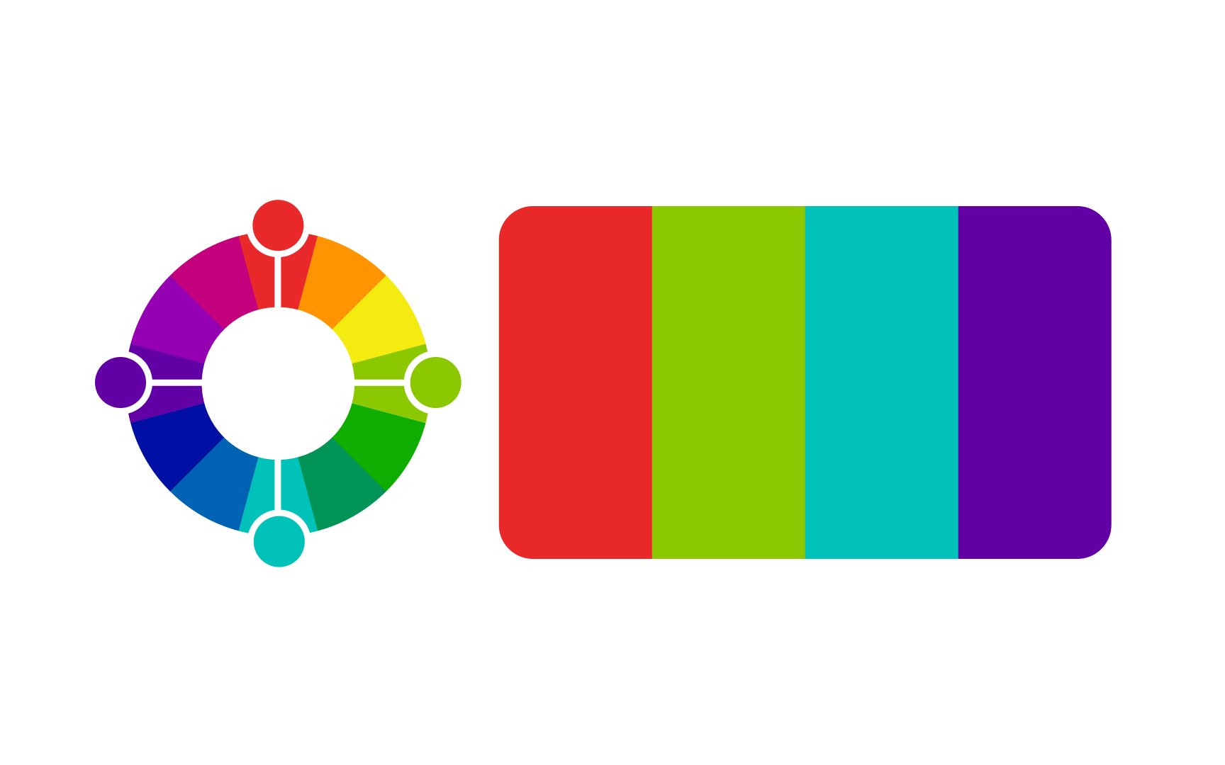
Rectangular tetradic
A rectangular color scheme is the richest of all available color schemes. This gives you the most variety when working with color. These schemes work best when you choose one of the 4 colors to be a dominant color and others as accent colors. Otherwise, your project may appear too busy and unbalanced. This simply means avoiding using all 4 colors in equal portions.[1]
Use rectangular color schemes to:
- Draw attention to a photo, room, or advertising piece
- To create a typography hierarchy by using the darkest color for body text and the 3 remaining colors for headings and subheadings
A square tetradic
These color combinations are always loud and fun, and the vibrancy makes designs stand out. However, be cautious while finding a balance because these combinations can easily be overwhelming. For the best results, choose one dominant color and use others as accent colors. This way, colors won't compete for attention or overwhelm users.
Use square color schemes to:
- Designs with color-coded elements, such as signage or transit maps
- Create a type hierarchy with a different color for each level of heading
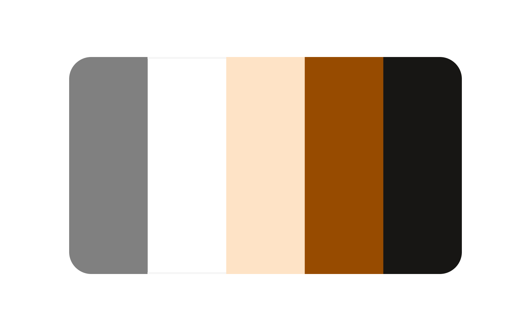
An easy way to harmonize your
Each neutral
Add neutral colors to your color scheme to:
- Create options for increasing
contrast - Harmonize colors that are competing for attention
- Serve as a background for the rest of the colors
References
Top contributors

Topics
From Course

Share


Similar lessons

Intro to Color Theory

Color Properties
