Confirmation dialogs
Confirmation dialogs protect users from costly mistakes. When someone clicks delete, cancels a subscription, or discards unsaved work, these patterns create a critical pause. Without standards, products develop inconsistent friction. Some actions are too easy to reverse while others provide unnecessary warnings. With a systematic approach, you can safeguard important actions without frustrating users.
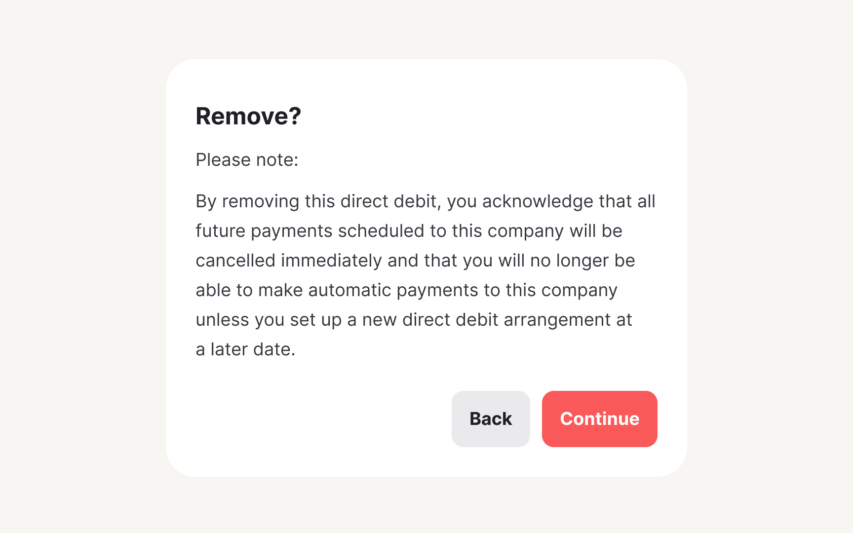
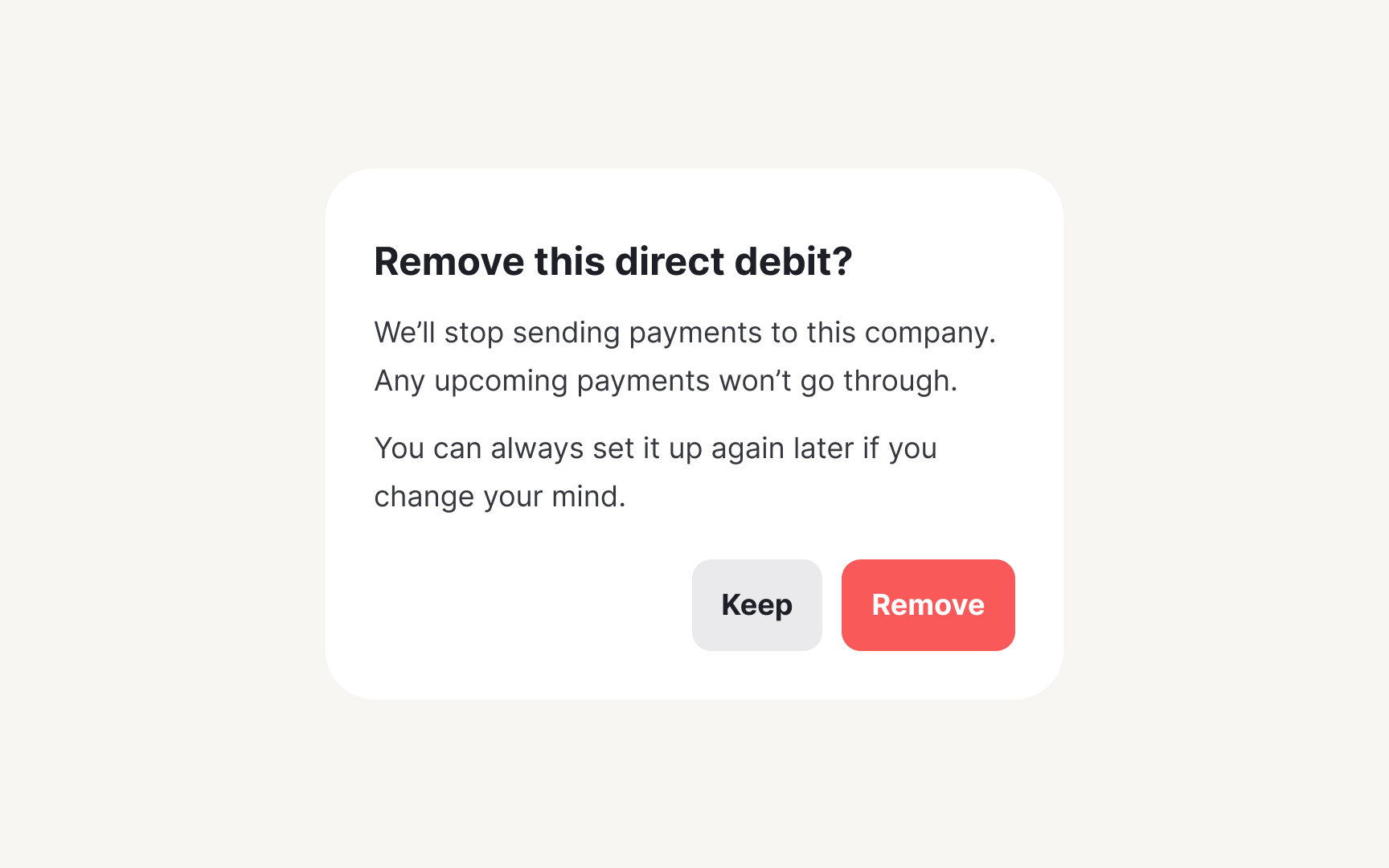
Make confirmation messages based on the severity of the consequence of the action. Low-impact actions need minimal friction: "Discard draft? You can start over anytime." High-impact actions require clear consequences: "Delete account? This permanently removes all data, projects, and access. This cannot be undone." Match the interruption level to the potential regret level.
Document button labeling standards. Instead of vague "Yes" and "No" buttons, use specific action labels that match the user’s intent and the context of the dialog.[1] Create accessibility guidelines ensuring screen readers convey the severity. This prevents both accidental deletions and confirmation fatigue.
