Destructive buttons
Destructive buttons handle risky actions in Apple interfaces. They warn users about operations that delete content, remove data, or make significant changes that are hard to undo.
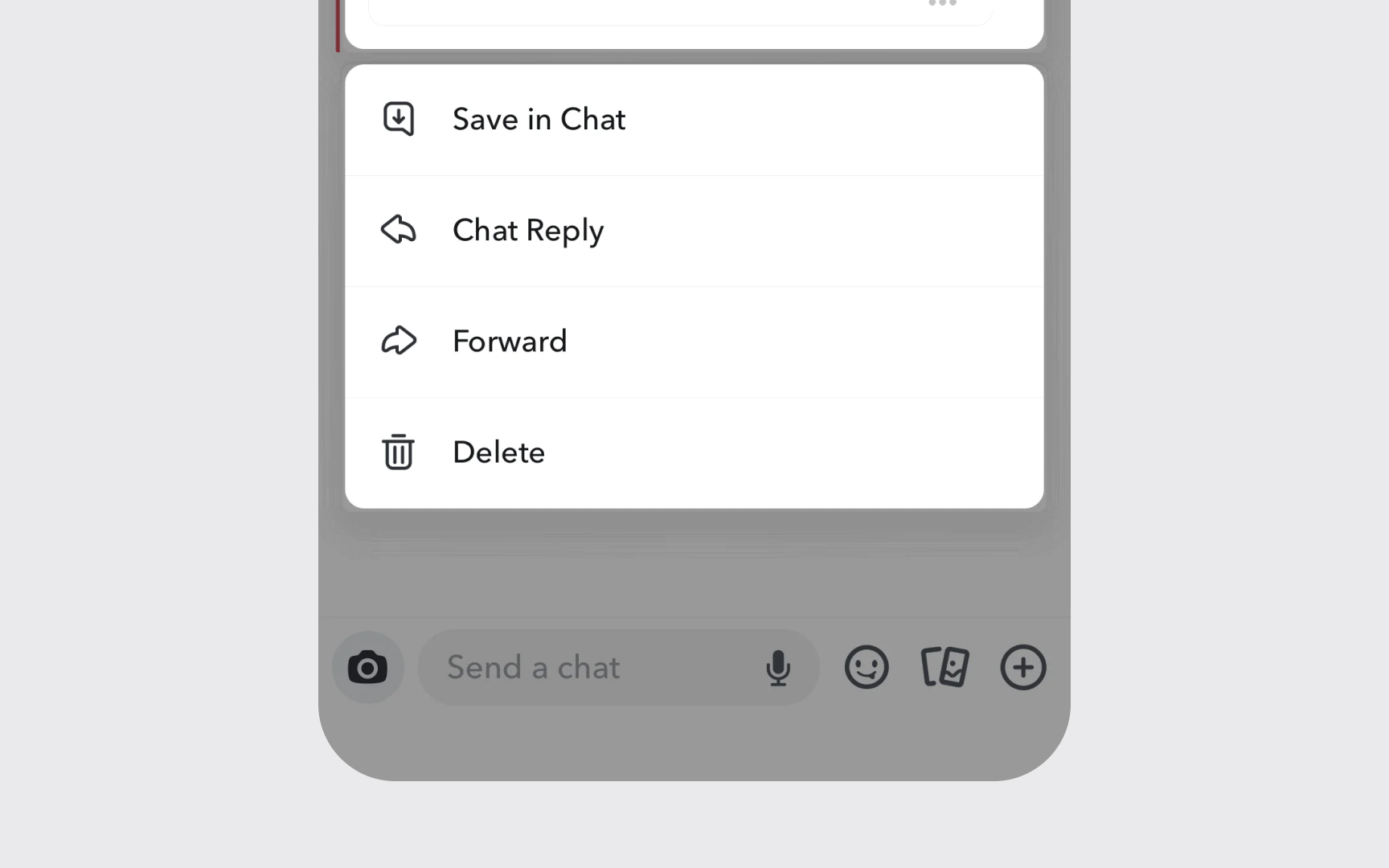
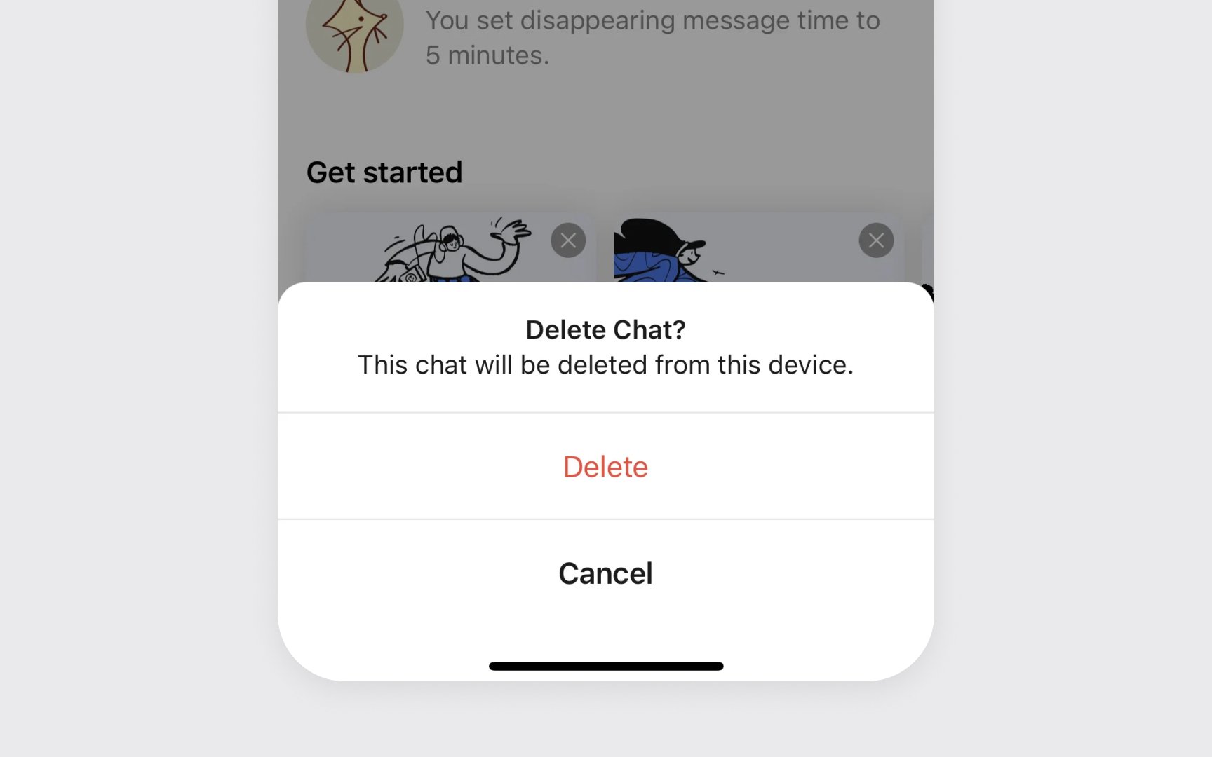
These buttons use red text with a plain style for clear warning. The color red signals caution, while keeping the button's appearance simple and consistent with other interface elements. In confirmation dialogs, destructive actions switch to filled red style for final confirmation.
Position and spacing matter for destructive buttons. They should be placed away from frequently used actions and include enough padding to prevent accidental triggers.
Common destructive button patterns include:
- Plain red style. Red text without background for initial actions
- Red filled. Used in confirmation dialogs for final actions
- Clear labels. Direct words like "Delete" or "Remove"
Pro Tip: Always ask for confirmation before completing destructive actions that can't be undone.
