Row content patterns
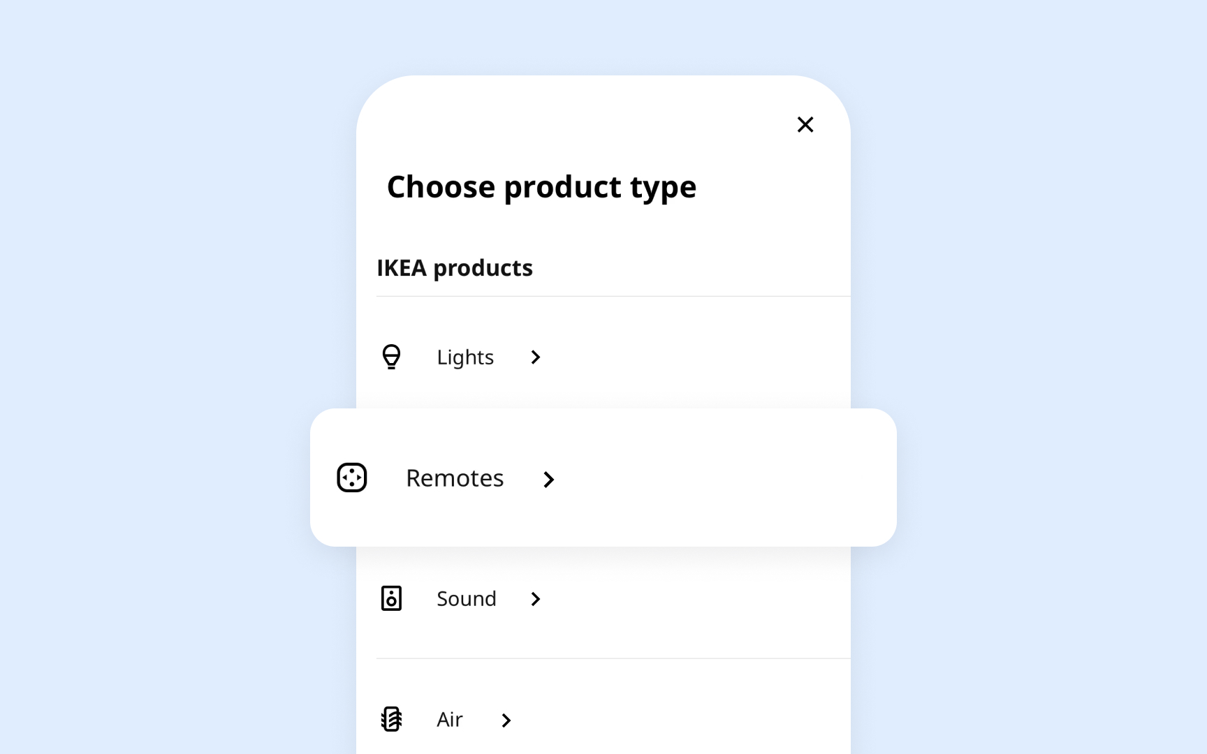
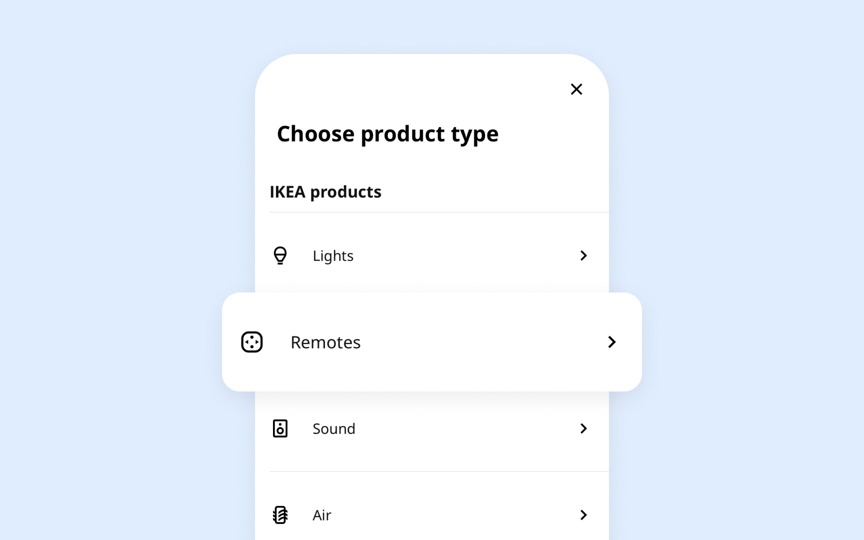
Every list or table row must organize content in a way that helps users quickly scan and understand the information. Whether it's a simple text label or a complex arrangement of images, text, and controls, row content follows specific patterns that maintain clarity and consistency.
Key guidelines from Apple HIG:
- Content hierarchy: Places primary information at the start, supporting details follow
- Image sizing: Maintains consistent dimensions for icons and thumbnails across rows
- Text balance: Uses prominent text for main content, lighter weight for secondary details
- White space: Adds breathing room between elements without creating gaps
- Action placement: Positions common actions at the trailing edge of rows
- Vertical rhythm: Keeps consistent spacing between elements across all rows
Pro Tip: Use system-defined spacing constants to maintain consistent gaps between row elements across your entire interface.
