Segmented controls
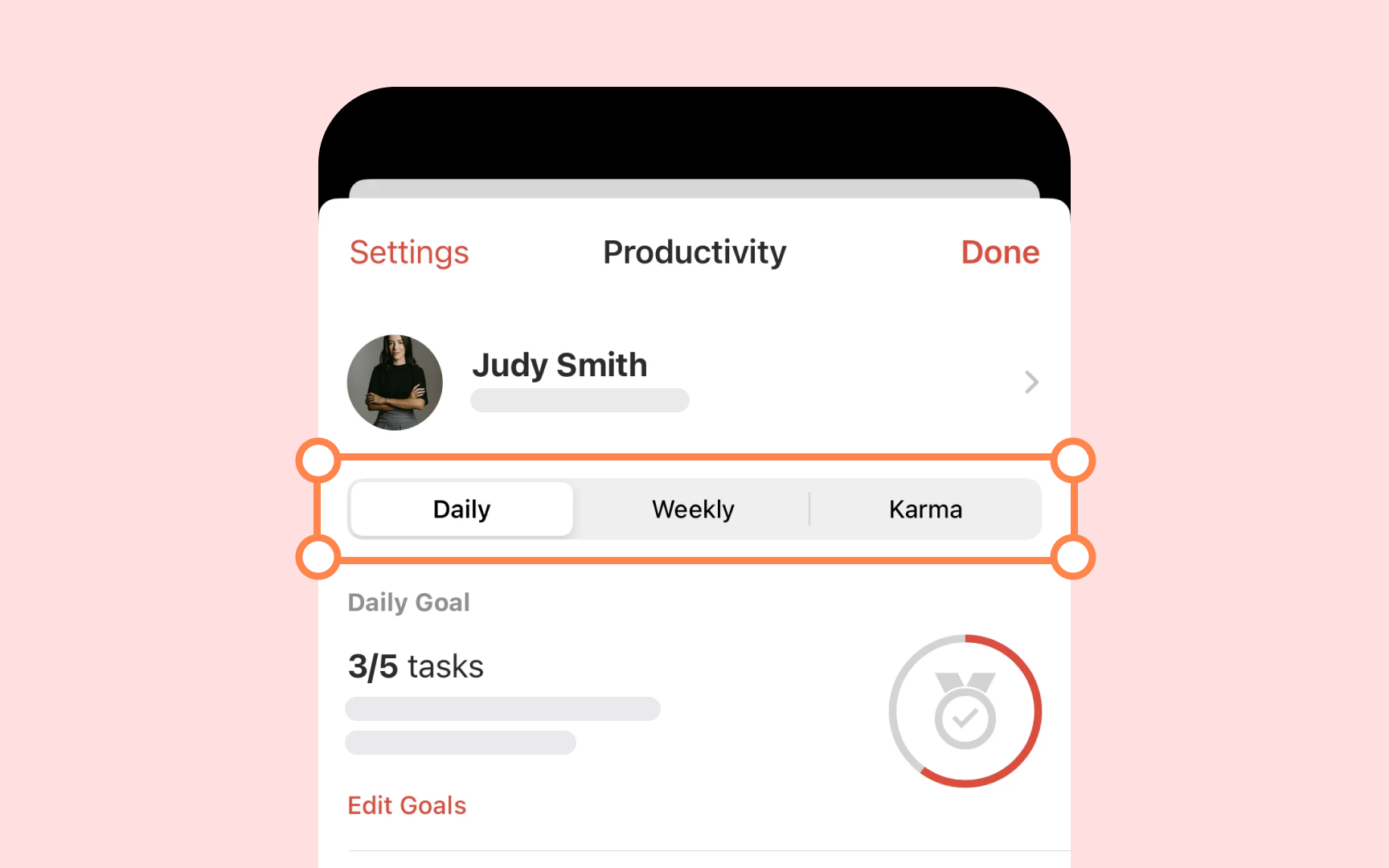
Segmented controls divide related choices into distinct sections that affect the same content or view. Like tabs in a folder system, they help users switch between different viewing options or modes while maintaining the context of where they are in the interface.
Key guidelines from Apple HIG:
- Control purpose: Groups mutually exclusive choices that affect the same content
- Visual grouping: Shows related options in a single horizontal row
- Selection states: Uses smooth transitions to show active segment
- Content display: Supports text labels, icons, or both to explain each option
- Segment behavior: Works in single or multiple selection modes
- Layout rules: Maintains consistent spacing and proportions between segments
Pro Tip: Keep segment labels short and clear — long text can make segments hard to read and the control too wide.
