YOJIT
Project overview:
This is a Ukrainian course project named Yojit that we have created as a design team.
The timeline was December 2022 – February 2023.
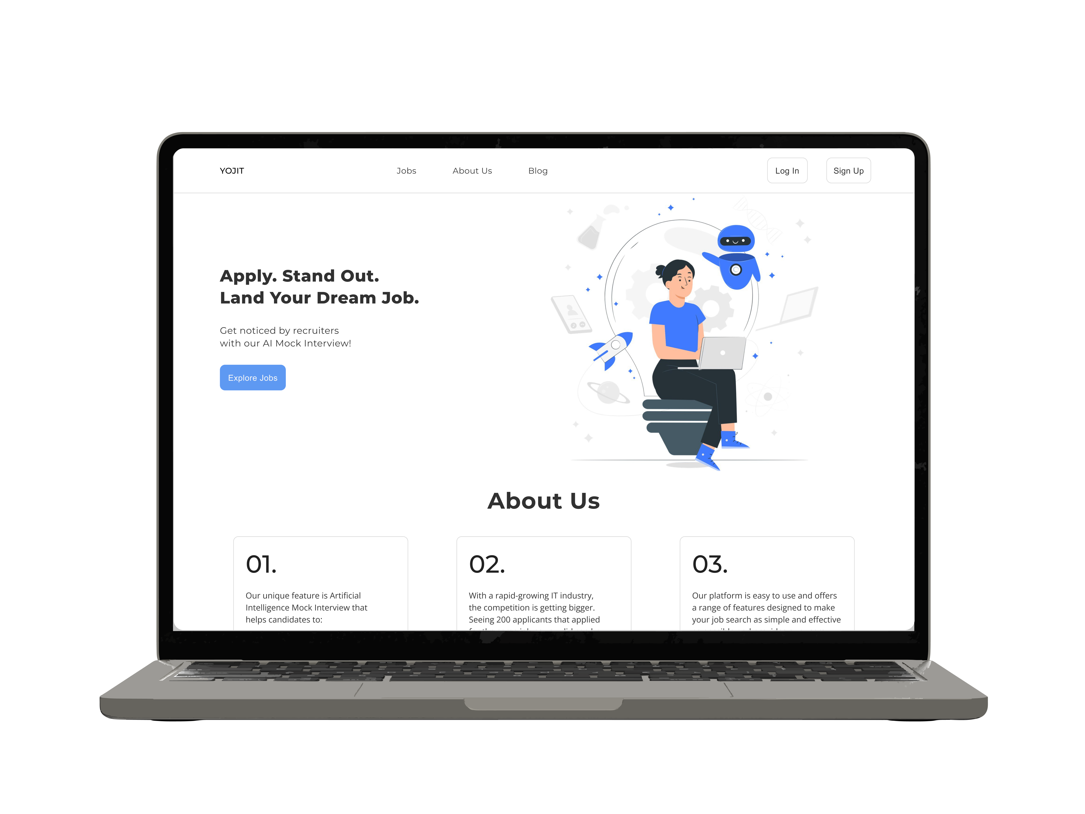
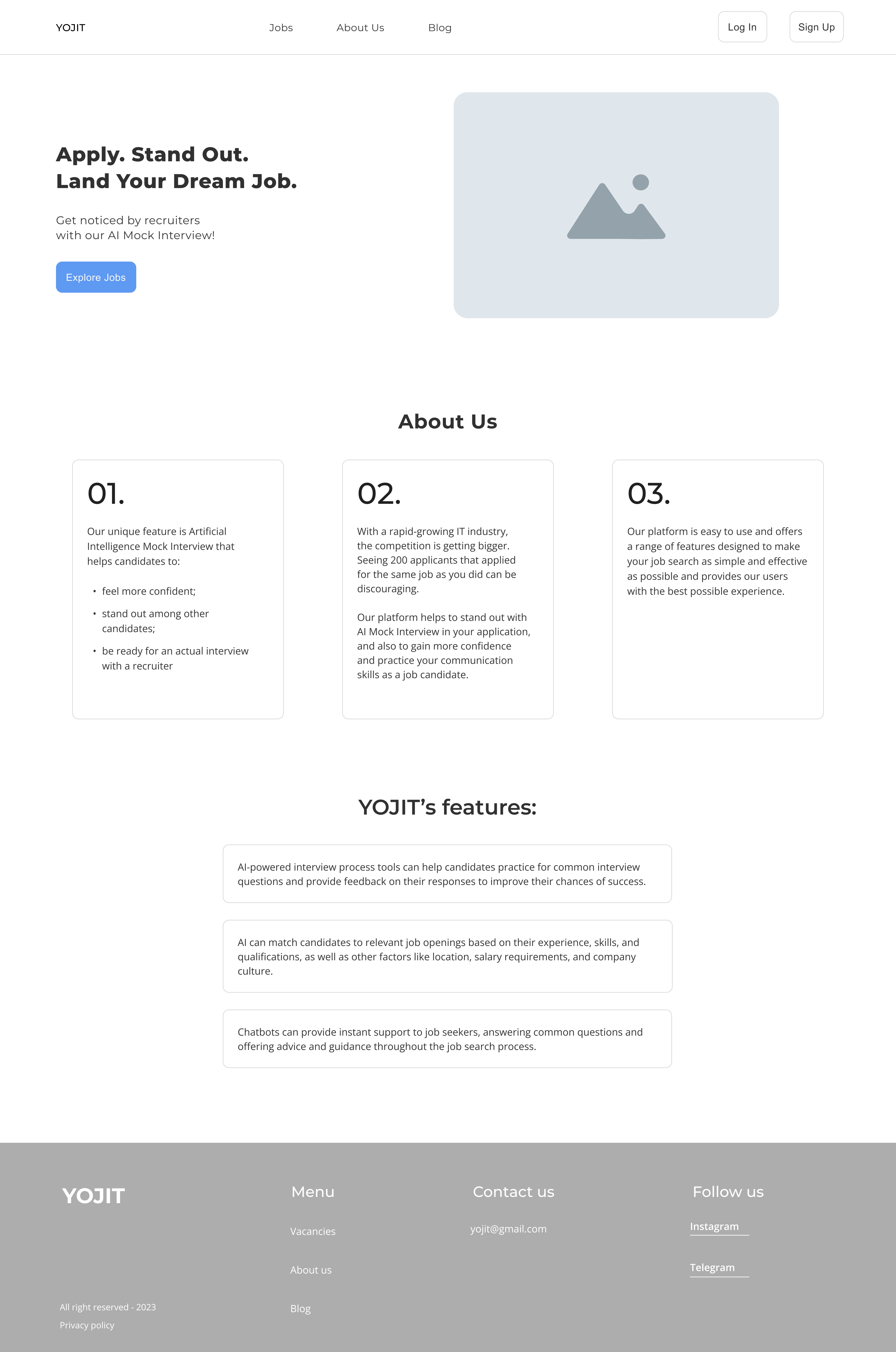
The unique feature of this project is Artificial Intelligence that helps candidates to stand out in the world of 200+ applicants. With the help of AI Mock Interview, job candidates will know what to expect from a company by answering text-based questions to AI chatbot.
It will also help recruiters to identify people they want to further communicate with and who fit company’s values.
Role
UX Researcher, UX Designer
Tools
Figma, FigJam, GoogleDoc, Notion
🗯️ The Problem In IT world everything is developing so rapidly that you are scared to miss something. It is especially frustrating for people who are looking for a job and see that 200 people had applied for the same vacancy. Companies and candidates spend a lot of time on the first "contact", the first interview. The idea is to improve the job search experience and connect IT employers and IT professionals in the best and fastest way for both parties.
Methodology - Design Thinking
Our team decided to use the Design Thinking Methodology for this project, because of its flexibility and orientation on users’ needs and desires.
📝 Empathize:
- Secondary research
- Pre-screener
- Competitor Analysis
- User Interview
✅ Define:
- Value Proposition Canvas
- Personas
- Customer Journey Map
💡Ideate:
- Brainstorming
👩🏻💻Prototype:
- Sitemap
- Wireframes
- Prototyping
⁉️ Test:
- Usability Testing
Empathize
Design brief
As it was a UX Design course project, our team went through all the stages step by step. We started from creating a brief where we covered questions about business goals, the market situation, target audience, main idea of the project, description of the project, contacts, deadlines, etc.
Secondary research
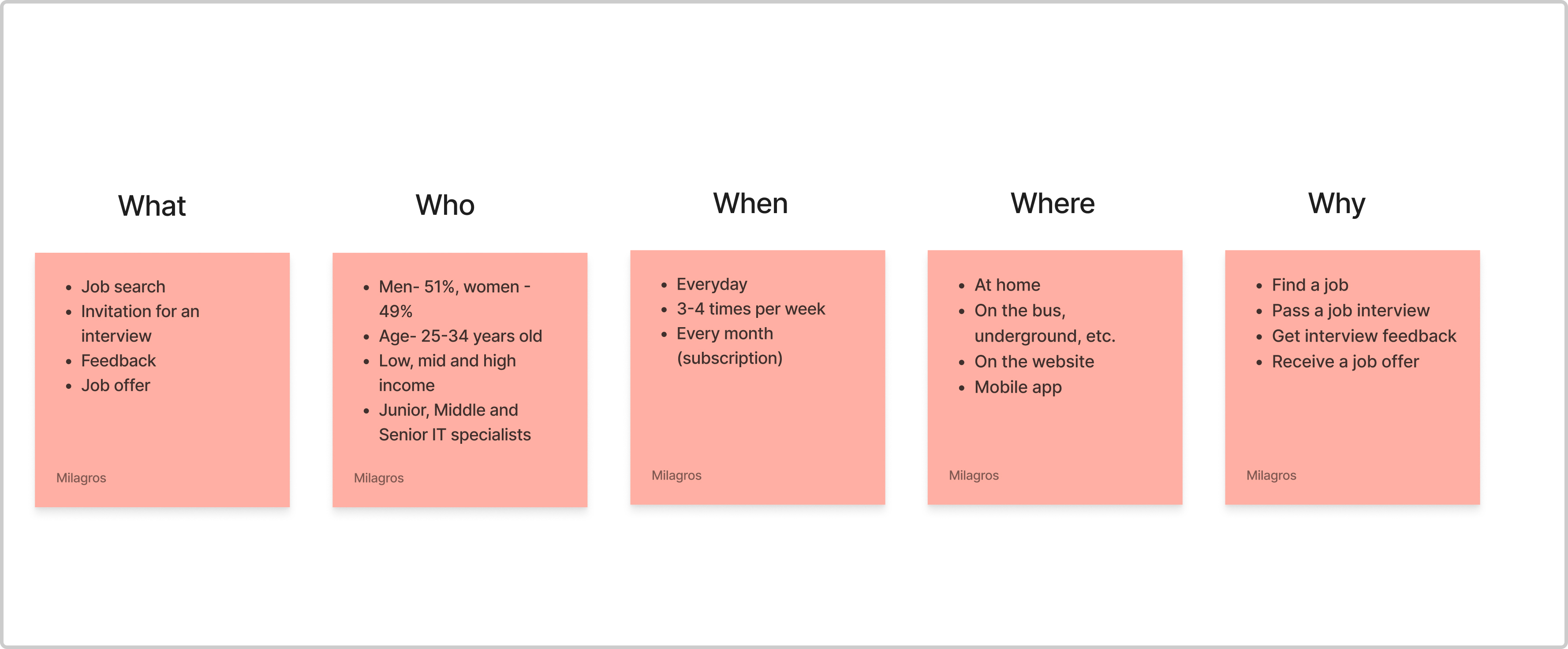
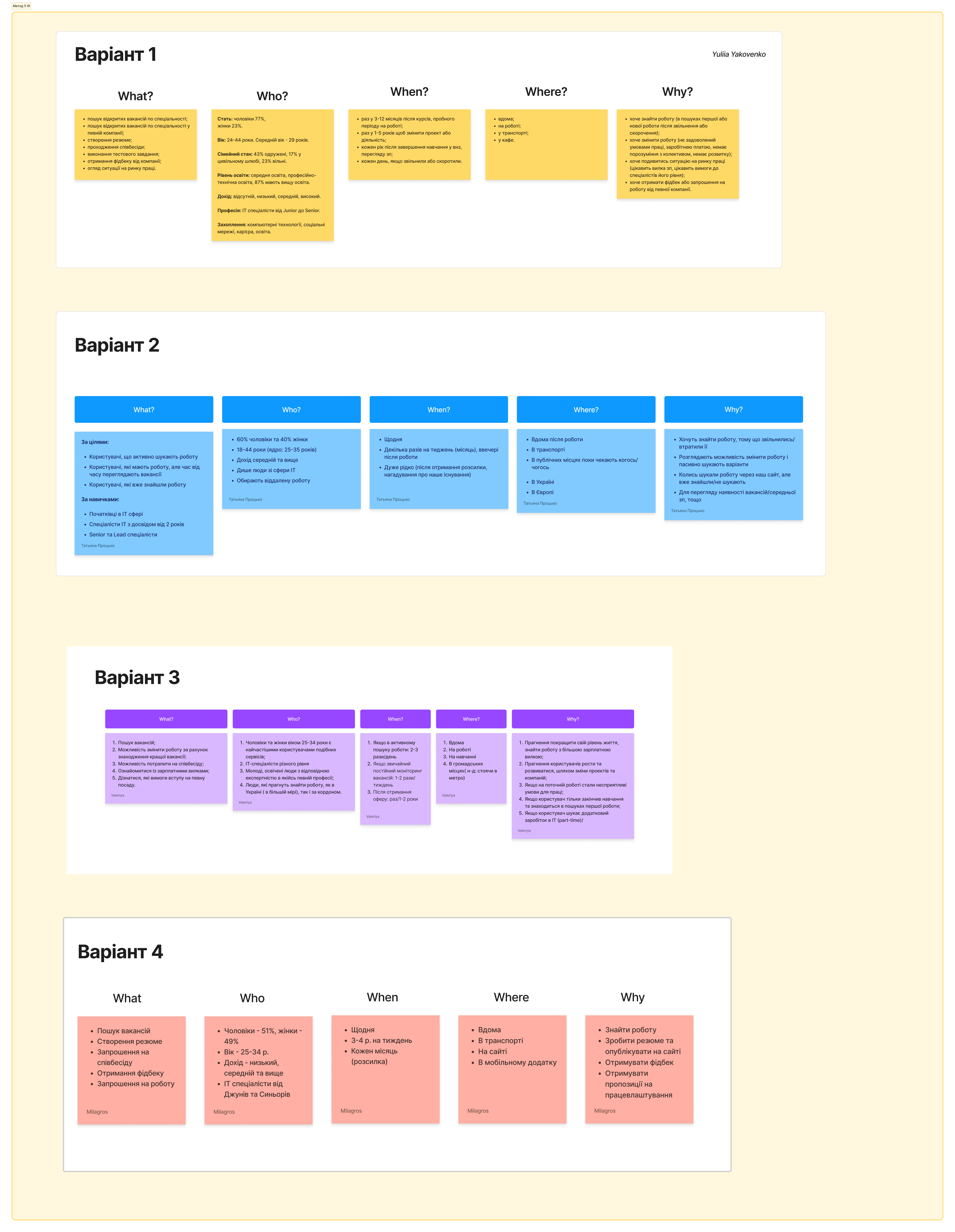
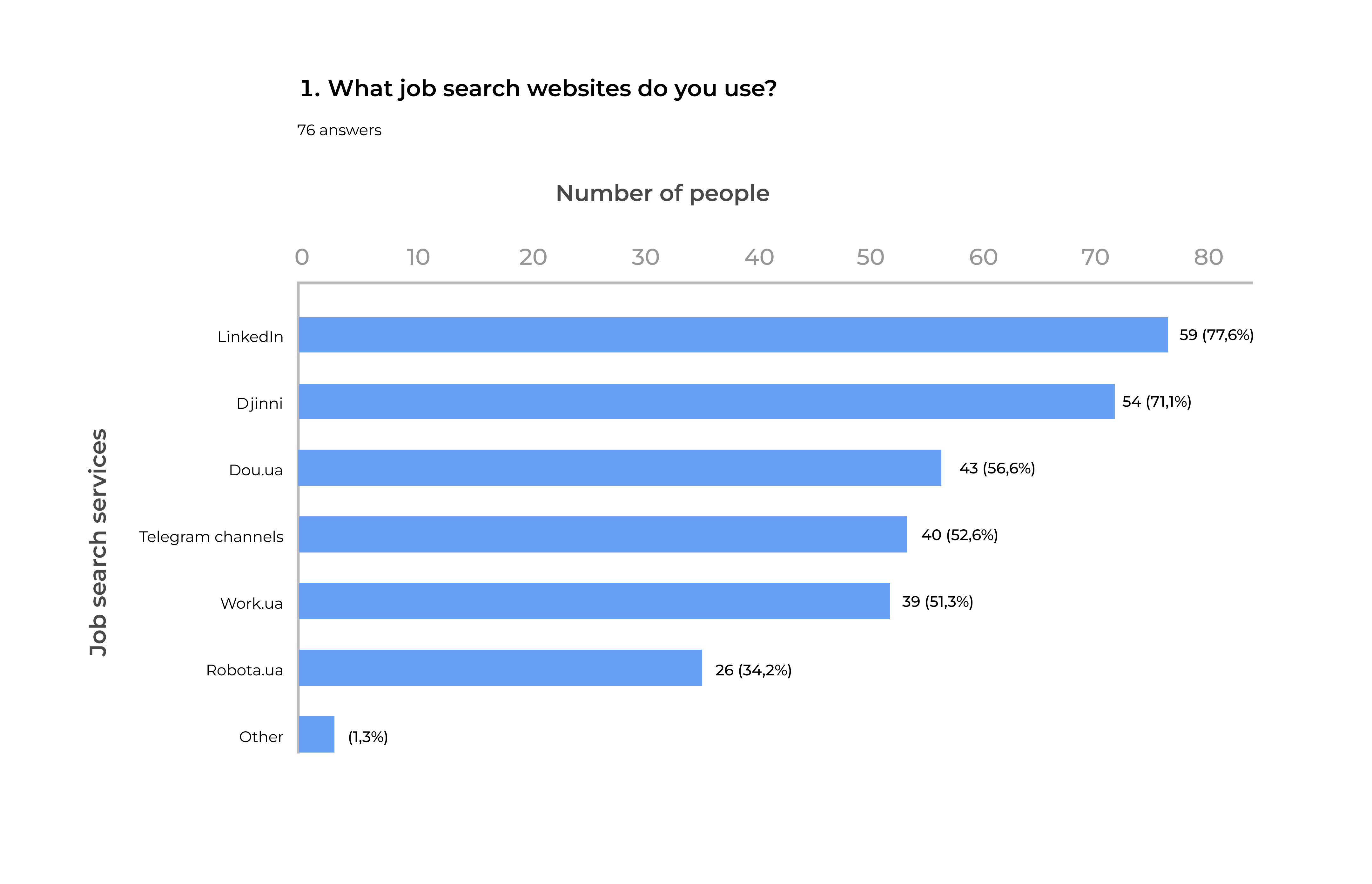
We did competitors’ analysis to find out the target audience and see their commentaries and feedback on forums. We analysed many Ukrainian job search websites - robota.ua, work.ua, djinni, dou.ua, etc. to find out what pros and cons they have. As a result of the competitors’ analysis, the "5W" method (see below), ethnographic research, research analysis from various job search services, we were able to identify our target audience.
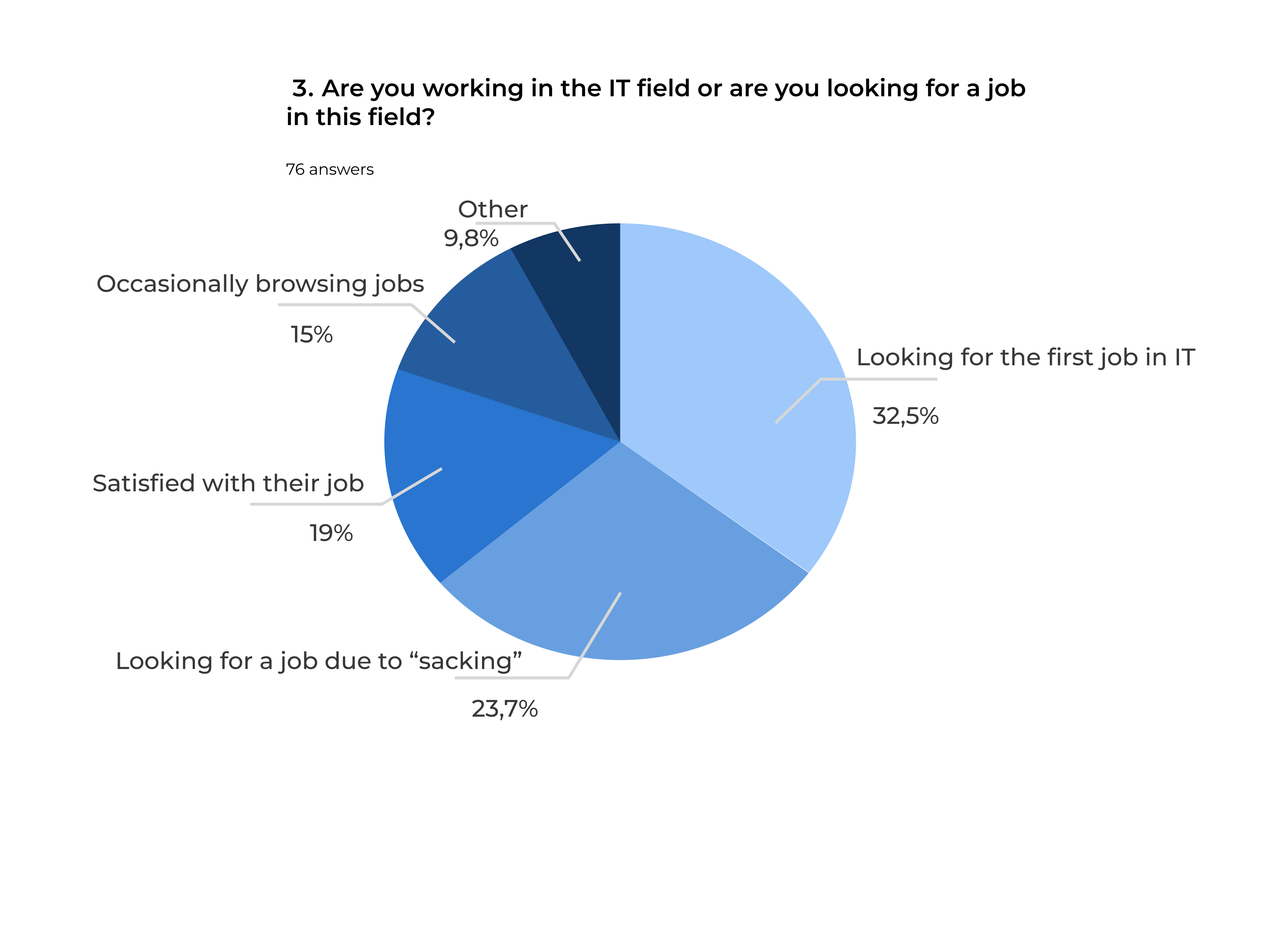
- Target audience analysis - we have identified 4 groups of the target audience, namely:
- People who want to get their first work experience (usually, these are students or graduates of universities, courses (this will be an audience aged 18 to 22), or older people who already have work experience in other fields, but the conditions do not suit them, they want to master a new direction in the IT field).
- People who want to find a job due to the loss of their previous job (these are IT specialists from Junior to Senior who are looking for work due to the loss of the previous one, they can be people aged 18 to 44 who want to restore their previous social and material status and not lose their position in the IT market by finding jobs that match their level of experience. Such users are actively looking for a job, so they visit relevant resources several times a week and strive to be among the first to respond to vacancies).
- People who are working but want to change their work conditions (these are IT specialists of the Middle to Senior level aged from 25 to 44 years. For such users, quality and interesting work is important to them, so they are in no hurry to find a job. These people want to change working conditions, get a better offer or work in a specific company. To do this, they occasionally look at new vacancies 2-3 times a week, pass test tasks and interviews in order to find a job of interest to them with an appropriate salary and desired working conditions).
- People who are working and satisfied with their job (these are people who study IT courses and want to combine education and work in the IT field. Also, these are people who study at the university and want to try themselves in the IT field, starting with a part-time job. Or people who already work in the IT field (or in another field), but want to improve their standard of living and earn more money for their needs).
Quantitative research (Pre-screener)
After defining our target audience we created a questionnaire (pre-screener) and posted it on social media for people to fill in, so we could sort the audience we needed.
User interview
We divided user interviews in four groups according to our target audience. After the interviews we gathered as a team and shared the insights which mostly intertwined with each other.
💡 Here are some of the interview insights:
- Irrelevant mailing
- Lack of relevant vacancies
- Lack of jobs’ description and requirements
- Inconvenient search and filtering
- No replies from recruiters
- No salary range or mention, etc.
Define
Value Proposition Canvas
After we analysed and transcribed our interviews, we created a Value Proposition Canvas to identify the pain points and offer a user-friendly value proposition.
Personas
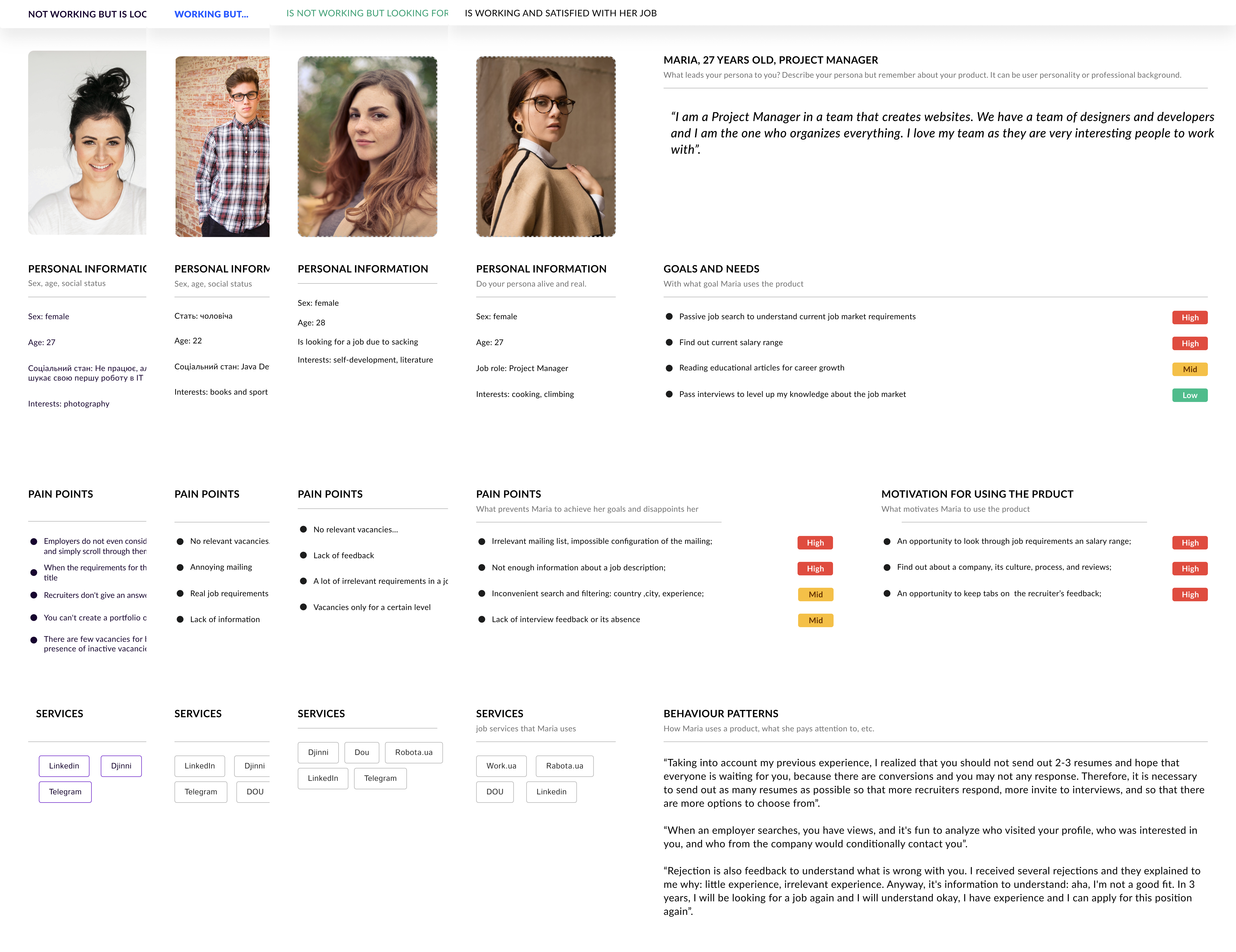
Then we created Personas based on real data and research to represent the different types of users who might use a service or product.
As we have 4 groups of target audience, we created 4 personas as well:
1 persona is Anna, she isn’t working, but is searching her first job in IT. These are her main pains:
- Employers do not even consider some job reviews and simply scroll through them without looking
- When the requirements for the candidate contradict the job title
- Recruiters do not respond after the interview
2 persona is Dmytro, he is working but looks at vacancies at times. These are his main pains:
- Availability of outdated job vacancies on the service
- Very often a mailing list arrives that does not meet the needs of the candidate
- The actual requirements of the vacancy do not correspond to those specified in the description
3 persona is Ksenia, who isn’t working because she lost her previous job. Her pain points are:
- Lack of actual vacancies, vacancies are outdated
- No replies to reviews or long replies
4 persona is Maria who is working and is satisfied with her job. Her pain points are:
- Irrelevant mailing of vacancies, impossible to configure it;
- Insufficient information on the vacancy: requirements, conditions, etc.;
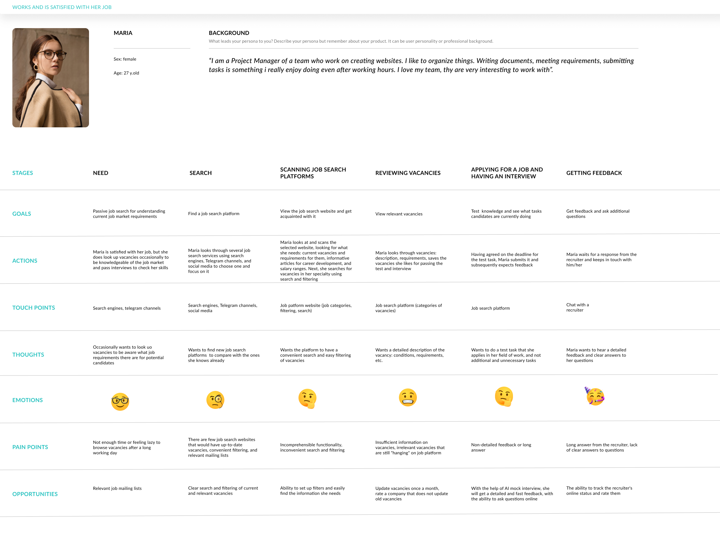
Customer Journey Map
Here are some of the Opportunities that we generated:
- Relevant mailing of vacancies of interest
- Clear search and filtering of current and relevant vacancies
- The ability to configure filters and easily find the information you need
- Update vacancies once a month, rate the company that does not update old vacancies
- A system of message statuses and notifications
- Artificial intelligence on the job search service will provide detailed and quick feedback, with the ability to ask questions online. AI Mock Interview will help to stand out and have a quicker interaction with a recruiter
- The ability to monitor the recruiter's online status and rate him for communication
- Constant updates of salaries and the ability to filter articles
Ideate
Brainstorming
- We conducted a classical brainstorming, where we chose a problem for which we generated ideas.
- The problem sounded like “Long responses from recruiters to candidates”
- Brainstorming session lasted from 20 to 40 minutes with each participant generating as many ideas as possible
- Then, we had to present our ideas and decide which of them would be the best by the Dot Voting method.
- After a discussion we came to the conclusion that the employer rating system was the best idea.
Prototype
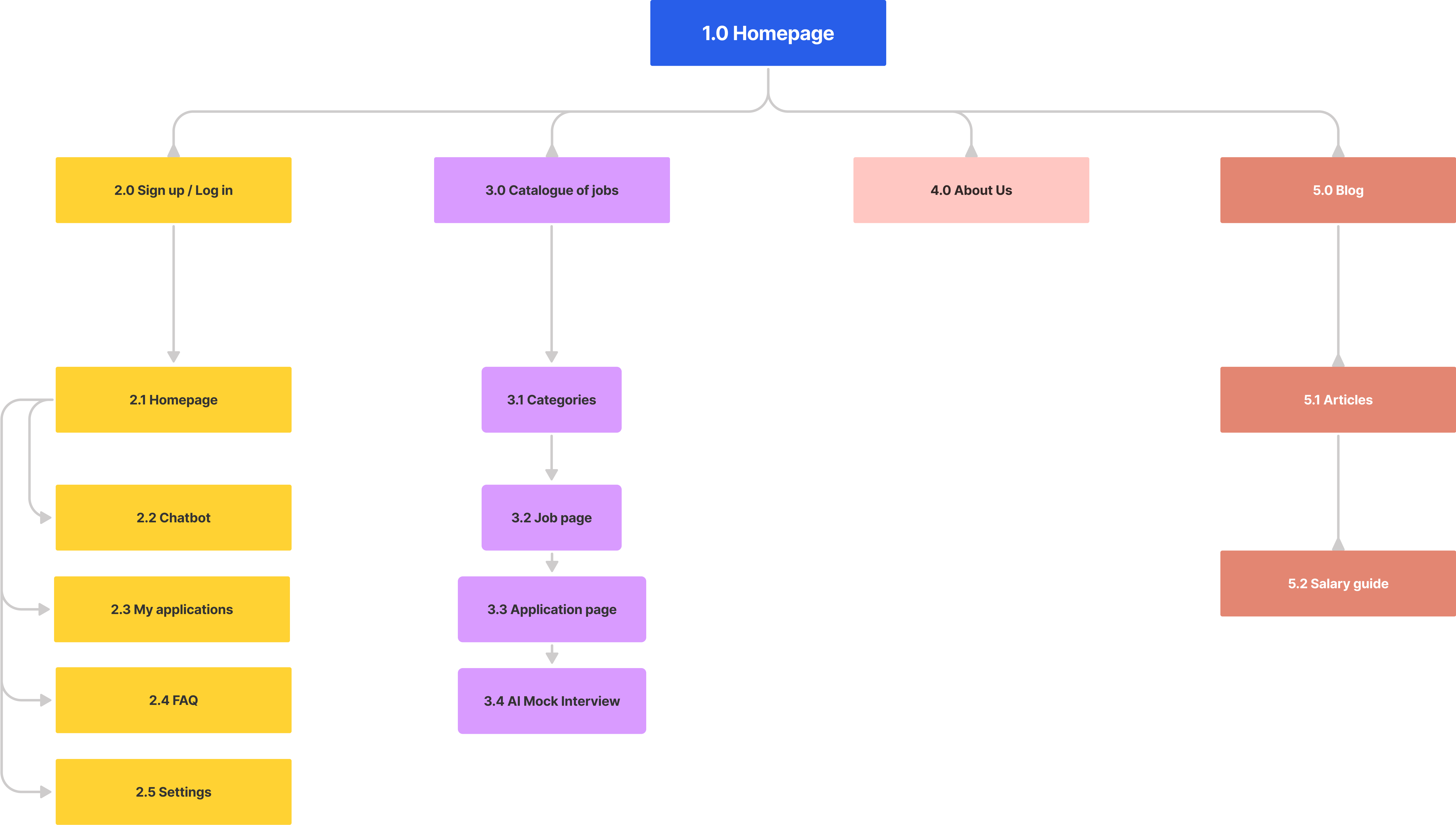
Sitemap
After group work we had to create our own sitemaps and wireframes.
I created a sitemap with all main pages that are essential for user experience.
Wireframes
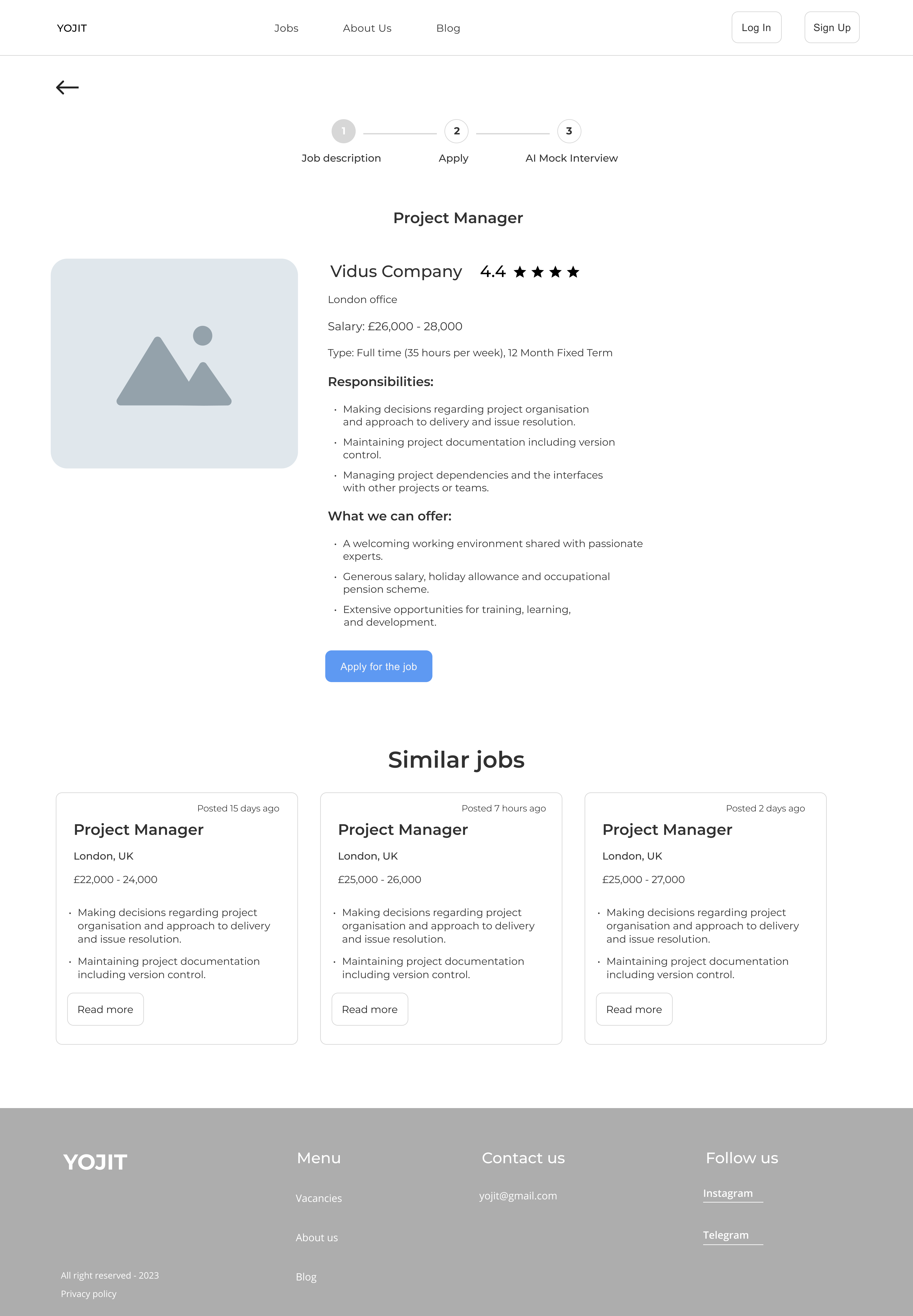
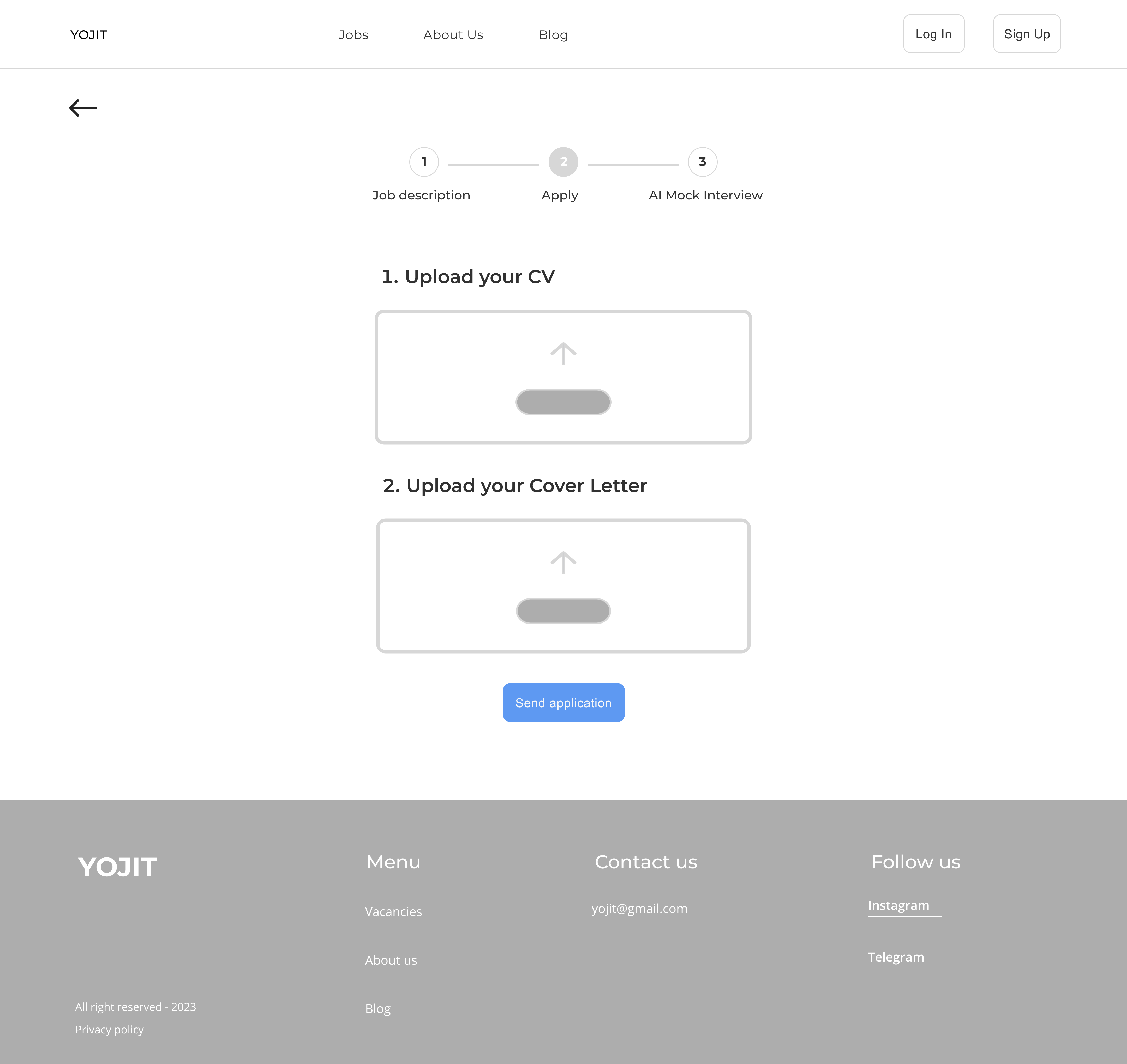
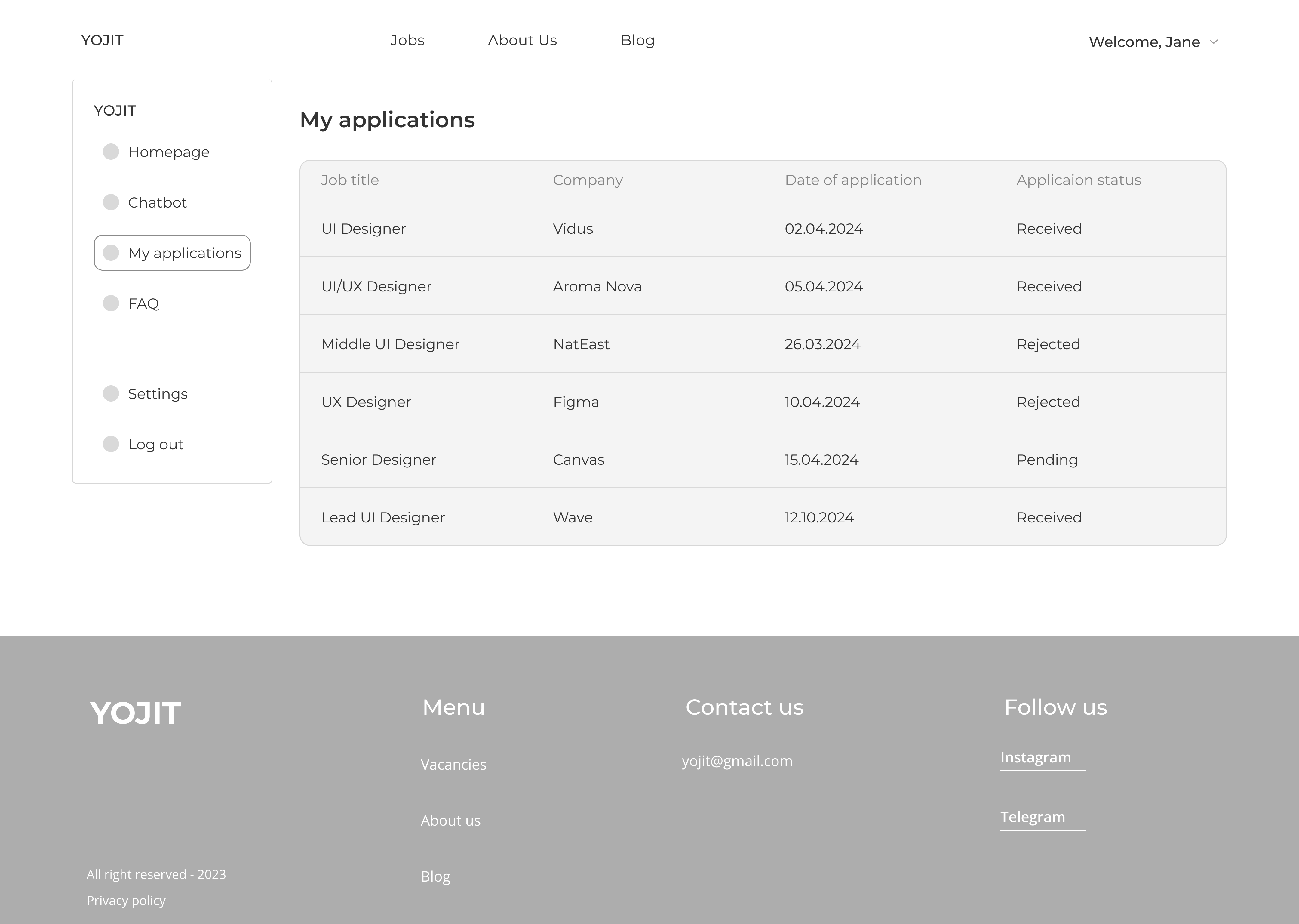
Following the sitemap, I created medium-fidelity wireframes for our project:
Test
Usability Testing
I conducted a usability testing with 4 participants from our user interviews.
The task: check the convenience of the service and whether it is easy to apply for a job.
Hypothesis: it will be difficult to figure out how to apply for a job.
Scenario: Imagine that you are a data scientist with 3-5 years of experience and are looking for an opportunity to improve your knowledge on the job, such as an interview. You've heard of a job website with artificial intelligence to match users with relevant jobs. Your job is to use this website to find jobs that match your skills and experience.
Target: people aged 27-35 who have a job but occasionally look at other jobs to keep their professional level in good shape.
Questions: Was it easy to find what you wanted on the website? Did you find search results with filters that match your search query? Was it easy to review and understand the details of the job posting? Did you find it easy to apply for a job? Overall, how would you rate your experience using an AI website?
Metrics: Completion rate (Completion rate) To understand how many users will find a vacancy without obstacles, and will help to identify weak points of the interface if many users do not understand what to do. Single Ease Question (SEQ) Is the user's journey clear from job search to interview.
The hypothesis was refuted: it was quite easy for the participants to go through all the stages.
CSAT = 100%
<aside> 💡 CSAT: Completion Rate: 4/4*100 = 100%
</aside>
My observations**:**
SEQ:
<aside> 💡 SEQ: (61 + 71)/4 =3,25.
</aside>
Search and filtering: Since the prototype was a demo version, it wasn't possible to press all the buttons and see all the features, but users had a general idea of how it works. For example, they were helped by indicators such as a down arrow for a dropdown or text in a placeholder that gave an indication of exactly what to look for. Details of the job advertisement: All students found the details of the job description. Apply for a job: All participants were able to easily apply for a job, mainly because it was "a click of a button".
Conclusion:
The participants were satisfied with the main functionality, because there were not many distraction markers and the functionality was very simple. The prototype was a demo version, so it was impossible to test all the functionality. However, there are things to work on and improve: for example, create responsive design and test it, create UI design of the project and run some more tests to make sure the interface works and meets users’ needs.
Tools used
Topics
Share
You might also like
SiteScope - Progress Tracking App

FlexPay

Mobile Button System

CJM for Co-Working Space - WeWork
Ubani Design System
Accessible Signup Form for SaaS Platform
Popular Courses

Introduction to Figma

Ethical & Responsible Product Design

