WattSense Sign in/ Sign up Page

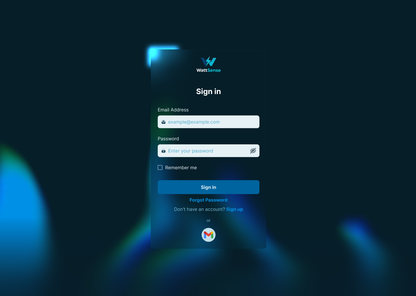
I designed the sign in and sign up pages for WattSense with a strong focus on power, energy, and modern SaaS UX.
The form uses a liquid glass style to reflect modernity and AI-driven technology. The glass effect adds depth without becoming decorative. I increased the frost level to maintain strong contrast and prevent any loss of readability against the background.
Dark mode was a deliberate choice. It reinforces a technical and energy-focused vibe, reduces visual noise, and creates a serious, industrial feel. It also helps key actions and data stand out clearly.
The primary color was chosen to represent energy, power, and technology. It feels electric yet controlled, which aligns with the product’s role in intelligent energy management.
Color contrast was carefully tested to meet accessibility standards.
- #0090E5 achieves a contrast ratio of 4.98:1, passing WCAG AA for normal text and AAA for large text.
- #78BCD5 achieves 8.10:1, passing WCAG AAA for normal text.
- #78BCD5 on lighter surfaces reaches 14.87:1, exceeding WCAG AAA requirements and making it suitable for critical UI elements.
Tools used
From brief

Topics
Share
Reviews
2 reviews

Okay, this one feels clean and professional right away 🔐✨ The sign-in / sign-up pages don’t try to overdo it, which is perfect for authentication flows.
I like how straightforward it looks no distractions, just clear fields and clear actions. That kind of simplicity builds trust, especially if Wattsense is dealing with something technical or energy-related ⚡👌
If I’d refine it a bit more, maybe add subtle reassurance cues like security notes or helpful microcopy for errors. Small touches like that can make auth flows feel even more solid 💬🔒 Overall though, clean, focused, and very usable.

This is really nice 👌
The glass effect feels modern without hurting readability, and the contrast choices are solid. Dark mode fits the product well and makes the main actions pop.
The color logic makes sense and feels intentional. Clean, thoughtful work overall.
You might also like

edX Sign-Up Page Redesign


Beautify Login page WCAG principles


Design Prioritization Workshop


Sanyahawa - Landing page Design

Uxcel Halloween Icon Pack


eWallet App Development Project

Visual Design Courses

UX Design Foundations


Introduction to Figma

Design Terminology
