Visit Badrashin


Feel free to leave comments and feedback!
---
I'm available for new projects: [email protected]
Portfolio: https://www.behance.net/youssefmu
Thanks.
Reviews
2 reviews

I really like the context and explanation of the project, I immediately understood the challenge and I really empathise with the target audience and their needs. The content is also informative which shows that the person wants to learn about the destination. The pages are tasteful looking and it makes me want to visit the location. It’s a beautiful website.
The logo and the photos are great! I would lean more into the visuals and use less of the dark overlay as I can see the photos are amazing, but they’re hidden behind that shade. This also affects how readable your buttons are. Also a tiny tip: removing the “Lorem ipsum” will really help polish your project.
I see the goal is to “Convince our persona to visit Badrashin” - for a project with so much detail about the audience I would recommend a specific problem statement that really shows you’ve tackled the core problem. It seems like the target audience has a lot of needs, but what is exact pain point we are solving with the solution.
Example of what your problem statement could be: "Travelers seeking sustainable, off-the-beaten-path experiences lack a platform that showcases Badrashin's authentic culture, artisanal shopping, local accommodations, and natural beauty."
Other than those points, its visually appealing and meets the goals of the intended audience. Nice work and keep at it!

Hello Youssef, your website design for Visit Badrashin is visually stunning and creates a beautiful, immersive atmosphere that perfectly captures the natural beauty of the location. The full-screen imagery and elegant typography work really well together aesthetically. However, I have some concerns about accessibility that would be important to address. The text overlaid on the background images has very low contrast, making it difficult to read, especially the lighter text elements. The buttons with outline strokes are quite subtle and may not meet WCAG contrast requirements. I'd recommend checking all text and interactive elements against WCAG AA standards (minimum 4.5:1 contrast ratio for normal text, 3:1 for large text and UI components). Consider adding semi-transparent overlays behind text or adjusting colors to ensure all users can comfortably navigate and read your content. These adjustments would make your beautiful design accessible to everyone.
You might also like
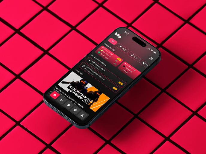
Blip - Esport app design (Light & Dark UI)


Reimagining Asana's Color System


Customer Journey Map for a Co-Working Space

Responsive Main Screen


Latios - Free Portfolio Template for UX/UI Designers

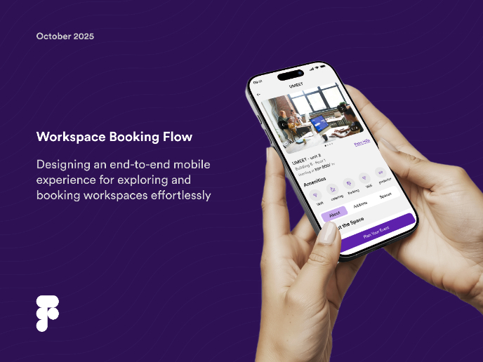
Workspace Booking Flow - UI/UX Design

Popular Courses

UX Design Foundations


Introduction to Figma

Design Terminology
