
Reviews
2 reviews
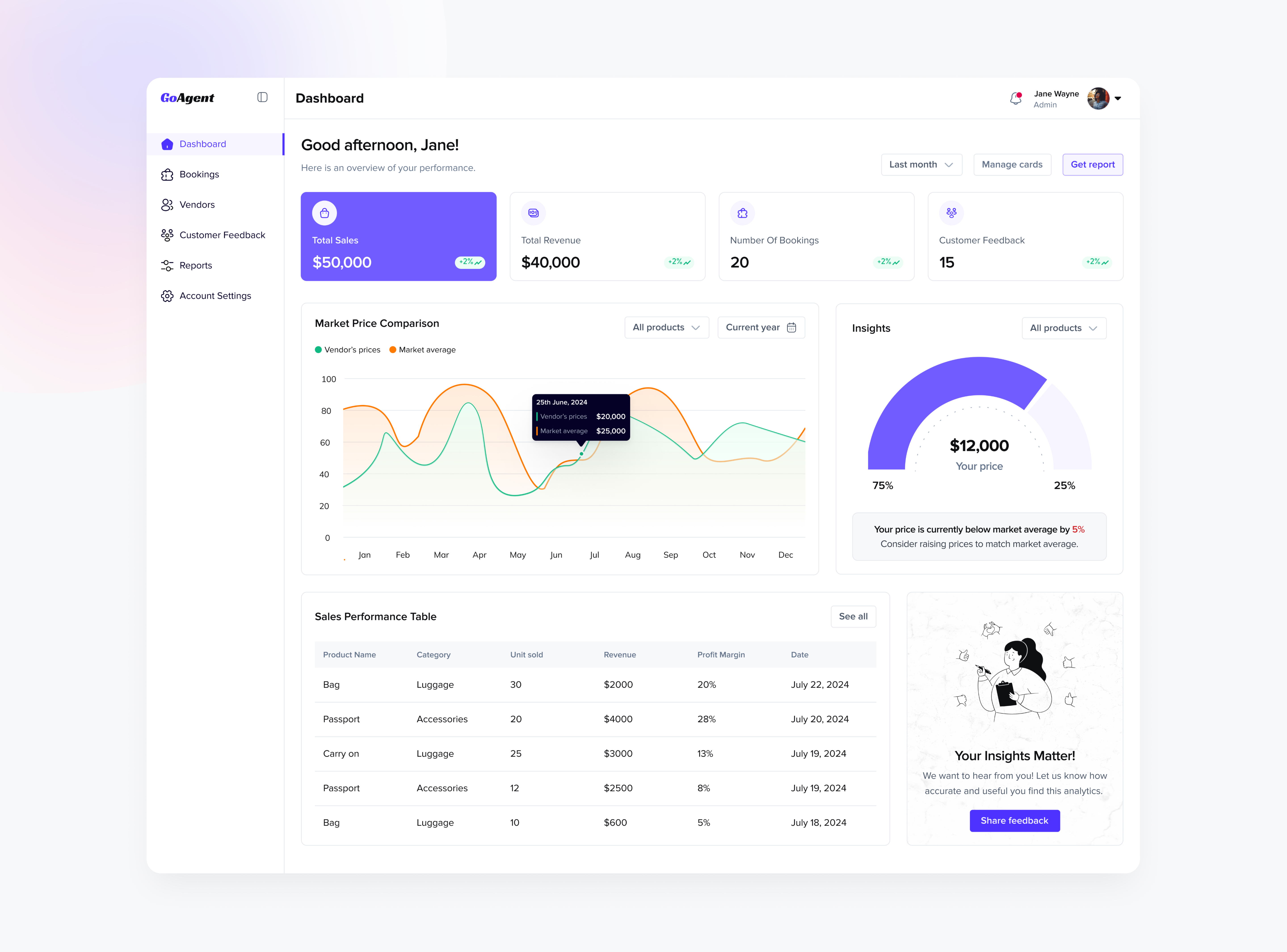
The dashboard UI design looks standard for SaaS. Colors are clean with accessibility considered.
Questions:
- How to best interpret the "Insights" card?
- What does the orange dot indicate on the left of "Jan" in "Market Price Comparison" card?

I liked the design presentation, specially the gradient you used on the top left corner.
Apart from this, the use of colors and typography also looks good.
One small suggestion - you can add a logout button on the left side navigation, which can make actions easier for the users..

The design is clean, well-organized, and easy to navigate. The color palette is also thoughtfully chosen and enhances the overall look and feel.
18 Claps
Average 4.5 by 4 people
You might also like

Project
Pulse — Music Streaming App with Accessible Light & Dark Mode

Platform & DeviceFor this project, I designed Pulse, a mobile music streaming application for iOS devices (using the provided mobile templat

Project
Islamic E-Learning Platfrom Dashboard

Visual Language & Color I wanted the interface to feel like a quiet room you'd actually want to sit in and study. The warm neutrals - off-wh
Project
SiteScope - Progress Tracking App

🧩 Project OverviewThis project showcases the design of a mobile login and sign up experience for a construction progress tracking app. The

Project
FlexPay

The onboarding was designed to reduce financial anxiety, create a sense of instant reward, and encourage early action. Instead of overwhelmi

Project
Mobile Button System

As my first ever ux design attempt, I tried to go with a simplified approach with only a few button types and states. I kept the color palle

Project
CJM for Co-Working Space - WeWork

This project presents a customer journey map for WeWork, created to understand the end-to-end experience of a remote professional using a co
Popular Courses

Course
UX Design Foundations

Learn UX design fundamentals and principles that create better products. Build foundational knowledge in design concepts, visual fundamentals, and workflows.

Course
Introduction to Figma
Learn essential Figma tools like layers, styling, typography, and images. Master the basics to create clean, user-friendly designs

Course
Design Terminology

Learn UX terminology and key UX/UI terms that boost collaboration between designers, developers, and stakeholders for smoother, clearer communication.