Using Design to Create a Better Team: Reducing Rework by 21% with a New Handoff Workflow


Summary: In this article, I will show in detail my process to develop a workflow and handoff template with a development team, using good design thinking practices to solve a problem regarding consistency between the design created and the product developed.
📔 Overview
Amo Promo is a tourism company from Minas Gerais with headquarters in Belo Horizonte, having within its umbrella 4 products categorized as e-commerce and 1 product focused on the affiliate market. For this reason, each product has a squad with developers and designers, who daily exchange and work together in the construction of new features and maintenance of their systems.

🤝 The team
For this project, the selected team was composed of people with more experience within the company, being them:
- 🖥 A Senior Product Designer/UX Designer
- 🖋 A Design Lead
- 📱 The development team of the company's flagship product
I was the Product Designer who worked and co-created with the development team, mapping all the pains of the designers and people involved in the technology area.
🗓️The current scenario
The only interaction between designer and developer at Amo Promo was done in scrum ceremonies. In the company's reality, the designer only stood as a support pillar in dailies, refinements and plannings, where the handoff usually occurs, in which usually the only deliverable was a figma link for the team, which should strive to understand what should be done and where each asset, interaction and flow is located. For understanding, a simple figma that represents a mobile checkout flow can look like this:
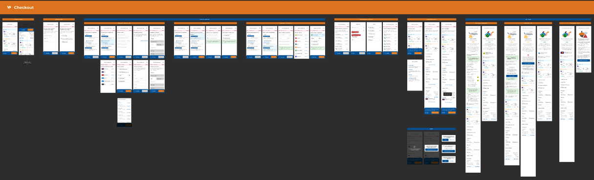
With this unstructured process, it was not uncommon moments of review in which the developer presented a project and the designer discovered that everything that had been studied, planned and ideated was not transformed into code the way he expected, and it was up to the team to run after a possible solution to correct that screen that could go up for production.
🚨 Problem
Before starting the project, we mapped the main pains of the people involved in the handoff process within the company, starting with an initial moment, where we talked to the entire squad that would be used for testing, moving on to conversations with the leaders of both areas and ending with a dynamic together with the QA's of the development team, as at the moment they were the people who suffered the most in these exchanges.
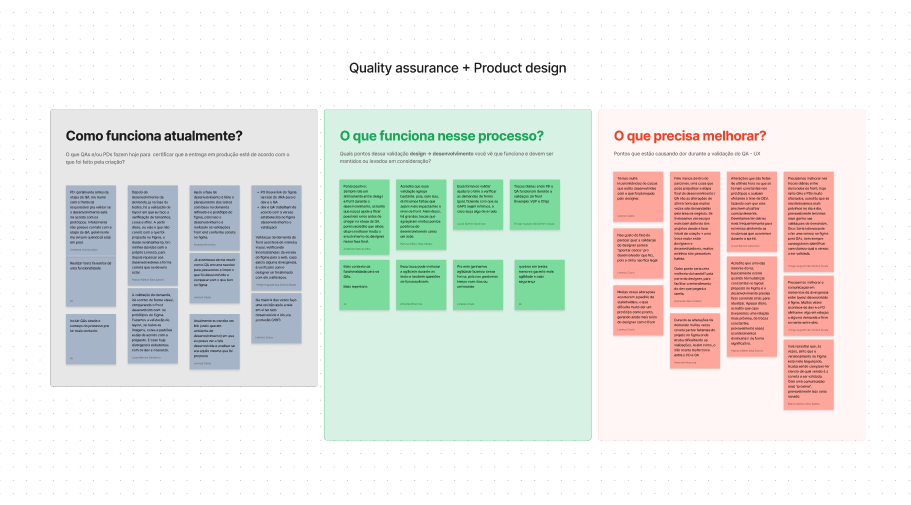
🚨 The main pains found in these processes, we list:
- The lack of a place where the designer and developer can create and insert technical elements of the product, as currently only 1 file was created, in which not only the technology and design team had access;
- The feeling of alienation of the developers regarding the decisions that were made during the design process, considering that the handoff was only the link of the figma artboard for the development team;
- The lack of design documentation explaining what problem that screen solved and what the objectives of that creation were;
- The centralization in the design team regarding finding possible flaws and redundancies in the product, as the development team was only called upon to create codes;
- There was no validation moment by the design team regarding what was coded, so that the designer would only discover what had been done in presentation ceremonies;
- The PO/PM of each squad did not have enough repertoire regarding the demands that the designer was working on, not understanding deadlines and how to fit possible projects into their sprints.
✅ On the other hand, we found some points that could be kept, as they worked well:
- Communication between designers and QA's worked very well, where quality people felt comfortable to clear possible doubts and validate problems that were found;
- QA's felt very comfortable regarding the understanding of the business and the decisions that were taken, as they were the people who exchanged the most with the design team.
🎯 Objectives
Our objectives, although not so tangible, were clear and direct: We needed to improve the consistency between our products and reduce the rework of Design and Development teams. In addition, it was a mutual need a deliverable that was defined as a Figma file where designers and developers communicate freely on the technical issues of deliveries, so, our motto for the project was:
➡ To provide the best working experience for all employees who work with design and technology, so they can work together for the improvement of the product.
🛣️ The process
Discovery
We began our discovery process by dividing efforts into two fronts:
1️⃣ Understand the side of the designers
For this analysis, we approached all the designers who work at Amo Promo and openly discussed the main recurring problems in interactions with developers, so that in the end, it was possible to find the common denominator that generated all the problems: Little documentation
As a second moment, the same people who were approached had a moment to share how they worked the Handoff in other previous professional experiences, in order to:
A) Find a model/flow that was consolidated in the market
B) Adapt all forms of work to better fit the team's routine
With these 2 simple steps, we collected a lot of information and valid models that could be used, but it was still necessary to understand our other user: The technology team.
2️⃣ Understand the workflow of the developers
In this second step of discovery, we discussed with developers, testers, product managers and leaders about the main "gaps” in the communication/interaction with the design team, and the points collected were:
- Lack of highlight to the different flows that a feature can have
- The short time between the developer receiving a new demand and the start of development (usually, the developer was aware of the demand that would be fulfilled, but only got to receive the screen in question during the planning, which occurs 1 day before the start of the Sprint)
- The lack of consistency between how the files were organized, so that each PD could follow a pattern confuse the developers.
- Not containing a place in Figma that talks only about design specifications, such as microinteractions, screen breakpoints and edge cases.
With all the pains collected, it was time to move on to the Ideation of the solution.
Ideation
The ideation phase was the moment to unite all the planning with the discoveries. First, we defined the ideal workflow, since we had the opportunity, we sought to improve the unstructured flow that was standard in the company. The organization of the stages was as follows:
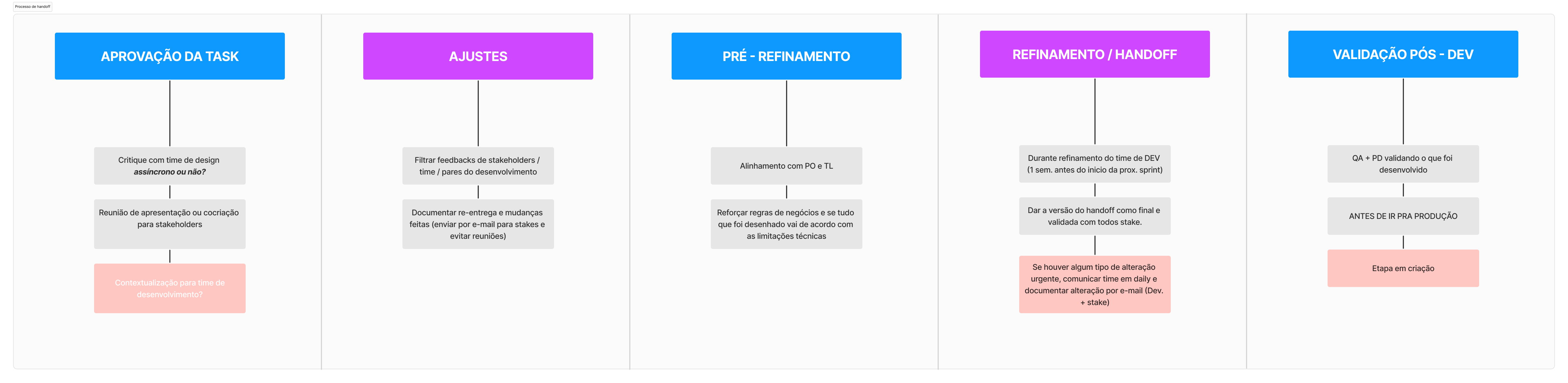
After the flow was defined, we sought the opinion of people who work in the organization of demands, such as Scrum Master and Product Owner, ensuring that this proposal would not negatively impact the agility of the development team. With the appropriate approval, we moved on to the second part:
🗂️ Organization of the figma of the products
One of the pains cited by the technology team was the lack of standardization in the Figma files, in which each PD followed a line of reasoning. At this moment, we gathered the design team again and co-created for the construction of a standard structure, which would serve all products and their peculiarities, making clear that in due circumstances, changes could be made. The model created followed the following logic of organization and releases:
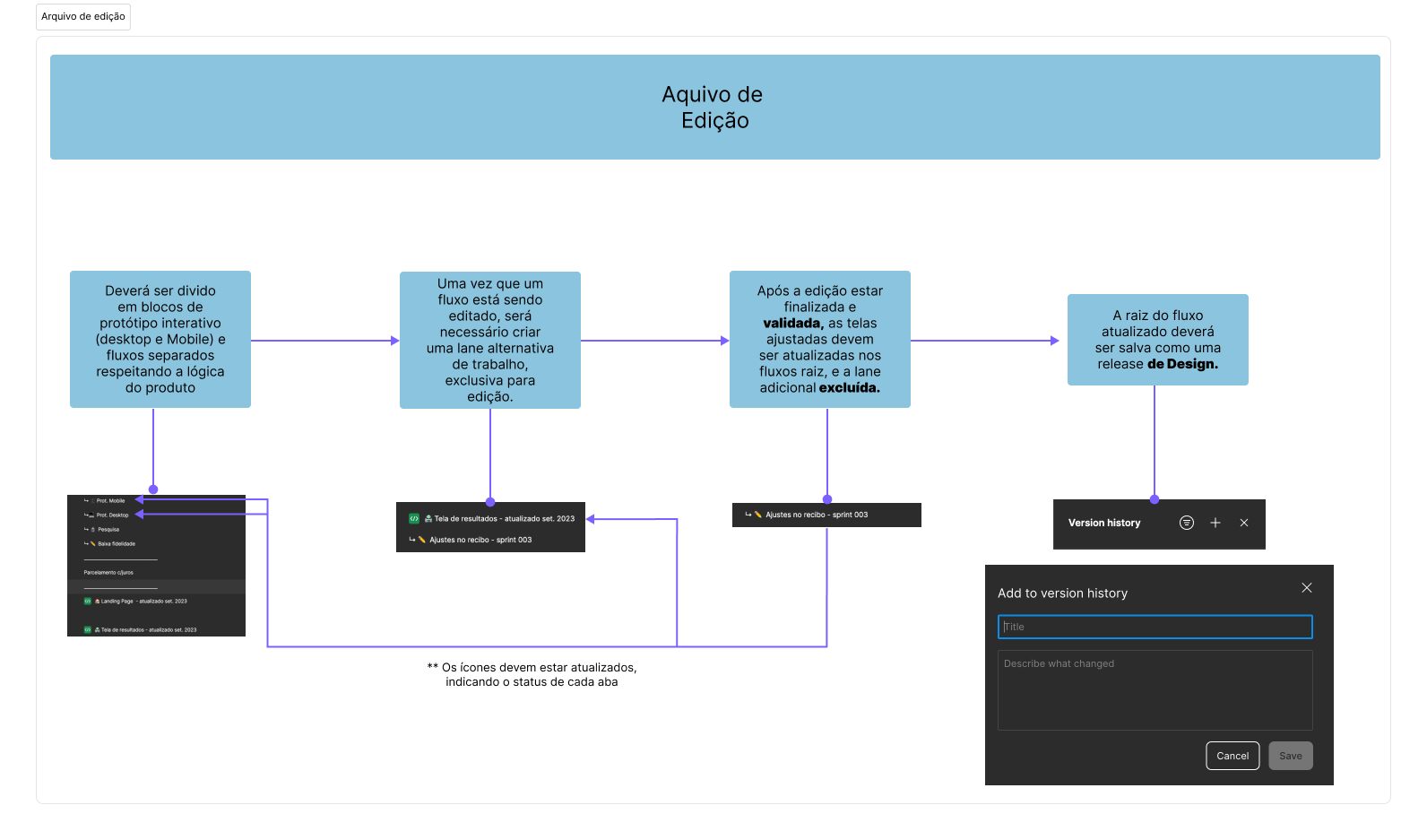
We defined that the best way to organize our products was as follows:
1 - The product must have 2 interactive prototypes (one mobile and one desk) that must always have the screens that are in production (maintaining consistency)
2 - Below the prototypes, the file must have 1 tab with each macro stage of the flow, also having the most updated screens (these screens do not necessarily have to be navigable)
3 - Each stage of the flow must have a tab classified as WIP (Work In Progress), which is where the Designer works his demands, being a free space to work without the need to keep everything updated.
With this organization, the team created a solid structure and of simple navigation, so that a developer can change squad and still find himself in the Figma of his new product. For better follow-up of updates, the design team started to work with releases, but I will not address this stage here.
With the figma of the product organized, it was time to create a Handoff template, where only designers and developers would have access.
📜 Amo Promo Handoff Template
Attacking the next problem that was mapped, we moved on to the creation of a separate document, where the designer can describe in all detail the specifications of his project, giving all valuable explanation to the developer. Thus, these were the categories we created within the file, making clear that not everything needs to be filled in, and at times more categories can be used:
- Static Screen: Section to show what the current screens look like with the new feature/flow implemented. All change notes should be cataloged in bullets.
- UI Specs: All UI specifications. They are guides to maintain consistency and standard throughout our system, however, they can be flexibilized and adapted according to need or limitations;
- Edge Cases: Edge Cases (or extreme cases) are unlikely situations or scenarios to happen, but they must be mapped and developed. Examples can be errors, empty results or even system drops;
- Navigation flows: The flow mapping should be inserted with arrows and elements that help the understanding of the new operation, showing what each element activates and the exit points of a screen;
- Assets used: In this tab, we leave all the files (images, videos, links, etc.) that were used in the project, so that the developer can easily find them.
The created file can be seen (and duplicated) at the link below:
Test
To put the template and flow created to the test, we adopted the skin test, using a Feature that had been worked on a few sprints by me and brought a lot of expectation to the stakeholders, so that in the old way of working, probably the development team would have some kind of rework to create the feature, be it due to inconsistency in the UI, lack of understanding of the rules or any other reason. Therefore, we understood this as the best moment to put the structured handoff to the test, as we trusted a lot in the solidity of what we created.
With the test defined, it was time to create the handoff of the Feature, which took about 1 day to be built and reviewed. The result was the following:
For this demand, the "Static Screen, UI Specs and Edge Cases” tabs were used, in addition to a documentation that detailed the reason for the feature, its impact and the metrics that would be followed.
⚡️ Results and learnings
After the handoff meeting (which was our test), it was time to wait for the start of development and follow the development team, keeping the Designer-Dev communication solid and daily.
With the feature duly developed, the results were clear and tangible, being them:
- 📉 Zero rework for the development team, ensuring that what was mapped and designed by the design team was effectively implemented by the developers.
- 📊 Reduced the time to fulfill the demand by 2 business days, initially estimated at 15 days exclusively for the front end, with development, review, and testing completed in 13 days!
With these results, it became evident to the design team that the test was incredibly validated. Consequently, we have continued using the handoff flow and template to this day (January 21, 2024). The most notable metric is a general 21% reduction in rework for the development team (tracked by JIRA), and the time to fulfill demands decreases with each Sprint.
🍀 With this, we can assert that Amo Promo now has a robust and validated Handoff process for all product squads in the company. This ensures that employees' focus is no longer on noting errors and inconsistencies but rather on working towards the evolution of each of their products!
Tools used
Topics
Share
Reviews
1 review

Hi Lorenzo,
Nice work on this project! Here are a few points in no particular order where I think you did well and where you could improve for next time.
The good:
• You laid out your thought process at each step well. I appreciated how you followed a design thinking framework and applied it effectively to an internal problem.
• I really appreciate how you have clear KPIs for your project and how you intentionally measured the effectiveness of your work.
To improve:
• This might not be as big a concern in your day to day work, but when presenting a case study online, be aware that likely over 50% of viewers will be seeing your study on a mobile device, myself included. With that in mind, while your charts and screens are full of data, they’re difficult to perceive and digest on a small screen.
• Related, there’s an old axiom “show, don’t tell.” You have a lot of text here and many will not spend the time to get through the good content you’ve put together. Find ways to condense the content, use big headings for structure, and make your screens more illustrative instead of so text heavy.
• Beware jargon. Here on Uxcel, most of your readers will follow what you’re saying just fine, but if I read this to most of my friends, they would have no idea what you’re trying to say. It might be challenging, but when you can simplify your language, I believe you’ll understand your product and process better and you’ll help others understand it better too.
You might also like

Smartwatch Design for Messenger App


Bridge: UI/UX Rebrand of a Blockchain SCM Product


Pulse Music App - Light/Dark Mode

Uxcel Halloween Icon Pack


Monetization Strategy


Designing A Better Co-Working Experience Through CJM

Popular Courses

Ethical & Responsible Product Design


Stakeholder Management


Product Vision & Strategy