Talenvo Website - Web and Mobile
The Rationale: Why I Built the Website This Way
The primary rationale was to create a high-converting digital storefront that validated Talenvo as a serious industry player before users even logged in.
- Establishing Authority: We needed to prove that Talenvo wasn't just another small project, but a scalable institution. The website had to look "investment-worthy."
- Conversion First: The site existed for one reason: to turn casual visitors into registered users. Every design choice was made to reduce friction between "curiosity" and "sign-up."
2. The Decision-Making Process
Phase 1: Strategic Messaging & Layout
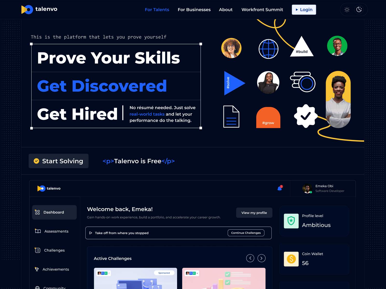
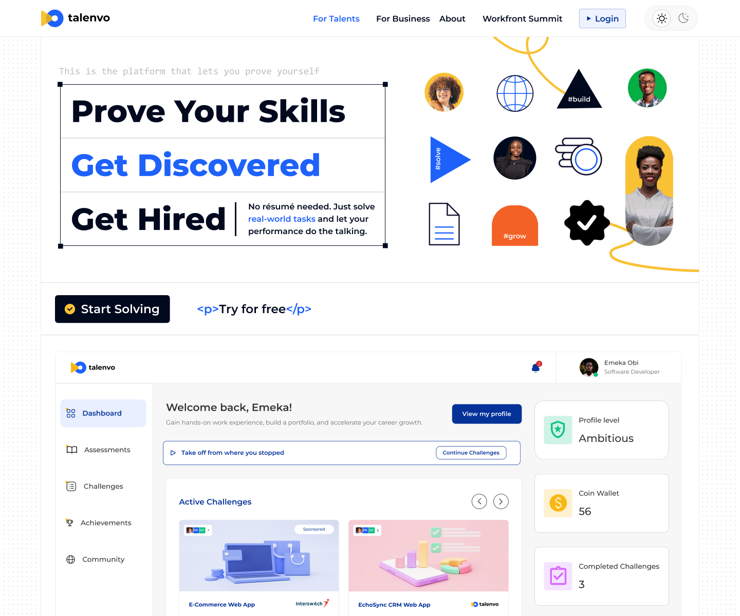
- Decision: I prioritized a "Value-First" Hero Section.
- Why: User attention spans are short. I decided against abstract visuals and chose a direct headline and clear imagery that explained exactly what Talenvo does.
- Decision: I structured the layout to separate content for two distinct audiences: Talents (users) and Businesses.
Phase 2: Visual Trust Signals
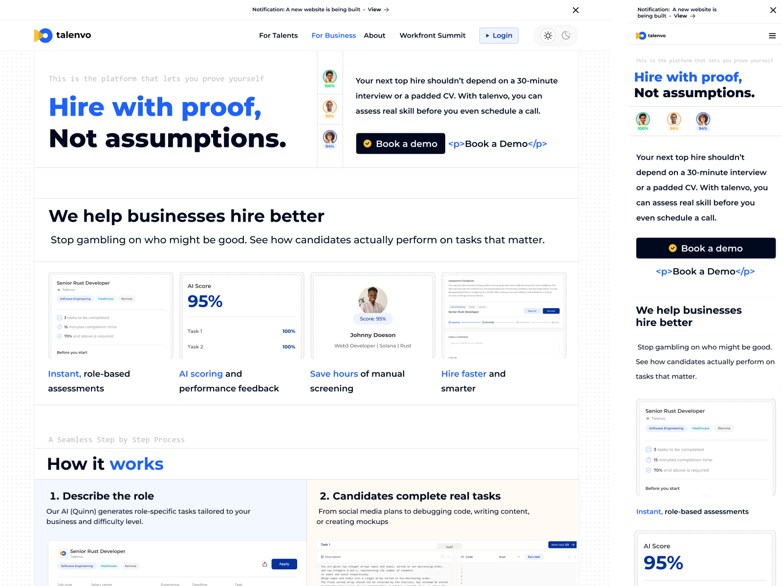
- Decision: I used a clean, corporate-yet-accessible visual style (using whitespace, trusted blues/tech colors, and high-quality photography).
- Why: Trust is the currency of the web. I avoided overly experimental trends in favor of a polished, professional aesthetic that signaled stability and security—crucial factors for the Microsoft grant evaluation.
Phase 3: Responsiveness & Accessibility
- Decision: I adopted a responsive approach for the website build.
- Why: Data showed our target demographic (young tech talents in Africa) accesses the web primarily via mobile. A desktop-only site would have been limiting. I ensured the site was responsive and lightweight and fast-loading even on slower connections.
Tools used
From brief

Topics
Share
Reviews
3 reviews

This is a challenging balance to strike 🤔 a corporate-yet-accessible visual style. You've attempted it with friendly and flexible aesthetic elements in the hero section, but it still skews heavily corporate. It feels like a corporation trying too hard to be relevant to youngsters and the indie scene, trying to be hip, in other words the “accessible” part doesn't quite land. You can feel this particularly in dark mode, where the colors somewhat overpower the intention. In light mode, it's more okay-ish.
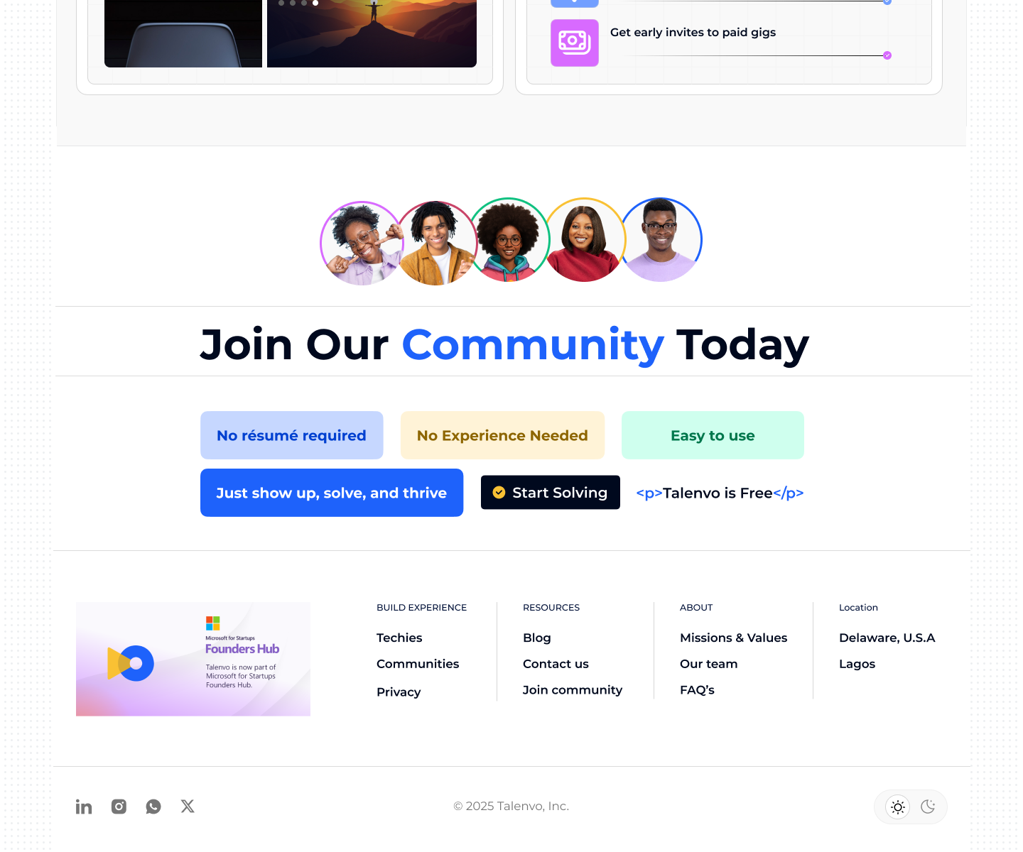
The user (me) probably hasn't finished gauging what this is all about, but these two duos are already competing for attention. What does it mean to pair a button with (assuming) an HTML aesthetic element?
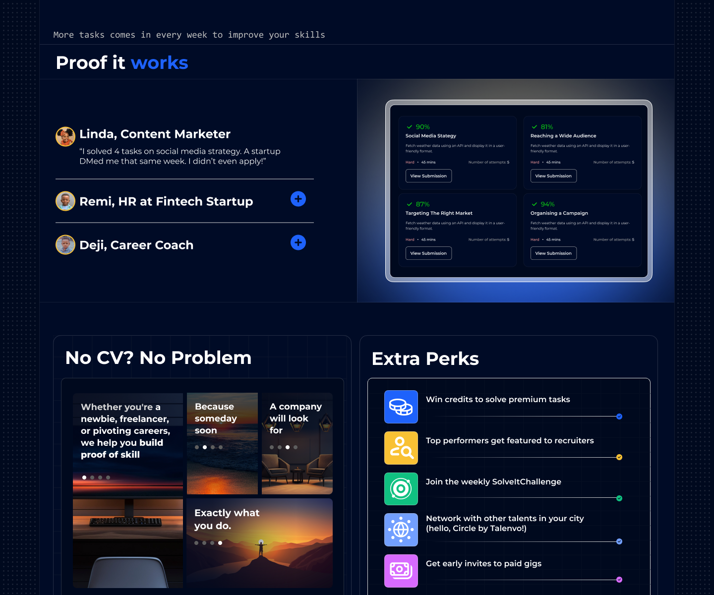
- [Start Solving] <p>Talenvo is Free</p>
- [Book a demo] <p>Book a demo</p>
Who's this for? Will a non-tech business owner who wants to hire someone understand the paragraph tag reference? Will a newbie in tech understand the clever paragraph tag usage, or might they see it as a coding error? These are just questions worth contemplating 😄
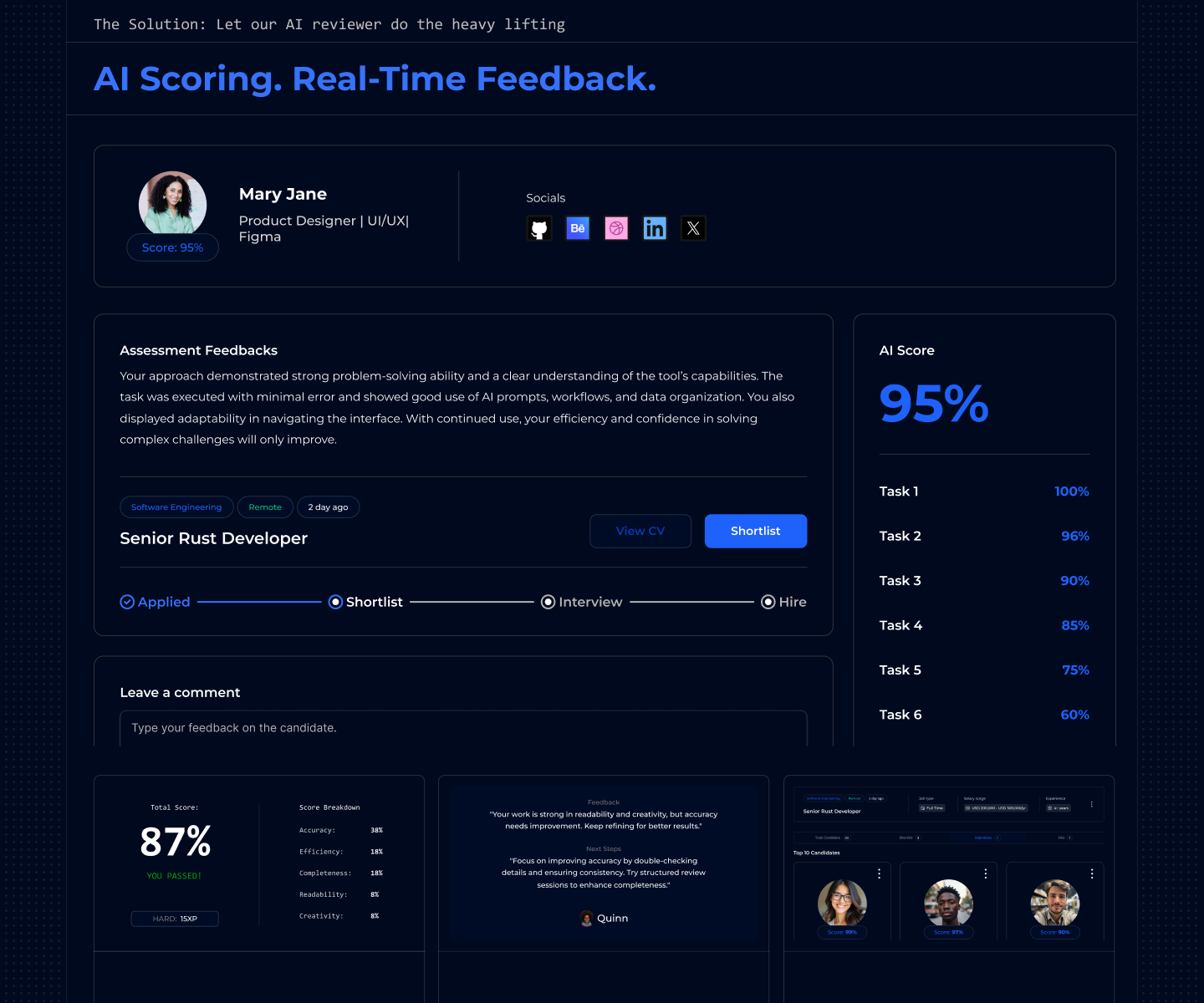
Furthermore, to avoid misunderstanding, I think you could make the dashboard interface more distinct. To put it simply: something like what linear.app does to showcase their internal dashboard. The current one blends too much with its surroundings, a user might mistakenly think they're already logged in.

Interesting product and great idea!
I really like the idea of putting the focus on skills, especially because it gives a fair chance to people who may not have had long-term experience in a traditional company setting. It makes the platform feel more inclusive.
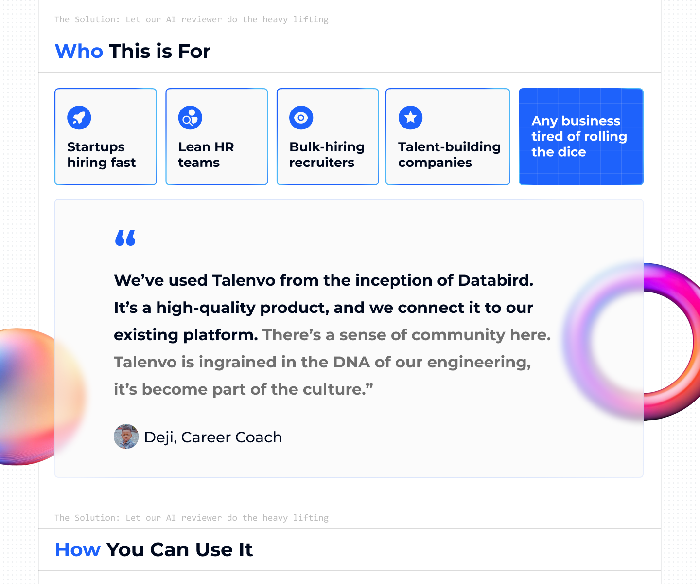
On the website, I would love to see more concrete information about who the platform is for. At the moment, there is an example for developers, which is a good start, but I would take that concept and expand it to more roles. That way, different types of users can immediately understand what to expect and where they fit in.
Even though the website looks nice visually, I think it needs a bit more breathing room. Right now it feels a little dense, and users might experience some cognitive overload. Another thing I noticed is that the web design and the platform design are almost identical, which makes it harder to distinguish the actual product from the marketing page. Giving the platform a bit more visual identity would help it stand out and feel more defined.
Good try for a challenging product. As per the design choice, it's all over the place. The main elements are hard to find, the hero section has too many things to look at, CTA buttons require cognitive power to figure out what they mean and where they are. The light mode is still okay in some aspects but the dark mode is what putting a lot of pressure on the eyes.
However, keep up the good work! Looking forward to many more designs from you.
You might also like

Pulse — Music Streaming App with Accessible Light & Dark Mode


Islamic E-Learning Platfrom Dashboard

SiteScope - Progress Tracking App


Mobile Button System


FlexPay


CJM for Co-Working Space - WeWork

Visual Design Courses

UX Design Foundations


Introduction to Figma

Design Terminology
