Typography System for Entertainment Platform

Bebas Neue and Raleway form a complementary and versatile pair that combines bold expression and readability. Their balance between edgy and refined makes them great for a brand like YouTube, which needs to capture attention while staying approachable and clear.

Reviews
1 review

You're very talented! I've actually used Bebas for a client quite recently. A very strong and great typeface.
The fonts chosen contrast well, but it’s essential to ensure that they align with the product’s brand personality. In order for us reviewers to be able to provide you with some good & relevant feedback for a case like this, it would've been great if you could've added what you're trying to achieve for what type of a brand, so to speak, even if you made it all up. So storytelling is vital for a project like this. Because that is what clients & employers these days are expecting when presenting a case like this.
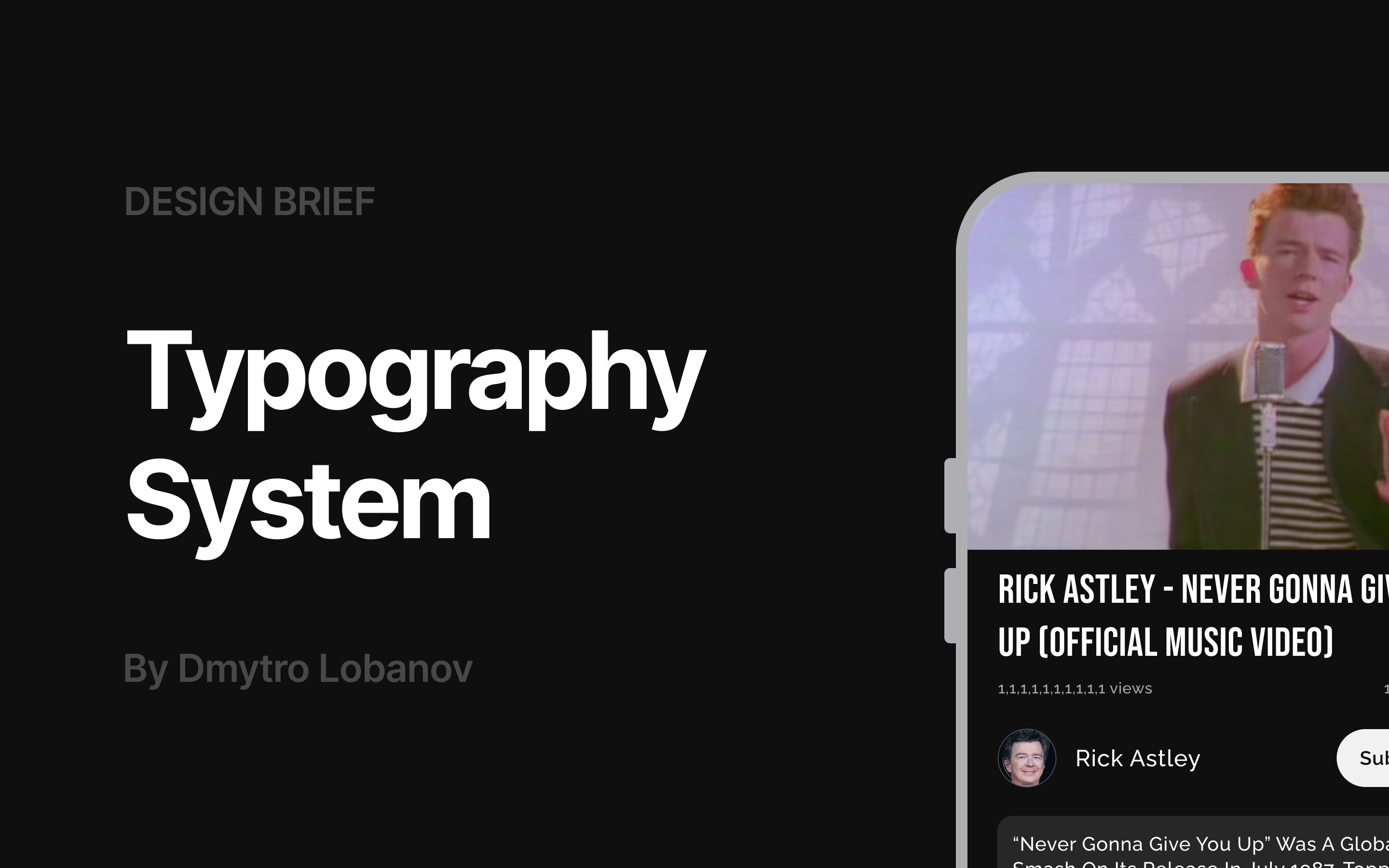
When we're on the subject of storytelling, I would encourage you to work on the visual presentation a little bit more. I understand that you're probably focusing on doing all the design briefs on Uxcel. A phrase a client most likely would have used (a phrase which we designers hate to hear) is "to make it pop". In this case I would say that the visual presentation needs som polishing. If you're going for a comedic and retro theme, like the Rick Astley (which I love by the way), lean into that concept and let the 80s infuse & influence your presentation so to speak. Make it dirty, grainy and let colors from that era come into the presentation.
And again, storytelling; what ratio did you use? Golden ratio? Why did you choose the different types of sizes etc. If you're not comfortable writing, please use Claude.ai or ChatGPT to help you write the story.
I wrote this on another case quite recently that I reviewed; If this typography is going to be used in an application I would encourage you to use an advance responsive sizing of the Typography for different devices. I urge you to take a quick look how MUI (a React component framework/library) for has solved it for inspiration. They even provide a chart visualising how the sizing responds to different breakpoints. https://mui.com/material-ui/customization/typography/#font-size
You're awesome! This is great! Keep up the great work!
You might also like

Pulse — Music Streaming App with Accessible Light & Dark Mode


Islamic E-Learning Platfrom Dashboard

SiteScope - Progress Tracking App


FlexPay


Mobile Button System


CJM for Co-Working Space - WeWork

Visual Design Courses

UX Design Foundations


Introduction to Figma

Design Terminology
