Travel Tours Landing page design

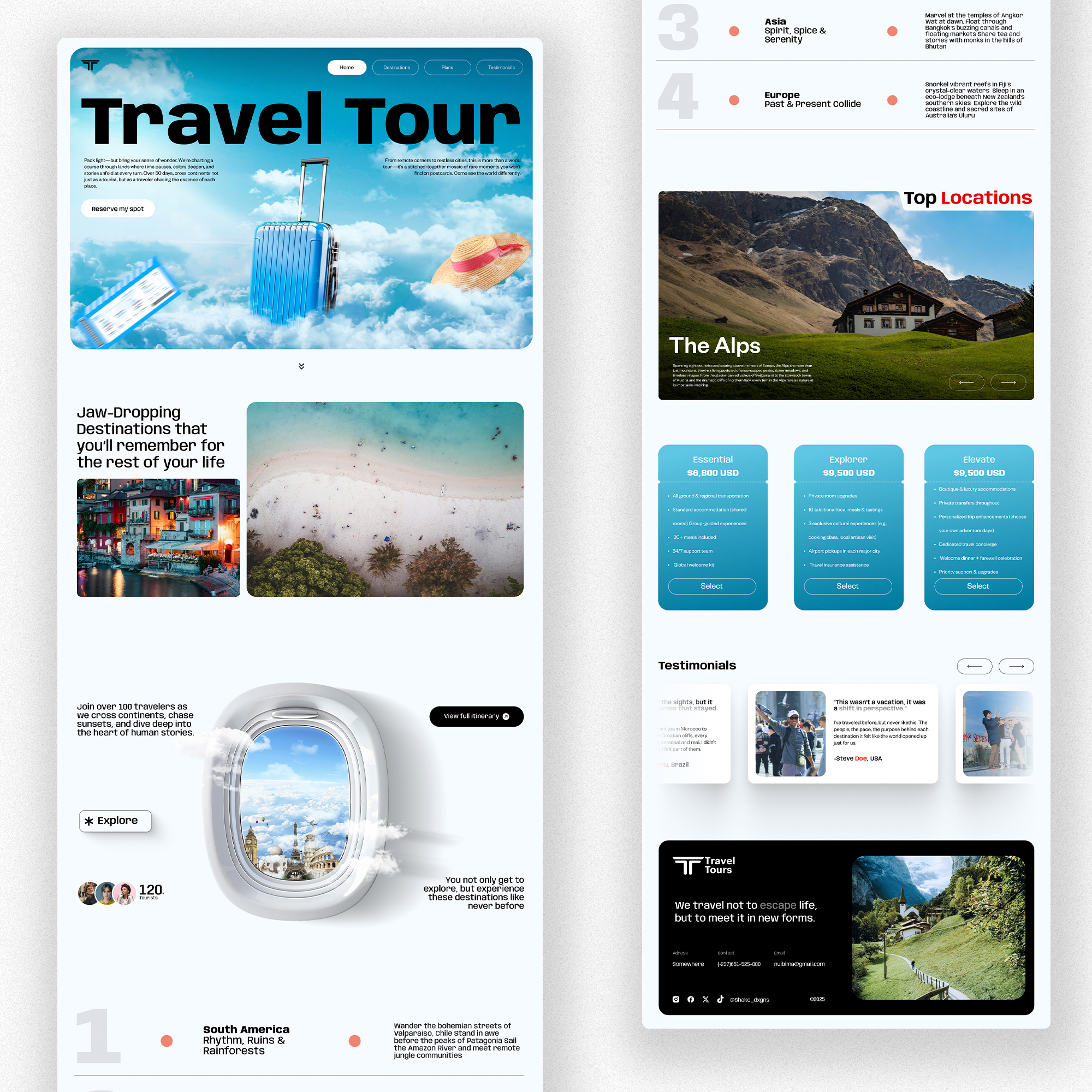
I tried to create a design that stands out from the traditional websites, while still taking note of the Fundamental UI/UX principles. The site targets the newer generation and therefore had to come off as "just another website". What are your thoughts on this?
Reviews
1 review

Hi Nuibim, your website has a vivid and engaging look — the use of high-quality photography gives it a strong vacation vibe and sets the mood nicely. Great work on that!
Here are a few suggestions for improvement:
- Above-the-Fold Layout. The Unique Selling Proposition (USP) is split between two distant areas of the screen, which makes it harder for users to process at a glance. Consider researching best practices for homepage layouts — aligning with common user expectations can improve clarity and impact.
- Design Consistency. Some UI elements aren’t fully aligned visually. For example, the cards have different corner radii, which can feel inconsistent. Also, the "Explore" element looks like a button — if that’s the intent, it should be styled like your other buttons. If not, it may need to appear less interactive to avoid confusion.
- Information Architecture. The hero area is visually strong but lacks actionable or informative content. While the imagery sets a nice tone, think about what users need to see right away to engage — what message or value would convince them to explore further or consider your service?
Great start!
Yuliia
5 Claps
Average 2.5 by 2 people
You might also like

Project
SONZ - Entertainment platform

The next-generation entertainment platform will allow its users not only to browse the trending songs and visuals but also to create their o

Project
Camp & Travel Explorer - App Design

Hey Uxcel Community, Most travel apps focus on destinations. This one focuses on the experience. Camp & Travel Explorer is a real client pr

Project
Solar system Dashboard Utility


Project
Signup page for a SaaS website

1. 44×44px touch targets All interactive elements fields, buttons, and the password visibility toggle meet the 44px minimum tap target. This
Editors’ Choice
Project
Uxcel Halloween Icon Pack

🎃 Introducing the Uxcel Halloween Icon Pack! 🎃 This custom Halloween-themed icon set was created to enhance the seasonal user experience o

Project
PLANTIST

A vibrant online marketplace where plant lovers can buy a diverse range of plants, gardening tools, and accessories. Our platform is designe
Popular Courses

Course
UX Design Foundations

Learn UX design fundamentals and principles that create better products. Build foundational knowledge in design concepts, visual fundamentals, and workflows.

Course
Introduction to Figma
Learn essential Figma tools like layers, styling, typography, and images. Master the basics to create clean, user-friendly designs

Course
Design Terminology

Learn UX terminology and key UX/UI terms that boost collaboration between designers, developers, and stakeholders for smoother, clearer communication.