Translating Flows Into Functional Structures

THE CHALLENGE
Low-fidelity sketches validated the flow logic, but lacked the detail needed for development handoff. The team needed wireframes that showed interaction patterns, information hierarchy, and visual language without committing to final design.
THE SOLUTION: MID-FIDELITY WIREFRAMES
After testing sketches, I've translated validated flows into mid-fidelity wireframes using Figma. These wireframes added clarity while maintaining the ability to iterate quickly.
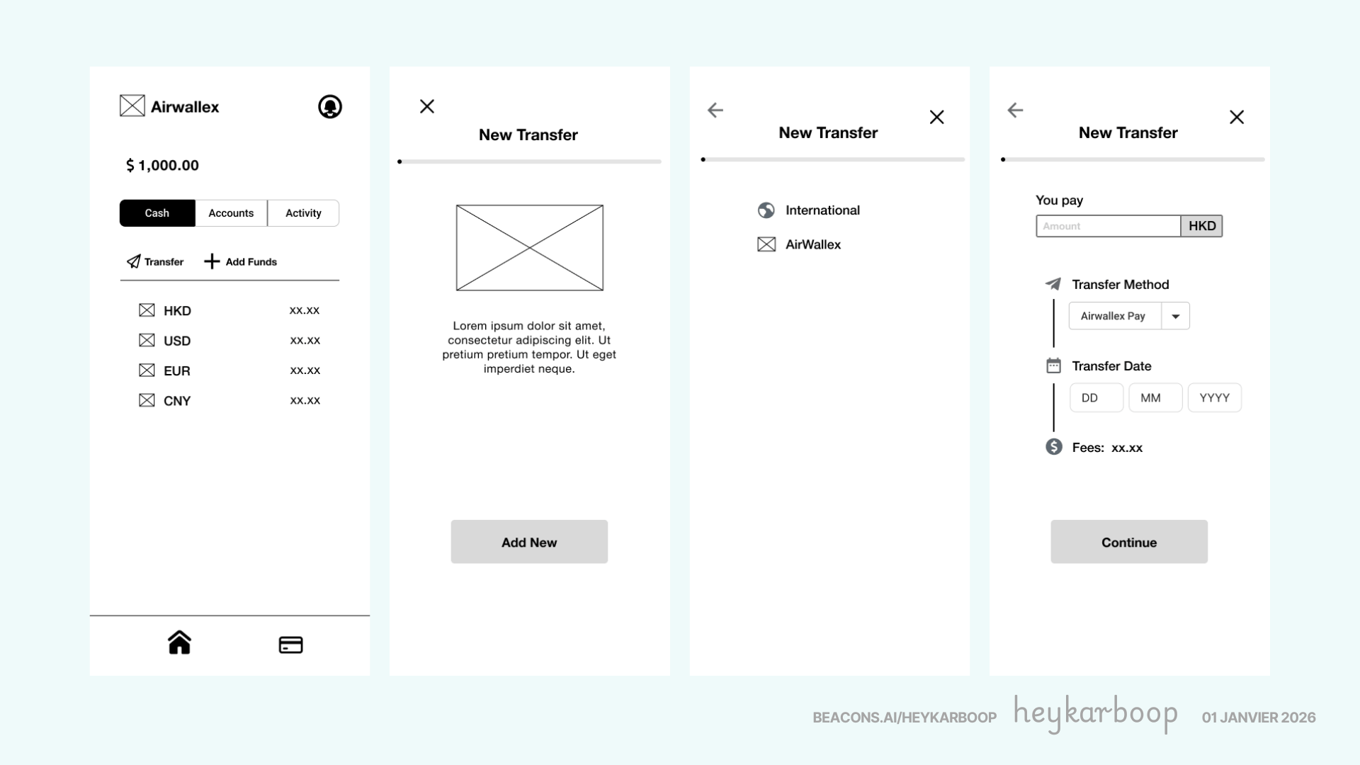
The 8-screen flow progresses from home screen through new contact creation, fund transfer operations, details confirmation and success page. It shows key information that users are looking for to gain trust and transparency in the process such as confirmed exchange rates and upfront fees.
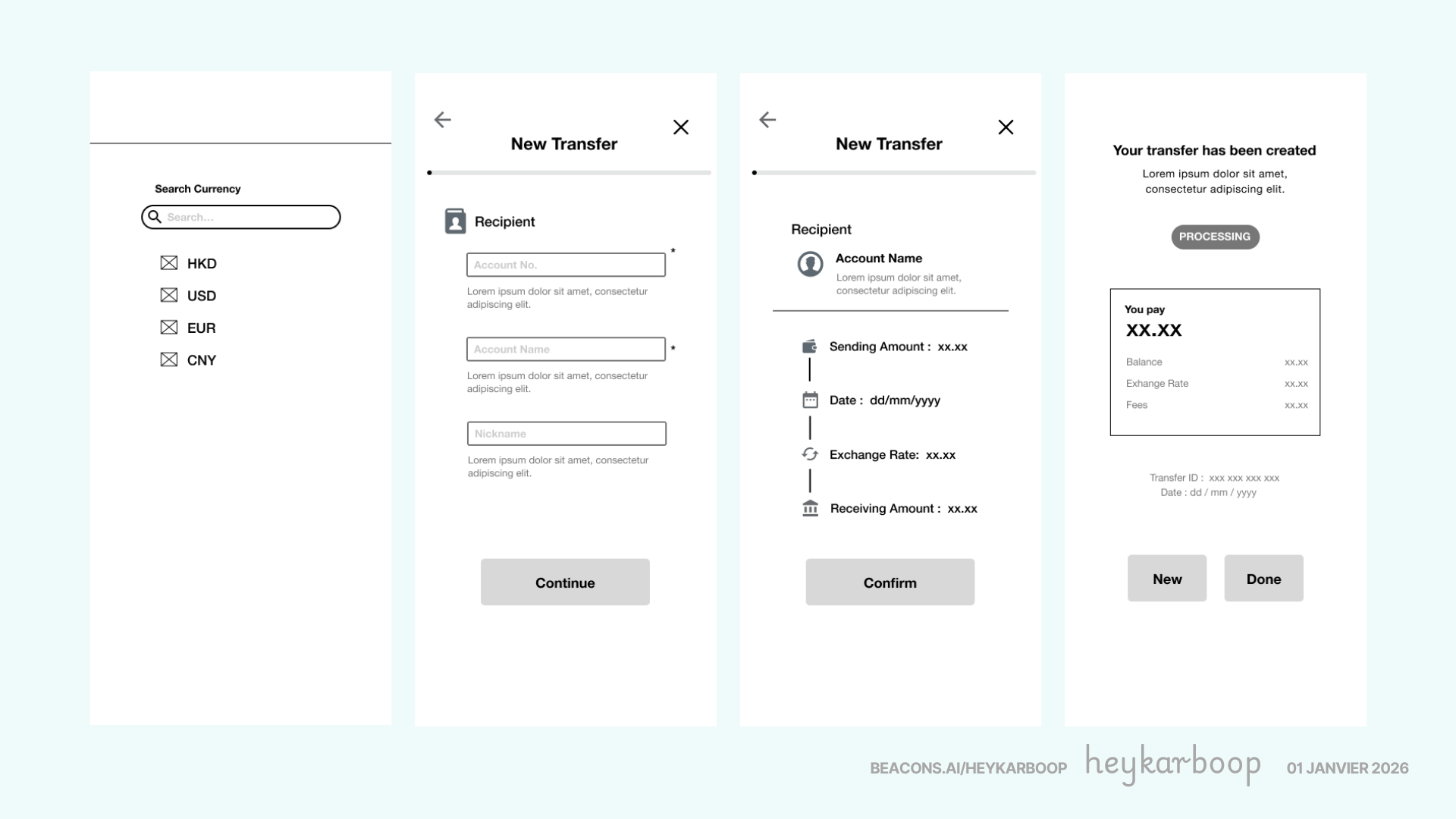
Each screen introduced visual hierarchy through icons, clear labelling, and precise spacing, moving beyond rough sketches while avoiding the time investment of high-fidelity design.
DESIGN PRINCIPLES APPLIED
Design principles applied focused on information hierarchy like size andn color, visual affordances like icons and buttons, consistent labelling removing ambiguity, and vertical organization creating a scannable layout.
Exchange rates, fees, and amounts remained visible throughout, ensuring transparency rather than hiding details until the end.
KEY FINDINGS FROM MID-FIDELITY TESTING
Mid-fidelity wireframes revealed three issues that sketches missed:
- Information Overload on Summary - Initial design crowded the summary screen so we reorganized with icons to improve scannability.
- Success State Details - Users wanted transaction confirmation as reference thus we've added key information like transaction ID and date of transaction, on top of the other details from summary.
TIMELINE
Day 1: Low-fidelity sketches hand-off. Selected wireframing kits including icons, buttons, text hierarchy, and other visual elements. Started on the 1st version of mid-fidelity wireframes.
Day 2: Iterations on the 2nd version of the mid-fidelity wireframes ensuring correct usage of icons without further cognitive load and scannability. Added interactions flow to produce a working prototype.
PROTOTYPING
The interaction design applied to mid fidelity wireframes helped developers understood spacing, hierarchy, and interaction states without constant clarification.
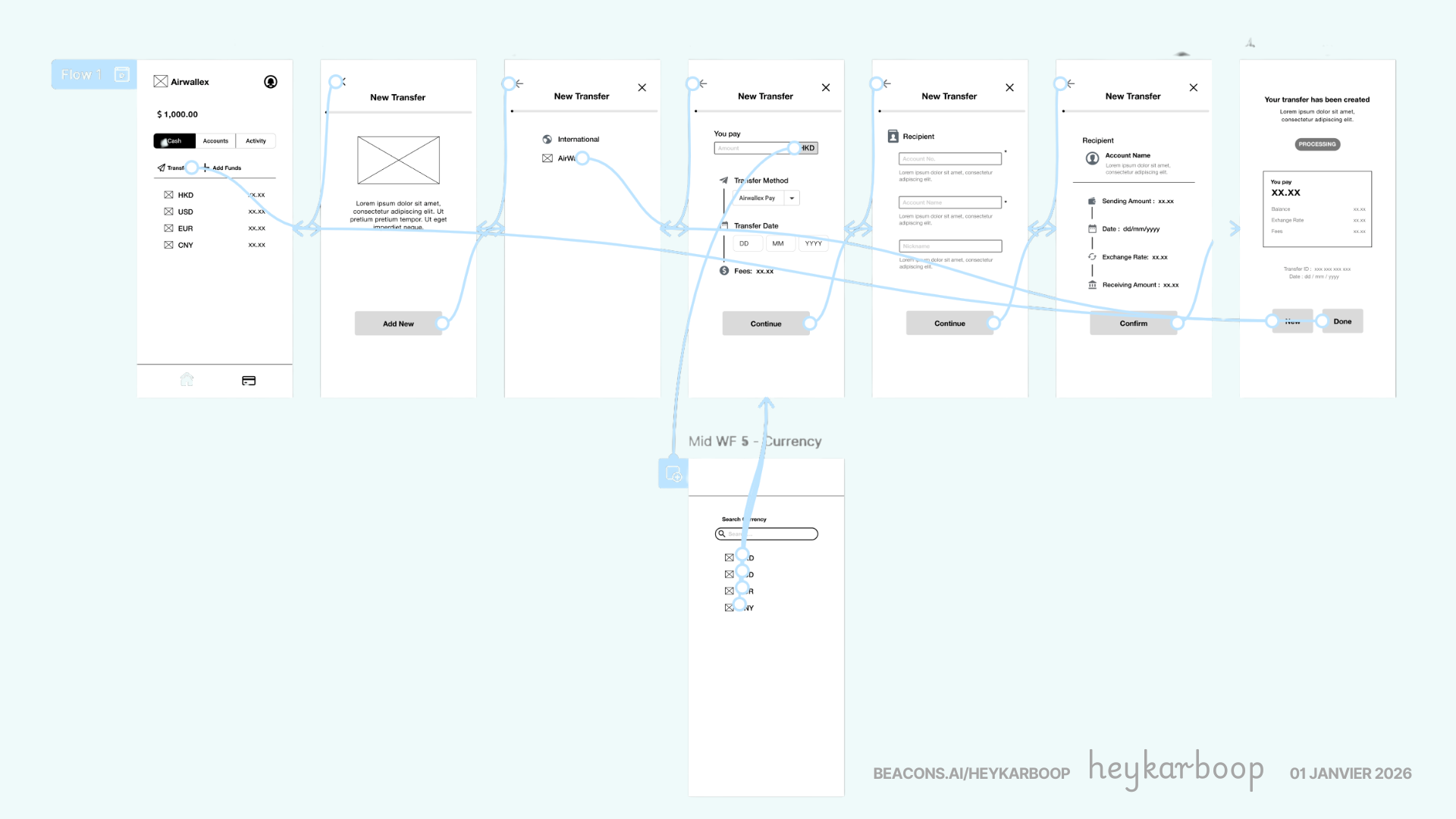
Here’s a walk through of Airwallex’s mid fidelity prototype: Click Here to Open Prototype
KEY TAKEAWAY
Mid-fidelity wireframes bridge the gap between rough sketches and polished design. They add enough detail to validate interaction patterns and information hierarchy without the time investment of high-fidelity design.
For Airwallex, this phase ensured that by the time designers moved to visual design, the structural and functional foundations were proven.
Reviews
2 reviews

Hi again Karen!
What I appreciate here is the mindset shift. “Translating flows into functional structures” suggests you’re not stopping at user journeys you’re thinking about how those journeys become scalable systems. That’s a strong systems-thinking signal.
It feels like you’re bridging the gap between conceptual UX (flows, logic, interaction) and practical execution (structure, components, architecture). Designers who understand both layers tend to design more resilient products because they anticipate edge cases and dependencies.
If I were to push this further, I’d make the transformation even more explicit showing before-and-after structure, constraints considered, and how decisions improved usability or maintainability. Overall, this reflects a mature approach to connecting experience design with product structure.

Good start! This feels like a solid early UX exercise, clear structure, defined problem, and a logical breakdown of the flow, clearly thinking in terms of hierarchy, states, and handoff, which is a good foundation.
That said, the project still reads a bit like a classroom-style brief: a clean, hypothetical problem with controlled constraints. As a next step, I’d encourage you to push toward more real-world complexity, jmaybe a bit messier requirements, edge cases, constraints from business or users, or even redesigning an existing product with actual limitations.
Overall, this is a good starting point.
You might also like

Smartwatch Design for Messenger App


Bridge: UI/UX Rebrand of a Blockchain SCM Product


Pulse Music App - Light/Dark Mode


Monetization Strategy


Designing A Better Co-Working Experience Through CJM


Design a Settings Page for Mobile
Popular Courses

Introduction to Figma


Design Terminology


The Product Development Lifecycle & Methodologies
