Tomaqet - App Design & Color Palette
Project Description
For this exercise, I decided to create a proof-of-concept app instead of redesigning an existing tool. As a big fan of the Pomodoro Technique for boosting focus and productivity, I envisioned a new app concept called Tomaqet (meaning "tomato" in Catalan). Living in Barcelona, I wanted the design to reflect the local culture and Mediterranean vibes while maintaining a strong emphasis on accessibility.
App Design
Tomaqet is a modern productivity app based on the Pomodoro Technique, which structures work into focused intervals followed by short breaks to optimize concentration and prevent burnout. The app’s UI is purposefully minimalist, eliminating distractions to keep the user fully immersed in their workflow. Its intuitive design makes it simple to track sessions and manage breaks effortlessly.
Color Palette
Inspired by Catalan culture and Mediterranean life, the color palette adds warmth and personality to Tomaqet while serving a functional purpose. Each stage of the Pomodoro cycle is visually distinct, using bold and high-contrast colors like Tomaquet (#B12A17) and Olivada (#362B29). Accessibility was a key consideration in the design, ensuring usability for individuals with various types of color blindness.
Tomaqet combines thoughtful functionality with cultural and visual inspiration, creating an app that is simple, inclusive, and uniquely tied to my personal journey.
-Tann.
Tools used
From brief
Topics
Share
Reviews
1 review
Hi Tann, I found your project very intriguing! 🍅 I think it was a smart choice to have a 'start' screen with a calm, white background contrasted with the 'focus' screen in terracotta—effectively emphasising the 'Concentrate' call-to-action.
That said, using multiple colour variations for buttons in such a compact app might feel overwhelming. It could be beneficial to standardize the design by having primary and secondary buttons that work across all backgrounds, or by adjusting the backgrounds themselves to maintain harmony.
Another thought: Spain is not only about 'La Tomatina' but also evokes imagery of the sun, sky, and sea. To make the app feel even more authentic, you could consider introducing a 'relax & rewind' screen in tranquil blue tones and a 'break' screen in sunny yellow. However, this would still require consistent button styling to tie it all together.
I absolutely love the small tomato icon at the bottom—it adds a charming, unique touch! Perhaps in the future, you could explore making it animated on certain screens to add some playful interactivity.
Finally, think about whether users might find value in having a history feature to track stats and analytics. This could be a helpful tool for monitoring and improving productivity over time.
Overall, an interesting and creative project! Keep up the great work!
Yuliia
You might also like
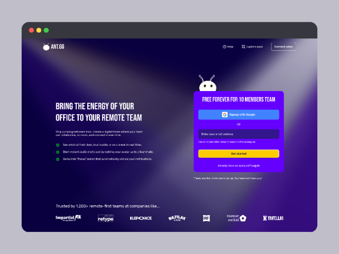
SaaS Signup Design
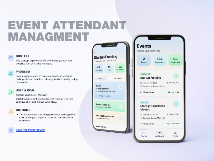
Events Managment App
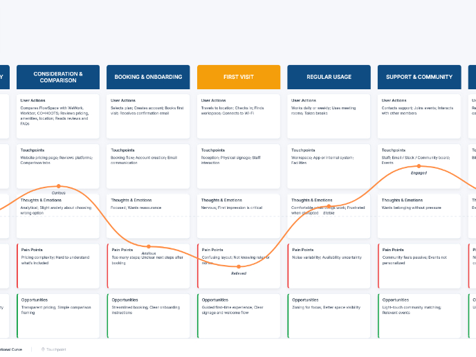
Customer Journey Map — Offsite Co-Working Experience
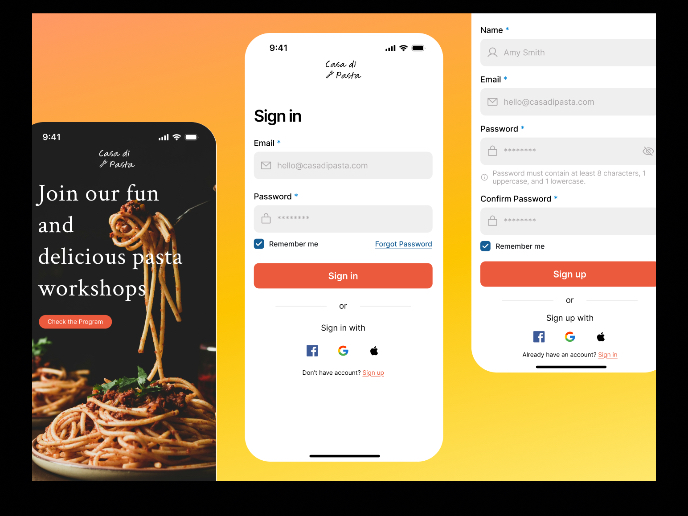
Mobile Onboarding: Casa di Pasta
Accessible Signup & Login Experience — Brainex
Accessible Signup Form
Visual Design Courses

UX Design Foundations

Introduction to Figma

