Time To Rise


Reviews
3 reviews

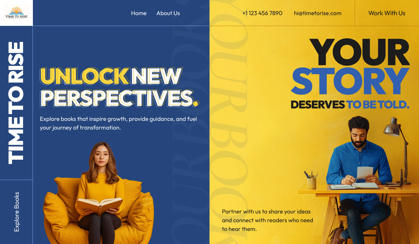
Awesome submission Mashhood, the design is really impressive, with a really well chosen color scheme. The blue and yellow harmonize really well together and give the design a very positive feeling.
The contrast between the text and the background is great, and makes for a very accessible and aesthetically pleasing design. Combined with the sharp corners and a fresh minimal font, it creates a very modern feeling.
There is one thing that could be improved. The effect used on some of the titles, where the outline of the original text overlaps on itself, looks great on a white background. Unfortunately, it doesn't translate as well on colored backgrounds. The text appears slightly fuzzy and can be somewhat uncomfortable to read.

Greate work!

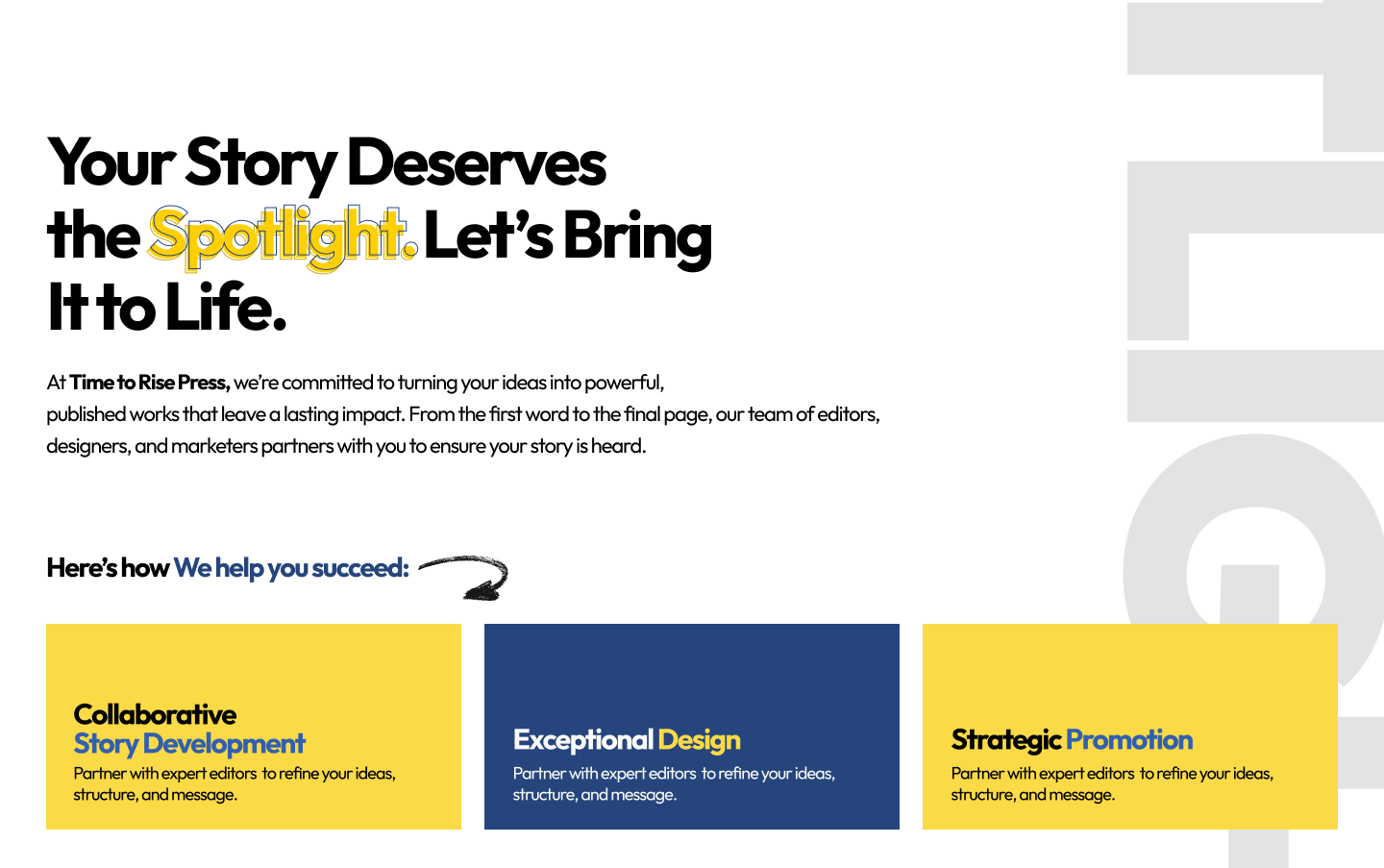
Awesome concept, good work mate! May be dedicate a bit of your time for a bit of context would be even greater for viewers!
You might also like

Entrant - Analytical Dashboard


Transit Cairo — Digital Mobility Redefined


Entrant Accessible Signup and Login Forms

CJM x Mindspace case study - Ester Cinelli

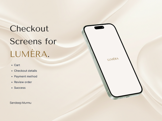
LUMÉRA - Checkout Flow

A/B Testing for Bumble's Onboarding Process

Popular Courses

UX Design Foundations


Introduction to Figma

Design Terminology
