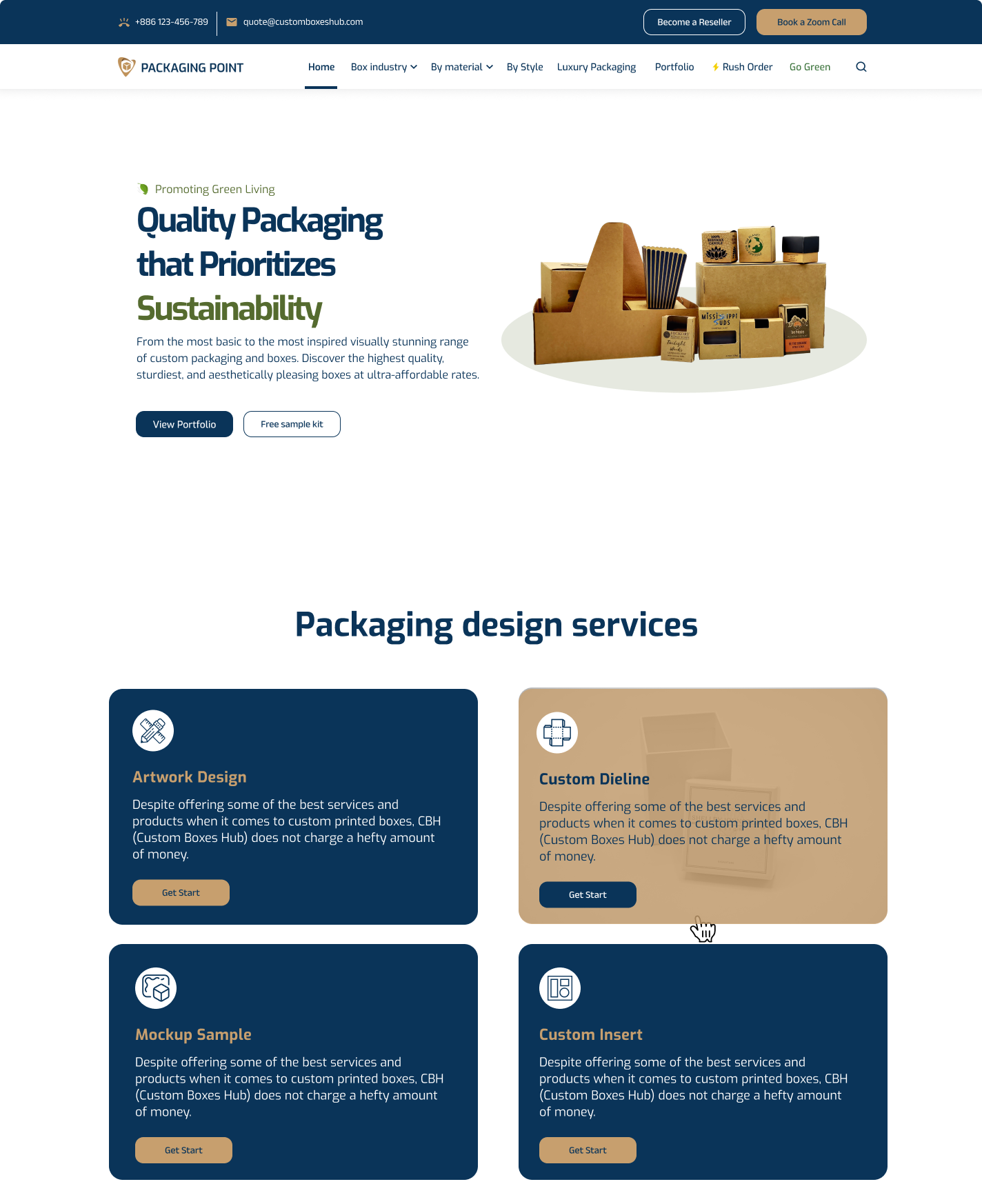
The Packaging Point
Creating a User-Friendly Experience for The Packaging Point
I wanted to make thepackagingpoint.com a website that's not only visually appealing but also incredibly easy to navigate and use. Here's how I approached the design:
Building a Clear Visual Hierarchy:
Right from the start, I focused on creating a clean and organized layout. Visitors should instantly understand where to find the information they need. I used larger fonts and more prominent placement for key elements like product categories and calls to action. Subtle color changes and borders helped differentiate sections without overwhelming users.
Aligning with The Packaging Point's Brand
The Packaging Point has a strong brand identity, and I wanted the website to reflect that. I carefully selected a color palette that matches their brand colors, ensuring consistency and creating a recognizable visual experience. Accessibility was also a priority, so I made sure there's enough contrast between text and backgrounds for everyone to see the content clearly.
Fonts for Readability and Flow
Choosing the right fonts was crucial. I opted for clear, easy-to-read fonts that work well on all screen sizes, from desktops to smartphones. I also established a consistent font hierarchy, using specific fonts for headings, body text, and captions. This creates a sense of order and makes it easier for users to scan and absorb information.
High-Quality Images that Tell a Story
Great visuals can make a world of difference. I incorporated high-quality images that showcase The Packaging Point's products beautifully. I also used lifestyle images and infographics where appropriate to further engage users and tell the brand's story.
Breathing Room with White Space
White space (empty space) might sound counterintuitive, but it's actually essential for a balanced and user-friendly design. I strategically used white space to prevent clutter and make the website feel less overwhelming. This allows elements to breathe and highlights important content.
Understanding Their Users (Optional)
(If applicable) To truly cater to The Packaging Point's audience, I conducted some user research. This involved surveys and interviews to understand what people were looking for when they visited the website. I also created user personas, which are fictional representations of different user types. By keeping these personas in mind, I could design a website that addresses their specific needs and goals.
Making Navigation a Breeze
Finding what you need should be effortless. I organized the website's content logically and intuitively. Clear menu labels, breadcrumbs for location awareness, and a search function all contribute to an easy-to-navigate experience.
Interactive Elements for a Smooth Journey
Calls to action (CTAs), forms, and product filters are all interactive elements that guide users and help them accomplish their goals. I made sure these elements are visually clear, easy to understand, and encourage users to take the desired actions.
Adapting to Any Device
In today's world, people access websites from all sorts of devices. I ensured the website is responsive and adjusts seamlessly to desktops, tablets, and smartphones. This creates a consistent and positive user experience regardless of the device used.
Website Performance: Speed Matters
Nobody likes a slow website. I used various techniques to optimize website performance and ensure fast loading times. This includes image compression, code minification, and potentially leveraging a content delivery network (CDN) for faster content delivery.
Helping People Find Them (SEO)
Search engine optimization (SEO) is crucial for getting The Packaging Point's website seen by the right people. I incorporated SEO best practices by optimizing page titles, meta descriptions, and image alt text with relevant keywords. This helps search engines understand what the website is about and improves its ranking in search results.
Accessibility for Everyone
Everyone deserves a great user experience. I considered accessibility guidelines to ensure the website is usable by people with disabilities. This might involve using alternative text for images, providing keyboard navigation options, and ensuring enough color contrast for people with visual impairments
Reviews
0 reviews
You might also like
Accessible Signup Form
Auction
Entrant - Analytical Dashboard
Transit Cairo — Digital Mobility Redefined
Babylon Balance - Designing Financial Clarity Through Constraint
Entrant Accessible Signup and Login Forms
Popular Courses

UX Design Foundations

Introduction to Figma


