NovaBank Error Page
Note: This project has been edited based on feedback.
Introduction
A 404 error page lets users know that the page they’re looking for is not available or does not exist.
Usually, the page doesn't serve any purpose besides letting us know that what we’re looking for isn’t there. Or could it?
404 Error Page for Finance Organization
As a general rule, when it comes to more serious organizations, we should be careful when and how we use humor.
As an ING user, a Dutch bank, I appreciate how engaging their content is. They are a formal bank, but on occasion, they employ playful copy in their emails or notifications.
I've tried to do the same with my error page.
Design Rationale
As a UX designer for a finance organization, I've created a 404 error page that balances professionalism with approachability. The design considers the following key aspects:
Platform & Device
- Platform: Web-based banking portal
- Device: Desktop
Content Strategy
Message Clarity
The error message is direct and clear, immediately communicating what happened.
I let the user know that we could not find what they needed. This phrasing places the responsibility on us and not the user.
Next, I jump straight to action. "Let's get you back in business". These words are to encourage the user to either try a new search or go back to the homepage.
Finally, the design includes a direct link to the FAQ.
The page uses straightforward language that conveys reliability and security.
Solution-Oriented Approach
Instead of just stating the error, the page provides multiple pathways for users to continue their banking journey. This helps maintain trust during a potentially frustrating moment.
Brand Voice
The copy maintains a professional yet helpful tone appropriate for a financial institution. It's slightly casual language while still being warm and reassuring, reinforcing the organization's commitment to service.
Visual Design Elements
Color Scheme: The Primary color is Blue. To build the color palette, I use this platform: My Color Space
I picked a shade of blue that wasn't too dark, but that would still convey trustworthiness and professionalism.
Using a color palette consistently throughout the user interface, I reinforce brand identity and create a cohesive experience.
Typography: Clean, highly readable sans-serif font consistent with the main site. For this design, I selected Montserrat for Headings, and Roboto and its weight variations to differentiate hierarchy and relevance in the text.
Visual Balance: Adequate white space to prevent overwhelming the user during an error situation.
Visual Hierarchy: Important information and action items are prominently displayed.
Conclusion
There's art in creating a 404 error page that engages the user and reduces friction. There's more to it than throwing some components together.
Tools used
From brief
Topics
Share
Reviews
1 review
Hello Andrea,
Your 404 page design is thoughtfully structured and visually clean. The tone is friendly and accessible, which can help reduce user frustration in case of navigation errors. I also appreciate the clarity in the content strategy and the careful attention to hierarchy and layout — everything is easy to follow.
That said, I’d recommend reconsidering the main hero phrase “We’re out of money.” In the context of a financial organization, this could be alarming to some users, even if intended humorously. For banking platforms, where trust and stability are crucial, it’s important to ensure language choices don’t inadvertently create confusion or concern.
A slightly more neutral or reassuring message could help maintain a professional tone while still being engaging.
Overall, a well-structured design — with just a small tweak, it could be even more effective and aligned with user expectations in the finance domain.
You might also like
eWallet App Development Project
🖥 Desktop Checkout Flow Design
Website CRM Dashboard
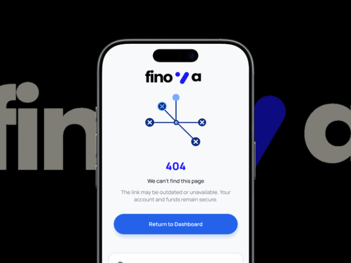
Helpful 404 Error Page for a Fintech Mobile App
Pebble Accessible SAAS Signup Flow
Music Player UI - Light & Dark Mode
Content Strategy Courses

UX Writing

Common UX/UI Design Patterns & Flows


