Tappy: A Messaging app for Smartwatch

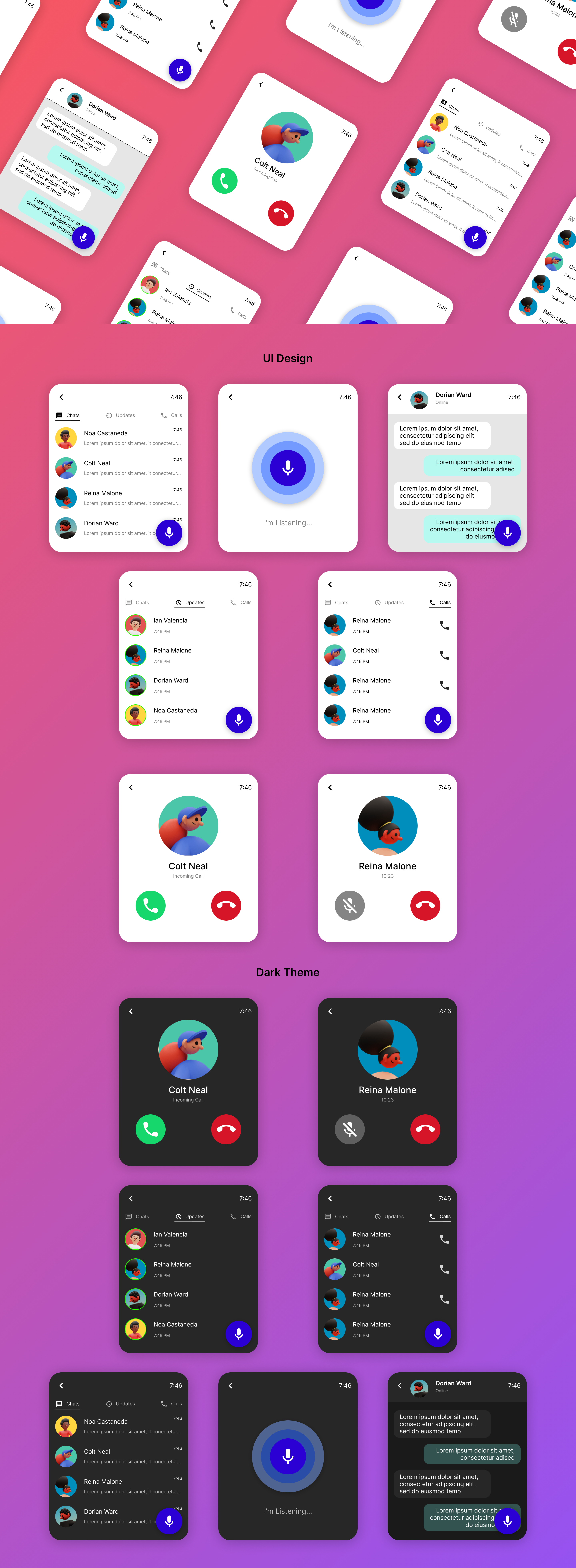
The smartwatch UI design focuses on providing an accessible, user-friendly, and efficient interface for users. Recognizing the constraints of a small screen and the need for intuitive interactions, this design integrates a smart assistant to enhance accessibility and streamline functionality.
Integration of a Smart Assistant
- Why: Smart assistants provide a hands-free, voice-driven interaction mode, ideal for scenarios where users can’t manually operate the watch.
- How:
- Voice Activation: Users can summon the assistant with a wake word or a long-press on the side button.
- Conversational Interface: The assistant responds to natural language commands, from setting reminders to sending messages.
- Proactive Suggestions: Context-aware prompts, like suggesting reminders based on calendar events, enhance usability.
Simplified Navigation
- Why: A small screen necessitates a straightforward and clutter-free interface.
- How:
- Minimalist Design: Each screen focuses on one primary function, avoiding visual overload.
- Gestures: Swipe and tap gestures enable seamless navigation through menus.
Dark Mode Overview
To enhance usability and aesthetic appeal, the smartwatch UI design includes a dark mode option. This feature not only aligns with modern design trends but also addresses user comfort and energy efficiency.
Tools used
From brief

Topics
Share
Reviews
2 reviews

It's great to see the use of smart assistants (multiple input methods) to make the most of the limited real estate available. This is a thoughtful approach to addressing the unique challenges of small-screen design.
In scenarios like these, hierarchy becomes especially important. Currently, the thumbnails appear to dominate the screen space compared to the titles. It might be worth iterating on this aspect to better align with what users need at the moment. Striking a balance between the visual weight of thumbnails and text can help create an effective hierarchy.
When presenting your designs, consider designing them at the actual viewport size of the watch. This will allow viewers to see your work at a true-to-scale dimension. Additionally, incorporating watch mockups in your presentation could enhance the overall impact and clarity of your design.
Lastly, generating sample content for UI copy using tools like ChatGPT instead of placeholder text like Lorem Ipsum can make your designs feel more natural and relatable.

Fantastic and vibrant design! Like a clean, fresh and concise look!
You might also like

Events Managment App


Mobile Onboarding: Casa di Pasta


Accessible Signup & Login Experience — Brainex


Accessible Signup Form


Accessible Signup Form

WellNest

Interaction Design Courses

UX Design Foundations


Introduction to Figma

Design Terminology
