Syafar Tour

This landing page is designed to sell various Umrah packages, including regular, private, and customizable options. The site targets three main user groups: prospective pilgrims/customers, travel agents, and the central admin team.
Key Features:
- Package Options: Regular, private, and customizable packages where users can select only the components they need (visa, hotel, transport, or flights).
- Easy Navigation: Users can easily search for packages, build custom ones, and compare options.
- Pricing Transparency: Detailed pricing is shown to travel agents for clear quoting, while customers see only total costs.
Target Users:
- Pilgrims: Can explore and customize their Umrah journey.
- Agents: Access detailed pricing to create offers.
- Admin: Manage packages, pricing, and user data.
Goal: To streamline the process of finding, customizing, and understanding Umrah package details, improving both customer and agent experience.
Reviews
1 review

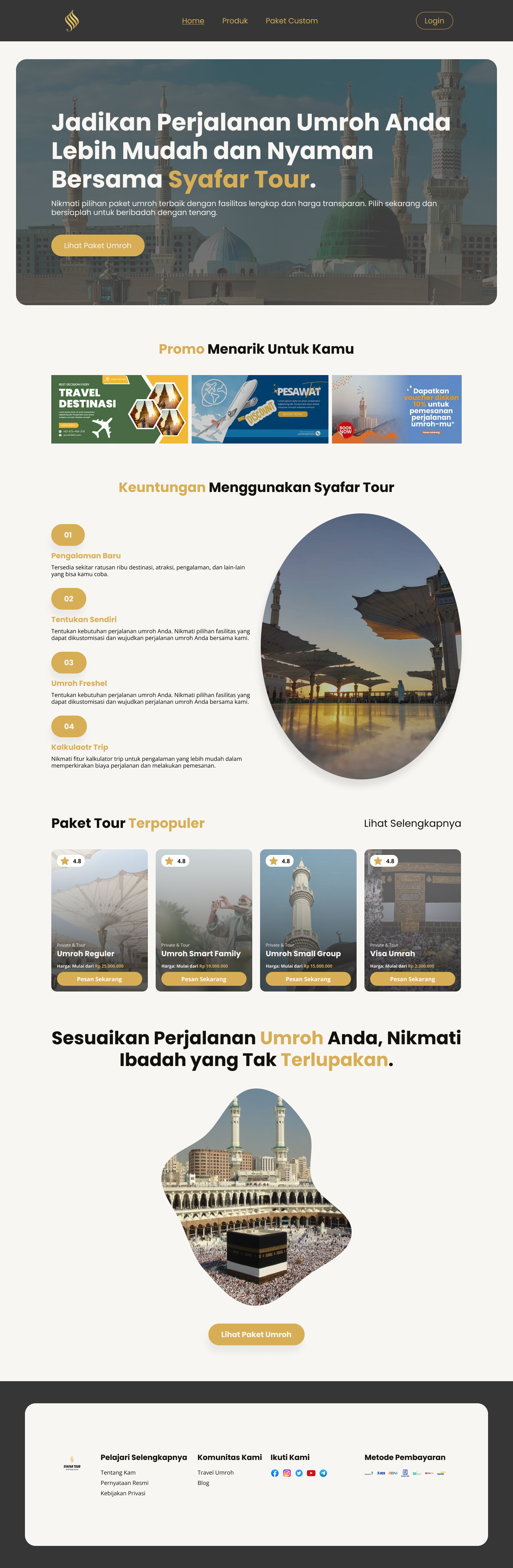
I really like the "Paket Tour Terpopuler" section; the cards are very clean and include star ratings and clear pricing. In the travel and Umroh industry, transparency and social proof (ratings) are the biggest drivers of trust.
By showing these details upfront, you reduce the user's "searching" time and make them feel more confident in the value of the packages, which directly helps conversion.
However, I have a few recommendations for the rest of the layout:
- Highlight Promos and Tours first: From a UX perspective, these are the primary things users want to see. Since the promos look like banners, try showing only one at a time. It is difficult for a user to focus on three competing offers at once, even if they are all valuable. Let them focus on one, then scroll or wait for the next.
- Information Hierarchy: I recommend putting the "Steps" or short guide at the end. Users usually want to see the product (tours) before they care about the process.
- Visual Affordance: You used the same pill-shaped elements for the step numbers as you did for your buttons. This is very confusing because users will expect them to be clickable. If an element isn't a button, it shouldn't look like one.
You might also like

Nestra from homepage to checkout process


Islamic E-Learning Platfrom Dashboard


Pulse — Music Streaming App with Accessible Light & Dark Mode

SiteScope - Progress Tracking App


Mobile Button System


FlexPay

Popular Courses

UX Design Foundations


Introduction to Figma

Design Terminology
