sunday. - Landing Page Project
The direction I wanted to go with the brand, sunday., is minimalist, yet elegant. I first looked at a couple of fashion brands that resonate with me for ideas and inspiration. Next, I created a rough wireframe containing elements that showcase the essence of the brand. From there, I refined the design to ensure that every element serves a purpose and contributes to a cohesive visual experience.
By focusing on simplicity and refined design, the landing page aims to create a serene and intuitive experience, allowing users to immerse themselves in the brand's identity without distraction. I believe this approach highlights the core message and ensures that every interaction feels intentional.
Reviews
5 reviews
Impressive work! The visual design is striking, and the choice of imagery combined with effective use of white space really elevates the user experience. The typography adds a touch of elegance, making everything feel cohesive and refined. Keep it up!

Thy Nguyen
visual design is awesome, great pictures, use of white space, typography... keep up the great work

Thy Nguyen
The first photo really caught my eye. I loved it and it made a great first impression.
Overall, the landing page seems free and breathable. Only then did I start to wonder if maybe there wasn't enough CTA, but you could explain that with the brand's concept. 🙃
If I had to change anything, it would be some more thematic images for the "Our Values" section. All in all, a nice landing page! Keep it up! 🖤
Fantastic job! The visual design is captivating, and the imagery, paired with the smart use of white space, truly enhances the user experience. The typography brings a sense of sophistication, tying everything together seamlessly. Great work—keep going!
Very clean & elegant conceptual design overall. Minimalism can often be a double-edged sword; as one would work with clay, one must know when to stop adding & when to start cutting away that which is not desired, but it is also important to ask if one has layered on enough. When used correctly in a way that frames the full scene appropriately, a minimalist approach can effortlessly paint the full picture with just a few elements, and this a great example of that.
Nonetheless, I enjoyed this piece and look forward to seeing more of your work.
You might also like
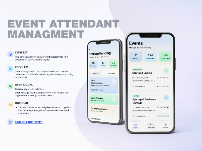
Events Managment App
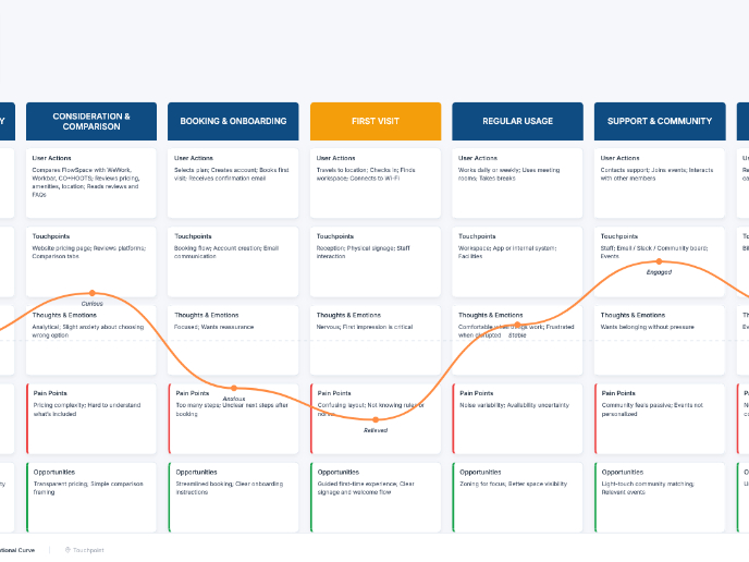
Customer Journey Map — Offsite Co-Working Experience
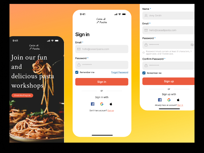
Mobile Onboarding: Casa di Pasta
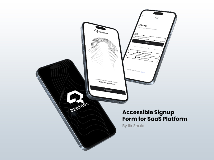
Accessible Signup & Login Experience — Brainex
Accessible Signup Form

Accessible Signup Form
Content Strategy Courses

UX Writing

Common Design Patterns


