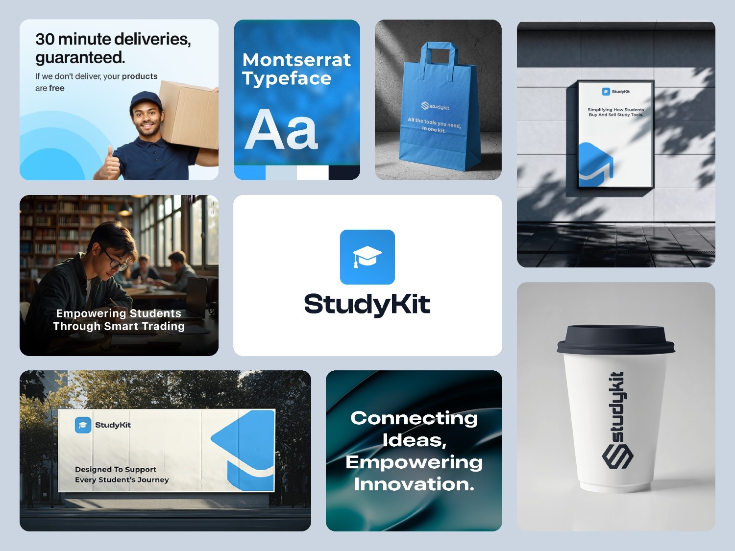
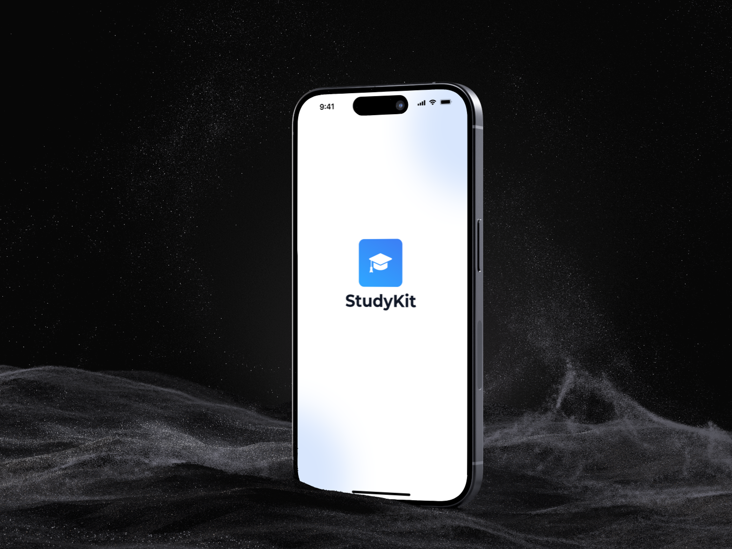
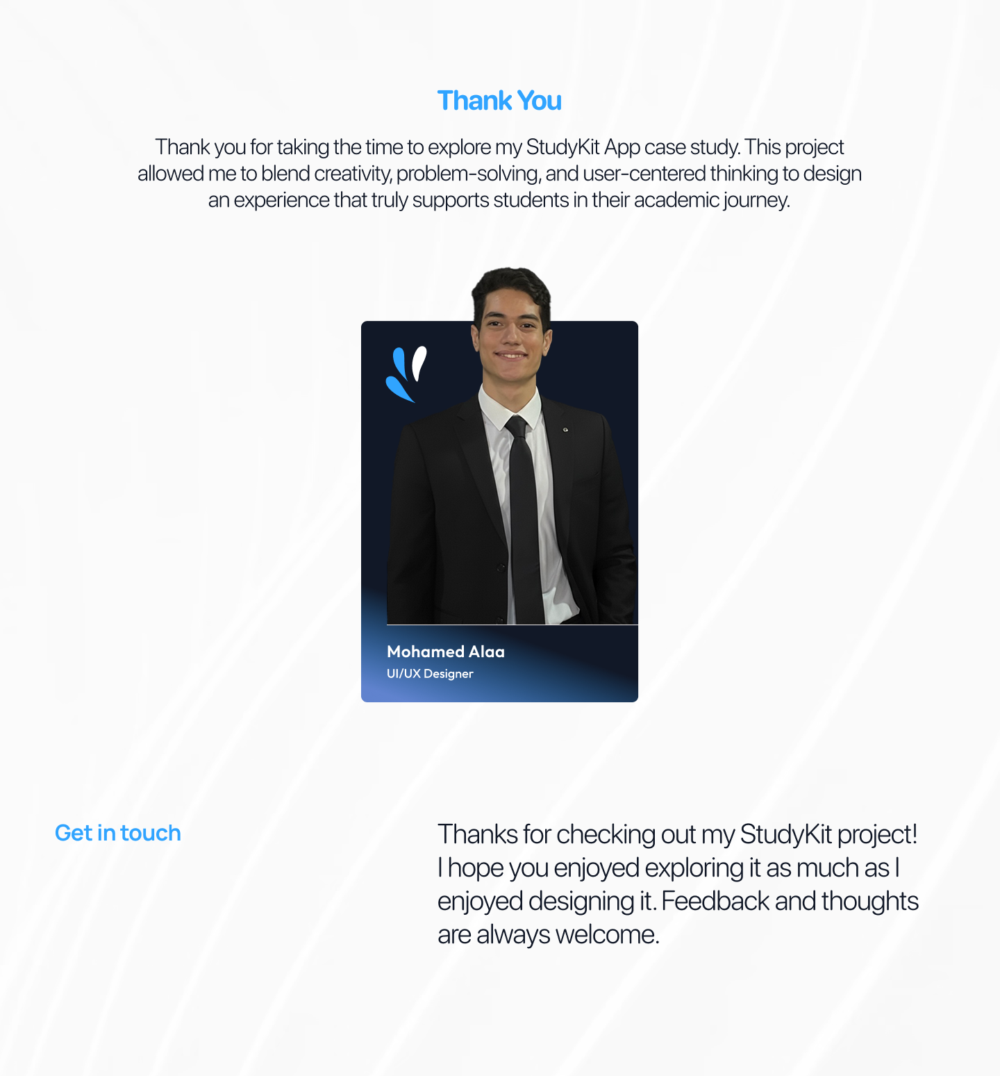
StudyKit - Campus Market App


Project Overview
StudyKit is Smart Tools for Smarter Learning, where simplicity meets accessibility. We know that students in medicine, dentistry, and engineering often struggle to find the right study tools. My goal is to create a seamless experience that helps students discover, organize, and access their tools easily all in one place. With StudyKit, students gain more confidence, save valuable time, and enjoy a stress-free learning journey.
Project Background
The StudyKit App was developed in the education technology industry, targeting university students in Egypt across faculties such as engineering, medicine, fine arts, and dentistry. Many students struggle to access or afford essential study materials and tools for their courses. The project aimed to solve this issue by creating a digital marketplace where students can buy, sell, or exchange academic tools easily and securely within their university community.
Here is Figma Link:
https://www.figma.com/design/ChSx0Us6uQ0zbGv6mt2rUT/Study-Kit-App?node-id=0-1&t=mQZhD3TY5M1c9FlU-1
Project Objectives
The main objective of the StudyKit App is to create a seamless platform for students to access and exchange study materials conveniently and affordably. The project aims to:
- Simplify the process of buying and selling academic tools and resources.
- Support students financially by enabling affordable access to essential study materials.
- Encourage sustainability through the reuse of educational tools instead of purchasing new ones.
- Enhance collaboration and connection among students across different faculties.
- Design an intuitive, student-friendly interface that ensures a smooth user experience.
Success Metrics
To measure the effectiveness and impact of the StudyKit app, the following key performance indicators (KPIs) were identified:

Research Goals & Methods
To create a user-centered experience for StudyKit App, I focused on understanding real student needs and frustrations when finding or selling study materials.
Research Goals
- Understand how students currently find study tools and resources.
- Identify common challenges in buying/selling academic items.
- Explore motivations for peer-to-peer exchanges among university students.

Methods Used
- Surveys: To gather insights on usage habits and preferred tools.
- Interviews: One-on-one talks with students from different faculties (Engineering, Medicine, Fine Arts, Dentistry).
- Empathy Map: To better understand university students’ needs, emotions, and challenges when buying or selling study materials, an empathy map was created.
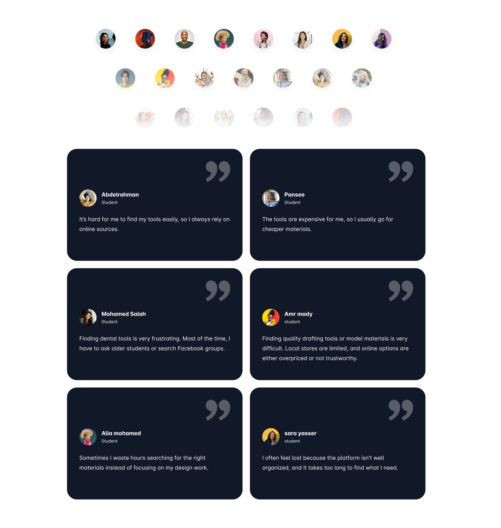
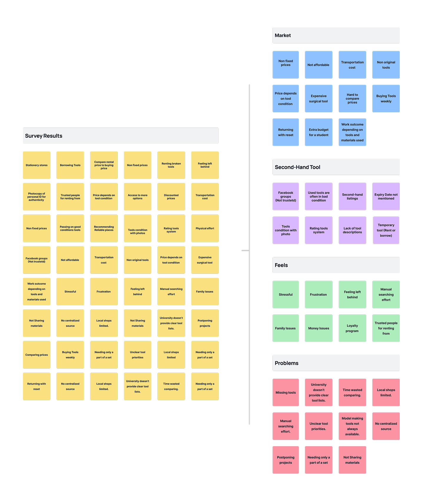
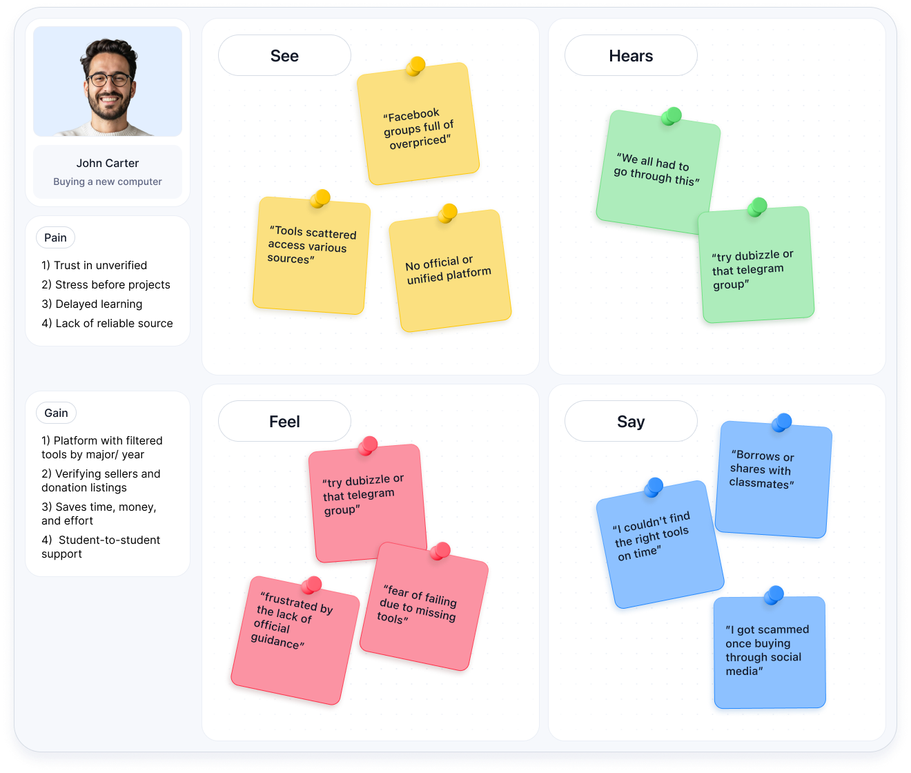
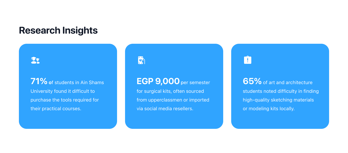
Key Findings
- Students face difficulty finding trusted sellers within their universities.
- High prices for new materials push them toward second-hand options.
- They prefer visual browsing and instant communication with sellers.
These insights shaped StudyKit’s core features, verified student profiles, categorized tool listings, and an easy in-app chat system.
Define the Problem
Through user research, it became clear that students across Egyptian universities face consistent challenges when it comes to accessing affordable and reliable study materials.
Problem Statement
Students struggle to find, afford, and exchange essential study tools such as lab equipment, drawing kits, and medical instruments — within their local university networks. Existing marketplaces are cluttered, unsafe, or not tailored to academic needs.

Context & Insights
- Many students rely on general platforms (like dubizzle or Facebook groups) that lack verification or trust systems.
- There’s no dedicated space for faculty-specific materials (e.g., engineering vs. fine arts).
- Students waste time comparing prices and dealing with unreliable sellers.
- This issue particularly affects first-year and low-budget students who need affordable tools quickly.
Core Problem
There is no centralized, student-focused marketplace designed for exchanging or purchasing study materials safely and efficiently.
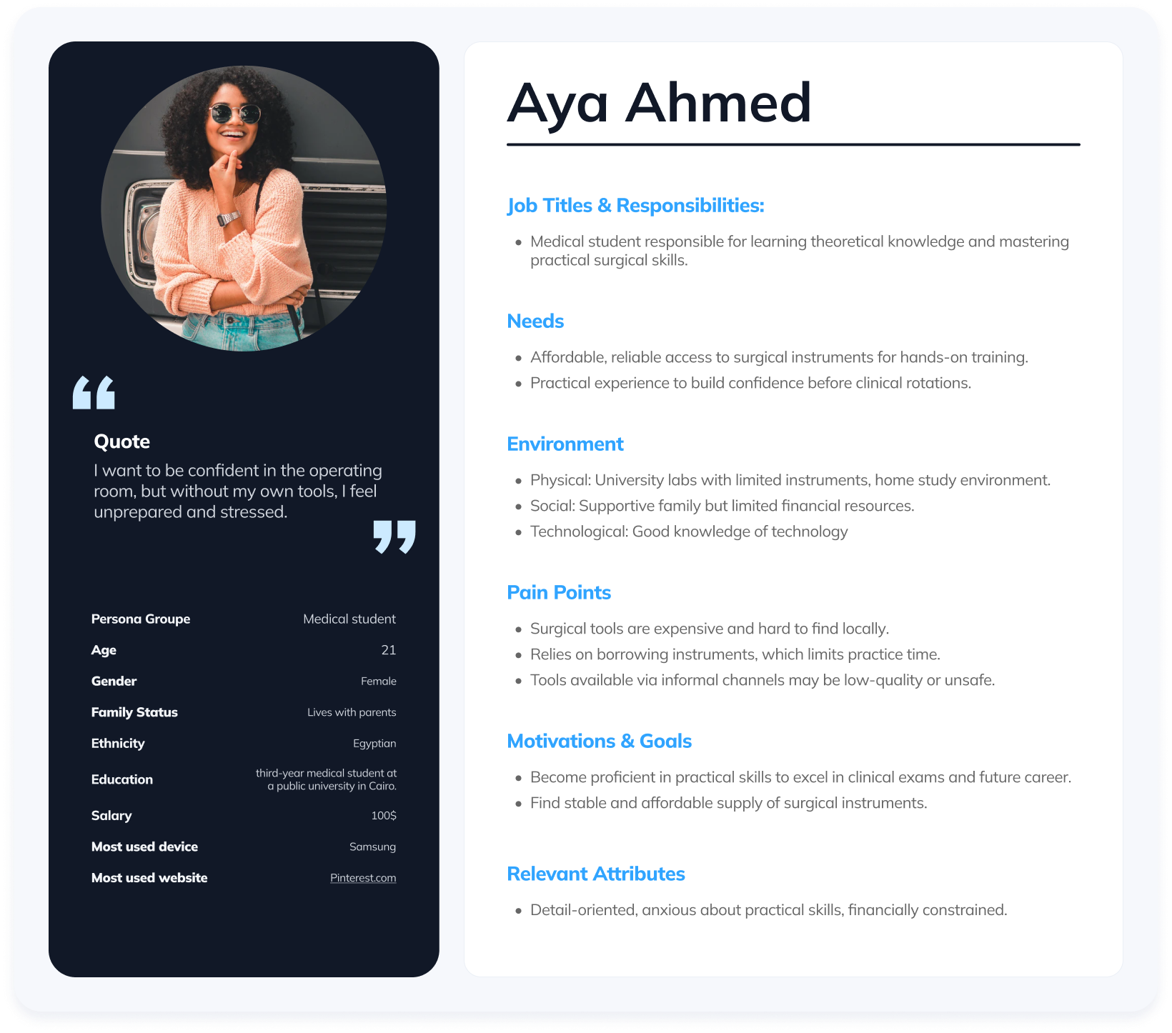
Define the Audience
To ensure the StudyKit app truly solves students’ real problems, it was essential to define and understand the core audience who would benefit most from the platform.
Target Users
The primary users are university students in Egypt from diverse academic fields such as engineering, medicine, fine arts, and dentistry. These students regularly need access to specialized study materials, tools, and kits that are often expensive or difficult to find.

My Process
The design process for the StudyKit app followed a structured and iterative approach, focusing on creating a simple, trustworthy, and student-centered marketplace. Each design decision was guided by user research insights and the goal of improving accessibility and efficiency for university students.
User Flow
The user flow was designed to ensure that students could quickly navigate the app from discovery to purchase:
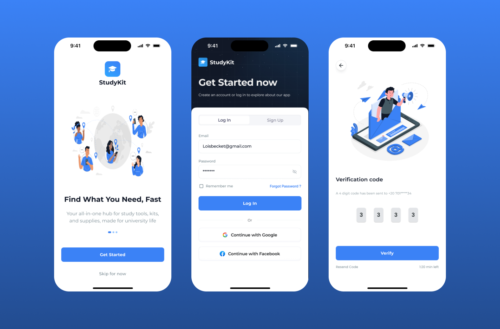
- Onboarding: Users are welcomed with short, catchy onboarding screens that explain the app’s value — “Buy, Sell, and Study Smarter.”
- Home & Categories: Students browse categorized study materials (Engineering, Medicine, Fine Arts, Dentistry).
- Search & Filter: A smart search system helps users find items quickly, with keywords like “drawing kit,” “microscope,” or “stethoscope.”
- Product Page: Displays clear visuals, pricing, and seller verification badges for trust.
- Chat & Transaction: In-app chat allows students to discuss details and confirm purchases directly.
- Notifications: Keeps users updated on order status, new listings, and price drops.
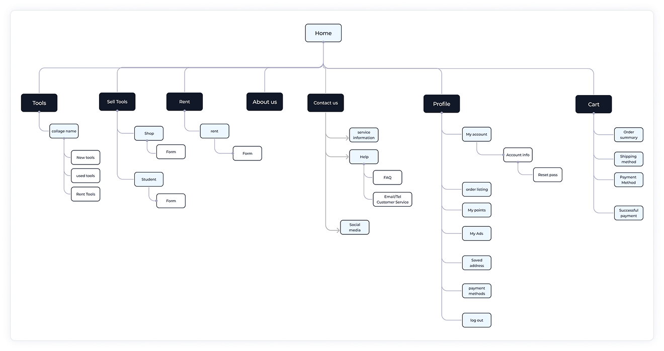
Information Architecture
The app’s structure was kept minimal and intuitive:
- Main Tabs: Home | Categories | Sell | Chat | Profile
- Subsections: Favorites, Notifications, My Listings, Purchase History
- This simple layout helps users navigate easily without feeling overwhelmed.

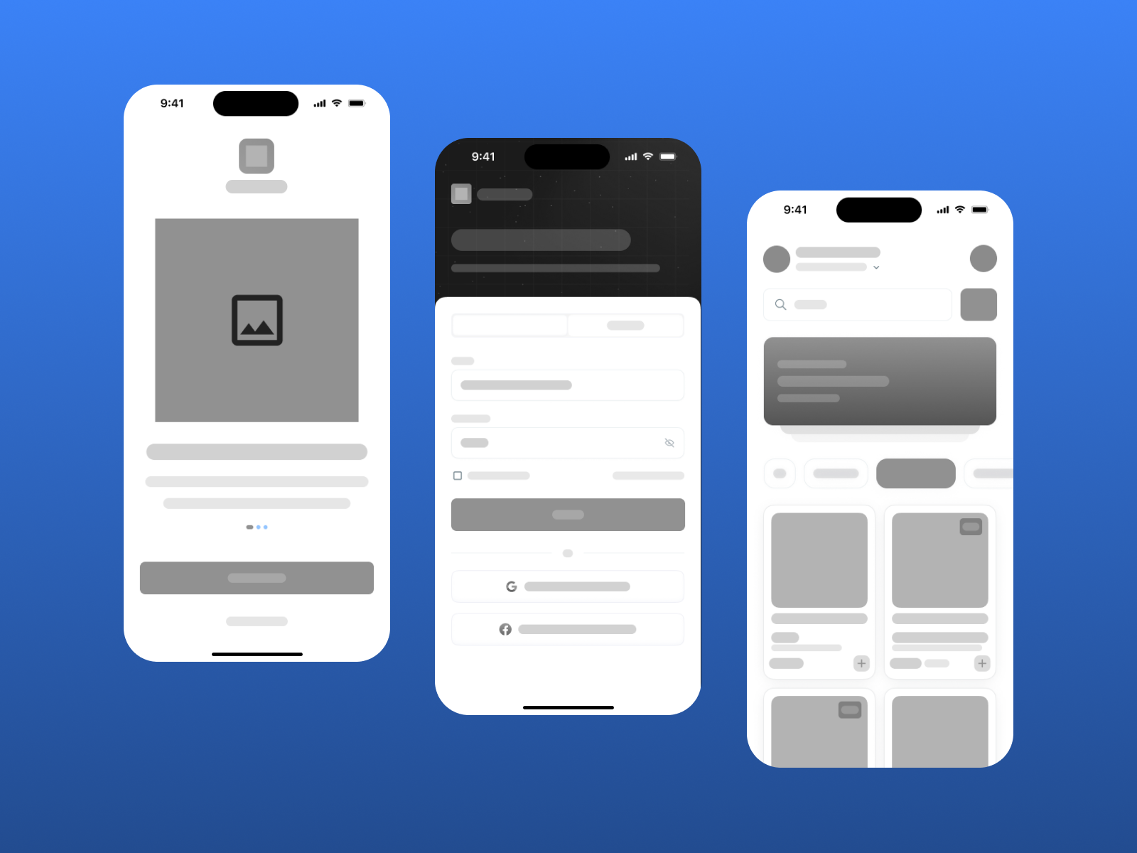
Wireframes to High Fidelity
- Wireframes: Started with low-fidelity wireframes in UXPilot to visualize key screens and establish layout consistency.
- Mid-Fidelity Prototypes: Introduced color hierarchy, visual balance, and student-oriented icons for academic relevance.
- Final UI: High-fidelity screens emphasized clarity, warm tones, and rounded edges to build trust and friendliness.

Design Decisions
- Trust & Safety: Seller verification and student ID integration were prioritized to reduce scams.
- Consistency: A clean and uniform design system ensures visual harmony across all screens.
- Accessibility: Chose readable typography and adequate contrast to support long usage sessions.
- Engagement: Notification and reward systems were added to increase user retention.
AI Prompts & Iterations
AI tools were used throughout the ideation and design process to enhance creativity, speed up exploration, and refine design directions. Using UXPilot, I generated and iterated prompts to test different UI structures, copywriting tones, and visual hierarchies.
AI Prompts Examples:
- “Design a clean, student-friendly app interface for buying and selling university supplies in Egypt.”
- “Suggest onboarding copy for a learning-themed marketplace app focused on trust and convenience.”
- “Generate error message ideas for search and wishlist empty states.”
- “Recommend 10 essential app screens for a student marketplace platform.”
Iterations:
Through multiple rounds of prompts and refinements, AI helped:
- Identify essential screens such as Login, Wishlist, Help Center, and Order Confirmation.
- Generate copy ideas for notifications, onboarding messages, and search keywords.
- Explore alternative color palettes and typography systems before finalizing the design system.
- Provide quick layout variations for testing different navigation patterns.


Impact on Design:
Integrating AI into the process reduced repetitive ideation time, allowed rapid prototyping, and provided diverse creative directions. The final UI blends human-centered design decisions with AI-assisted inspiration, resulting in a faster, more refined product outcome.
Final Solution
After identifying the key challenges faced by students and testing early wireframes, the final StudyKit app was designed to deliver a seamless, safe, and user-friendly marketplace tailored to academic needs. The solution focuses on simplicity, trust, and accessibility — ensuring students can easily buy, sell, and exchange study tools in just a few taps.
Final Design Overview
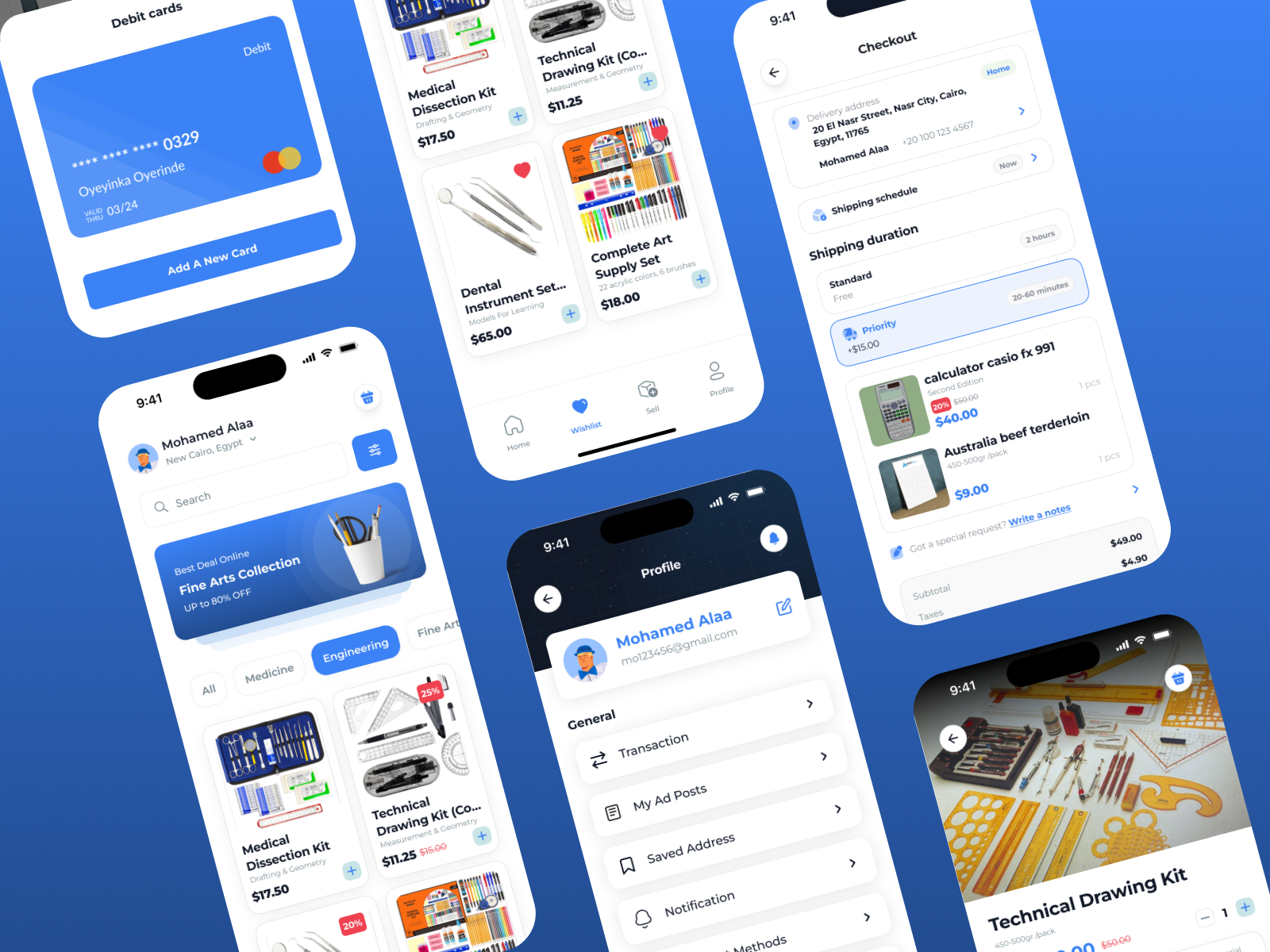
The StudyKit app includes a full journey of over 15 key screens that capture the complete user experience:
- Onboarding Screens – Introduce the app’s purpose: “Buy, Sell, and Study Smarter.”
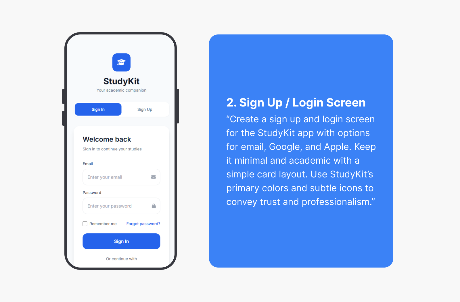
- Login & Sign Up – Simple and quick authentication using email or student ID.
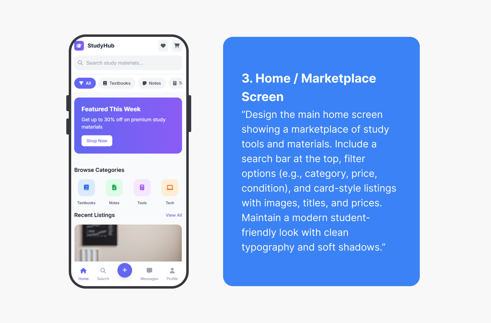
- Home Screen – Displays featured categories such as Engineering, Medicine, Fine Arts, and Dentistry.
- Search & Keywords Screen – Allows users to type academic tool names or browse trending keywords.
- No Results Found – A friendly empty state encouraging users to try new searches or request items.
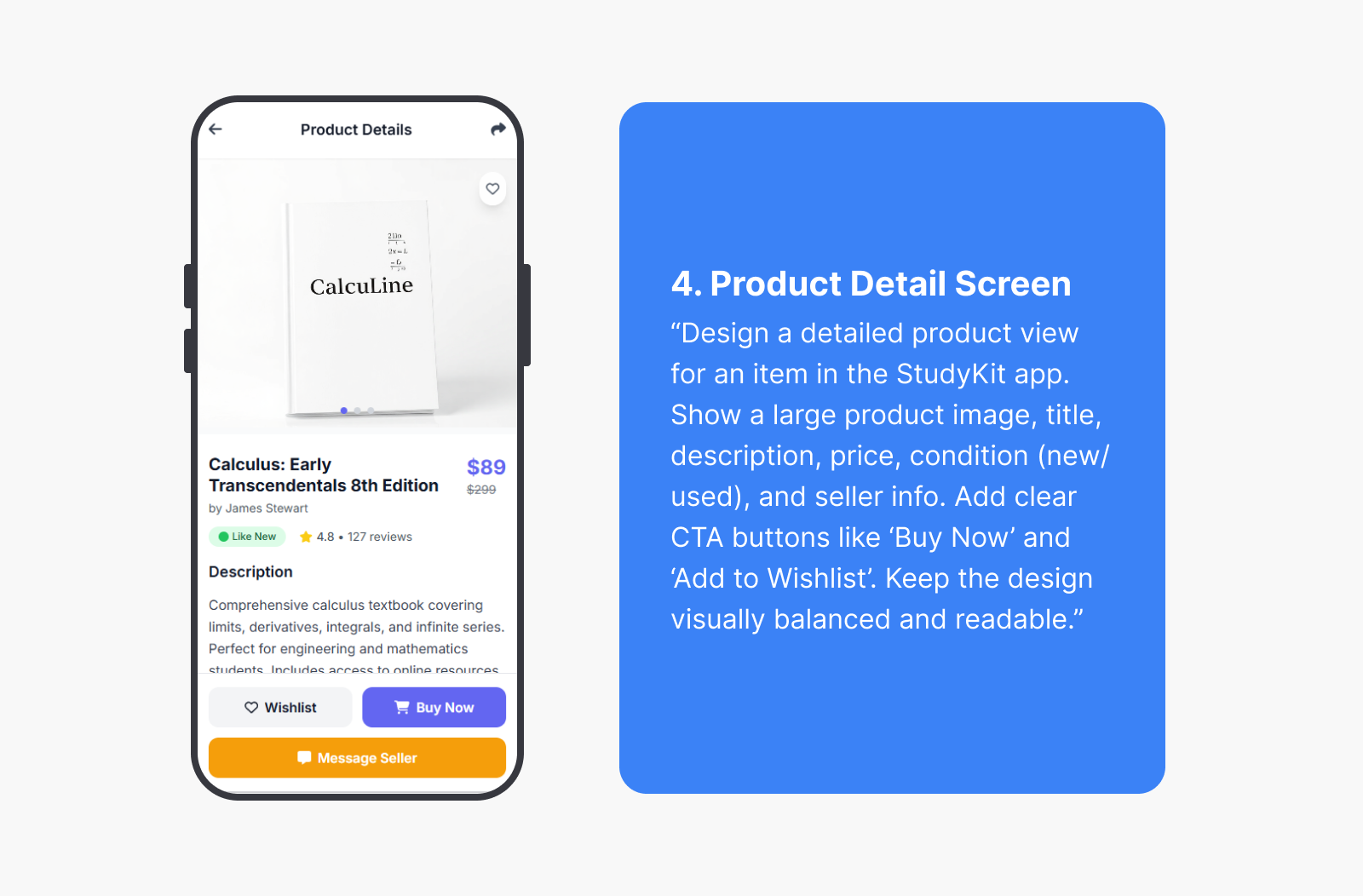
- Product Details – Showcases product photos, description, price, and verified seller details.
- Wishlist – Lets users save favorite items to revisit later.
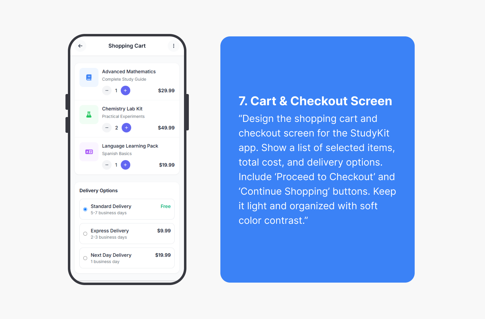
- Order Confirmation – Provides clear confirmation and delivery details after checkout.
- Saved Address – Enables quick selection of delivery locations for faster orders.
- A New Card – Secure payment setup with easy management of multiple cards.
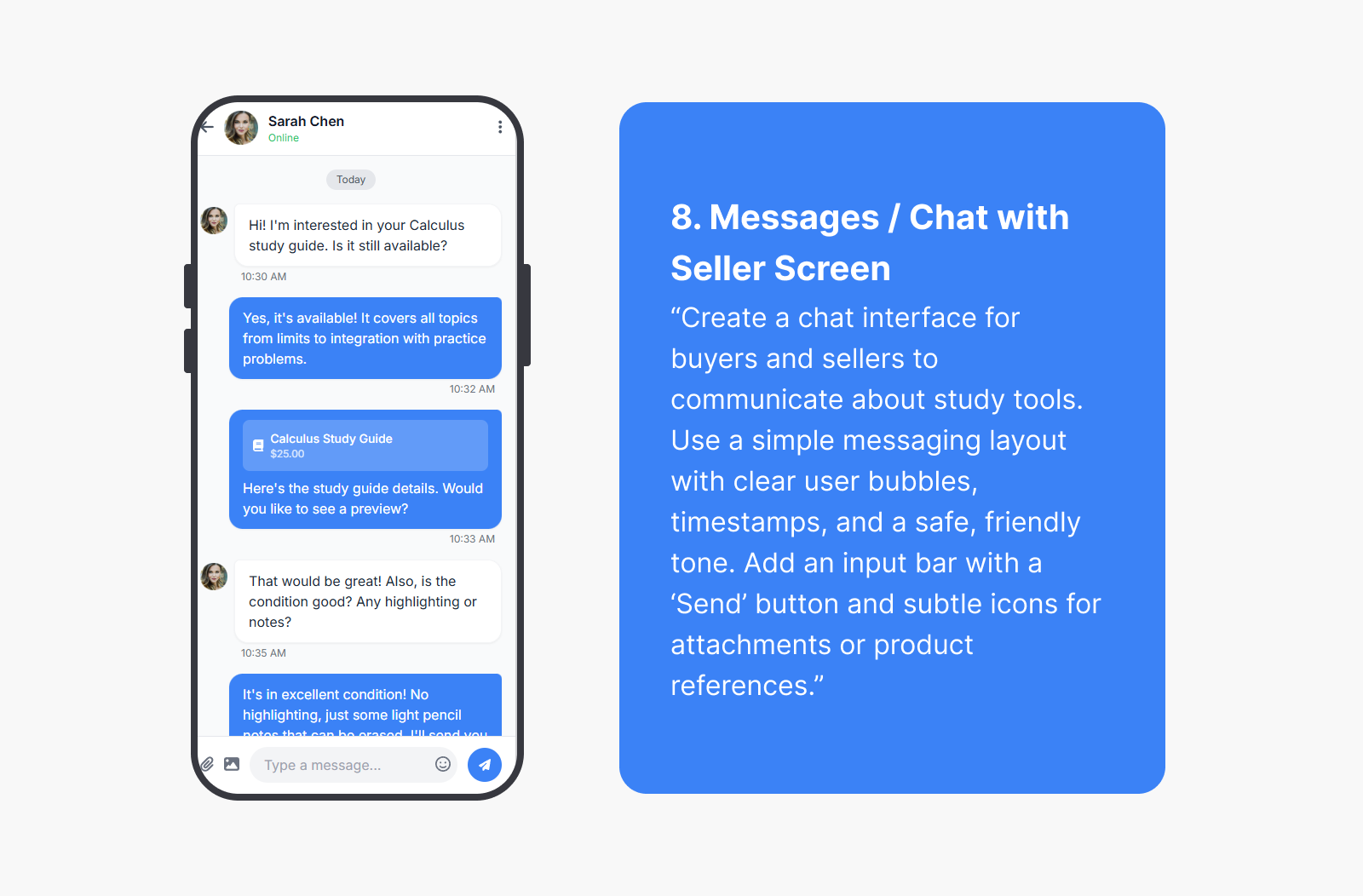
- Chat Screen – In-app messaging for communication between buyers and sellers.
- Sell Item Screen – Simple form to upload product images, details, and category.
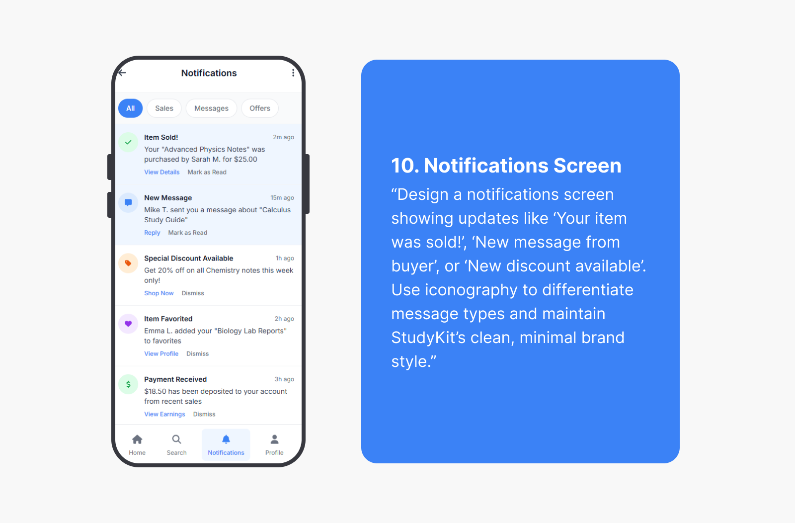
- Notifications – Keeps users updated on offers, messages, and delivery progress.
- Help Center – A section for FAQs and support, ensuring smooth user assistance.
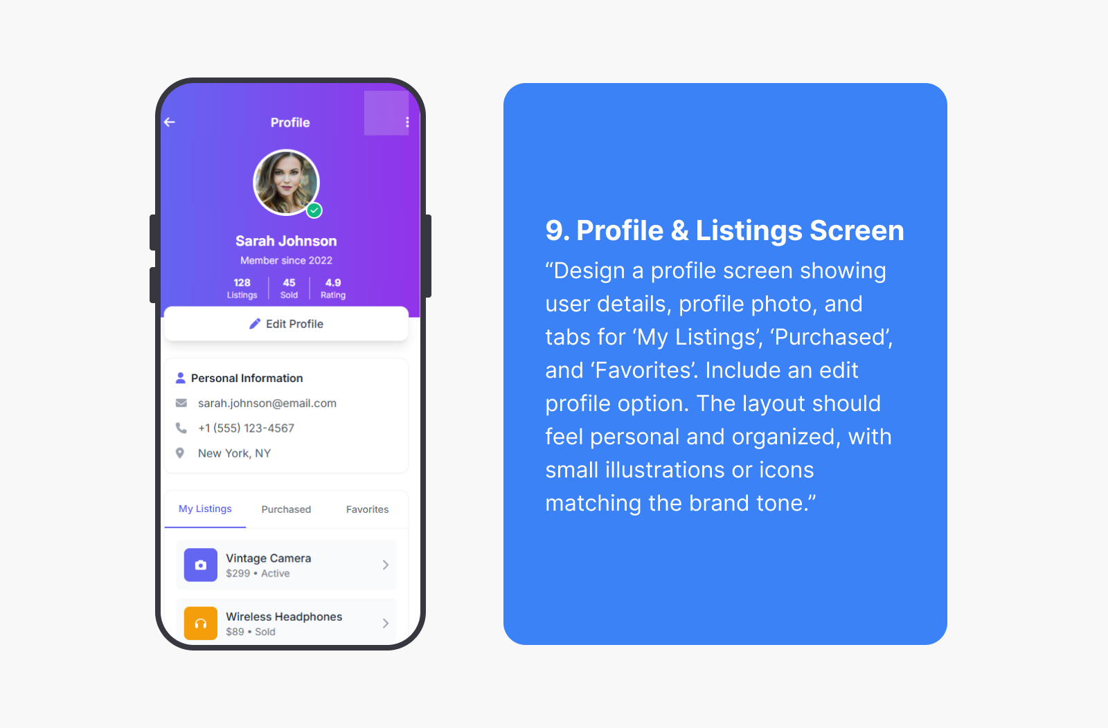
- Profile Page – Displays user info, listings, and transaction history.
Each screen was designed with clarity, minimalism, and academic relevance, ensuring smooth navigation and consistency across all flows.
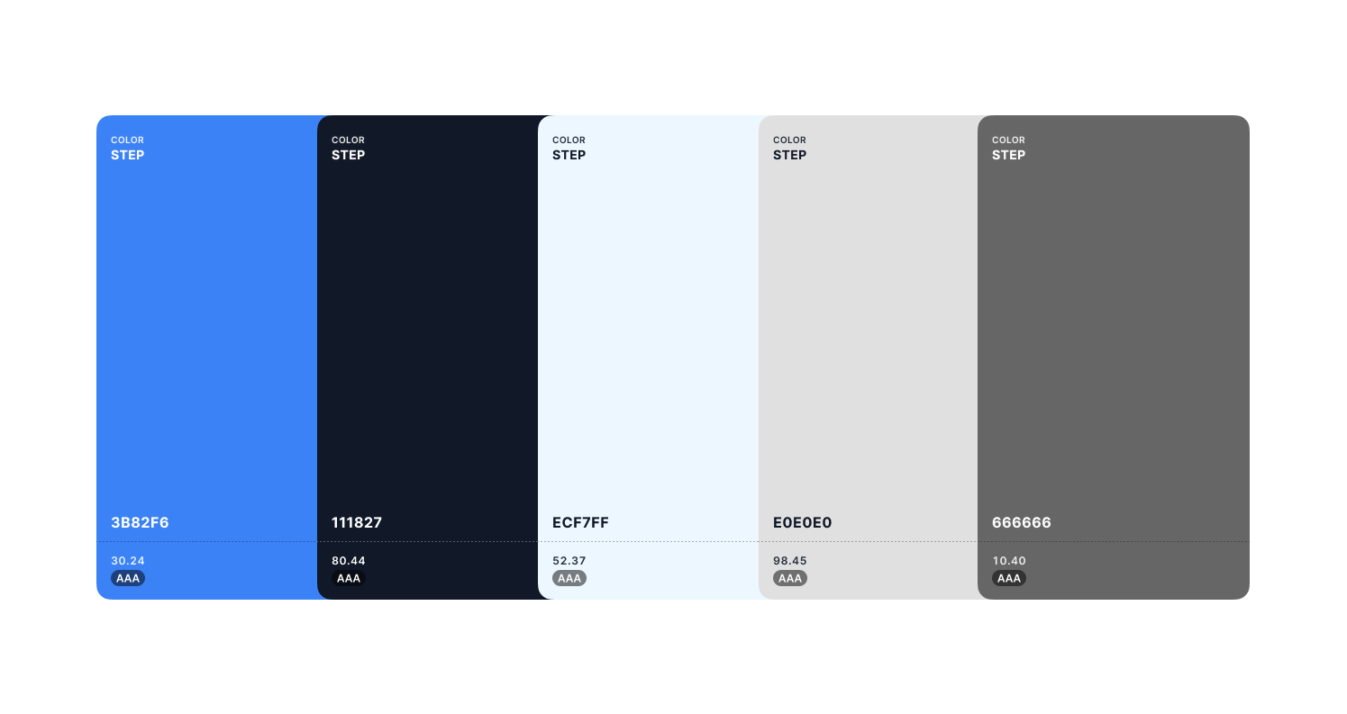
Color Palette
The color palette was designed to convey a clean, modern, and trustworthy experience for students and professionals using the app. The goal was to maintain a balance between clarity and engagement, ensuring that the interface feels bright, friendly, and easy to navigate while still supporting strong usability and accessibility.
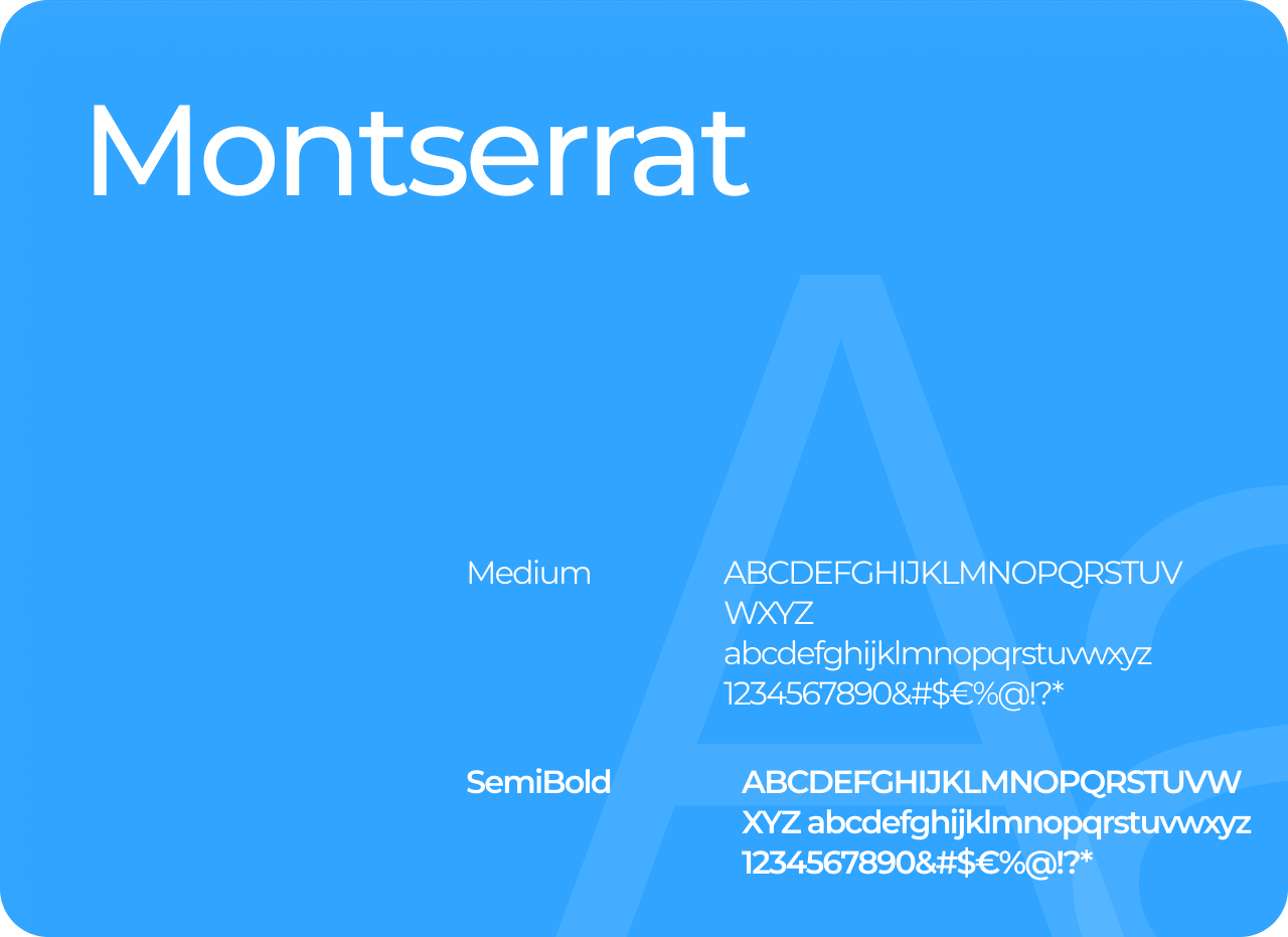
Typography
Typography emphasizes readability and hierarchy for both visual comfort and usability.
- Primary Font: Poppins — modern, approachable, and highly legible.
- Headings: Bold, structured type to highlight important content.
- Body Text: Regular weight for easy reading and clean spacing.
- Buttons & Labels: Medium weight for clarity and emphasis.
The consistent use of typography supports the clean, student-friendly brand personality of StudyKit.
Tools used
From brief

Topics
Share
Reviews
2 reviews

Awesome, Great work!

Bravo Mohamed your case study shows a clear problem definition, solid UX thinking, and a clean,friendly UI. The flow is intuitive, and the focus on trust is a strong differentiator.
To level it up, I’d recommend adding more depth in user research insights, showing usability testing results, and refining trust & transaction flows (ratings, reviews, secure payments). Strengthening visual identity and adding micro-interactions would also make the UI more distinctive.
Overall keep iterating
You might also like

Smartwatch Design for Messenger App


Bridge: UI/UX Rebrand of a Blockchain SCM Product


Pulse Music App - Light/Dark Mode


Monetization Strategy


Designing A Better Co-Working Experience Through CJM


Design a Settings Page for Mobile
Product Thinking Courses

Ethical & Responsible Product Design


Product Vision & Strategy


Product Management Foundations
