Spotify UI – Apple Vision Pro
👋 Hi folks,
I'm obsessed with acquiring new skills and knowledge. I have been exploring the spatial UI design for VisionOS.
I want to share my Spotify x Apple Vision Pro UI design.
Let me know what you think 😄
Reviews
3 reviews
Hi Anna, great job on the design! I really appreciate the clarity and simplicity of the interface. The dark version definitely offers a stronger contrast and improves readability. It would be interesting to see how the interface could adapt to ambient lighting conditions for an even more dynamic experience. Keep up the great work!
Hi Anna,
I really liked the design layout and thought process. Darker version has better contrast and less readability issue.
Well done, Anna
This is a clean interface, and I hope there would be a way for the system to read the room ambiance at different times, to display the interface in a color that would have a great contrast with the room.
You might also like
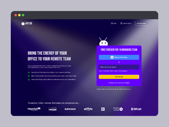
SaaS Signup Design
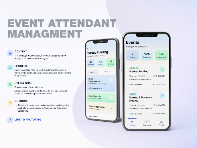
Events Managment App
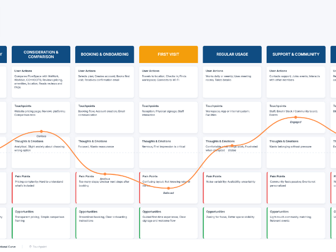
Customer Journey Map — Offsite Co-Working Experience
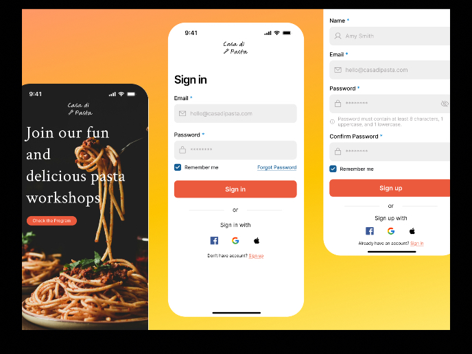
Mobile Onboarding: Casa di Pasta
Accessible Signup & Login Experience — Brainex
Accessible Signup Form
Popular Courses

UX Design Foundations

Introduction to Figma

