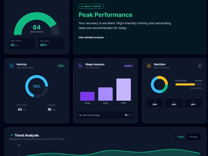
Splitewise- International splitting


Splitwise is a popular expense-sharing app that allows friends, families, and colleagues to manage and split expenses efficiently. Despite its success, the app faced usability issues that impacted user engagement and conversion rates for premium features. We aimed to address these challenges to make Splitwise more accessible, user-friendly, and valuable for all users.
Tools used
From brief

Topics
Share
Reviews
3 reviews

Hello, Yasaman!
Your work looks very clean and professional, with a strong focus on the app's functionality. The effective use of space and structure helps present the information clearly. Additionally, the device presentation successfully creates a contextual understanding of the app's usage.
To enhance the design further, consider incorporating more contrasting accents or gradients to highlight key interface elements and draw attention to essential areas.

Design look really cool.

The idea is really cool. But I've some observations for you (In terms of UI).
- The profile photo is transparent. You can make it Opacity: 100%. It will give full visibility.
- Icons can be consistent.
- I think there is an inconsistent issue regarding spacing and elements widths.
Overall it looks good. Hope it adds real value to users. Thank you.
You might also like
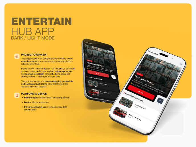
EntertainHub App (Dark / Light Mode)

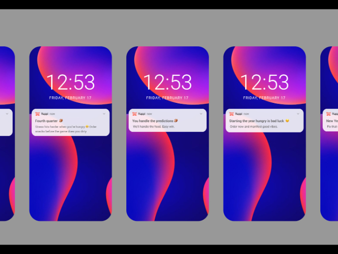
Rappi is always present at the best events

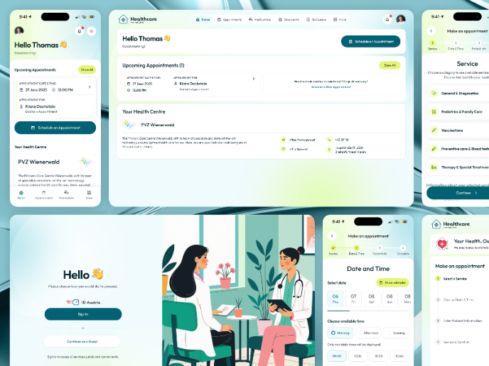
💊 Healthcare Desktop & Mobile App UX/UI Design

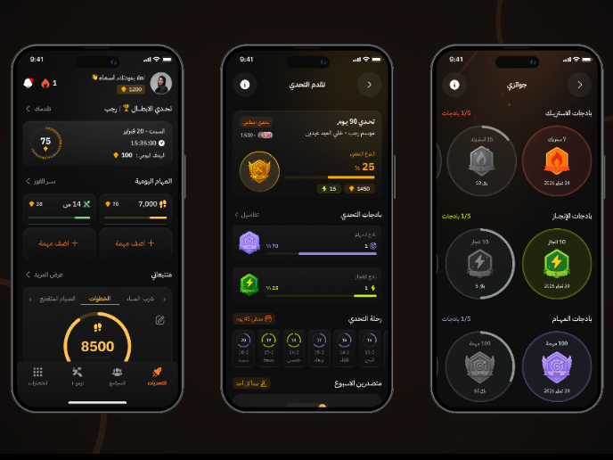
Fitness Challenges App

Personal Wellness Dashboard


Events Managment App
Visual Design Courses

UX Design Foundations


Introduction to Figma

Design Terminology
