Signup Form for SaaS Platform - LearnX

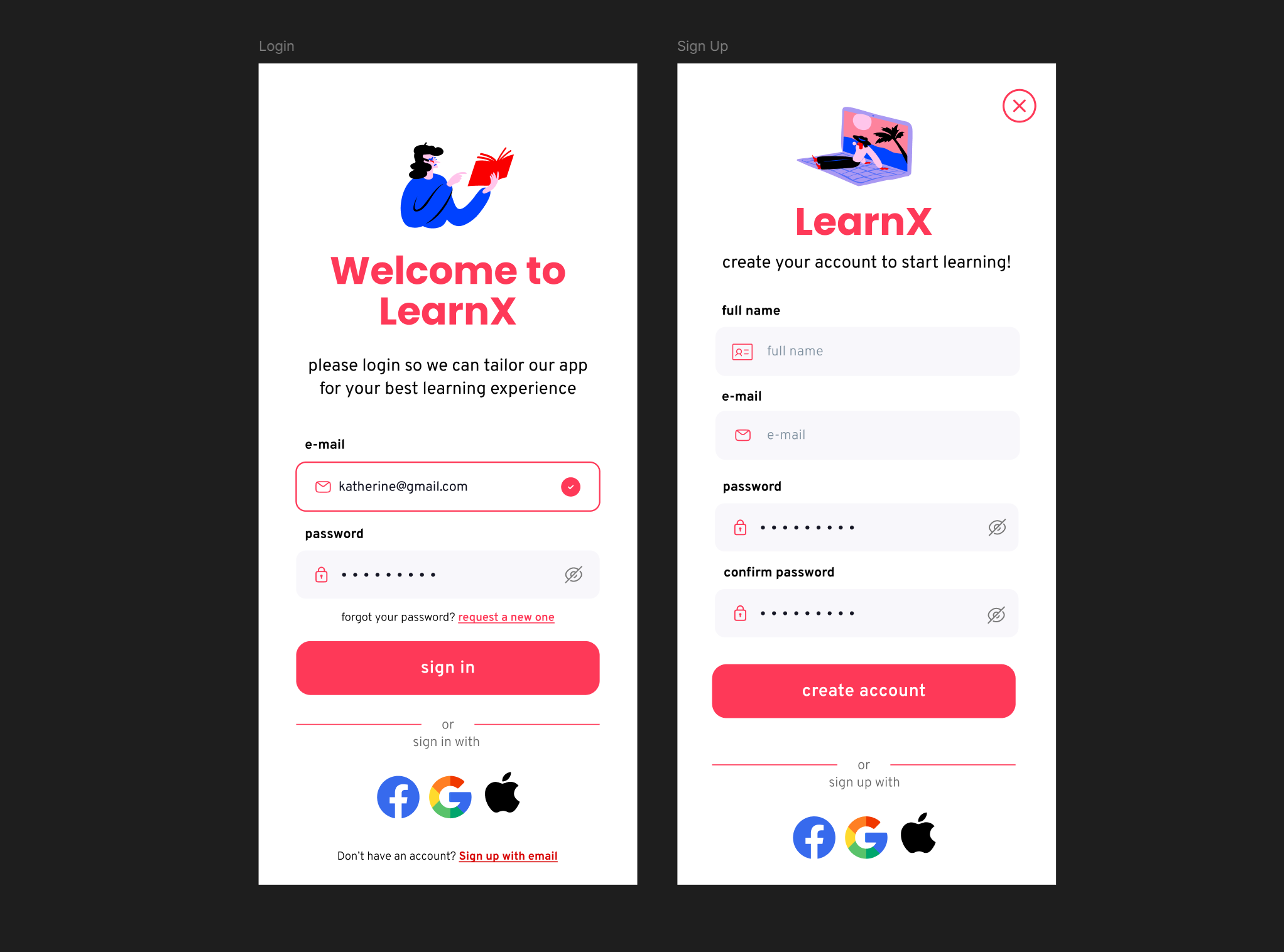
I designed a sign up/login form for an online learning platform.

Reviews
2 reviews
I think you did a good job with the login/signup pages. They are very well-suited to a learning platform. I like how you used color to highlight the elements that need to stand out. However, I think there are a few areas for improvement. You offer multiple ways to log in, but only provide the option to sign up using an email, which seems a bit irrational as it limits the choices for users who may prefer other signup options such as social media accounts or phone numbers. Finally, it would be helpful to have an option for users to reset their passwords in case they forget them.
Additionally, it would be great to see the design process and understand your perspective. We encourage users to treat projects at Uxcel as case studies. You can learn more about this from this tutorial. Other than that, well done!

Hi Marek!
Love the aesthetic direction you took with these sign in / sign up pages, minimal and straightforward.
An addition that I believe can help improve the user experience is changing the success state of a field to green, a common color users are familiar with seeing as a visual indicator when they've filled out a field successfully.
You also have an opportunity to utilize the placeholder copy to help further inform users how to properly fill out the field, ex: the email field can say "name@email.com" to indicate what format to type in.
Thanks for sharing, keep it up!
You might also like

Pulse — Music Streaming App with Accessible Light & Dark Mode


Islamic E-Learning Platfrom Dashboard

SiteScope - Progress Tracking App


Mobile Button System


FlexPay


CJM for Co-Working Space - WeWork

Visual Design Courses

UX Design Foundations


Introduction to Figma

Design Terminology
