Sign Up Page Design Exploration – HIREMATE

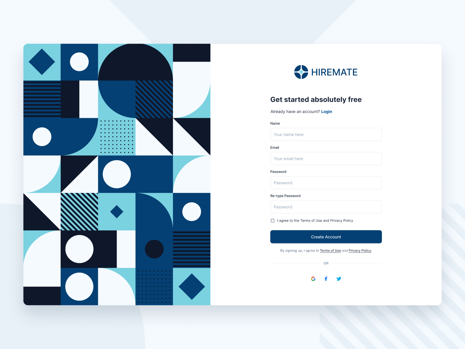
Here’s a fresh take on a sign up experience with a bold geometric visual on the left to balance the minimal form on the right. The goal was to create a welcoming first impression while keeping the user journey clear and effortless.
👁️🗨️ Focus: Modern layout, visual hierarchy, and accessibility.
🧩 Style: Clean form + playful geometric patterns.
🛠️ Tools: Figma
Reviews
2 reviews

Gustafian, your sign-up page is visually engaging with a modern, balanced layout and vibrant geometric design that creates a strong first impression. Simplifying the form, refining hierarchy by reducing logo size, and making the heading and social login options more prominent could improve clarity and completion rates. Overall, it’s a fresh, accessible design with great potential to be even more user-focused.

This project presents a login/sign-up layout where the left side features a bold geometric illustration, while the right side contains the form fields. The geometric graphic is visually appealing, and the chosen colors are vibrant and well-balanced.
However, I’m not entirely sure whether such a large and colorful element should occupy so much space, especially if it serves only an illustrative purpose and does not convey anything about the company or its services. While it adds aesthetic value, it might draw attention away from the core functionality of the page. A simpler layout, focusing on the form itself, could be more effective.
Another point concerns the logo size. Currently, the logo appears too large, giving it disproportionate emphasis. Since users are already on the company’s platform, the brand is already established in their minds. I would recommend reducing the logo’s size—either the icon alone or the icon with the wordmark—so that it feels present but not dominant. Conversely, the main page heading could be slightly larger, but more concise. For example, instead of “Get started absolutely free,” a shorter phrase like “Get started free” or “Create your free account” would be faster to read.
Regarding the placement of the “Already have an account? Log in” link, it is usually more intuitive to place this below the “Create Account” button (or vice versa when on the login page). At present, that area is occupied by the “By signing up, I agree to the Terms of Use and Privacy Policy” statement. This could be simplified by including underlined links to these documents within the checkbox label, so users can access them if they wish, without them taking up a prominent spot in the form flow.
The form itself also feels a bit heavy, with fields for name, email, password, and re-type password. Reducing the number of fields—at least on the first step—would likely improve completion rates. Email and password are usually enough for an initial sign-up, with additional details requested later in the process.
Lastly, I would give greater visibility to the social login options (Google, Facebook, X). Currently, they are quite understated and positioned after the form fields, meaning users see the longer form first and may drop off. If these buttons were placed directly under the title—larger, more prominent, and clearly labeled—they could encourage faster, frictionless sign-ups. The traditional “OR” separator could then lead into the email/password form for those who prefer that route.
You might also like

Smartwatch Design for Messenger App


Bridge: UI/UX Rebrand of a Blockchain SCM Product


Pulse Music App - Light/Dark Mode


Monetization Strategy


Designing A Better Co-Working Experience Through CJM


Design a Settings Page for Mobile
Popular Courses

Core UI Components


UX Design Foundations


Introduction to Figma