Sign up Form for SaaS Platform


I've designed a sign-up form for a SaaS platform with strict adherence to Web Content Accessibility Guidelines (WCAG) to create a more inclusive and seamless user experience. While the original sign-up form in the Uber Eats app is well-designed, I’ve made specific enhancements to further improve its accessibility.
Luminance Contrast for Readability: To ensure text is easily readable, all text elements meet or exceed the WCAG-recommended contrast ratio of 4.5:1, improving visibility for all users.
Distinct Styles for Interactive Elements: Interactive elements are styled for easy identification. Links that switch between the Login and Sign-Up screens are underlined and displayed in green, enhancing navigation and usability.
Consistent Navigation: Uniform headings throughout the app provide clear orientation cues, helping users understand their location within the interface and ensuring a structured, predictable experience.
User Feedback on Interactions: Immediate feedback is provided for user actions. Error messages are highlighted with colored text, error icons, and red-bordered input fields, making mistakes easily noticeable and quick to correct.
Clickable Labels for Input Fields: Input labels remain visible and interactive at all times, preventing confusion and improving usability.
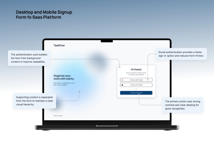
Password Visibility Toggle: An eye-slash icon allows users to toggle password visibility, reducing errors and enhancing convenience during input.
Multiple Login Support: Users have flexible recovery and access options, including “Forgot Password,” third-party login integrations, and direct support center assistance.
Language Accessibility: A language-switching option ensures inclusivity by allowing users from diverse linguistic backgrounds to navigate the app in their preferred language.
Tools used
From brief

Topics
Share
Reviews
5 reviews

Great work on creating an accessible and user-friendly signup flow! Here are a few suggestions.
What’s Working Well:
- Clear Visual Feedback: The use of visual cues helps users identify issues easily.
- Good Use of Contrast: Ensures readability and accessibility.
- Persistent Labels: Staying visible helps users maintain clarity throughout the process.
What Can Be Improved:
- Copywriting: Some phrases, like “Signup with Google,” could be clearer to guide the user through the process.
- Success Screen: The user should be given a clearer next step after completing the sign-up, such as directions to the next part of the app.
- Iconography: The icons could be refined to improve clarity and make sure they align with the overall design for consistency.
You’ve done a solid job, just a few tweaks to make it even more intuitive! 🤙

Final Feedback for Your Mobile Signup Flow Design
Your mobile signup flow is well-executed, focusing on accessibility, usability, and clear feedback. Below are the strongest aspects and critical areas that need improvement to make the experience even better.
Strengths (Well-Designed Elements)
1️⃣ Consistent and Readable Labels
- The labels remain visible while users type, preventing confusion and improving screen reader compatibility.
2️⃣ Strong Visual Contrast for Readability
- Text, buttons, and icons maintain high contrast, ensuring legibility for users with low vision.
3️⃣ Error Handling with Visual Cues
- Error messages use red borders and icons, making it easy to identify mistakes quickly.
4️⃣ Touch-Friendly UI for Mobile
- Buttons and input fields have adequate touch areas, preventing accidental taps.
5️⃣ Password Visibility Toggle
- The eye icon for password visibility is well-placed for easy access.
Areas That Need Improvement
1️⃣ Error Message Contrast Needs Improvement
Issue: Red text on a dark background may not be readable for users with colour blindness.
Fix: Increase the contrast ratio by using a lighter red (#FF6B6B) or adding a subtle background behind error messages.
2️⃣ Signup with Google Button Text is Unclear
Issue: “Signup with Google” does not specify whether users will be signed up immediately or redirected for additional details.
Fix: Change the text to “Continue with Google” to clarify that users will proceed with the signup process rather than completing it in one tap.
3️⃣ Signup Success Screen Lacks Next-Step Guidance
Issue: After signing up, the screen only confirms success but doesn’t guide users on what to do next.
Fix: Add a clear CTA button such as:
- “Go to Dashboard” (if users are automatically logged in).
- “Verify Your Email” (if confirmation is needed).
Helena has made a constructive comment. I fully agree with her.

You've applied the sign-up flow cases very well! The designs I see are also very neat. Good work!

👏 Great job, Lê Xuân Bách!
Your SaaS Sign-Up Form shows a clear understanding of accessibility best practices — from strong contrast ratios to persistent labels and inclusive language options 🌏. The flow feels structured and easy to follow, with thoughtful feedback for user actions 👏
You might also like

eWallet App Development Project


🖥 Desktop Checkout Flow Design


Website CRM Dashboard


Helpful 404 Error Page for a Fintech Mobile App

TaskFlow Authentication Flow


Pebble Accessible SAAS Signup Flow

Visual Design Courses

UX Design Foundations


Introduction to Figma

Design Terminology
