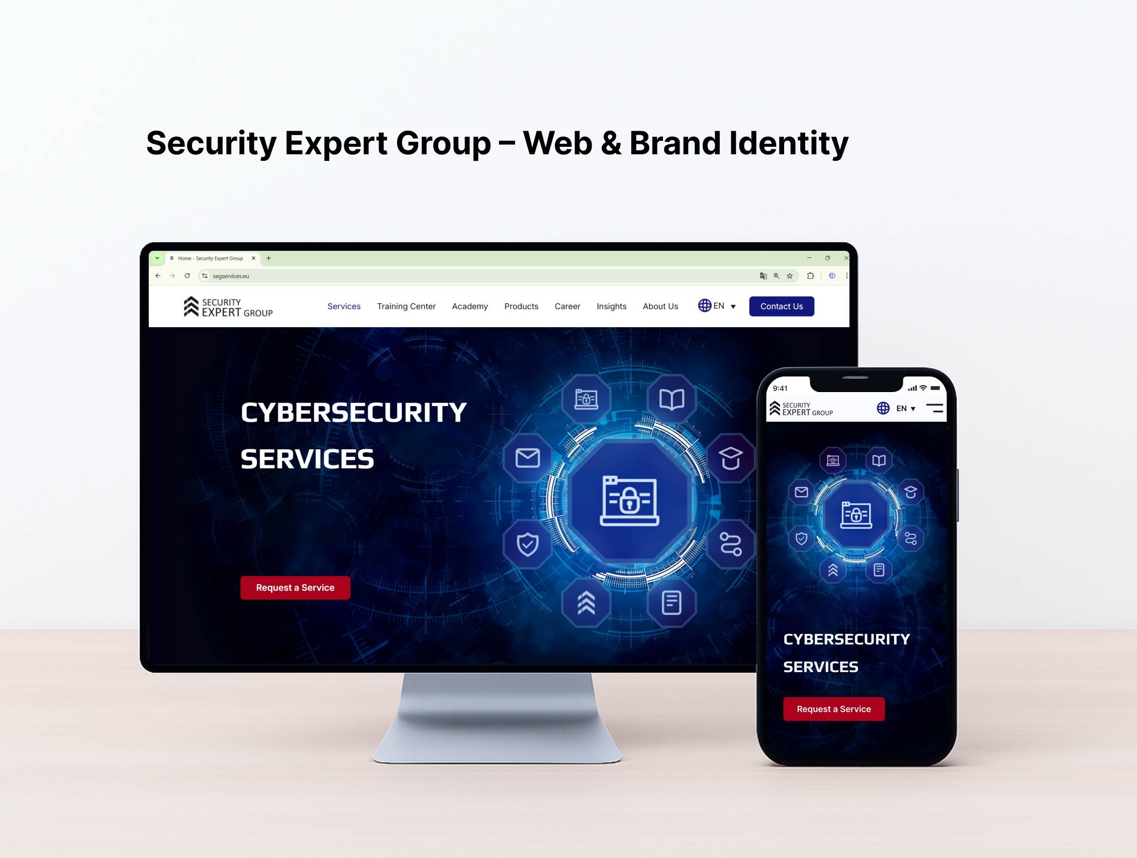
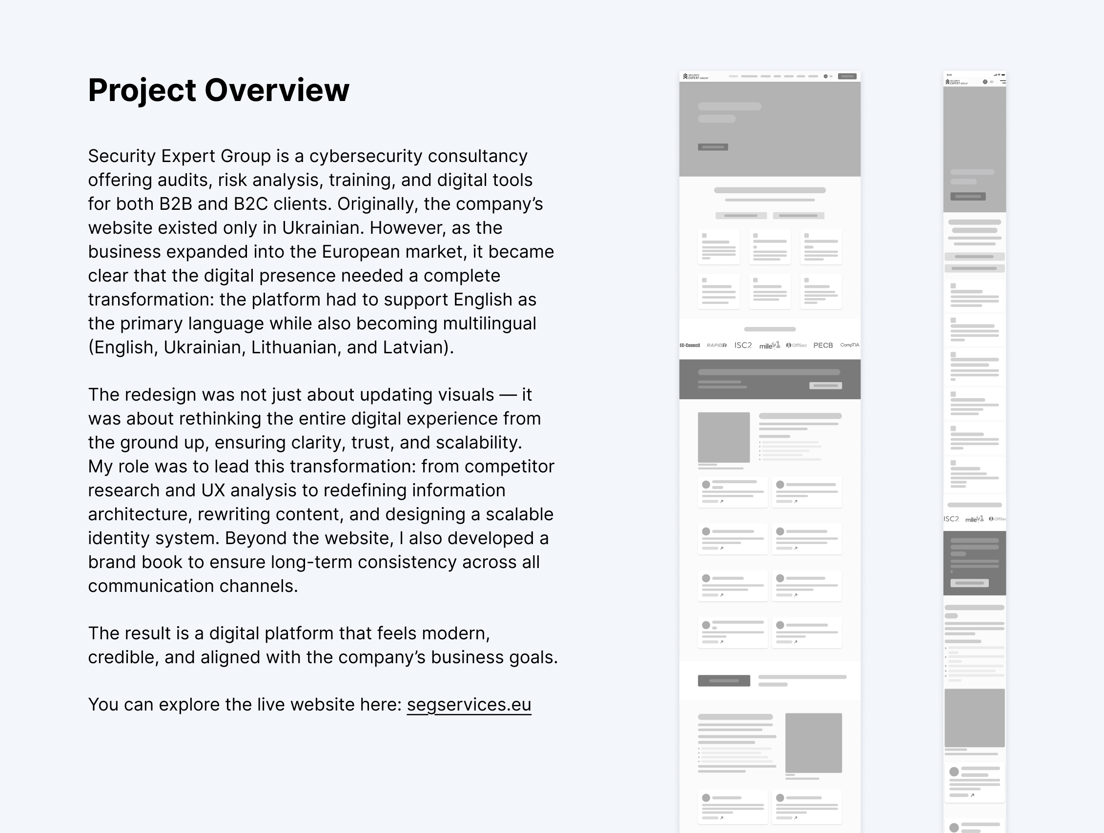
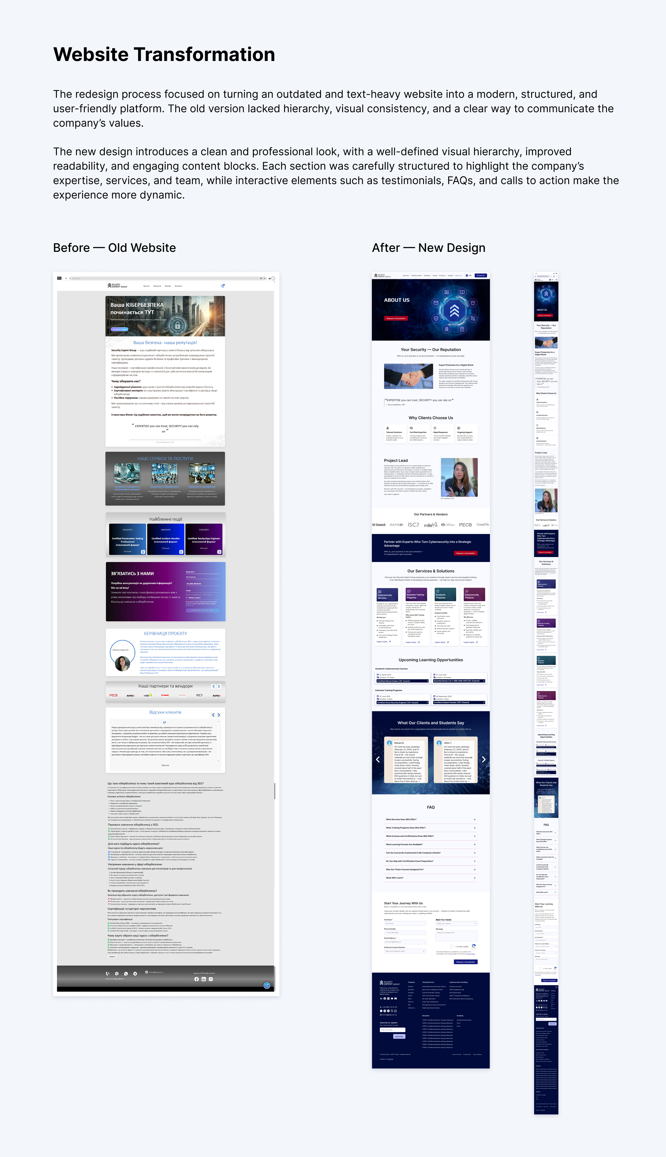
Security Expert Group — Web & Brand Identity Redesign
Thank you for watching!
Reviews
3 reviews
Overall solid work – you can see the project had business sense and actually solved concrete problems.
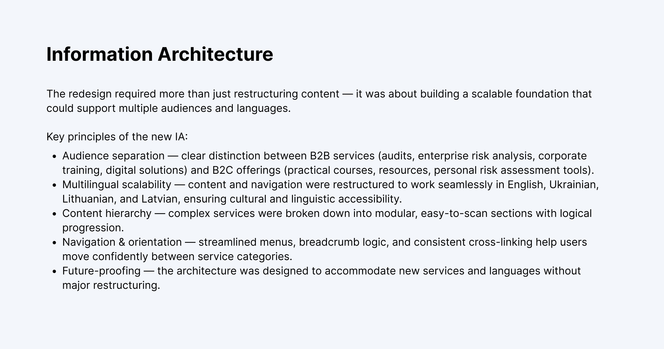
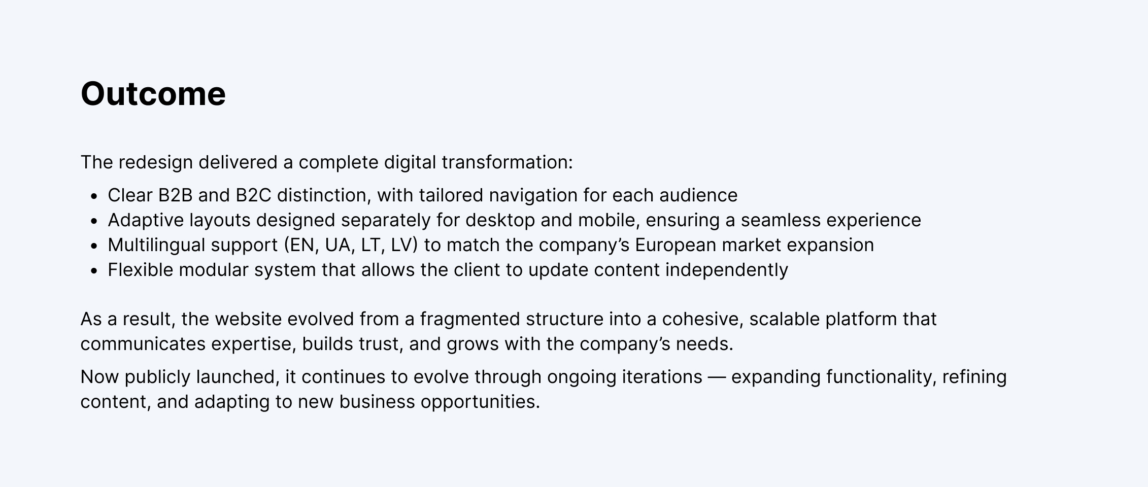
- Real transformation - This wasn't another "we refreshed colors and fonts." You took a business that had one language and a local mindset, and prepared it for European expansion. That's concrete value.
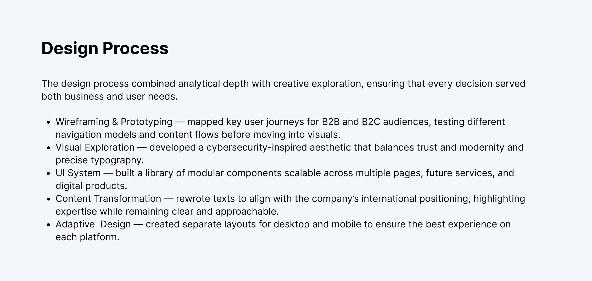
- Good Process with structure - Research → IA → wireframing → visual → system. Classic, but done properly. I can see that you thought first, then drew.
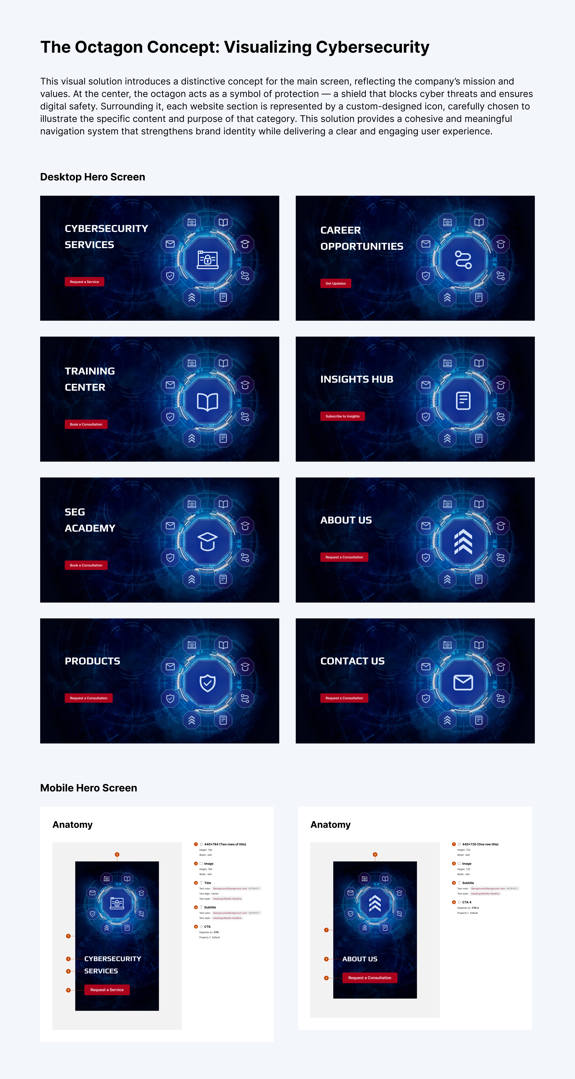
- Octagon concept - Nice idea for visual consistency and navigation. Those hero screens with icons look good and actually build recognition.
What makes me wonder?
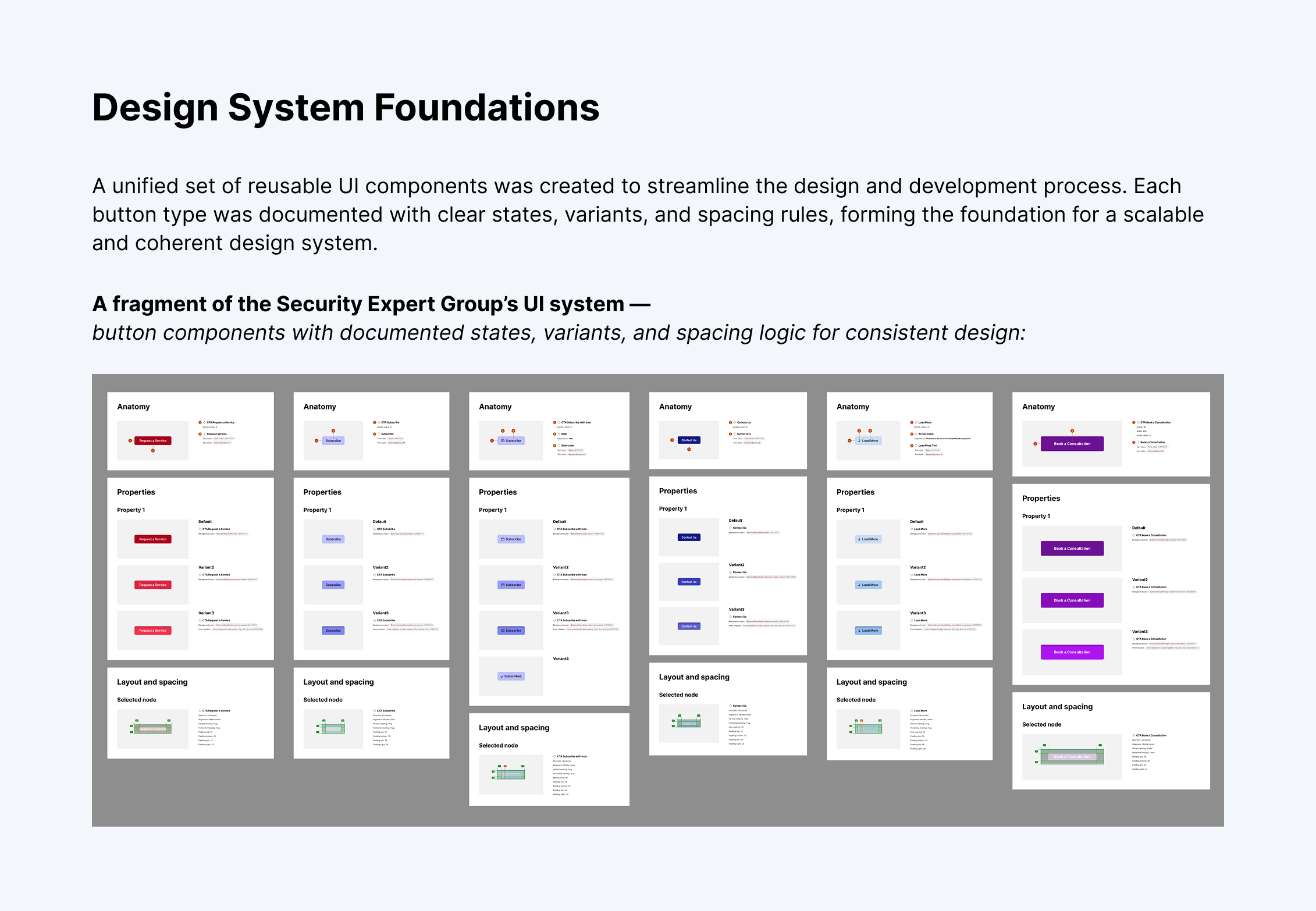
- Design system – You're showing screens with buttons and their states, but that's basics. A real design system is much more – tokens, spacing scale, grid system, components in different contexts, documentation for devs.
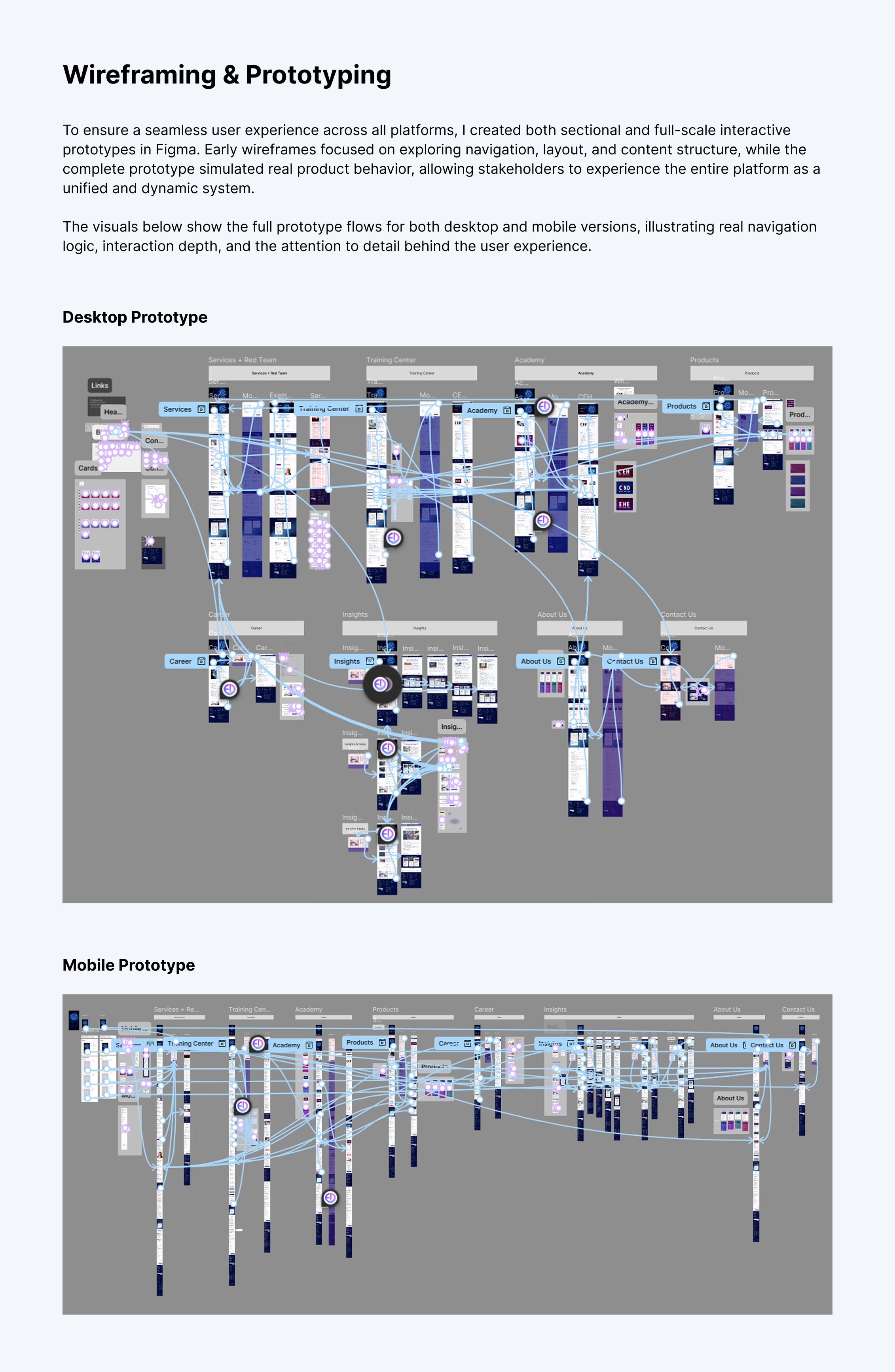
- Prototypein in Figma - Massive user flow maps with hundreds of connected screens. Question: was this an effective method? Because often such mega-flows in Figma are overengineering – more time on maintenance than actual testing of solutions.
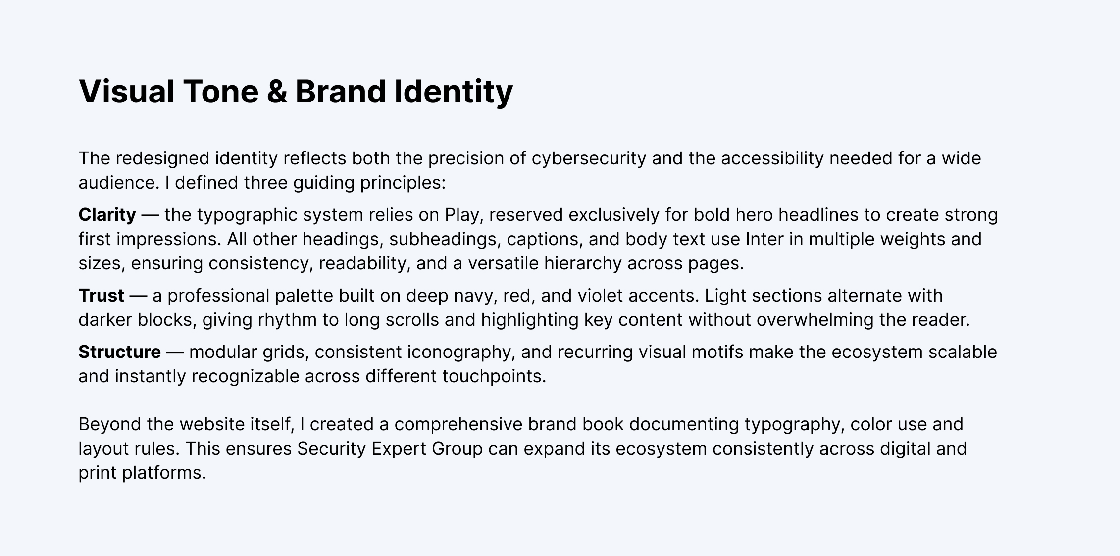
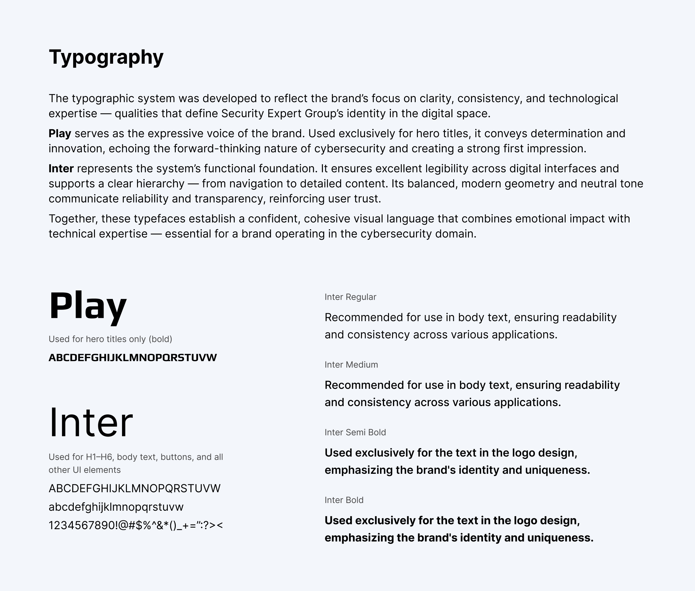
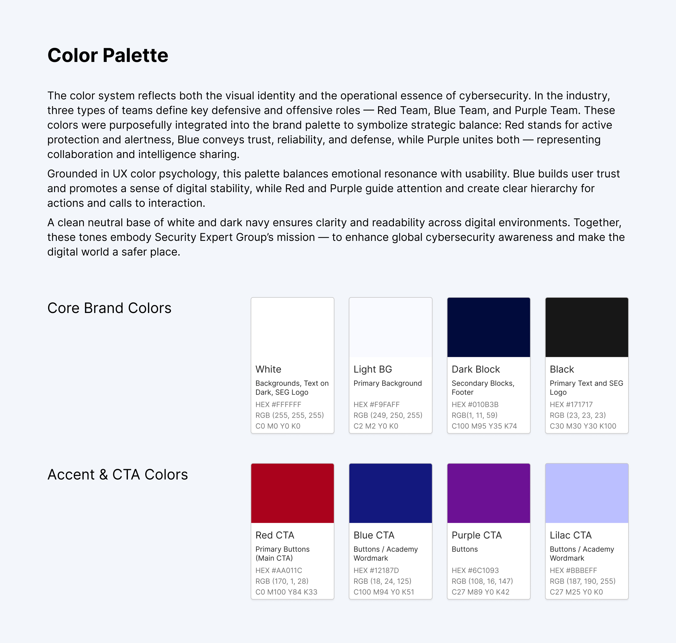
- Branding – You talk about a brand book, show typography and colors, but I don't see why specifically Play and Inter, why this particular shade of navy?
What's missing?
- Metrics / results - Zero data on whether this worked business-wise. Did traffic increase? Did conversion improve? Did EU clients actually start clicking more? I know we sometimes don't have them, but it's worth noting whether they were measured at all.
- Challenges and trade-offs - Every project has challenges. What went wrong? What did you have to simplify? What did you struggle with? A perfect case study is a red flag – means it was either trivial, or you're hiding something.
Summary:
Good, sensible project, professionally executed. But the presentation is a bit... safe. I'm missing honesty, doubts, real challenges. Everything looks like a success story without hiccups, and projects like that don't exist.
If this is a piece of portfolio – fine, it does the job. If this is a case study I'd add more about the thought process, decisions, trade-offs, and actual business impact.
But overall it is really GOOD job 💪😊
Wow, really appreciate the effort you put into explaining rationale and everything that lead to the decision you made! Awesome job mate! Hope to see your next one!
website perfectly balances simplicity and sophistication — it’s the kind of digital presence that feels both premium and personal
You might also like

Improving Dating App Onboarding: A/B Test Design

FORM Checkout Flow - Mobile

A/B Test for Hinge's Onboarding Flow

Accessibility Asse

The Fitness Growth Engine

The Relational Workspace
Popular Courses

UX Design Foundations

Introduction to Figma


