SaaS Website Landing Page

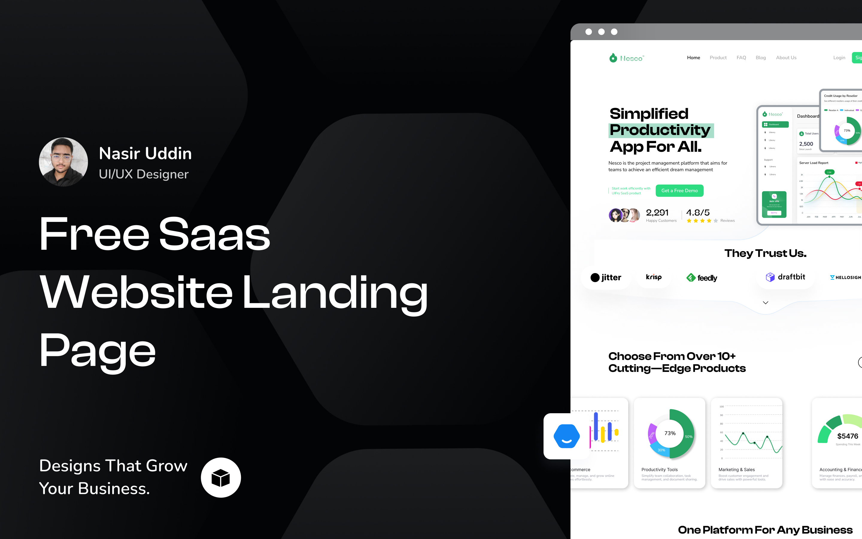
Welcome to my design concept for a modern SaaS website landing page. This project was focused on creating a visually captivating, responsive, and user-friendly interface that enhances engagement and drives conversions. Built with a focus on intuitive navigation, responsive layouts, and visual harmony, the design offers a seamless experience for potential users. Perfectly crafted for SaaS businesses, the layout effectively communicates features, benefits, and call-to-action elements that drive results.
💡 Key Highlights:
1. Clean and intuitive layout for seamless navigation.
2. Strategically placed CTAs to boost user actions.
3. Fully responsive design optimized for all devices.
4. Focused on showcasing SaaS features and benefits effectively.
Tools used
Topics
Share
Reviews
1 review

Your design is well thought out and user-focused. It’s clear that you’ve prioritized clarity and usability. Here’s detailed feedback after reviewing the design:
Strengths
- The hero section stands out with a bold heading (“Simplified Productivity App For All”), clear CTAs, and product screenshots that give a quick idea of what the app offers.
- Features are displayed cleanly with icons and graphs, making them easy to scan and understand.
- The pricing section is simple and easy to compare, with the "Pro" plan highlighted effectively.
- Testimonials with user images add credibility, and the heading “What Our Clients Think About Us?” makes the feedback relatable.
- Social proof like trusted brand logos and user stats helps build trust and reassure visitors.
Areas for Improvement
Hero Section:
- The value proposition feels too broad. What makes the app “simplified”? Adding specifics would make it more impactful.
- The screenshot looks flat. Shadows or animations could make it more engaging.
Typography:
- The body text feels a little cramped. Increasing font size or line height would improve readability, especially on smaller screens.
Visual Consistency:
- There’s a mix of flat icons and gradient illustrations, which feels inconsistent. Sticking to one style would make the design more cohesive.
Testimonials:
- The layout of the testimonials feels disconnected from the rest of the design. Using cards or a slider would integrate this section better.
Footer:
- The footer is packed with links and feels dense. Dividers or better grouping could make it easier to navigate.
Suggestions for Improvement
- Add interactivity: Hover effects or subtle animations on buttons and icons would make the page feel more dynamic.
- Refine the colour palette: Green is used throughout, which works for productivity, but adding complementary colours (like greys or blues) would bring more balance.
- Improve the hook: The hero section needs a stronger, action-oriented subheading or a product demo to make it more engaging.
- Enhance pricing clarity: Add captions like “Best for teams” or “Perfect for startups” under each pricing plan to make them more relatable.
- Make testimonials more relatable: Include specific feedback tied to industries or user scenarios for better context.
Final Thoughts
Your design has a strong structure, and good visuals, and follows SaaS design principles. Small refinements—like improving typography, adding interactivity, and ensuring consistency—will make it more polished and professional. It’s a great foundation that can be made even better with a few tweaks.
You might also like

Pulse — Music Streaming App with Accessible Light & Dark Mode


Islamic E-Learning Platfrom Dashboard

SiteScope - Progress Tracking App


Mobile Button System


FlexPay


CJM for Co-Working Space - WeWork

Popular Courses

UX Design Foundations


Introduction to Figma

Design Terminology
