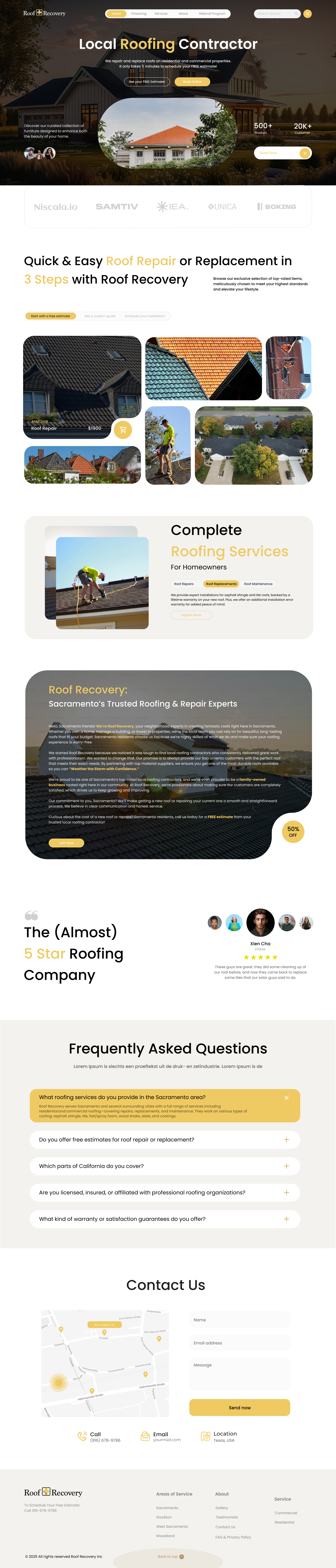
Roof Recovery – Local Roofing Contractor
Variation 1: White Home Page
This variation focuses on a clean and minimal landing page to ensure clarity and trust for potential customers. By using a white background, the design highlights the brand identity, service offerings, and call-to-action buttons without distraction. The goal was to create a professional, modern, and approachable interface that builds credibility and encourages users to connect with the roofing contractor.
Key Highlights:
- Clean white background for clarity and professionalism.
- Emphasis on key services and call-to-actions.
- Simple layout for user-friendly navigation.
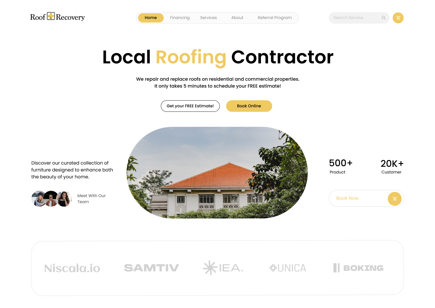
Variation 2: Image Background with Overlay
The second variation explores a more visually engaging approach, using a real roofing-related background image with an overlay. This design adds depth and context, immediately connecting users with the industry while maintaining readability of the text. The overlay ensures contrast, allowing the call-to-action and brand message to remain prominent.
Key Highlights:
- Real-life background imagery to create authenticity and visual impact.
- Overlay for readability and balance.
- Strong visual storytelling to build trust and connect emotionally with users.
Tools used
From brief

Topics
Share
Reviews
10 reviews

Hello Prince,
Your design overall looks clean, professional, and well thought-out. The layout structure, content hierarchy, and use of imagery are strong, and it’s clear that you’ve put effort into creating a visually appealing and user-friendly presentation.
That said, one area that clearly needs improvement is accessibility. At the moment, several color combinations (specifically white text on yellow backgrounds and yellow text on white backgrounds) do not meet WCAG contrast ratio standards. These combinations make it difficult for users with low vision, color blindness, or even in bright environments to clearly perceive the content.
Improving contrast is one of the most important aspects of accessible design. Ensuring that text and background combinations reach at least the minimum AA standard will make your design much more inclusive and easier to navigate for all users. I recommend testing your current palette with a contrast checker and adjusting the colors where needed.
Overall, your work has strong potential, but bringing it up to accessibility standards will significantly enhance both usability and professionalism.

Overall, the design looks good. However, I noticed that the white text on yellow CTA buttons reduces accessibility. These were the main points that stood out to me. Everything else looks nice, but paying more attention to micro spacing would make it even better.

Nice clean variations, Prince — just refine small details like menu legibility and CTA wording, and you’ll have an even stronger, more polished landing page!

Hey Prince,
Really impressed with the dynamic layout you've created for the Roof Recovery project. The color palette you've chosen works really well together.
One thing I noticed on the hero section, the "Meet our team" element has some contrast issues that might affect accessibility. I'd also suggest simplifying the hero area a bit. Right now there are quite a few elements competing for attention, and some feel like they might be there just for the sake of it rather than serving a clear purpose.
For the rest of the site, I'd recommend keeping an eye on paragraph length. Aim for around 50-75 characters per line on desktop and 30-50 on mobile - it makes a huge difference for readability. Some sections seem to run a bit long right now.
Overall though, you've done a great job with this.
Hello Prince,
Both variations of your landing page design are awesome.
The value proposition microcopy is straightforward. CTA labels are informative, intended for conversion. "20K customers" and "500+products" are social references to attract new customers. Your design also enables users autonomy by providing alternatives, e.g. "Book online" or "Get free estimate".
Your design would be more engaging if overall color contrasts could be enhanced, the left column copy could be more streamlined and make it more explicit if "meet with our team" is a link/clickable.
Overall, you have curated a pleasant landing page.

Nice work presenting two clear options.
The white version gives a professional and trustworthy feel, though it may benefit from small details like testimonials or badges to avoid looking too empty.
The image version adds strong visual impact and feels more relatable, just ensure text remains clear across devices.
Both are solid, the final direction should align with whether the client wants to focus more on simplicity and trust or on emotional connection through visuals.

Roof Recovery redesign is literally through the roof!
I’m assuming this is a redesign, since the reference link on the project shows a different design. I also think this kind of style will appeal more to Gen Z and millennials with its modern navigation, bento layout, and friendly edge shapes. Then again, how many in those generations actually own homes and are willing to go as far as getting their roofs recovered 😅. That’s probably why most roofing websites look straightforward and a bit “dated” because they are designed with their real target market in mind.
Even so, your redesign is well-framed and solid. A few things that caught my eye are:
- Reduced legibility in Variation 2 of the main menu. If you kept it black text on yellow, it would still match the rest of the design while keeping the legibility intact.
- In the offering section, you wrote “exclusive selection on top-rated items meticulously chosen…” but the image shows a roof flipped vertically on the top right. I get that image constraints are tough, but it should not stray too far from the message.
- Why does the CTA say “Join Now” in Roof Recovery's profile section? Is it an organization or a community? “Book Now” would be more suitable, or even leaving it at the last paragraph “…call us today for a free estimate…” would make sense.
- As an expert and top-rated roofer in Sacramento who is meticulous, you really have to live up to the standard. Having misalignment in the footer section, specifically in the “service” column, feels like a small bummer.
All in all, it is a strong concept and a bold improvement over the usual roofing site approach. With a few adjustments, it could really raise the bar for this niche.

Nice design !!

Nicely done, Elvin! I really like the first version with the white background, it has such a clean and modern look. The font choice and primary color work well together, giving the design a strong foundation.
A few points I’d recommend revisiting to make the experience even stronger:
- The yellow color feels optimistic and fresh, but in terms of accessibility, it’s not very effective — especially when used on a white background or with small text. You might want to explore a more contrasting option to ensure readability.
- Having two CTAs, ‘Book Now’ and ‘Book Online’, feels confusing because they suggest the same action. Streamlining this into one clear CTA would avoid user hesitation.
- The sale badge currently blends in with the primary color. Differentiating it with a distinct color will help users quickly notice and understand it.
- The text block feels a bit massive. Simplifying the content and presenting it as a bullet list would make it much easier to scan and digest.
Overall, you’ve got a very solid and modern design.
Muito bom trabalho, design muito bem elaborado! Parabéns!
Só um adendo, eu tomaria um pouco mais de cuidado na acessibilidade de alguns botões, creio que o contraste entre o fundo e texto não esteja muito alto.
No mais, está tudo muito bom!
You might also like

HealthFlow: Designing a Simple and Insightful Wellness Dashboard


Improving Dating App Onboarding: A/B Test Design

FORM Checkout Flow - Mobile


A/B Test for Hinge's Onboarding Flow


Accessibility Asse


The Fitness Growth Engine

Content Strategy Courses

UX Writing


Common UX/UI Design Patterns & Flows


Building Content Design Systems
