Robot Management SAAS Dashboard

A user-friendly interface for robot management software. It provides a comprehensive overview of robot performance and task statistics
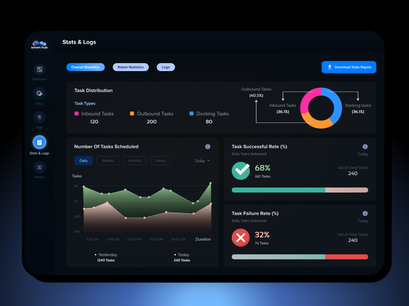
Task Scheduling: Line graphs illustrate the number of tasks scheduled, successful, and failed over daily, weekly, and monthly periods.
Robot Statistics: A section dedicated to robot-specific data, such as duration, task success/failure rates, and daily task counts.
Downloadable Reports: An option to generate detailed reports for further analysis.
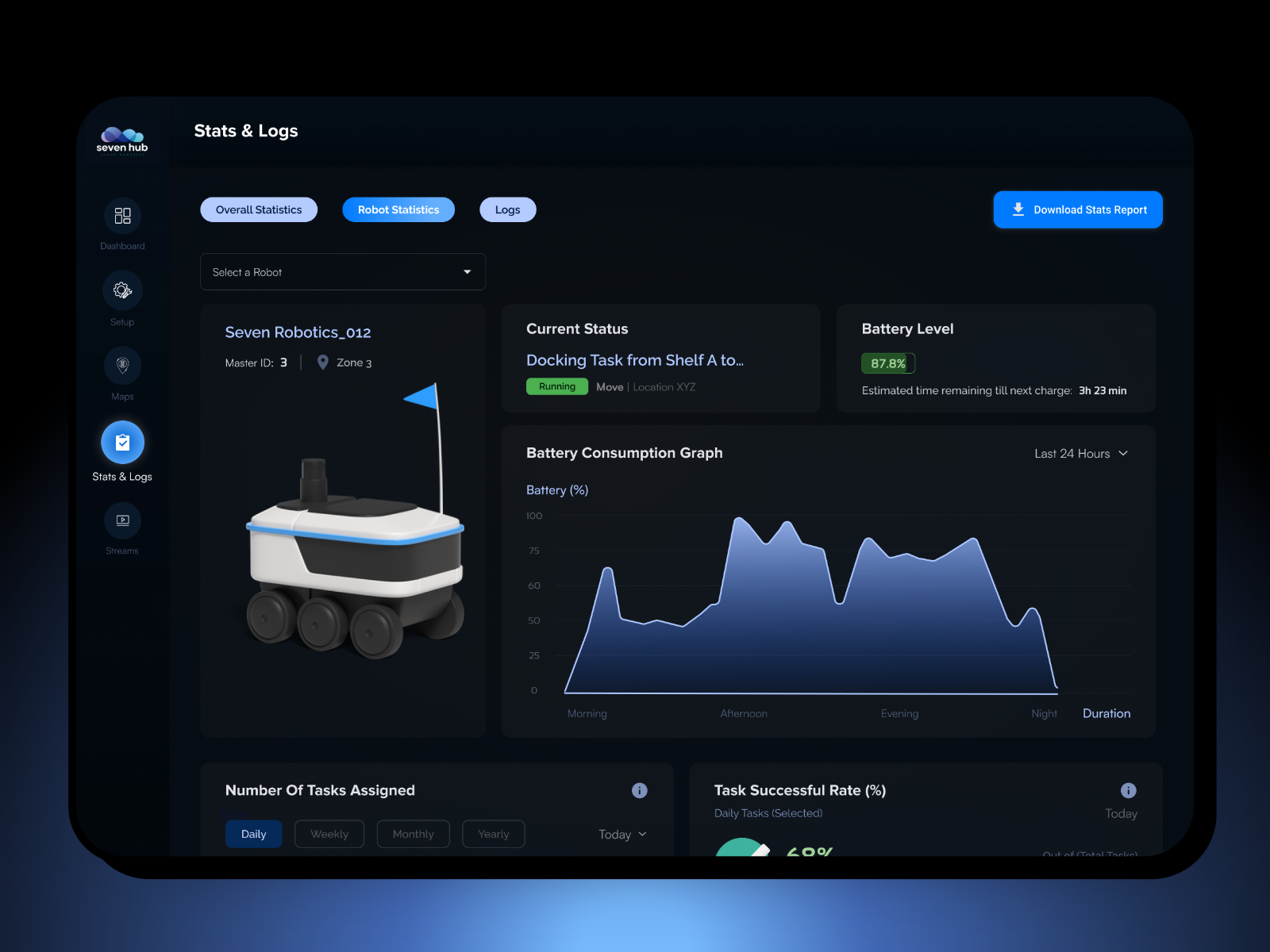
A user-friendly interface for a robot management software. It provides a detailed overview of a specific robot's performance and status. Key features include:
- Robot Information: Displays the robot's name, master ID, zone, and current task.
- Battery Status: Shows the battery level, estimated time remaining until next charge, and a battery consumption graph.
- Task Statistics: Presents the number of tasks assigned, successful, and failed over daily, weekly, and monthly periods.
- Downloadable Reports: An option to generate detailed reports for further analysis.
Reviews
2 reviews

You're very talented! The project looks very promising! And like another Michal Kuczek wrote, I'm also interested to know more! :)
The circular charts and linear task graphs don’t visually harmonise, not for me at least.
Consistency in design components, like choosing one style of graph for similar types of data, could enhance readability and visual unity.
The breakdown of successful and failed tasks is valuable, but it would help to include more details, such as trends over time (whether task success rates are improving or declining). Adding tooltips with additional context when hovering over the graph points can make it easier for users to interpret the data. Again, having the the different coloured bars on different sides doesn't visually harmonise for me. Rounded corners on coloured bar might add a direction and create a more harmonised view?
Having a collapsible side menu might enhance the user experience by providing more screen space to the data without distraction.
The checkmark icon 'Task successful rate' is misaligned and to big, going outside bound of the avatar background.
Ensure that the dashboard can be fully navigated using keyboard shortcuts and that all data points (graphs, stats, and buttons) are accessible for screen readers. Maybe just make a description or annotations of how this is suppose to be achieved.
Overall, you've done a great job! Some minor tweaks and this is a great start for what ever you're creating. Inspiring! Keep up the great work!

That project is really interesting! Who are you working for? Or is this you personal SaaS idea?
Tell me more.
Regarding the design, the background is too dark, make the black a tiny bit grayish. Improve the contrast of some text (it's hard to read, even for someone with no vision challenges). The top tabs look like filters, make them look more like tabs.
You might also like
SiteScope - Progress Tracking App


FlexPay


CJM for Co-Working Space - WeWork


Ubani Design System


Accessible Signup Form for SaaS Platform

Loginino

Popular Courses

Introduction to Figma


KPIs & OKRs for Products


Design Composition